FreshRSS

Normální zobrazení

Jsou dostupné nové články, klikněte pro obnovení stránky.
PředevčíremHlavní kanál
  • ✇Android Authority
  • 5 ways talking to Gemini Live is much, much better than using Google AssistantRita El Khoury
    Since Gemini Live became available to me on my Pixel 8 Pro late last week, I’ve found myself using it very often. Not because it’s the latest and hottest trend, no, but because almost everything I hated about talking to Google Assistant is no longer an issue with Gemini Live. The difference is staggering. I have a lot to say about the topic, but for today, I want to focus on a few aspects that make talking to Gemini Live such a better experience compared to using Google Assistant or the regu
     

5 ways talking to Gemini Live is much, much better than using Google Assistant

20. Srpen 2024 v 21:18

Since Gemini Live became available to me on my Pixel 8 Pro late last week, I’ve found myself using it very often. Not because it’s the latest and hottest trend, no, but because almost everything I hated about talking to Google Assistant is no longer an issue with Gemini Live. The difference is staggering.

I have a lot to say about the topic, but for today, I want to focus on a few aspects that make talking to Gemini Live such a better experience compared to using Google Assistant or the regular Gemini.

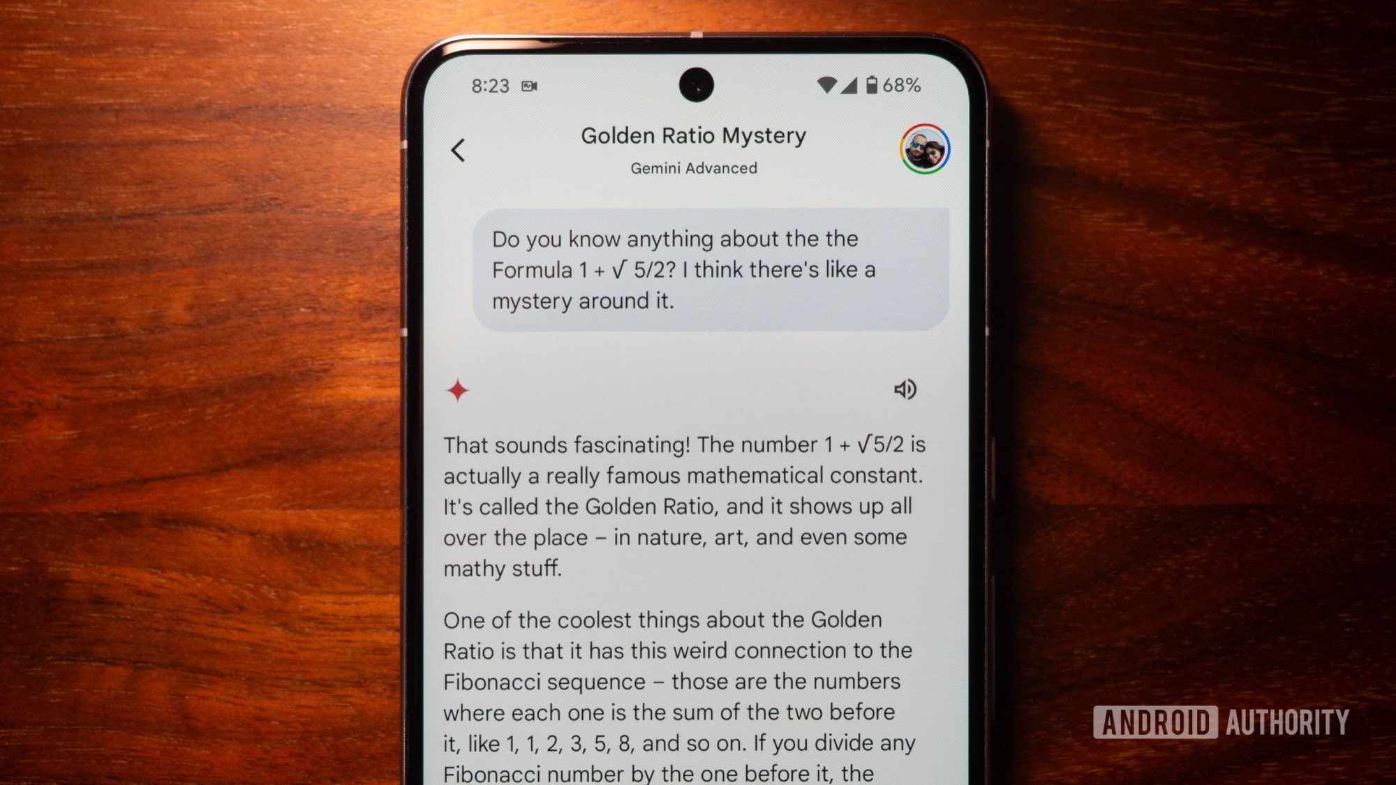
1. Gemini Live understands me, the way I speak

google gemini live natural language question 2

Credit: Rita El Khoury / Android Authority

English is only my third language and even though I’ve been speaking it for decades, it’s still not the most natural language for me to use. Plus, I have the kind of brain that zips all over the place. So, every time I wanted to trigger Google Assistant, I had to think of the exact sentence or question before saying, “Hey Google.” For that reason, and that reason alone, talking to Assistant never felt natural to me. It’s always pre-meditated, and it always requires me to pause what I’m doing and give it my full attention.

Google Assistant wants me to speak like a robot to fit its mold. Gemini Live lets me speak however I want.

Gemini Live understands natural human speech. For me, it works around my own speech’s idiosyncracies, so I can start speaking without thinking or preparing my full question beforehand. I can “uhm” and “ah” mid-sentence, repeat myself, turn around the main question, and figure things out as I speak, and Live will still understand all of that.

I can even ask multiple questions and be as vague or as precise as possible. There’s really no restriction around how to speak or what to say, no specific commands, no specific ways to phrase questions — just no constraints whatsoever. That completely changes the usability of AI chatbots for me.

2. This is what real, continuous conversations should be like

google gemini live interruption correction

Credit: Rita El Khoury / Android Authority

Google Assistant added a setting for Continuous Conversations many years ago, but that never felt natural or all that continuous. I’d say “Hey Google,” ask it for something, wait for the full answer, wait an extra second for it to start listening again, and then say my second command. If I stay silent for a couple of seconds, the conversation is done and I have to re-trigger Assistant again.

Plus, Assistant treats every command separately. There’s no real ‘chat’ feeling, just a series of independent questions or commands and answers.

Interruptions, corrections, clarifications, idea continuity, topic changes — Gemini Live handles all of those.

Gemini Live works differently. Every session is a real open conversation, where I can talk back and forth for a while, and it still remembers everything that came before. So if I say I like Happy Endings and ask for similar TV show recommendations, I can listen in, then ask more questions, and it’ll keep in mind my preference for Happy Endings-like shows.

I can also interrupt it at any point in time and correct it if it misunderstood me or if the answer doesn’t satisfy me. I don’t have to manually scream at it to stop or wait for it as it drones on for two minutes with a wrong answer. I can also change the conversation topic in an instant or give it more precise questions if needed.

Plus, Gemini Live doesn’t shut off our chat after a few seconds of silence. So I can take a few seconds to properly assimilate the answer and think of other clarifications or questions to ask, you know, like a normal human, instead of a robot who has the follow-ups ready in a second.

Better yet, I can minimize Live and go use other apps while still keeping the chat going. I’ve found this excellent while browsing or chatting with friends. I can either invoke Live mid-browsing to ask questions and get clarifications about what I’m reading, or start a regular Live chat then pull up a browser to double check what Gemini is telling me.

3. TL;DR? Ask it for a summary

google gemini live interruption summary

Credit: Rita El Khoury / Android Authority

As I mentioned earlier, every command is a separate instance for Google Assistant. Gemini Live considers an entire chat as an entity, which lets me do something I could never do with Assistant: ask for a summary.

So if I had a chat about places to run around in Paris and test the new Panorama mode on the Pixel 9 series, I can ask it for a summary in the end, and it’ll list all of them. This is incredibly helpful when trying to understand complex topics or get a list of suggestions, for example.

4. Want to talk more about a specific topic? Resume an older chat

google gemini live continue chat

Credit: Rita El Khoury / Android Authority

At one point, I opened Gemini Live and said something like, “Hey, can we continue our chat about Paris panorama photos?” And it said yes. I was a bit gobsmacked. So I went on, and it seemed to really know where we left off. I tried that again a few times, and it worked every time. Google Assistant just doesn’t have anything like this.

Another way to trigger this more reliably is to open Gemini, expand the full Gemini app, tap on Recents and open a previous chat. Tapping on the Gemini Live icon in the bottom right here allows you to continue an existing chat as if you never stopped it or exited it.

5. Check older chats and share them to Drive or Gmail

google gemini live export docs gmail

Credit: Rita El Khoury / Android Authority

Viewing my Google Assistant history has always been a convoluted process that requires going to my Google account, finding my personal history, and checking the last few commands I’ve done.

With Gemini, it’s so easy to open up previous Live chats and read everything that was said in them. Even better, every chat can be renamed, pinned to the top, or deleted in its entirety. Plus, every response can be copied, shared, or quickly exported to Google Docs or Gmail. This makes it easy for me to manage my Gemini Live data, delete what needs to be deleted, and share or save what I care about.

Google Assistant still has a (significant) leg up

google gemini live calendar fail

Credit: Rita El Khoury / Android Authority

Despite everything Gemini Live does well, there are so many instances where I felt its limitations while using it. For one, the Live session is separate from the main Gemini experience, and Live only treats general knowledge questions, not personal data. So I can ask Gemini (not Live) about my calendar, send messages with it, start timers, check my Drive documents, control my smart home, and more, just as I could with Assistant, but I can’t do any of that with Gemini Live. The latter is more of a lively Google Search experience and all the regular Gemini extensions aren’t accessible in Live. Google said it was working on bringing them over, though, and that is the most exciting prospect for me.

Gemini Live still doesn't have access to personal data, calendars, smart home, music services, etc...

Because of how it’s built and what it currently does, Gemini Live requires a constant internet connection and there’s nothing you can do without it. Assistant is able to handle some basic local commands like device controls, timers, and alarms, but Gemini Live can’t.

And for now, my experience with multiple language in Gemini Live support has been iffy at best — not like Assistant’s support of multiple languages is stellar, but it works. On my phone, which is set to English (US), Gemini Live understands me only when I speak in English. I can tell it to answer in French, and it will, but it won’t understand me or recognize my words if I start speaking French. I hope Google brings in a more natural multilingual experience to it, because that could be life-changing for someone like me who thinks and talks in three languages at the same time.

google gemini live fullscreen listening

Credit: Rita El Khoury / Android Authority

Logistically, my biggest issue with Gemini Live is that I can’t control it via voice yet. My “Hey Google” command opens up the main Gemini voice command interface, which is neat, but I need to manually tap the Live button to trigger a chat. And when I’m done talking, the chat doesn’t end unless I manually tap to end it. No amount of “thank you,” “that’s it,” “we’re done,” “goodbye,” or other words did the trick to end the chat. Only the red End button does.

Google Assistant was a stickler for sourcing every piece of info; Gemini Live doesn't care about sources.

Realistically, though, my biggest Gemini Live problem is that there’s no sourcing for any of the info it shares. Assistant used to be a stickler for sourcing everything; how many times have you heard say something like, “According to [website];” or, “on the [website], they say…?” Gemini Live just states facts, instead, with no immediate way to verify them. All I can do is end the chat, go to the transcript, and check for the Google button that appears below certain messages, which shows me related searches I can do to verify that info. Not very intuitive, Google, and not respectful to the millions of sites you’ve crawled to get your answer like, uh, I don’t know… Android Authority perhaps?

  • ✇Android Authority
  • UWB is still under-utilized on Android, but there’s a bit of hopeRita El Khoury
    Credit: Robert Triggs / Android Authority Opinion post byRita El Khoury It’s been nearly four years since Samsung shipped the first Android phone with an ultra-wideband chip — or UWB for short. Since then, Samsung has included UWB in eight other phone series, including flagships from the Galaxy S21, S22, S23, and S24 line-up, as well as the Z Fold 2, 3, 4, and 5. Google has also followed suit with the Pro models of its Pixel 6, 7, and 8, plus the Fold and Tablet. Yet, here we are, with basi
     

UWB is still under-utilized on Android, but there’s a bit of hope

8. Červen 2024 v 14:00
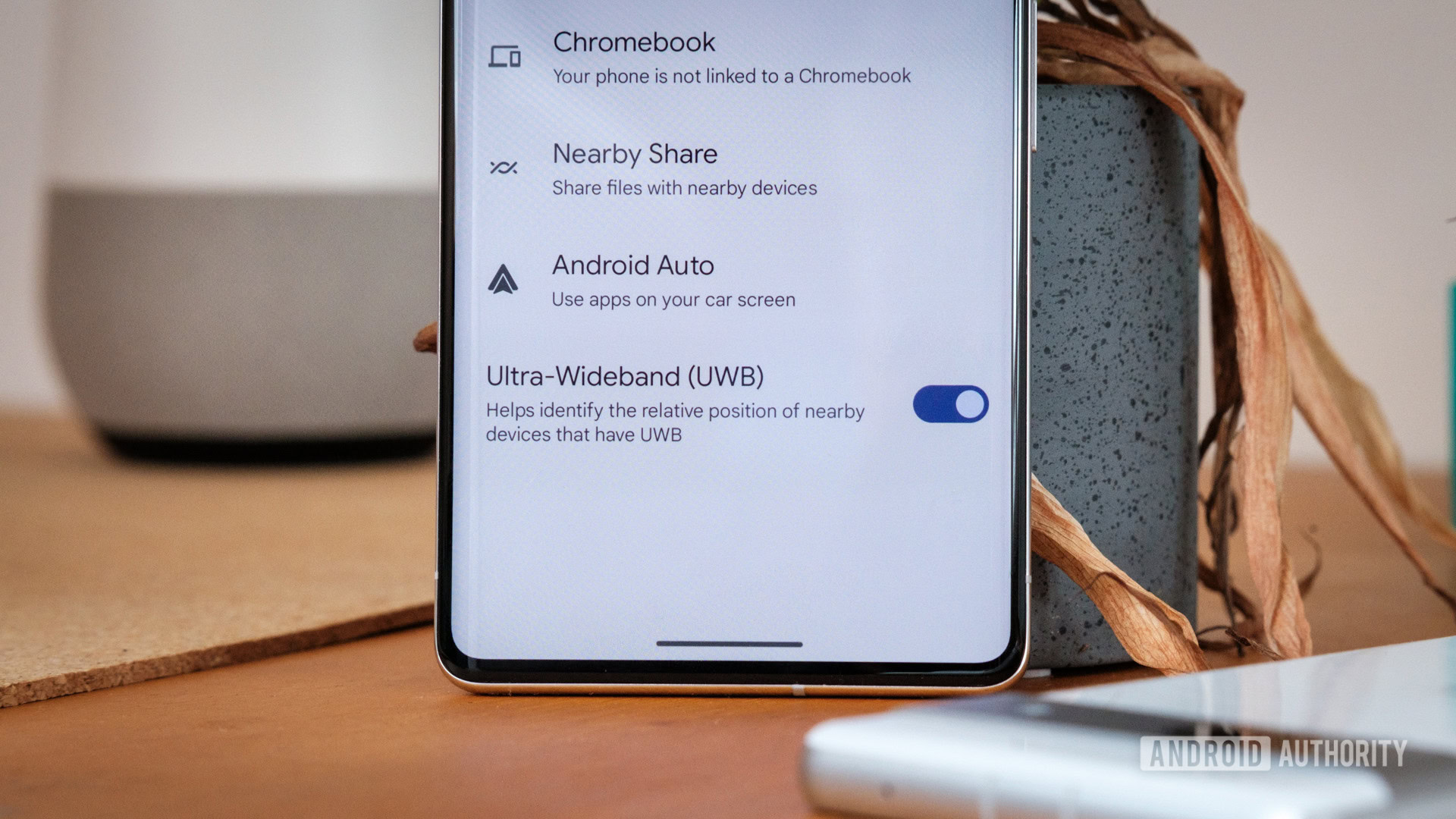
Ultra wideband UWB toggle
Credit: Robert Triggs / Android Authority
Opinion post by
Rita El Khoury

It’s been nearly four years since Samsung shipped the first Android phone with an ultra-wideband chip — or UWB for short. Since then, Samsung has included UWB in eight other phone series, including flagships from the Galaxy S21, S22, S23, and S24 line-up, as well as the Z Fold 2, 3, 4, and 5. Google has also followed suit with the Pro models of its Pixel 6, 7, and 8, plus the Fold and Tablet.

Yet, here we are, with basically nothing to show for the tech. UWB enables secure keyless entry in some high-end cars and is also used by Samsung to better locate a lost Galaxy SmartTag 2 near you. That’s everything you can use UWB for right now. The chip is also supposed to power the quick music casting from your Pixel phone to your Pixel Tablet, but that feature hasn’t yet rolled out despite being teased for months.

  • ✇Android Authority
  • Google Gemini ‘Ask This Video’ hands-on: The power of YouTube in a snapRita El Khoury
    Yesterday, we shared with you a preview of what you can do with Google’s new Gemini-powered “Ask This Page” feature, which was announced at I/O 2024. Today we’re getting our hands on another upcoming “Ask This…” feature, the one that works on YouTube videos. Just like yesterday, this is an early hands-on preview with Ask This Video. The feature is not live yet, but Android Authority managed to activate it in the Google app. So, while we tried to push it a bit and see what it can do and where
     

Google Gemini ‘Ask This Video’ hands-on: The power of YouTube in a snap

29. Květen 2024 v 21:02

Yesterday, we shared with you a preview of what you can do with Google’s new Gemini-powered “Ask This Page” feature, which was announced at I/O 2024. Today we’re getting our hands on another upcoming “Ask This…” feature, the one that works on YouTube videos.

Just like yesterday, this is an early hands-on preview with Ask This Video. The feature is not live yet, but Android Authority managed to activate it in the Google app. So, while we tried to push it a bit and see what it can do and where it might fail, there could still be room for improvement before Google launches it to the public.

Gemini Ask This Video: What it is and how it works

google gemini ask this video

Credit: Rita El Khoury / Android Authority

Ask This Video is an upcoming Gemini-powered generative AI feature that helps you ask questions about any YouTube video you’re currently watching. Instead of scrubbing and skipping through different parts of that video to find a specific bit of information, you’ll be able to query Gemini and it’ll try to find the answer in that video, without coloring outside the lines. In theory, this should be a big time-saver if you’re looking for a specific information in a YouTube video and you don’t want to waste time trying to find it.

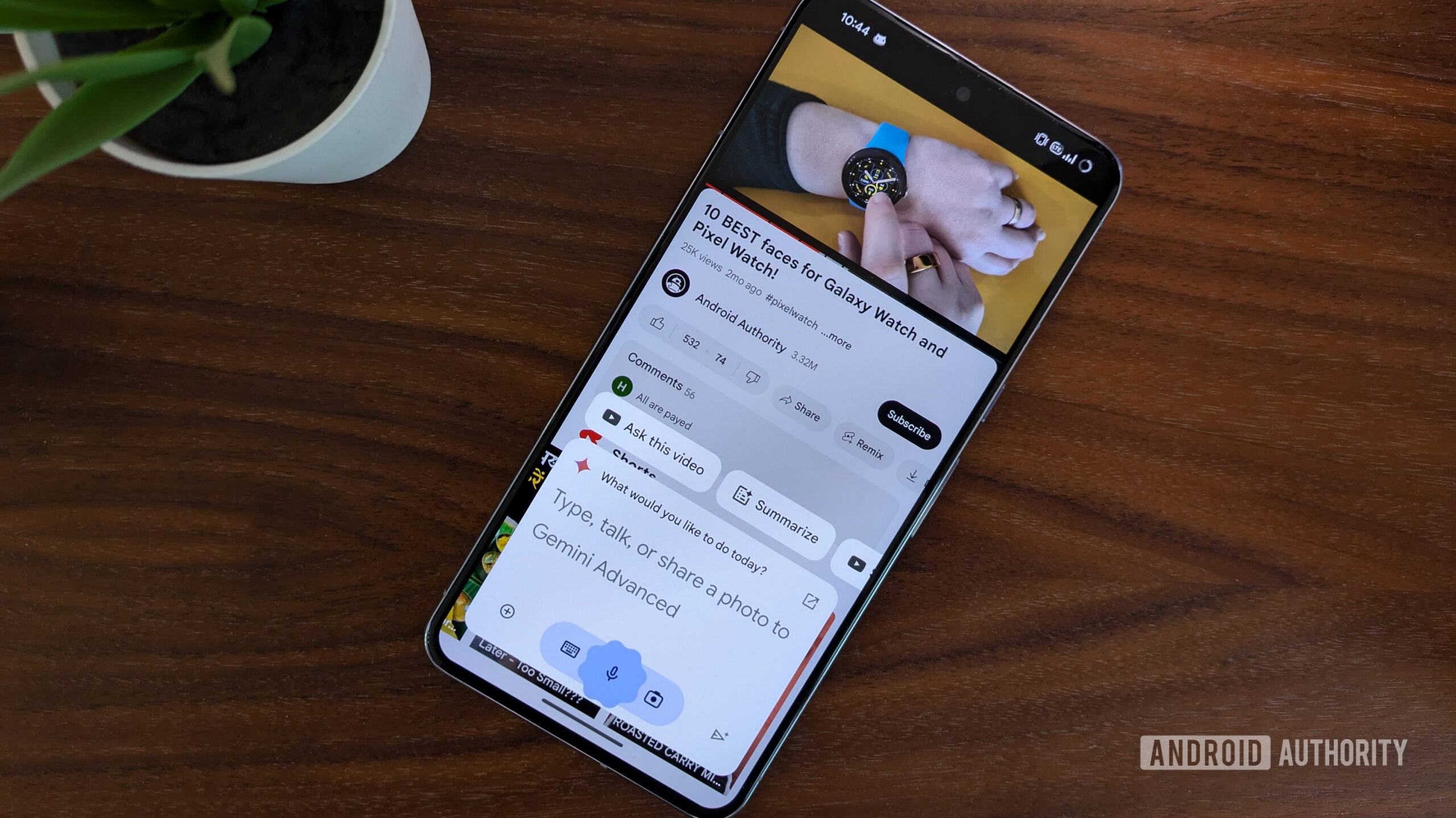
To activate Ask This Video, you just tap and hold the power button to pull up Gemini on your Android phone while watching a YouTube video. Gemini is context-aware now, so it’ll know you triggered it in YouTube and surface an “Ask this video” chip on top of the pop-up menu. See the image above for reference.

Tap that and you’ll notice that Gemini has now attached the video to the pop-up, so you can start typing questions in your natural language and Google’s AI will try to find answers. It takes about 6-8 seconds for Gemini to process the request and come back with an answer.

Ask This Page understands nuance sometimes

In the example above, you can see we asked Gemini about Android Authority‘s “Pixel 8a is here, but why” video where my colleague C. Scott Brown argued that the Pixel 8a is a good phone, but its value and competitiveness is diminished by the better and frequently-discounted Pixel 8. But suppose you haven’t watched that video and you need to know what’s wrong about the phone in a few words to see if this is worth watching (spoiler: it is good content). You could do what we did and check with Gemini to see what’s wrong or bad about the Pixel 8a. And I think it pretty much nailed the nuance of C. Scott’s argument.

google gemini ask this video answer 5

Credit: Rita El Khoury / Android Authority

In the next example above, I asked it for the differences between the Nothing Ear and Ear (a) in my video. It didn’t list every single difference, but focused on the biggest ones and synthesized the most important bits. In in the video, I mention these features and differentiating factors in several places, but not in succession, so once again, it understood that and didn’t make any mistakes in its summary. The answer is incomplete, though, in my opinion, as there are other factors to consider between the two earbud models. But for an early AI version, I’ll consider this a win. (Such is the state of AI summaries now that an accurate answer is counted as a win, even if it’s incomplete).

Ask This Page can find an answer faster than you can say skip


I think the most impressive part of Ask This Video is how easily it can answer a pressing question, without you having to watch the whole video to unearth it. It’s not perfect yet, but in the case of my hands-on with Chipolo’s new Find My Device trackers, it correctly answered that you don’t need a separate app to use the trackers, and in Carlos Ribeiro’s fast-charging myths and truths video, it nailed his recommendation of sticking with 100W cables to keep your gear future-proof.

Ask This Video has the potential to become a genuinely useful feature when skimming videos and looking for answers. Speaking from personal experience, YouTube has become my go-to resource now for specific tutorials and how-tos (I find that the quality there is better than the random hundreds of SEO-targeted written articles), but it’s usually tough to find the exact piece of information I’m looking for in a lengthy video. I used to turn to YouTube’s video transcripts and search for specific keywords in them to quickly find my answer. Gemini should be much faster and more practical than that trick.

Google still has to fine-tune Ask This Page

As with everything AI, and specifically Google AI, things aren’t 100% perfect just yet. We didn’t try to “red team” Ask This Video, we just went for regular tech videos and questions. I’m sure when this feature goes live and people start pushing it to its limits, they could make it give bad, weird, and potentially unacceptable answers.

Going back to our tests, we ran across a couple of instances where Ask This Page wasn’t 100% spot on. In the first example above, we asked it whether the Pixel 8a was powerful and whether there was a better phone, based on my Pixel 8a tests video. The first time it answered, it only used the first half of the video where I compared the 8a against the Pixel 7a and 8, which resulted in a glowing answer in favor of the new phone.

None of that was technically wrong, but it wasn’t the full picture. Since we know that the second half of the video looks at the competition, we tried to rephrase the question to nudge it in the right direction, and that’s where it told us that the OnePlus 12R is a more powerful phone in the same price range.

The problem is that random viewers won’t have this kind of context, so they might take the first answer at face value and not realize that the video went into a different set of comparisons later and that there’s a more capable phone for the same price. This is the kind of context that I’m afraid AI summaries will miss again and again, until they get better at it. As someone who’s only recently become a YouTuber, I’ve seen so many depressing comments from people who didn’t watch my videos and jumped on a word in the title or the intro without seeing the nuance, and I fear these kinds of incomplete or wrong AI answers will create more situations like that where we’ll be blamed for the AI’s failure to summarize or synthesize something correctly.

google gemini ask this video answer 6

Credit: Rita El Khoury / Android Authority

The final example is the one where Gemini veered off-track. We asked it about the best analog options among my 10 favorite watch faces for the Pixel and Galaxy Watch and it returned three options. Only one — Nothing Fancy — is correct. Sport XR is a digital watch face and I even say that in the video when I introduce it. Material Stack is also a digital design, though I don’t mention it explicitly. Meanwhile, Gemini failed to find the option that is simply and obviously called “Analogue watch face.” It also missed “Typograph,” another watch face that I explicitly mention as having an analog design.

Let’s face it, though, this is not as dire as those terrible AI results in Google search, but if this kind of simple error can occur with watch faces, then who’s to say what can happen with more nuanced and complicated videos?

We kept our focus on tech in these early tests, but there’s a bit of everything on YouTube, from politics to social issues, cooking tutorials, sports highlights, and more. Even though Google has this ever-present “Gemini may display inaccurate info, including about people, so double-check its responses” notice at the bottom of the pop-up, we all know that most people will eventually just rely on the answer they’re getting. Errors in answers can be very detrimental, both to the viewer and the video creator, as more and more people start relying on Gemini and trusting it with their everyday queries.

Personally, I’m not a fan of this “move fast, break things, and ask for forgiveness later” approach with AI. I would have preferred if Google tested it more and waited for it to mature before throwing it out in the world. But investors and money speak, not users like you and me, so once again, this is another discussion for another day.

  • ✇Android Authority
  • The amazing, groundbreaking, and fantastic LG G3 is 10 years old nowRita El Khoury
    Credit: Rita El Khoury / Android Authority Someone, please tell me to stop going this quickly! It’s been a whole decade since LG announced one of its best-ever smartphones, the G3. A perfect follow-up and a big leap from the excellent G2, a better phone than the later G4, the LG G3 was my favorite Android phone in the quirky 2010s. It was also the phone that completely changed my mind about Android photography, custom ROMs, stock Android, and Android skins. Grab your tissues; we’re about to
     

The amazing, groundbreaking, and fantastic LG G3 is 10 years old now

29. Květen 2024 v 16:26

lg g3 phone case match shoes 4'

Credit: Rita El Khoury / Android Authority

Someone, please tell me to stop going this quickly! It’s been a whole decade since LG announced one of its best-ever smartphones, the G3. A perfect follow-up and a big leap from the excellent G2, a better phone than the later G4, the LG G3 was my favorite Android phone in the quirky 2010s. It was also the phone that completely changed my mind about Android photography, custom ROMs, stock Android, and Android skins. Grab your tissues; we’re about to dig into a slice of smartphone nostalgia.

The LG G3 was absolutely perfect for me

Before getting the LG G3, I had been using its predecessor for nearly a whole year. The G2 was my first LG smartphone, and it absolutely blew me away. The display, camera, Android experience, and buttons on the back; I liked everything about it. The G3 reinforced all those features and all those feelings.

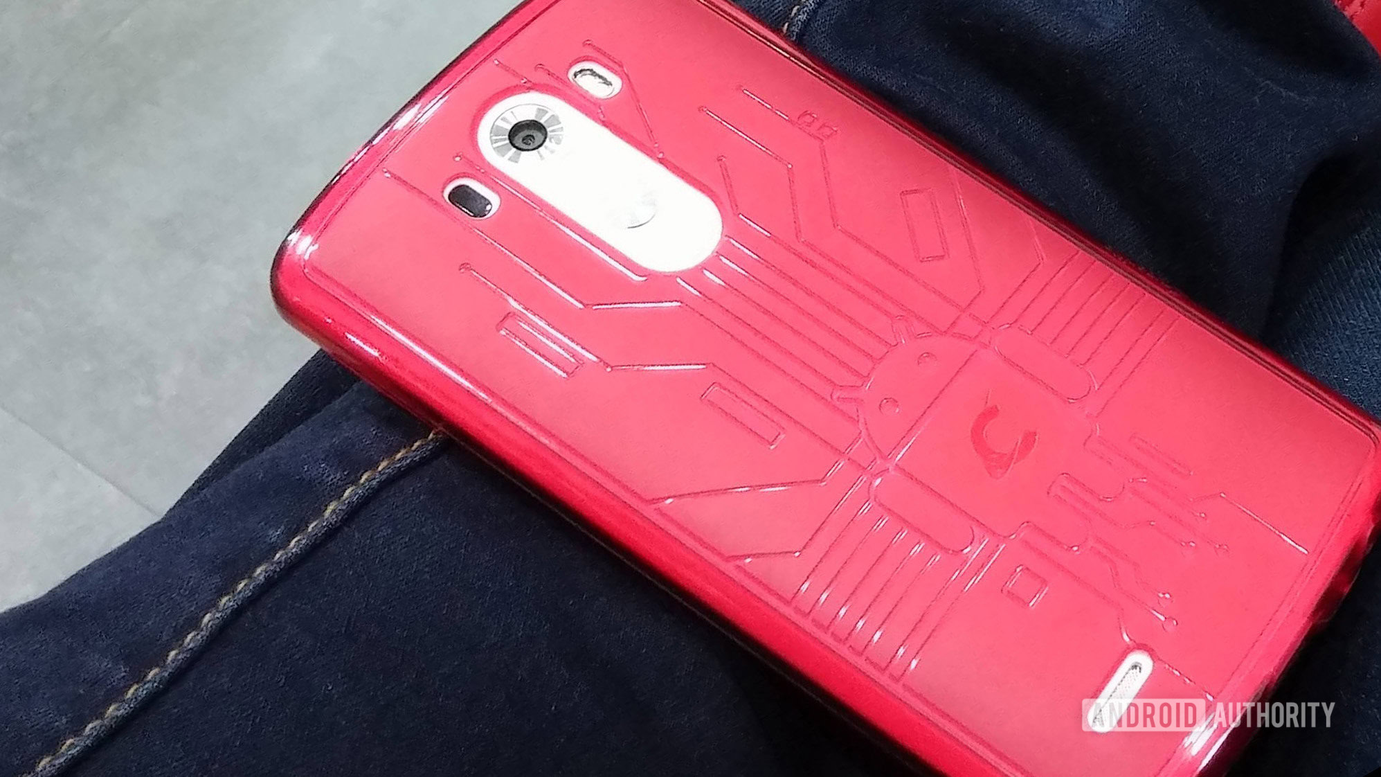
At the time, I had a silly obsession with matching my phone’s case with my shoes, so here’s a collection of “shoes match phone” pics with my LG G3. Ah, how I miss those Cruzerlite Bugdroid Circuit cases! Phone cases peaked with that design and have never recovered since.

By the time I got the G3 in my hands, I was a buttons-on-the-back convert. I loved the placement of the volume and power keys, my index rested on them naturally, and it just made sense to have such a hand-agnostic location. Left-handed? Right-handed? Both? It didn’t matter. Just grab the phone and the controls are easily accessible, regardless.

The G3 also solidified my resolution in not rooting or installing a custom ROM on my phone. Before it, I had gone to extra lengths to make sure my HTC Desire Z and Samsung Galaxy S3 were rooted and running some enthusiast-made stock Android ROM, but LG’s approach to Android was actually usable compared to the slow-to-update HTC and heavy Samsung TouchWiz implementations, respectively.

Additionally, the display-to-bezel ratio and that beautiful Quad HD display really enhanced my experience with the phone. For the first time, it felt like I was carrying a display, not a phone, and I still recall the surprise on the faces of nearly everyone that saw that me using that phone. I never heard as many “wow” exclamations as much as when I was using the G3.

Rear buttons, Quad HD display, powerful processor, decent Android skin, the G3 had everything going for it.

And then there was the Snapdragon 801, a world-class processor. Chip improvements were incredibly frenetic and drastic in the early 2010s — you could buy a flagship phone one day and a month later another chip would be released with double the processing power. Things were getting more stable and incremental around 2014, and the Snapdragon 801 was an example of that. A very solid, very performant chip, that handled complex tasks without a hiccup.

To me, though, the difference was stratospheric: I went from a single-core 800MHz processor on the Desire Z (early 2011) to a quad-core 1.4GHz on the Galaxy S3 (2012), then quad-core 2.26GHz on the LG G2 (2013), and finally 2.5GHz on the G3 (2014). I don’t recall ever complaining about anything with that chip, even though some people said the G3’s Quad HD display was so demanding it caused some lag and battery drain.

The first Android camera I truly trusted

It was with its camera, though, that the LG G3 really won me over. Before switching to Android, I was invested in the magnificent world of Nokia smartphones and mobile cameras. After using the Nokia N95, N82, N8, and 808 Pureview, my mobile photography expectations were sky-high, and I had yet to find an equivalent or even just a “fine enough” alternative on Android. The Desire Z and Galaxy S3 I sported before LG’s phones were capital-B Bad cameras. With the G2, I had better results, then the G3 really strengthened that. It was one of the best camera phones of its era.

Coming from Nokia smartphones, Android's cameras were a great disappointment... until the LG G3.

With optical image stabilization (OIS), a feature not so customary of that era’s phones, and laser autofocus, the G3 could focus quickly and snap sharp images in many situations. It was the only camera I took on hikes across Lebanon, as I rediscovered the beauty of my country by visiting areas I’d never been to. I mean — look at the glory of that first shot and try to understand how terrified we all were for the photographer on the precipice!

And then there are the panoramas. We didn’t have ultrawide-angle lenses back in 2014, and boy, did I like a good panorama to snap the real glory of a landscape!

The LG G3 was also my travel camera to London, Istanbul, and Las Vegas. The sun’s reflection on the Mandala Bay hotel and the New York New York hotel shot are so good they still pass the eye test today (until you start to pixel-peep).

The G3 immortalized my first quad-driving experience, that silly late-night Winnie the Pooh playground moment, and my best spiky hair selfie. I dream of the day my hair would look like this again.

And although night modes weren’t a thing just yet, and mobile photography was pretty terrible in low-light and dark conditions, I still managed to eke out some exceptional shots from the G3. My three favorite snaps below, from Zaitouna Bay in Beirut, are simply phenomenal for a mid-2010 smartphone.

And then there are the other random food, nature, cat, and sassy cow shots, because, of course, has those in their photo gallery. This was truly a versatile, reliable camera, that paved the way for more important mobile photography leaps.

The G3 was peak LG, it all went downhill from there

I didn’t want to admit it at the time, but the LG G3 was really peak LG. Even though I switched to the G4 and G5 after it and tried to recapture that same magic, and even though I was intrigued by many of LG’s quirky smartphones after those (Velvet, Wing, to name a couple), none of them really caught the near-perfection of the G3 in my eyes. That was as good as it was ever going to get for LG, and the company’s decline after that and its eventual exit from the smartphone market is proof. I just wish things had gone in another direction for the Korean giant.

  • ✇Android Authority
  • Theft protection is genuinely the most useful Android feature in yearsRita El Khoury
    Opinion post byRita El Khoury Tech is too iterative, too boring, and too focused on AI. And then there are genuine moments of wonder when a company announces an impressive new feature, and you go, “AHA! YES. THAT!” Once it’s out there, that feature seems so obvious, so simple, and so impactful that you can’t imagine going back to a world where it doesn’t exist. These moments are becoming few and far between, but I’ve gone through them with Google a few times in recent years. First, there was
     

Theft protection is genuinely the most useful Android feature in years

15. Květen 2024 v 20:00

Opinion post by
Rita El Khoury

Tech is too iterative, too boring, and too focused on AI. And then there are genuine moments of wonder when a company announces an impressive new feature, and you go, “AHA! YES. THAT!” Once it’s out there, that feature seems so obvious, so simple, and so impactful that you can’t imagine going back to a world where it doesn’t exist.

These moments are becoming few and far between, but I’ve gone through them with Google a few times in recent years. First, there was the Pixel’s car crash detection, launched in 2019, which relies on the phone’s location, microphones, and physical motion to guess if you’ve been in a crash and help you get in touch with emergency services. Then, there was Android’s earthquake alert system in 2020, which uses millions of Android phones‘ accelerometers to detect vibrations and alert people in the area, giving them a few precious seconds to react and take cover.

Android Remote Lock

Credit: Google

Now, Google is using similar sensors to determine whether your phone has been snatched while unlocked. When I heard the feature being described, I had one of those “Aha” moments again. As someone who frequently uses public transit in Paris and grips their Pixel 8 Pro a little too tight because of the notorious theft rates in the Parisian metro, this is the kind of feature I never knew I needed but that I wouldn’t want to live without anymore.

This is the kind of feature I never knew I needed but that I wouldn't want to live without anymore.

It sounds deceptively simple and obvious, too, but someone had to think of it. Here’s the scenario: You’re holding your phone, unlocked, and browsing or streaming or doing whatever you do on your phone. A thief snatches it, runs far away from you, and is smart enough to immediately open the camera (to avoid display timeout and hence keep the phone unlocked). Once they’re in a safe space, they can disable Find My Device, go into your apps, get your data and photos, buy things, and do a lot of online and financial damage. Phone thieves rarely care about the price of the phone they’re stealing; they want the more valuable information and data in it.

In that kind of scenario, you don’t have much time to avoid the damage. Logging in to your account from another device and setting up remote lock takes time and requires a good Samaritan (or that you still have a spare computer or phone on you). Time that the thief has probably used to get away with a bunch of nefarious things.

Our phones carry our lives, and phone theft isn't about stealing the actual device anymore, but the data inside it.

Android’s upcoming theft detection lock avoids all of this headache. If your phone is unlocked, the accelerometer detects a jump (the snatch) followed by fast movement away from its original location (the getaway) to lock itself automatically. If the phone is still in your hands, and you did some sudden weird acrobatics to trigger it, you just unlock your phone as you normally do and go about your merry way. If, however, the phone was actually stolen, the thief can do zilch for a while. They would need illegal hardware and software to get into the phone, by which time you’ve hopefully erased it.

Android Theft Protection

Credit: Google

Look, if someone is hellbent on stealing your particular phone and getting your particular data, I’m sure they can figure out a way to do it. Nefarious people will always find a way. But theft protection — be it for phones, cars, or homes — is about raising the barrier and lowering the incentive, and this is what this new Android feature does. It puts another hurdle in the way of petty thieves and forces them to abandon snatch-and-grabs.

Google is making sure millions of Android phones would be less desirable as snatch-and-grab targets.

My favorite part of this, though, is what Google said about its rollout. While the feature will first come with Android 15 “later this year,” it should still trickle down to older Android versions through Play Services. That means it could impact millions of phones overnight and make them far less vulnerable as theft targets. And once the word spreads among the thieving community, far less desirable, too.

And while you may not need this feature every moment and every day, it’s akin to car crash detection and earthquake alerts. Just like airbags in a car, you don’t use them every day, but the one time you need them, they’re there.

It’s been a couple of years since I’ve seen Android add something so genuinely useful. An icon here, a toggle there, a hidden menu somewhere — those are all fine. But something that can, in an instant, be the differentiator in your life? No, these are rare occurrences, and a theft detection lock is among them. Now we wait until the feature actually launches to test it out.

  • ✇Android Authority
  • The best Chromecast alternative is a streaming box many of us can’t buyRita El Khoury
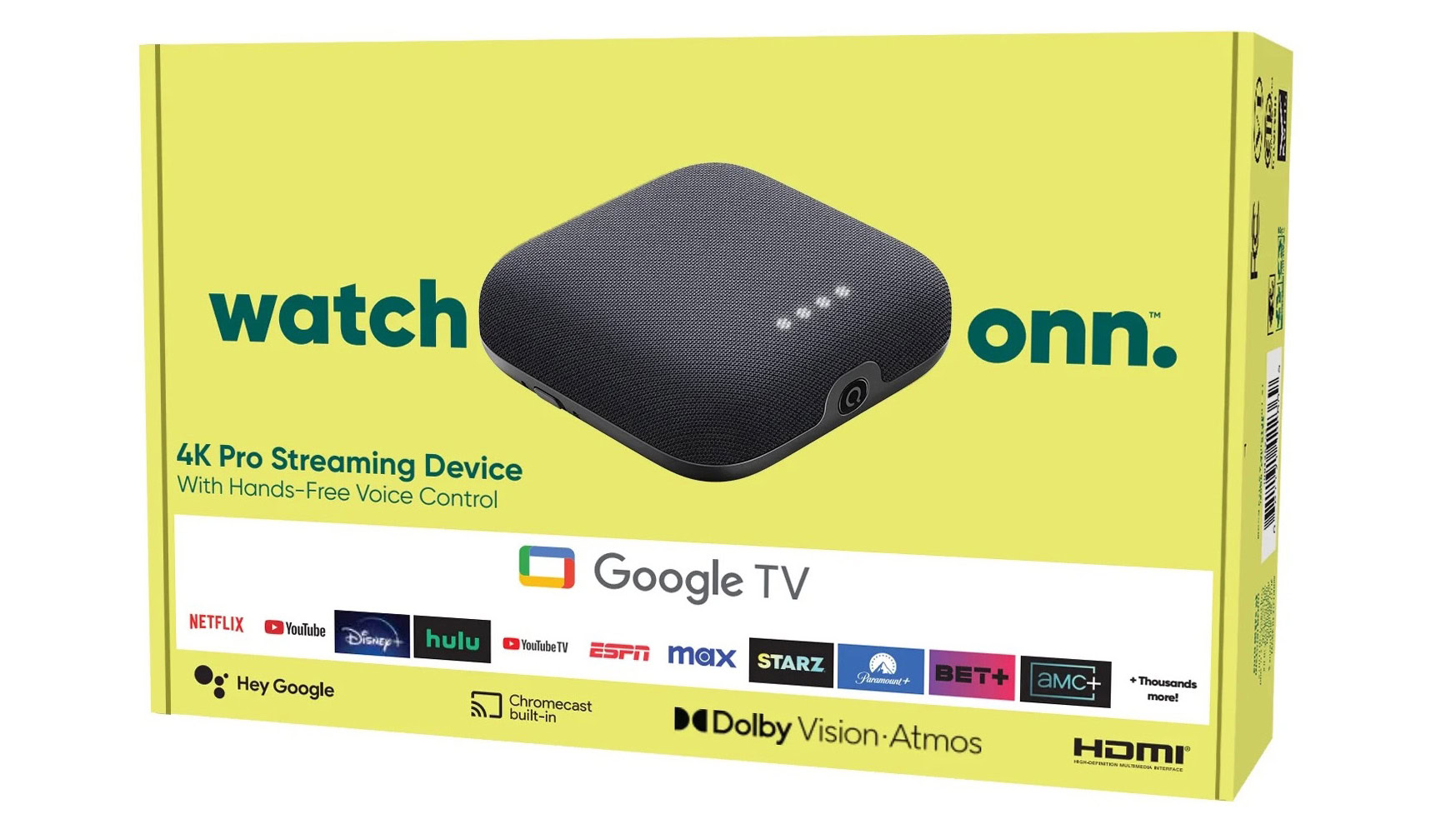
    Credit: Walmart Opinion post byRita El Khoury For the first time in a while now, I find my consumerist self jealous of not living in the US. The reason? Walmart, and more specifically, the latest Walmart Google TV streaming box. The new onn 4K Pro box is, by far, one of the most exciting Google TV streamers launched in recent years and one of the best Chromecast alternatives out there. The only problem is that it’s available in the US, and… well, that’s it. We won’t be getting it in Europe
     

The best Chromecast alternative is a streaming box many of us can’t buy

12. Květen 2024 v 16:00
walmart onn 4k pro google tv streaming box
Credit: Walmart
Opinion post by
Rita El Khoury

For the first time in a while now, I find my consumerist self jealous of not living in the US. The reason? Walmart, and more specifically, the latest Walmart Google TV streaming box. The new onn 4K Pro box is, by far, one of the most exciting Google TV streamers launched in recent years and one of the best Chromecast alternatives out there. The only problem is that it’s available in the US, and… well, that’s it. We won’t be getting it in Europe or other countries either.

Walmart’s new onn box caught my eye ever since the first leaks started. Contrary to previous onn sticks and streaming devices, this one was clearly not aiming for the very low-end $20 market. Instead, it seemed packed to the brim with features and specs that just made me look sideways at my 4K Chromecast and sigh, “Why not you?”

  • ✇Android Authority
  • A budget Pixel phone is an oxymoron in 2024Rita El Khoury
    Credit: Paul Jones / Android Authority Google has made its bed and must now lie in it: There is no such thing as a budget Pixel anymore. Looking at the new Pixel 8a, a few things regarding Google’s strategy and priorities became abundantly clear to me. The definition of a “Pixel phone” has evolved, and with it, the feasibility of a budget phone that fits this new vision. Let me explain.
     

A budget Pixel phone is an oxymoron in 2024

11. Květen 2024 v 16:00
Google Pixel 8a v Pixel 7a
Credit: Paul Jones / Android Authority

Google has made its bed and must now lie in it: There is no such thing as a budget Pixel anymore.

Looking at the new Pixel 8a, a few things regarding Google’s strategy and priorities became abundantly clear to me. The definition of a “Pixel phone” has evolved, and with it, the feasibility of a budget phone that fits this new vision. Let me explain.

  • ✇Android Authority
  • The Pixel 8a is the best of the Google Pixel A series, and the worst of itRita El Khoury
    The Google Pixel 8a is here after months of rumors and leaks. On paper, this is the most impressive Pixel A series Google has released to date and one of the best mid-range Android phones available to buy today. And at a time when other startups are rushing to release half-baked AI hardware, it’s refreshing to see a phone made for normal people that works the way it’s supposed to and without breaking the bank. But there’s something utterly ‘uninteresting’ about the Pixel 8a, despite how good
     

The Pixel 8a is the best of the Google Pixel A series, and the worst of it

10. Květen 2024 v 15:00

The Google Pixel 8a is here after months of rumors and leaks. On paper, this is the most impressive Pixel A series Google has released to date and one of the best mid-range Android phones available to buy today. And at a time when other startups are rushing to release half-baked AI hardware, it’s refreshing to see a phone made for normal people that works the way it’s supposed to and without breaking the bank.

But there’s something utterly ‘uninteresting’ about the Pixel 8a, despite how good it is. Just look at its announcement: It came without any fanfare from Google. No press conference, just a blog post. The company didn’t dedicate a 15-minute chunk of its yearly Google I/O presentation to announce this latest budget entry. Even if this phone is supposed to bring Google’s Android vision to the masses, it’s almost as if the Pixel 8a is insignificant in Google’s eyes — at least when compared to the bigger AI picture looming in the background.

  • ✇Android Authority
  • Focus Go is the free photo gallery app I’ve always wantedRita El Khoury
    https://www.youtube.com/watch?v=fkz5K31Eqrw Some of you may remember the name Francisco Franco from the early mod-heavy days of Android and the famous “Franco kernel” releases. Over the years, Francisco has released several other apps, too, including a powerful photo gallery app called Focus. But development on that has stalled for a while now, and while we wait for the fully reworked Focus, we have a lighter sibling to tide us over: Focus Go. And Focus Go is exactly what I want from a gallery a
     

Focus Go is the free photo gallery app I’ve always wanted

17. Duben 2024 v 16:00

https://www.youtube.com/watch?v=fkz5K31Eqrw

Some of you may remember the name Francisco Franco from the early mod-heavy days of Android and the famous “Franco kernel” releases. Over the years, Francisco has released several other apps, too, including a powerful photo gallery app called Focus. But development on that has stalled for a while now, and while we wait for the fully reworked Focus, we have a lighter sibling to tide us over: Focus Go. And Focus Go is exactly what I want from a gallery app on Android.

For my use case, Focus Go is the perfect replacement for many gallery apps like Simple Gallery, an excellent app that was sold off and is now filled with ads; the beautiful Memoria, which hasn’t been updated in years; or even Google’s own Gallery, a lesser-known local equivalent to Google Photos.

What I find unique about Focus Go is that it takes simplicity to a whole other level. The app lets me view photos and videos from my phone’s storage, add to favorites, share, and control video playback speed.

There are no superfluous extras, edits, multiple sorting methods, or anything else. You only get a couple of settings to change the number of columns, customize the thumbnail’s corner radius, group by folder or date, and improve the viewing experience (higher quality thumbnails, HDR, and max brightness when viewing media). Oh, and it follows my phone’s light or dark theme. That’s it.

Focus Go is a simple gallery app that's blazing fast, lightweight, free, ad-free, and doesn't require extra permissions.

For that, you get the kind of Android app we don’t see anymore: Focus Go is free and will remain so, is ad-free, weighs only a few Megabytes, and has minimal permission requirements. It obviously needs access to your storage, and it has an internet permission for those who want to make a donation to Francisco. There are no incomprehensible requests to use your location, camera, microphone, or contacts. The app is blazing fast as a result of this very lighthanded approach.

I like this a lot. When I’m looking for a photo gallery app, I just want it to be that and do that. I already use Google Photos for most of my photo/video browsing and editing needs, but it’s not as fast or efficient for accessing local files stored in my Screenshots or WhatsApp folders, for example. A secondary gallery app needs to get out of the way and give me as little headache as possible, and Focus Go does that perfectly.

This is the kind of Android app we don't see anymore.

After years of hanging on to Memoria and knowing it would be obsolete sooner or later, I’ve finally uninstalled it. Focus Go is the app I’m now using to access my screenshots and local photos. It’s also the one I’ll be recommending to anyone who asks me for a local photo gallery app. And it’s a strong contender to replace Google’s Gallery on my parents’ and family members’ phones — I keep them away from Photos because I don’t want them to delete their memories inadvertently and mess with their backups.

  • ✇Android Authority
  • This TP-Link smart home hub reminds me so much of the Pixel TabletRita El Khoury
    https://www.youtube.com/watch?v=ZvqvcUhb9UM At MWC, TP-Link showed me its new Matter-compatible smart home hub, the Tapo H500 Smart HomeBase. And there’s just something about it that reminded me of the Google Pixel Tablet — specifically its charging dock. Just look at it. In a general way, the Tapo H500 serves the same purpose as the Pixel Tablet: It’s a central place for you to control your smart home. But that’s where the similarities end, really. Everything about the HomeBase is different. Fo
     

This TP-Link smart home hub reminds me so much of the Pixel Tablet

2. Březen 2024 v 14:00
https://www.youtube.com/watch?v=ZvqvcUhb9UM

At MWC, TP-Link showed me its new Matter-compatible smart home hub, the Tapo H500 Smart HomeBase. And there’s just something about it that reminded me of the Google Pixel Tablet — specifically its charging dock. Just look at it.

In a general way, the Tapo H500 serves the same purpose as the Pixel Tablet: It’s a central place for you to control your smart home. But that’s where the similarities end, really. Everything about the HomeBase is different. For one, you bring the tablet. You can put your iPad, your Galaxy Tab, or even skip the whole tablet part and close down the tablet latch. To control connected devices, I had to open the TP-Link Tapo app installed on the iPad in the demo area.

  • ✇Android Authority
  • Facebook bought WhatsApp 10 years ago and didn’t ruin it like we fearedRita El Khoury
    Credit: Rita El Khoury / Android Authority Opinion post byRita El Khoury 10 years ago to the day, Facebook announced that it was purchasing WhatsApp for $19.6 billion — that’s billion, with a B. The news rocked the online world for several reasons, not the least of which being Facebook’s iffy privacy and data handling reputation, plus its propensity to use ads anywhere, which contradicted with WhatsApp’s core principles and what everyone had loved about it so far.
     

Facebook bought WhatsApp 10 years ago and didn’t ruin it like we feared

19. Únor 2024 v 19:25

whatsapp facebook logos

Credit: Rita El Khoury / Android Authority

Opinion post by
Rita El Khoury

10 years ago to the day, Facebook announced that it was purchasing WhatsApp for $19.6 billion — that’s billion, with a B. The news rocked the online world for several reasons, not the least of which being Facebook’s iffy privacy and data handling reputation, plus its propensity to use ads anywhere, which contradicted with WhatsApp’s core principles and what everyone had loved about it so far.

The online media and communities weren’t clement about that purchase either, criticizing the sale, scrutinizing Facebook’s promises, and generally being pessimistic about WhatsApp’s future. As a WhatsApp user myself and a forced Facebook user (my friend created my profile before we graduated college so we could all keep in touch, and I barely used it), I felt conflicted by all of it. I wanted to move away from WhatsApp right then, but I also had all of my friends and family on it. Even some businesses too. I was sure not everyone would be as bothered as I was by the ownership transfer and, even if I could convince my close ones, I couldn’t convince an entire nation and culture.

Using WhatsApp for the first few months after that purchase felt 'dirty.'

Using WhatsApp for the first few months after that purchase felt “dirty,” but the sale slowly faded into the back of my mind. Every few months, something would come up that would remind me of Facebook’s involvement with WhatsApp, I’d feel icky again, and then just learn to ignore it. Even when WhatsApp changed its policies, I clicked on “Agree,” with all the resentment and resignation of the world.

Then WhatsApp’s co-founders left Facebook, and Cambridge Analytica happened, followed by many other Facebook scandals. With a bit of distance, and knowing I objectively didn’t like where things were at but was still sticking around on WhatsApp, I slowly realized that my relationship with the service transcends any other relationship I have with other apps and messaging apps on my phone.

My relationship with WhatsApp transcends any other app on my phone; it is engrained in my real life.

WhatsApp isn’t just WhatsApp to me, it’s the way I communicate with everyone I love. It has photos and voice notes from my dead grandma, my early flirtations with my now-husband, and every high and low I went through during those hellish 2019-2021 years while my country’s economy collapsed, COVID happened, half of Beirut blew up, I shut down my pharmacy, and I moved to France. WhatsApp was, whether I wanted to or not, engrained in every aspect of my real life. You can’t fabricate an emotion like that with an app.

With time, too, I noticed that WhatsApp didn’t get worse — at least not as bad as other social networks and messengers did. Until this very day, the service is still, mostly, ad-free, unlike the scourge of Instagram (Facebook’s other big social purchase). There’s no algorithmic feed either. You control your contacts, who can reach out to you, who sees you and your photos, which WhatsApp communities, channels, and businesses you communicate with, which groups can invite you in, and so on. You get end-to-end encryption across multiple devices too. All in all, 10 years later, it feels like WhatsApp has escaped the worst of Facebook.

10 years later, it feels like WhatsApp has escaped the worst of Facebook.

And in a way, Facebook itself has recently been on a bit of a redemption arc. Oh, I’m not even remotely convinced it’s all in good faith, but it was fun to see people rooting for Threads over X, for example, or falling for the Meta Quest 3 over the Apple Vision Pro. Look how far we’ve fallen that we’re choosing the least bad of two very bad options. But I digress.

I guess what I’m trying to say is that despite everything that felt iffy, 10 years ago, about this deal, it didn’t turn out as bad as we had all collectively imagined back in 2014.

Today, Telegram and Signal are right there, but they play that supporting actor role in my life, and I wouldn’t bat an eyelash if I lost access to them this very instant. WhatsApp on the other hand? It’s how I talk to my parents and aunt back home and that, my friends, says it all.

  • ✇Android Authority
  • The Galaxy S24 colorized my black-and-white photos and made strawberries brownRita El Khoury
    https://www.youtube.com/watch?v=9eB7ciQnvb0 An urban legend tells the tale of Google promising a cool feature for its Photos application: the magic ability to turn your old black-and-white photos into colorful pics. Google’s magnificent dataset of photos would help its AI engine figure out what a certain shade of grey should have been, originally. So your grandpa’s blue shirt would become blue again, and the tree behind him would return to its green shade. Sadly, Google has yet to release this f
     

The Galaxy S24 colorized my black-and-white photos and made strawberries brown

17. Únor 2024 v 16:00

https://www.youtube.com/watch?v=9eB7ciQnvb0

An urban legend tells the tale of Google promising a cool feature for its Photos application: the magic ability to turn your old black-and-white photos into colorful pics. Google’s magnificent dataset of photos would help its AI engine figure out what a certain shade of grey should have been, originally. So your grandpa’s blue shirt would become blue again, and the tree behind him would return to its green shade.

Sadly, Google has yet to release this feature for its Photos application (it briefly tested it then took it back). In the meantime, Samsung has already taken the leap and added a Colorize option as part of its Galaxy AI features on the Galaxy S24 series. And it’s incredibly easy to use, but is it any good, for real? Can you rely on Samsung to turn your black-and-white photos into a colorful snap? I did some extensive testing.

You can only colorize what Samsung lets you colorize

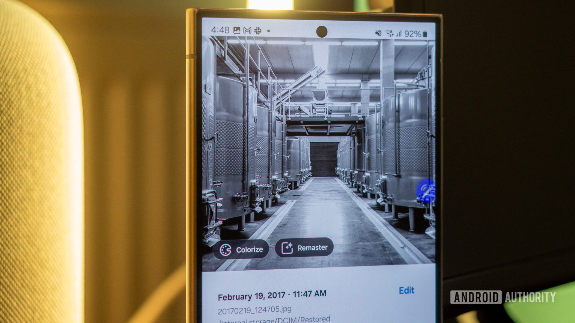
Colorizing photos is an option Samsung reserves to itself, in a way. It’s not part of the generative edit magic button, and can only access it in Samsung’s Gallery app. It’s one of the smart suggestions that show up as a chip (on the bottom left of the photo) when you swipe up on a pic to see its details.

Once you hit the Colorize button, it only takes a few seconds for the Galaxy S24 to pop up the result. Samsung shows a before/after slider, so you can check the result before saving it (or saving it as a copy). The best part is that sometimes it understands that there are focal points in your photo, like in this collage of two of my photos. It gave me the option to zoom in on both faces to see the before/after transformation. Cool.

However, since this is a smart suggestion, I can’t force it on photos that Samsung doesn’t deem worthy of colorizing. I tested the feature with about 30 black-and-white photos and the Colorize suggestion popped up on all of them except the two below. Both sushi photos, for the fun coincidence. Since I didn’t get the option here, I can’t force colorize these pics in any other way. So my sushi platters will remain colorless for now.

Colorizing people and pets

I started my tests with photos of those we love the most — people and pets. Speaking from a personal perspective, the photos I’d want to colorize would be of my grandmas and grandpas, and the early childhood pics of my parents. We have dozens of albums’ worth of black-and-white snaps that could use an extra sparkle like this.

But since I don’t know the real colors of those photos and since I wanted to test Samsung’s ability to recreate those, I decided to run my test on photos where I have the originals. So I took some photos from my library, dropped the saturation down to zero, made them black-and-white, saved that as a new photo, and transferred them to the Galaxy S24.

In the first samples below, you’ll see how Samsung deals with people and pets. In general, it nailed what should be a skin tone (though the side of my face in that collage remained blue), the pink hue of lips, and the color of grass in the background of the dog’s photo.

I would say my husband’s photo above is the most realistic colorization of the bunch. Yes, it failed at getting the colorful ceiling panels above him, but the face and shirt look good if a little cold. I could add a bit of warmth to that photo and you wouldn’t be able to tell it started as a black and white photo.

In general, Samsung nailed what the colors of skin, hair, lips, and tongues.

The other two photos above exhibit a filter-like effect. The saturation is too weak, my indigo sweater looks almost black, and the grass beyond the dog is too pale. Given Samsung’s propensity to over-saturate its own camera photos, it’s weird to see it go the other way in this colorization exercise.

My biggest disappointment is in the Samoyed’s colorization. A proper AI should recognize the dog’s breed and know they’re white, not pink-purple. This shouldn’t be a question.

Bringing landscapes back to life

Moving on to landscapes, I had high hopes. This is the exact opposite of people: Given an extensive dataset of photos and locations, colorizing a greyscale landscape should be kids’ play for an AI engine.

The Galaxy S24 disappointed me a bit here. The first two landscapes of the Swiss mountains and Lake Bled, respectively, turned up too warm and vintage.

The third photo is the best colorization result I’ve seen among all 30+ images I tested. It looks nearly perfect, and both the blue and green hues are quite close to the original pic’s colors.

Adding some colors to flowers

My disappointment continued with photos of flowers. Once again, given a proper dataset, the AI should know the flower’s exact species and figure out exactly what color it should be. In my tests, that wasn’t the case.

I expected Samsung's AI to know the flower's exact species and colorize it accordingly. It didn't.

The first colorization is fine, until you notice the pink center of the hibiscus is nowhere to be found. But the other two are more of a crime against botany everywhere. Gone is the blue-purple of the globe thistle, replaced by a warm yellow-green shade. The orange and yellow of the Peruvian lily are barely colorized into a blue-green tint. There aren’t many colors of these flowers, so Samsung shouldn’t get them wrong.

Colorizing food is hit-and-miss

If you were already thinking that there isn’t a lot of extra “intelligence” going on behind this feature, this should seal the deal. While the burger and fries photo is fine (and probably the second best after the green and blue landscape above), the fruit bowl is an absolute disgrace if you ask me.

Samsung turned strawberries, blueberries and bananas into three shades of brown.

Even in the black and white photo, you can tell these are bananas, blueberries, and strawberries. You can’t turn them into three shades of brown!

The same is true of the pizza photo, where the pink of the ham is brought back as a boring light brown mush. I’d forgive missing the red of the platter because there’s nothing to hint at it in the original photo, but the pink ham should be an easy one.

From simple scenes to challenging colorful scenes

I knew I was hitting a wall with this feature, but I decided to push it a bit more. First with a few simple scenes that it handled rather fine. It didn’t choose the right color tone in the first two underground and cellar photos, but the result is realistic. I’ll also give it some extra points for recognizing the white and red of the lighthouse.

Things became tougher as I went on. Photos with multiple colors result in a boring single-hue colorization. I don’t blame Samsung for not knowing the exact colors here, but it’s proof that the AI has limits. It sees shades of grey and figures out a middle hue value that makes sense. It isn’t using geolocation or a huge public dataset to colorize photos.

Samsung isn't using geolocation or a huge public photo dataset to colorize photos.

Case in point: Bilbao’s building (first photo) and Le Havre’s Catène de Containers (third pic) become orange mush and whatever that blue-green’ish shade is for the shipping containers.

Pushing further, I tested the Colorize option on extremely busy photos and the results were a bit bad in the first two samples (too vintage-feeling and desaturated), while the third one nailed the trees and lights colors quite well.

Red is the toughest color

You might have noticed that in many of the examples above, the Galaxy S24’s colorization engine is often choosing to veer away from reds. The only times it really added some reddish hues were for pink lips and the lighthouse. For the flowers, strawberries, pizza ham, and many other red elements, it just ignored the red color. This is another example. The red lighthouse is turned into a blueish grey.

Verdict: Can Samsung really colorize your black-and-white photos?

samsung galaxy s24 ultra colorize in gallery 2

Credit: Rita El Khoury / Android Authority

For photos of people, I’m convinced that Samsung will do a good job of bringing those old black-and-white snaps into life. All of the examples I tested (including the ones I didn’t share here for privacy purposes) got a good skin tone, proper pink for the lips, and decent enough hair coloring. Now if you have red hair or blue eyes, lower your expectations. The Galaxy S24 might not guess that.

For all other photos, the results are mitigated. I expected Samsung to use different factors (subject of the photo, location, and its own image dataset) to get some color back into photos. But as shown by the examples of the dog, flowers, different landscapes, and those brown strawberries and blueberries — sorry, I just can’t forget those! — that isn’t the case.

I suspect that Samsung's AI, in search of speed, is dividing photos into specific areas, and sometimes lumping the entire pic into one.

Plus, I have a suspicion that Samsung’s AI engine, in search of speed, is attempting to divide any photo into specific areas before it colorizes it. Most times the whole photo ends up lumped together and gets the same treatment.

You’ll see this in colorized photos that are basically just a single tone (sea port lighthouse above, Bilbao buildings, fruit bowl, pizza, flowers photos, most of the landscapes, and the dog photo). And that tone is often too warm or too cold, not saturated enough, and definitely too vintage filter-like.

In some photos, though, you get two or three different zones and a different tone between each. These are the ones that are the closest to reality and the original photo. This is true for the first lighthouse photo, the green and blue river landscape, and the burger. Those are my favorites of the bunch.

For old photos of people, you don't know what you're missing on, but you know what you're gaining. The feature is a win then.

In conclusion, I’d personally try this feature on photos of people, and I’d expect it to do things mostly right. If I’m colorizing super old photos, I won’t know what colors I’m missing on, but I’ll know what I’m gaining. So it’s a win. For anything else, it’s a coin toss. I wouldn’t waste my time. Keep the vintage black-and-white instead of a bad yellow or blue filter.

❌
❌