Galaxy S24’s One UI 6.1 messed up the Voice Recorder app UI
For every few great new features and changes in One UI 6.1, there's one that makes me wonder what Samsung was thinking. Don't get me wrong, I love the Galaxy S24+ and One UI 6.1 so far, but some aspects go against my idea of improvement.
As I pointed out before, one such issue has to do with the Notification Categories feature, which One UI 6.1 hides behind a new and arguably useless menu that only serves to make this incredibly useful and streamlined tool unnecessarily obscure. Especially for new users who may not know this feature ever existed.
But, anyway, here's another change in One UI 6.1 that I simply don't understand and bugs me. It's in a similar vein as Notification Categories, i.e., a primary feature that used to be highly accessible and is now inexplicably hidden behind extra menus.
Voice Recorder took steps backward with the Galaxy S24 series
The Voice Recorder app in One UI 6.0 and earlier versions lets users pick between the Standard and Interview recording modes straight from the home screen. In my mind, it makes perfect sense to have these two main modes at the forefront of the Voice Recorder UI. It's sensible to let users choose the best recording mode for each situation with ease.
Here's what the Voice Recorder app's home screen looks like in One UI 6.0, with easy-to-reach “Standard” and “Interview” selection buttons.
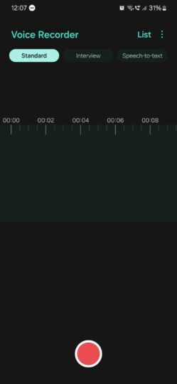
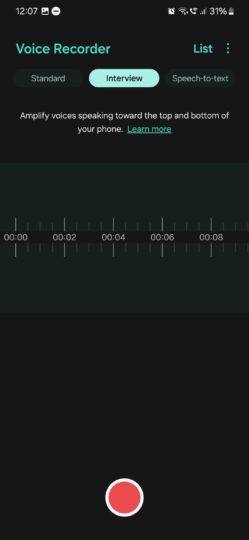
Voice Recorder modes in One UI 6.0
Now, moving on to One UI 6.1. True enough, the Voice Recorder app gained very useful new Galaxy AI features like summarize, transcribe, and translate — at least for the Standard recording mode. But for whatever reason, the update also hid the Standard and Interview recording options deep into the app's settings menu. These modes are now four taps away instead of just one.
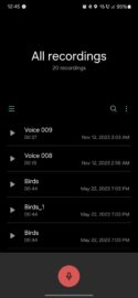

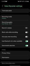
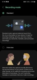
Voice Recorder modes in One UI 6.1
Needless to say, if you want to record audio with your Galaxy S24, you better go through the app's settings menu and make sure you have the right option selected for the occasion every time you want to start a recording. It's convoluted for no reason, and I'm adamant that the old UI design was superior.
Perhaps Samsung moved the two recording modes to a new menu to ensure that people read the detailed information about each one and understand the Interview mode's AI limitations. Even so, the execution is far from ideal. If you ask me, a new “Recording Mode” shortcut button on the app's home screen would have been much better than hiding this new mode menu deep into the settings screen.
With the next big update, I'm hoping Samsung will address some of these odd UI shortcomings that cropped up on the Galaxy S24 series. I do love the Galaxy S24+, but sometimes, it feels like One UI 6.1 took a few steps back, and it's hard to understand Samsung's decision-making process.
The post Galaxy S24’s One UI 6.1 messed up the Voice Recorder app UI appeared first on SamMobile.

