FreshRSS

Zobrazení pro čtení

Jsou dostupné nové články, klikněte pro obnovení stránky.

Google Pixel 8a vs Pixel 8: What’s the difference and which should you buy?

The Google Pixel 8 was officially announced in late 2023 bringing quite a few improvements with it at the time, though it’s since been succeeded by the new Pixel 9 series. The Pixel 8 can often be found at a sharply discounted price these days, but it’s also pretty similar in specs to the Pixel 8a. Which of these devices should you actually buy? Good question. Let’s dive in and take a brief look at the Pixel 8 vs Pixel 8a.

Google Pixel 8a vs Pixel 8: Specs

Google Pixel 8aGoogle Pixel 8
Display6.1-inch OLED
120Hz refresh rate
2400 x 1080 resolution
20:9 aspect ratio
6.2-inch OLED
120Hz refresh rate
2400 x 1080 resolution
20:9 aspect ratio
ProcessorGoogle Tensor G3Google Tensor G3
RAM8GB8GB
Storage128/256GB128/256GB
Battery4,492mAh
18W wired charging
7.5W wireless charging
No charger included
4,575mAh
27W wired charging
18W wireless charging (with 2nd-generation Pixel stand)
12W wireless charging (with other Qi-enabled chargers)
No charger included
CamerasRear:
64MP wide camera
ƒ/1.89 aperture
OIS + EIS

13MP ultra-wide camera, 120deg FoV
ƒ/2.2 aperture

Front:
13MP
ƒ/2.2 aperture
Rear:
50MP wide camera
ƒ/1.7 aperture
OIS + EIS

12MP ultra-wide camera, 125deg FoV
ƒ/2.2 aperture

Front:
10.5MP
ƒ/2.2 aperture
Connectivity5G
4G LTE
Wi-Fi 6e
Bluetooth 5.3
NFC
5G
4G LTE
Wi-Fi 7
Bluetooth 5.3
NFC
Operating SystemPixel UI
Android 14
Pixel UI
Android 14
Water resistanceIP67IP68
ColorsAloe, Bay, Obsidian, PorcelainHazel, Rose, Obsidian, Mint
Dimension and weight152.4 x 73.7 x 10.1mm
192.8 grams
150.5 x 70.8 x 8.9mm
187 grams

In many ways, the Google Pixel 8a and Pixel 8 are so similar that they’re easy to compare. They share nearly identical displays, dimensions, software experiences, and update commitments, many of which we’ll get to in a minute. That said, the similarities also make it far more difficult to find daylight between the two when deciding which one is right for you.

In some ways, however, the similarities pay off for fans of the more affordable Pixel A series. Both phones pack the same Tensor G3 chipset, Titan M2 security core, and identical options for both RAM and storage. As a result, they produced almost identical results in our performance benchmarks and day-to-day usage.

As you can see in the graphs, the more affordable Pixel 8a delivers results nearly identical to those of the Pixel 8 and, in our graphically intensive stress testing, actually maintains its performance better than the flagship. While benchmarking numbers don’t usually mean too much in an average day of mixed usage, they’re often a good indicator of how well a phone will keep up, and the Pixel 8a has no problem cruising through a day of web browsing, social media scrolling, and light gaming just as well as its premium counterpart.

On top of that, the Pixel 8a and Pixel 8 ship with Android 14 out of the box and one of the best update commitments in the industry. Google decided to keep pace with Apple’s lofty promise when it added seven years of Android updates, feature drops, and security patches to the Pixel 8 series in late 2023, and now the Pixel 8a gets the same benefit. That not only puts it on par with the flagships but ahead of its similarly priced rivals.

All of these shared features also mean that both the Google Pixel 8a and Pixel 8 support the same set of AI-powered features and lean heavily on Gemini as Google transitions to its powerful new assistant (with Google also confirming Gemini Nano on-device support that will land in a future Feature Drop). You can tap into helpful extras like Circle to Search, generative wallpapers, Live Translate, and several calling features like Hold for Me, Call Screen, and Smart Replies. Both phones have plenty of photo editing options, too, which we’ll come back to down below.

Google Pixel 8a vs Pixel 8: Design, size comparison, and colors

Google Pixel 8 vs Google Pixel 8a back standing

Credit: Ryan Haines / Android Authority

I don’t blame you if you feel like you’re seeing double looking at the picture above. Google’s Pixel design is pretty well nailed down at this point, with flat displays and camera bars across the board, but the Pixel 8 and Pixel 8a are about as close to twins as you can get.

The two devices are nearly the same height, width, and thickness despite the Pixel 8 offering an extra tenth of an inch of display real estate, sitting at 6.2 inches to the Pixel 8a’s 6.1 inches. Yet, despite its slightly smaller display, the Pixel 8a offers almost the same specs as its more polished counterpart. There’s only a weight difference of a few grams between them, something I hardly noticed while carrying both around for a few days. Both phones have 60 to 120Hz Actua Displays with 14 hundred nits of HDR and 2,000 nits of peak brightness, and they feel just about identical if you’re swiping up and down or mindlessly scrolling social media. Just note that the Pixel 8a comes locked at 120Hz by default, so you’ll have to opt in for the variable refresh rate. On top of that, the OLED panels have the same 1,080 by 2,400 resolution, meaning that the more affordable Pixel is just a hair more pixel-dense.

Honestly, I’ve found that the best way to tell the Pixel 8 and Pixel 8a apart is the latter’s much rounder corners, making it feel a bit smaller in the hand — something that I thoroughly appreciate as a person with smaller hands. Google’s premium Pixel 8 sports glossy Gorilla Glass Victus on the back, too, while the Pixel 8a has a matte composite (it’s plastic, call it plastic) back that looks a bit more like the Pixel 8 Pro. Personally, I prefer the feeling of the 8a when I reach into my pocket, mostly because I know I won’t pull out a phone that’s covered in smudges. The flagship Pixel 8 is the slightly more durable of the two, using Gorilla Glass Victus on both the front and back and carrying an IP68 rating against water and dust to the Pixel 8a’s IP67.


Both Pixels also share matching in-display fingerprint readers and matching buttons and ports scattered around their aluminum frames. To my eye, both fingerprint readers seem to register at the same speed, so it’s nice to see Google keep one standard fingerprint reader instead of going cheaper for the mid-range. Also, you’ll find the power and volume controls on the right edge with a lone SIM tray holding down the left. The USB-C port is also flanked by a pair of stereo speakers.

Google Pixel 8a vs Pixel 8: Camera

Google Pixel 8 vs Google Pixel 8a laying flat

Credit: Ryan Haines / Android Authority

Although the camera bars on the Pixel 8 and Pixel 8a may look the same, they have a few differences across their dual-camera setups. The Pixel 8a’s budget camera setup offers more megapixels to play with, pairing a 64MP primary camera and a 13MP ultrawide sensor. Don’t be fooled by the bigger numbers, though, as the individual pixels are slightly smaller on both sensors, meaning that the cameras aren’t quite as well equipped for lower-light scenarios. The Pixel 8a’s ultrawide sensor also has a slightly narrower 120-degree field of view and misses out on Macro Vision — a software feature that both the Pixel 8 and Pixel 8 Pro support.

Moving over to the more premium Pixel, it pairs its 50MP primary camera with a 12MP ultrawide sensor, both of which are larger than the options on the Pixel 8a. On top of having slightly larger individual megapixels, the Pixel 8’s primary camera is capable of a 2x in-sensor crop, giving you a little bit more optical zoom range before switching to digital zoom.

Both the Pixel 8 and Pixel 8a have dual rear cameras, but the flagship packs a bit more punch.

The Pixel 8a has a slightly sharper selfie camera, too, with 13MP to the Pixel 8’s 10.5MP, though the results are pretty similar from both sensors based on our tests.

As you can see in the samples below, the Pixel 8 and Pixel 8a are just about neck and neck in some of the most common shooting scenarios. They’re well matched in color and details, and even the ultrawide shots are almost identical despite the slightly different fields of view.

Google Pixel 8 Google Pixel 8a Google Pixel 8
Google Pixel 8a

There are a few slight differences when it comes to capturing selfies, though. Despite both phones defaulting to 1x zoom when you flip the camera around, not all definitions of 1x zoom are created equal. The Pixel 8a offers a much wider frame than the Pixel 8, making it much easier to fit additional people and background details into your selfie. Both shots look good as far as colors go, but it’s somewhat surprising to see such a difference between the default zoom lengths.

Google’s Pixel 8 also handles its longer zoom lengths much better than the Pixel 8a. Its larger sensor seems to maintain both color and detail better than the smaller sensor on the mid-range phone. The difference is most noticeable on finer lines like the name of the ship below and the details in the wood planks of the dock.

As far as camera features go, Macro Vision is the only major omission from the Pixel 8a — everything else is almost exactly the same. Neither device offers Google’s new Pro controls, but both can tap into Night Sight, Top Shot, Portrait Mode, Cinematic Pan, and punch in with Super Res Zoom up to 8x.

Both phones also offer similar video features, with up to 4K recording from the front and rear sensors. However, the Pixel 8 packs a few more options regarding the frame rate, with 24fps available on both front and back and 60fps on the selfie camera. Google’s Pixel 8a, on the other hand, is limited to 30fps from the selfie camera at both 4K and 1080p.

Google Pixel 8a vs Pixel 8: Battery life and charging

Given their similar overall size and specs, it’s no surprise to see the Pixel 8 and Pixel 8a toting nearly identical batteries. The Pixel 8 has the slightly larger cell of the two — 4,575mAh to the Pixel 8a’s 4,492mAh — but our battery testing showed that the mid-ranger stretched its juice further in most cases. In fact, it put up better numbers while on a Zoom call, snapping photos, recording 4K video, and even significantly better 4K playback performance. Outside of the lab, both phones can easily power through a full day of usage. I got into a habit of using adaptive charging overnight and regularly found myself hitting the end of the day with at least 20% remaining.

However, one area where there’s a little bit of daylight between the Pixel 8 and the Pixel 8a is in their charging setups. The Pixel 8 is much quicker, supporting up to 27W wired charging with a compatible USB PD PPS charger, while the Pixel 8a tops out at 18W. There’s a big difference in wireless charging capabilities, too, with the more expensive device capable of up to 18W with the second-generation Pixel Stand and 12W with other Qi-enabled pads while the mid-ranger is limited to 7.5W, no matter the charger.

While the difference in charging speed from 18W to 27W may not sound too vast, our controlled testing showed that the Pixel 8a took about 20 more minutes to reach a full battery than its Pixel 8 counterpart, so it might pay to spend just a little bit more if you need to get back up and running in a hurry.

Google Pixel 8a vs Pixel 8: Price and availability

Google Pixel 8a: Starts at $499

Google Pixel 8: Starts at $699

If you’re close to making your decision between buying the Pixel 8 and Pixel 8a, I guess you should know how much each phone will cost you. Well, for starters, both phones are widely available in the US, both unlocked and on deals through major carriers like Verizon, T-Mobile, and AT&T.

If you’re leaning toward the Pixel 8a, it starts at $499 with 128GB of storage — the same price as the previous Pixel 7a. It’s also available in four colors: Bay, Aloe, Obsidian, and Porcelain. Should you decide you need 256GB of storage right off the bat, it’ll set you back $559, and you’re limited to the Obsidian finish.

On the other hand, if you’re leaning toward the flagship Pixel 8, it kicks off at $699 with the same 128GB of storage. It launched in three colors, Hazel, Obsidian, and Rose, but Google has since added a fourth Mint color that’s a little softer than the Pixel 8a’s Aloe option. You can upgrade to 256GB of storage for the same $60 fee, bumping your price to $759.

Google Pixel 8a vs Google Pixel 8: Which should you buy?

google pixel 8 back in hand

Credit: Ryan Haines / Android Authority

Now that we’ve gone through every last piece of the Google Pixel 8 and the Google Pixel 8a, it’s about time to decide which one is right for you. Unlike a lot of comparisons where we end up saying that the right one comes down to your personal preference, there’s a pretty clear winner here — but it comes with a caveat.

The easy answer when choosing between the Pixel 8 and the Pixel 8a is to tell you to buy the flagship Pixel 8 — one of the best Android phones around — but only to do so when you can find it on sale. These two phones share so much in common, from the chipset to the camera quality to 90% of their respective designs, that Google is relying on the difference in price to sway people one way or another.

At MSRP, it's a tricky call, but recent sales for the Pixel 8 make the Pixel 8a a tough sell.

When compared at full price, the Pixel 8a seems like a great deal, given how many flagship specs it boasts, but as soon as you factor in discounts, the $200 gap suddenly feels much smaller, and the Pixel 8’s more premium aspects like faster charging and better materials feel that much more attainable.

Google Pixel 8a vs Google Pixel 8: FAQ

When did the Google Pixel 8 and Pixel 8a come out?

Google launched its flagship Pixel 8 on October 4, 2023, following it up with the Pixel 8a on May 7, 2024.

Do the Google Pixel 8 and Pixel 8a have wireless charging?

Yes, both phones support wireless charging, but the Pixel 8 is faster with 18W speeds to the 7.5W speeds of the Pixel 8a.

Do the Google Pixel 8 and Pixel 8a have headphone jacks?

No, neither the Pixel 8 nor the Pixel 8a has a headphone jack.

Are the Google Pixel 8 and Pixel 8a waterproof?

The Google Pixel 8 packs an IP68 rating while the Pixel 8a offers IP67 resistance against water and dust. That means both phones can withstand submersion in water for up to 30 minutes.

Do the Pixel 8 and Pixel 8a have SIM slots?

Yes, both the Pixel 8 and Pixel 8a have slots for SIM cards on their left sides.

Do the Pixel 8 and Pixel 8a support dual-SIM? What about eSIM?

Yes, both the Pixel 8 and Pixel 8a support dual-SIM with a single nano-SIM and an eSIM profile.

Do the Pixel 8 and Pixel 8a have SD card slots?

No, the Pixel 8 and Pixel 8a do not have SD card slots — both come with either 128 or 256GB of fixed storage.

It finally feels like Google is ready for a Pixel Flip… next year

If you didn’t already know, I like flip phones. I’ve been using the Motorola Razr Plus (2024) and Samsung Galaxy Z Flip 6 since they came out, and I’ve already theorized about what a flippable iPhone would look like. Now, it’s Google’s turn for my elevator pitch. I think it’s finally time for a Google Pixel Flip, but I think Google should probably wait until 2025 to launch it, and here’s why.

Finally, cooler under pressure

Google Pixel 9 Pro Fold in hand

Credit: C. Scott Brown / Android Authority

If you’ve ever used a flip phone, be it a Galaxy Z Flip 6, Razr, or even OPPO’s Find N3 Flip, you know that the form factor has its limitations. You end up searching for the perfect mix of battery capacity, a capable chipset, and ample cooling power and find that you can only choose two of the three. Add one of Google’s roasty, toasty Tensor chips to that mix, and you’ve got a recipe for a flip phone that’s dead by noon — at least for now. Alright, I’m exaggerating, but only by a little bit.

I think 2025 will be the perfect time to put that Tensor heat under some flip phone pressure, though, because Google is finally changing its process. After four generations of Samsung-made Tensor chips, all signs point to Google switching to TSMC for what should become known as the Tensor G5. And, if you remember what happened when Qualcomm did the same thing when it moved from the Snapdragon 8 Gen 1 (made by Samsung) to the Snapdragon 8 Gen 2 (made by TSMC), you’ll know that the change in process should come with much better thermal performance.

Qualcomm switched from Samsung to TSMC for better thermals, and it sounds like Google's next.

Of course, that change may or may not come with a boost to raw performance power, but we know that’s not really Google’s priority. The current Tensor lineup already benchmarks behind Qualcomm’s top-tier Snapdragon 8 Gen 3, but we’re usually willing to give it at least somewhat of a pass because of all the AI features it has to power. Would I love to see the Tensor G5 bring a little more power to Pixel? Sure, but I’m happy to settle for better thermals in the meantime.

Once Google controls that heat, it will probably feel a bit more comfortable tackling the other limitations of the flip form factor. As soon as it settles on a chipset that doesn’t chew through the battery like it’s going out of style, it will be able to work out a battery capacity and cooling system that can fit within the pocket-friendly confines I’m looking forward to. And if Google is after a flip phone as thin as the Pixel 9 Pro Fold, it might be a true feat of engineering.

Third time’s the charm (seriously, though)

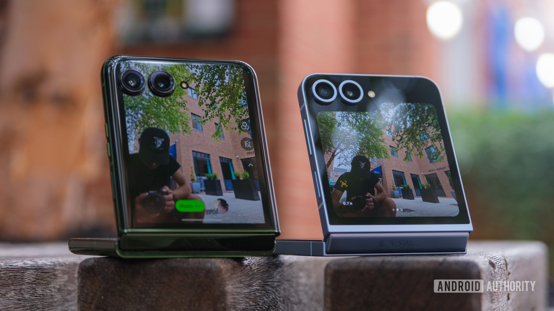
Samsung Galaxy Z Flip 6 vs Motorola Razr Plus cover screens

Credit: Ryan Haines / Android Authority

I’m also perfectly happy for Google to wait another year before launching its first Pixel Flip because that’s about when the best foldable phones hit their stride. It usually takes one or two tries before the hinge feels locked in and the crease begins to shrink. Think about it — the OnePlus Open is OPPO’s Find N3, the Galaxy Z Fold 3 is when Samsung finally started using tougher materials, and we’re kind of on the third Motorola Razr redesign as long as we don’t count the 2022 model that only came to China.

So, in 2025, Google will also be developing its third generation of foldable phones. By then, I think it will have learned a thing or two (if it hasn’t already). We’ve already seen quite the design evolution from the first Pixel Fold to the Pixel 9 Pro Fold, and now all Google has to do is find a way to scale it down. Its revamped hinge is a solid improvement over the original, opening easier and settling flatter after just one year of development. Google has also swapped from the sizable top and bottom bezels on its first Pixel Fold to thin ones with a punch hole selfie camera on its second, bringing it in line with most other book-style foldables.

I was also somewhat worried about how Google would combine its signature camera bar with a compact flip form factor, but it seems to have handled that on the Pixel 9 Pro Fold, too. The simple answer is that it’s not as married to the camera bar as I initially expected — which is good news for a flip phone. Instead of stretching its sensors across the back panel, it cut the camera bar in half and stacked two sensors on top of each other. So, if I had to guess, a Pixel Flip would then cut that modified camera bar in half again, giving us a two-camera setup similar to what is already on the Pixel 9 — complete with the excellent image processing that we already know it’s capable of.

Perhaps the biggest mystery after that is what Google would do with its cover screen (other than call it the Pixel Window, of course). It could either copy Samsung with an oddly shaped panel, mimic Motorola with one that stretches around the cameras (I doubt it), or follow OPPO with a narrower, phone-shaped display that sits next to the panels instead. I’m not sure which one I’d want, but I know that the revamped Pixel Weather widget would be a must-have, as would flexible app support — please don’t give me a Good Lock-like experience, Google.

Let’s face it: flip phones are just easier

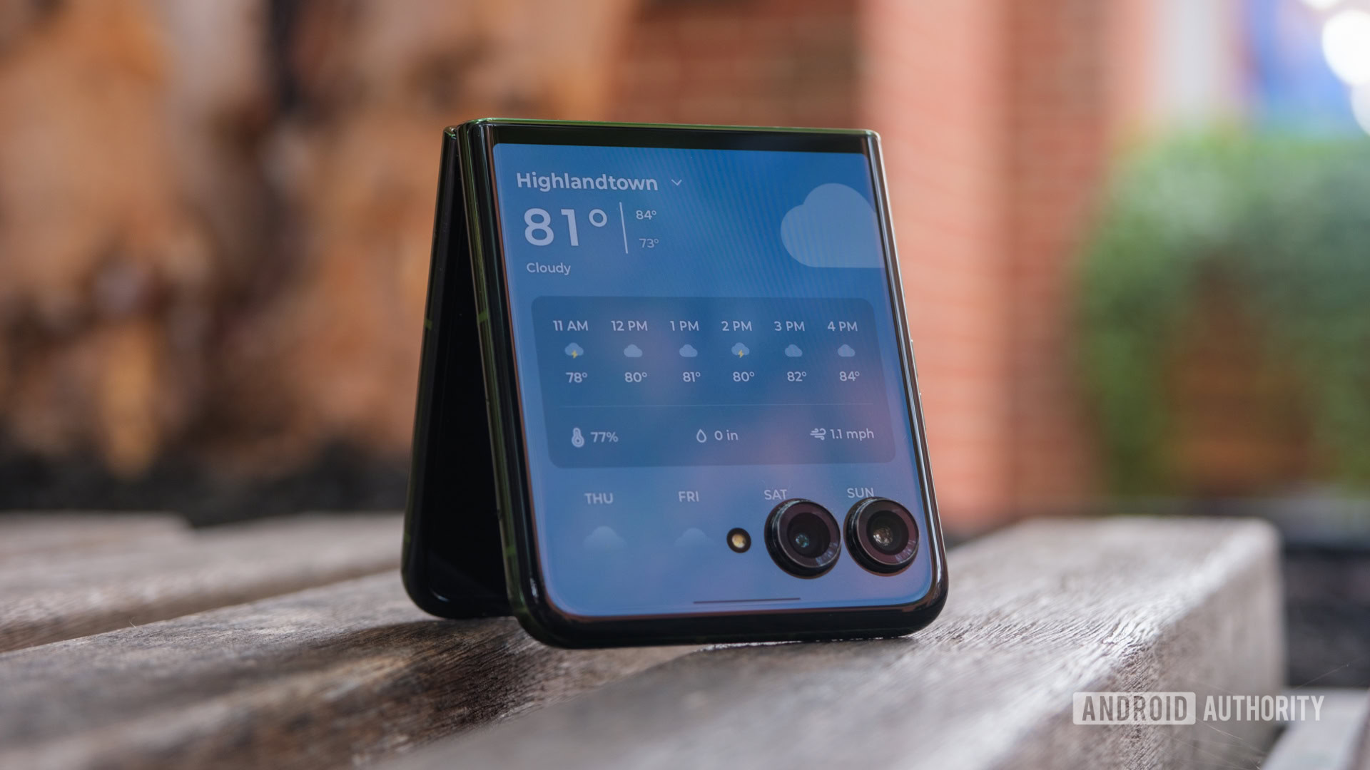
Samsung Galaxy Z Flip 6 vs Motorola Razr Plus Motorola weather widget

Credit: Ryan Haines / Android Authority

On top of it all, flip phones (like blondes) have more fun. Whereas book-style foldables tend to get lumped in as super-expensive devices for power users, flip phones are usually more affordable and seen as fashion statements. I think Google’s clean, colorful flavor of Android falls into the latter more than the former. Material You is loaded with color-matching options, and its large, relatively simple widgets seem like they’d flow perfectly across a relatively compact cover screen. Oh, and Google’s straightforward Gmail, Google Photos, and Messages interfaces should be easy enough to scale down for a pocket-friendly experience.

The fact that flip phones are typically more affordable should help Google’s chances, too. Unless you’re committed to a book-style foldable, it’s probably impossible to imagine spending $1,800 on your next phone. Dropping around $1,000, on the other hand, is somehow much more acceptable. Google has already bumped the price of its Pixel 9 Pro (the smaller one) to a grand, and the Galaxy Z Flip 6 now costs more than that at $1,100. So, if Google can ready up a Pixel Flip that undercuts Samsung, it might be onto something.

Google's Pixel UI and Gemini features are just the right kind of fun for a flip phone.

Even if Google launches a Pixel 10 Pro Flip (or some equally convoluted name) that matches the Galaxy Z Flip 7 dollar for dollar, I think it’ll be on the right track. Currently, Samsung’s expensive flip phone only really has to compete with the Motorola Razr Plus (2024), which it largely beats by offering longer software support, more reliable cameras, and a few Galaxy AI features ready ahead of the Moto AI rollout. Google can easily roll in with a matching seven years of updates, pack in its Magic Editor and Add Me features, and put Gemini in every last piece of Pixel UI. Once it does, Samsung will finally have to worry about someone not named Apple.

That is, of course, my dream for 2025. It feels like Google should be ready by then, and it all hinges on the switch from Samsung to TSMC for the Tensor G5 chip. If that happens and it works out like I think it will, I’ll carry a Google-branded flip phone for a long time to come.

Don’t call the Motorola Razr Plus an underdog anymore

Everyone loves an underdog story. Names like Rudy, Rocky, and Bilbo get us to root for the undersized, underpowered hero in the face of unthinkable odds every time. For a while, my favorite underdog story was the one where Motorola, the original king of the flip phone, tried to reclaim its crown from Samsung. It pitted the Razr against the Galaxy Z Flip, hoping that nostalgia, a slightly bigger cover screen, and a cleaner Android skin would take it back to the top.

At first, it didn’t work. Samsung grabbed all of the headlines for its Galaxy Z Flip series, drawing me into the world of flip phones. Then, Motorola skipped a year or two, practicing and creating the training montage that every good underdog flick needs. Now, Motorola is back with its second Razr Plus, and I don’t think it’s an underdog anymore. The Motorola Razr Plus (2024) vs Samsung Galaxy Z Flip 6 is finally a flip phone title match.

Little screens, big expectations

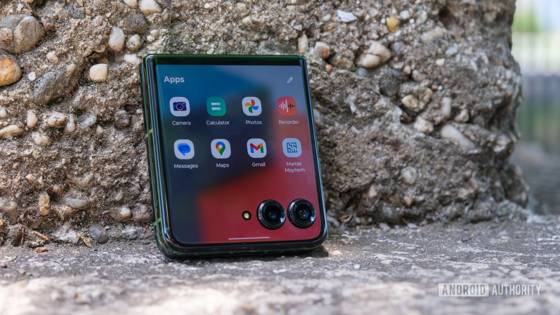
Motorola Razr Plus folded app drawer

Credit: Ryan Haines / Android Authority

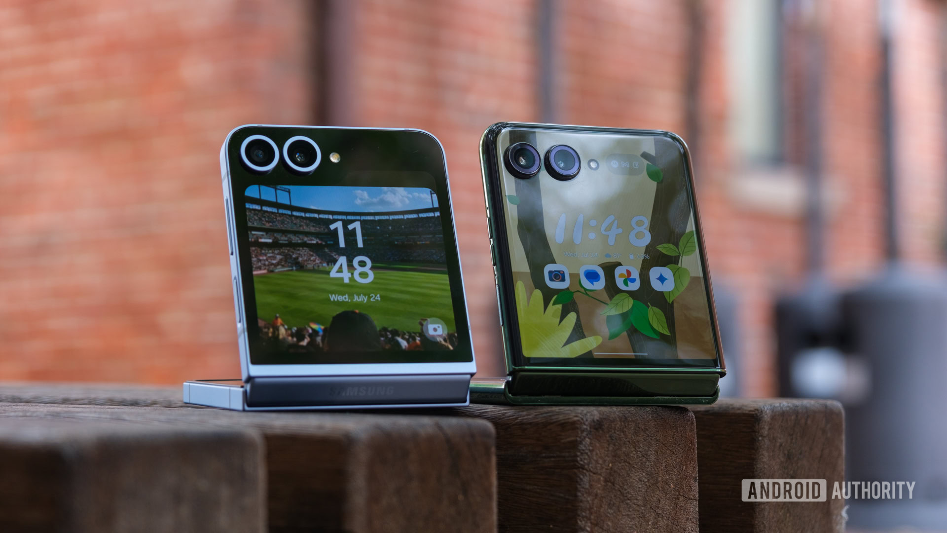
Falling in love with a flip phone is all about how you use the big screen — or rather, the not-so-big screen. And when it comes to the Motorola Razr Plus vs Samsung Galaxy Z Flip 6, the cover screens are about as different as can be. Where Samsung’s experience is locked down and measured, Motorola’s is open and flexible. The Galaxy Z Flip 6 forces apps into a smaller, square window within its folder-shaped panel, while the Razr Plus allows them to stretch across its entire display, even if the camera cutouts are in the way. Somehow, the acceptance of imperfection is what wins me over.

I understand why Samsung didn’t change its latest Flex Window from the 3.4-inch Super AMOLED panel it introduced on the Galaxy Z Flip 5 — most people still haven’t tried a flip phone, let alone purchased one. Unfortunately, that also means it hasn’t fixed what people (or at least I) didn’t like about the complicated software experience, either. Good Lock is still a requirement if you want to put more than Maps, YouTube, and Google Messages (not Samsung Messages) in your app drawer. I, of course, jumped through the hoops to get the rest of my apps on the Flex Window, but I had to reference the guide I wrote a year ago explaining how to do it. It feels like an over-engineered solution to a problem that Motorola just ignored — the fact that apps optimized for tall, thin phone displays won’t run perfectly on short, square cover screens.

Sorry, Samsung, but one app drawer is always better than two.

To its credit, Samsung has an excellent set of widgets on the Galaxy Z Flip 6. They’re set up so that you can combine multiple widgets on each panel of the Flex Window, making it almost feel like a giant Galaxy Watch or a small Nest display. One or two — like Spotify — need a layout all their own, but I can appreciate having my calendar, weather forecast, and easy access to a voice recorder all on one page, even if they don’t offer as much information right up front.

And yet, I still think I like Motorola’s experience better. The Razr Plus gained some extra real estate for 2024, stretching from 3.6 inches to an even 4-inch AMOLED panel that covers almost the entire top of the phone. It’s an overpowered display, combining a variable 165Hz refresh rate with up to 2,400 nits of peak brightness and packing in nearly 100 more pixels per inch than its Samsung rival. Motorola’s cameras are less intrusive, too, sitting in lower, rounded housings instead of Samsung’s relatively tall, color-matched rings.

Design and specs aside, I prefer Motorola’s cover screen because of the software experience and its willingness to embrace imperfection. Yes, it sounds backward, but it’s true. I just finished saying how tall, thin apps don’t work as well on short, square displays, but Motorola at least lets them try with as much of its display as possible. You can add any app to your cover screen drawer with a simple flip of a toggle, and Motorola programmed a button to push apps above the camera cutouts should they block parts of the interface. It lets me doom scroll through Instagram, catch up on House of the Dragon on a display it was never meant to be seen on, and try to outscore fellow tech journalists in Freekick Football without opening my phone.

Samsung doesn’t get all the credit for the best widgets, either. Although Motorola’s aren’t quite as flexible — you can’t put several on one page — they offer far more information upfront. When I set up my Razr Plus, it came with games, access to my contacts, my calendar, and the weather right out of the box — oh, and just one app drawer to worry about. The Galaxy Z Flip 6, on the other hand, gave me a weather widget in the corner of one panel, leaving me to do the rest on my own. Some people might love that flexibility, but it could create a steep learning curve for those who’ve never used a flip phone.

Opposing viewpoints

Samsung Galaxy Z Flip 6 vs Motorola Razr Plus cameras

Credit: Ryan Haines / Android Authority

Even though I don’t think the Razr Plus is an underdog anymore, part of that mentality still exists within the phone. Specifically, the fact that underdogs usually have to be clever and try new things to outsmart their opponent, be it Chick Hicks, Davy Jones, or the Globo Gym Purple Cobras. To its credit, Motorola decided to think differently about the cameras on its latest Razr Plus. I’m just not sure if this is a winning strategy.

Instead of sticking with the wide and ultrawide combination that we’re used to on flip phones — well, and any other dual-camera device — Motorola decided to double down on portrait mode. It upgraded its 12MP primary camera to a sharper 50MP sensor, then ditched the reliable 13MP ultrawide camera for a 50MP telephoto with 2x optical zoom. Normally, I’d be thrilled since I’m not the biggest believer in the ultrawide field of view, but there’s something about a telephoto sensor in this form factor that doesn’t feel quite right.

Motorola went all-in on portrait mode... only to limit its cover screen to 1x zoom.

Don’t get me wrong, it’s great that a dual-camera flip phone can zoom in as far as the triple-camera Galaxy S24, but that’s not where phones like this are at their strongest. I prefer to use the Razr Plus and the Galaxy Z Flip 6 closed, treating their large primary sensors like super-powered selfie cameras. But when I do that, I rarely exceed 0.5x or 1x zoom — neither of which needs a telephoto sensor. Perhaps more confusingly, the Razr Plus won’t let you zoom beyond 1x on its cover screen, saving all of its portrait power for when the phone is open.

Samsung, on the other hand, follows the underdog vs rival story perfectly (at least in Hollywood terms). It knows what works, and it stuck with it. The Galaxy Z Flip 6 packs the wide and ultrawide camera pairing that it’s had since the beginning, this time with a higher-resolution 50MP primary sensor for the bulk of your shooting. Sure, it has smaller individual pixels and bins by default (Motorola does, too), but the swap means that Samsung can crop its sensor for 2x optical zoom. Oh, and the Galaxy Z Flip 6 lets you zoom in on the cover screen, no telephoto sensor required.

Samsung’s flip phone finally supports Expert RAW now, too, in case you want even more control over your camera settings. Though, once again, it’s more fun to pull up the front cameras and snap away. And, if you’re going to do that, Samsung’s Auto Zoom makes it much easier to frame your shot and automatically zoom before you use a gesture to take your photo. It’s not lightning fast — the camera takes a second or two to identify you — but it’s made life significantly easier when lining up pictures with friends.

Here are just a few shots and some of my thoughts from both cameras:

Motorola Razr Plus

It feels somewhat unfair to the Galaxy Z Flip 6 that I’ve spent more time with the Motorola Razr Plus, but that’s the way it goes sometimes. The Razr Plus has come with me for several adventures, including its own launch event in Brooklyn, a trip to the Guinness Open Gate Brewery here in Baltimore, and a stop at an Orioles game. I’ve put it through its paces at all of my stops, and I’ve picked up on a few things. For starters, I’m still not convinced that it needs a telephoto camera. Sure, it’s capable of 2x optical zoom, but everything beyond 4x is pretty much digital, and it all looks pretty rough. The 30x image of a player at home plate looks closer to a painting, which isn’t a great thing.

The Razr Plus struggles a bit with shadows, too. In the second row of photos, it’s tough to pick out the centers of the metal flowers around the archway, and the Razr Plus darkened my friend Derrek’s face even though we took a selfie in the middle of a bright warehouse. But hey, I used a Razr to take a picture of Paris Hilton, the original Razr influencer, so that’s something.

Samsung Galaxy Z Flip 6

As mentioned, I haven’t spent quite as long with the Galaxy Z Flip 6, but it’s long enough to notice a few things. For starters, I definitely missed having an ultrawide angle during my time with the Razr Plus. Living in a tall city, there are plenty of times when you want to fit just a little bit more in your shot. Also, Samsung definitely skews to a darker color profile. The mural of a jaguar is lighter in real life, and the statue of two lacrosse players is as well. Sometimes, the darker hues work out for Samsung — its greens are still extremely punchy, but I don’t think I’d call it true to life.

Things like recording video from either side and taking selfies on the internal cameras generally come out in the wash. The Razr Plus (2024) and Galaxy Z Flip 6 support up to 4K video at 60fps, 1080p at 240fps, and HDR10 Plus from their primary cameras, both with optical image stabilization. Motorola’s 32MP punch hole selfie camera and Samsung’s 10MP option are both fine, too, but I’ve hardly used either one because of how much better the primary cameras are.

Need for power, need for speed

Samsung Galaxy Z Flip6 04

Credit: Lanh Nguyen / Android Authority

Our ex-underdog still has one major limitation in its quest to dethrone the Galaxy Z Flip 6, though — its chipset can’t quite keep up. While both the Razr Plus and Galaxy Z Flip 6 ship with the same base RAM and storage (12GB and 256GB, respectively), the modified configuration of Qualcomm’s Snapdragon 8s Gen 3 is no match for Samsung’s overclocked Snapdragon 8 Gen 3 for Galaxy. In film terms, Anakin Skywalker’s podracer doesn’t get the same thrust from its engines as Sebulba’s.

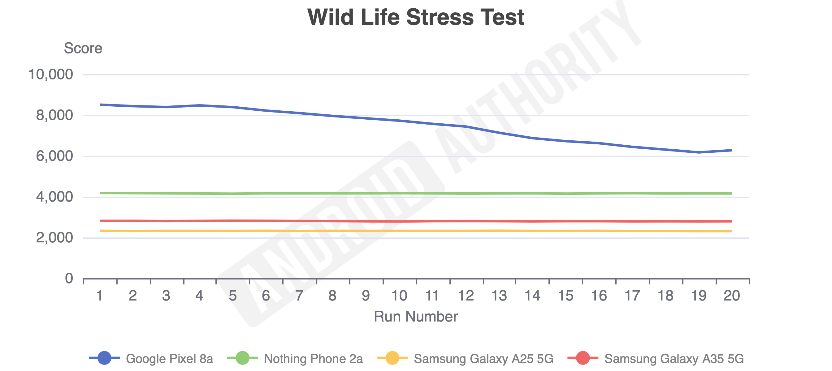
As we all know, Anakin wins the Boonta Eve Classic in the end, but it’s not down to raw power. If it were, he’d lose every time, just like the Razr Plus does in most of our benchmarking tests against the Galaxy Z Flip 6. The difference isn’t always a big one — the single-core Geekbench 6 and PC Mark tests were relatively close — but Samsung’s flip phone opens a much wider gap regarding graphics. Its performance in the Wild Life test started at triple the score of the Razr Plus, and even after 20 runs, it remained more than 50% higher than its competitor. Much of the gap in graphics performance comes back to the Snapdragon 8s Gen 3 using an older GPU, so sometimes it pays to grab the latest chipset.

Of course, it’s not all bad news for the Razr Plus. It still puts in a solid shift and feels capable of making it through a mixed day of usage — so long as you trust the cover display for lighter tasks. Honestly, you’re probably not going to notice too many of the gains from Samsung’s more powerful chipset anyway — it might be a hair quicker here and there, but both chipsets are perfectly capable of cruising through day-to-day tasks like web browsing, answering emails, and a little bit of gaming anyway.

Samsung Galaxy Z Flip 6 vs Motorola Razr Plus battery life

Credit: Ryan Haines / Android Authority

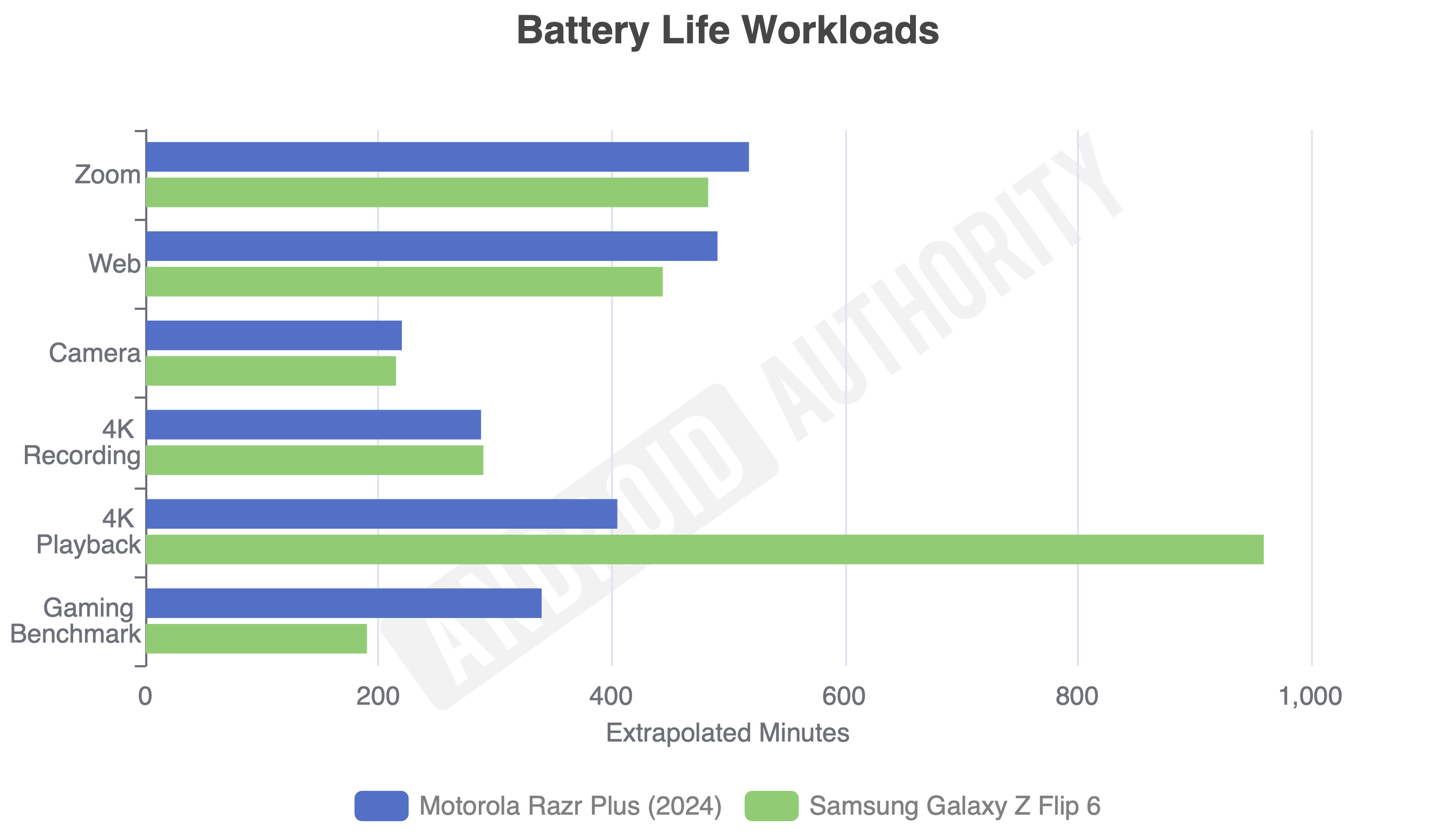
Where the Razr Plus does make up some significant ground is in its battery life and charging setup. Like Anakin, it might not be more powerful, but it can run longer and return to full strength quicker. Both the Razr Plus and the Galaxy Z Flip 6 pack 4,000mAh batteries, and in our battery drain test, Samsung’s flip phone only ran away in one category: 4K video playback. It more than doubled the Razr Plus’ performance, which is great news if you watch a lot of high-resolution videos, but Motorola came out at least slightly ahead in Zoom calling, web browsing, camera snapping, and even gaming battery life, a mix of which you’re more likely to do throughout the day.

Motorola also keeps its edge (pun intended) when it comes to charging. The Razr Plus (2024) offers Galaxy S24 Ultra-level 45W wired TurboPower charging, which easily beats the Galaxy Z Flip 6’s 25W wired speed with a compatible charger. Both tie in 15W wireless charging, though Motorola has a slight advantage in reverse wireless speeds, too, at 5W instead of 4.5W.

Galaxy AI still reigns supreme

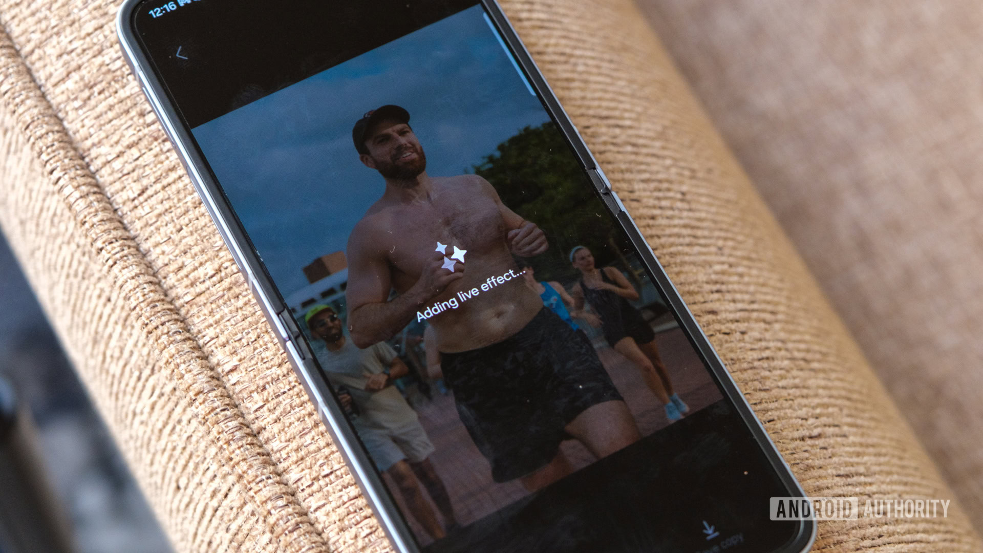
Samsung Galaxy Z Flip 6 live effect

Credit: Ryan Haines / Android Authority

Oh, and don’t think I’ve forgotten about 2024’s buzzword of the year — AI. One of the most important pieces of both Samsung’s and Motorola’s choice in the chipset is that both Snapdragon models support on-device AI features. From there, it’s up to the two companies to see how quickly they can roll out their respective features.

So far, like every underdog story worth its salt, Samsung is winning. The Galaxy Z Flip 6 is further ahead in all manner of Galaxy AI-powered features, with things like Auto Zoom, Sketch to Image, and Portrait Studio debuting in One UI 6.1.1. They’re new additions on top of Circle to Search, Live Translate, and Photo Assist, which Samsung introduced in previous generations. I’ve only really come to trust Circle to Search and Auto Zoom, as they feel the most straightforward, though I’ll also generate a wallpaper here and there — if you still want to classify that as exciting, on-device AI.

On the Razr Plus, Moto AI needs to catch up. Right now, Motorola is only ready to offer a few of its generative features, including two forms of wallpaper generation called Style Sync and Magic Canvas. It also has a couple of camera wrinkles — Adaptive Stabilization and Action Shot — but the best of its on-device power is coming… eventually. Remember that it took Motorola over a year to bring Android 14 to its previous Razr Plus, so who knows when “eventually” could be.

The Motorola Razr Plus (2024) finally deserves its crown

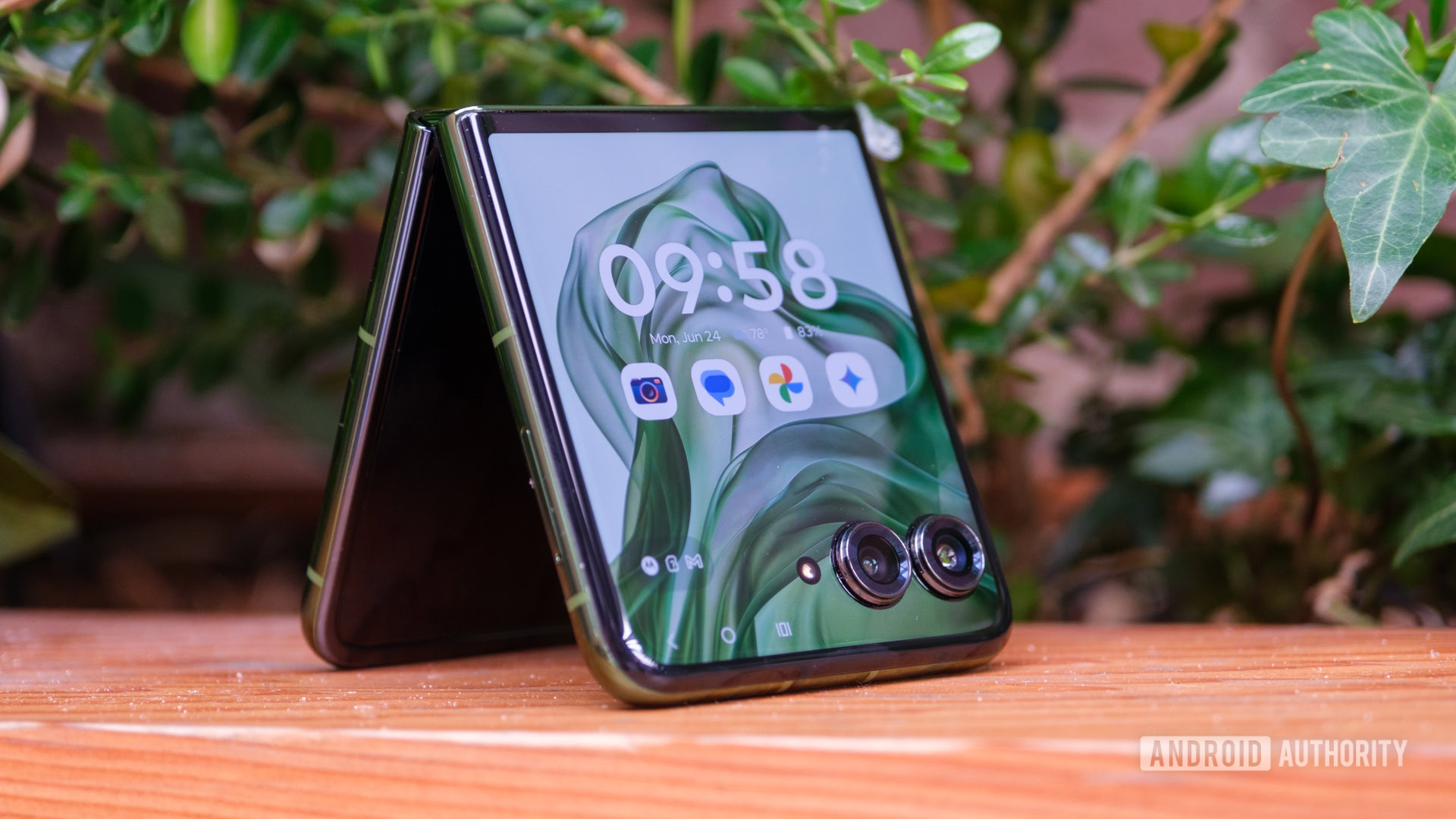
Motorola Razr Plus 2024 tent fold

Credit: Ryan Haines / Android Authority

There are plenty of ways to end an underdog story. Rudy sacks the quarterback, Rocky wins the fight, and Luke Skywalker blows up the Death Star (or defeats the emperor, take your pick of Star Wars film). No matter which one you prefer, there still has to be a winner. And, despite its more useful pair of cameras, more powerful chipset, and longer update commitment, I can’t bring myself to pick the Galaxy Z Flip 6. Yes, it’s an excellent phone and easily Samsung’s most complete Galaxy Z Flip to date, but it also feels like a phone stuck spinning its wheels.

There are so many things that Samsung’s latest Galaxy Z Flip 6 has in its corner. It has a better ecosystem of accessories, an almost infinitely customizable software experience, and a build quality that’s worthy of a museum display, and yet it feels too surgical and precise for my liking. There are phones I think should feel like well-oiled machines, like the Samsung Galaxy S24 Ultra and Apple iPhone 15 Pro Max, but they’re the opposite of the Galaxy Z Flip 6. Instead, this phone should be leaning on its uniqueness and embracing the fact that it’s smaller and more portable than a Klondike Bar.

Samsung's flip phone feels like a tool, but I prefer the imperfect flexibility of the Razr Plus.

Which is exactly what the Razr Plus does. Motorola’s top-end flip phone is less powerful, won’t get seven years of updates, and has cameras that make almost no sense in this form factor, and yet it’s by far the more enjoyable to use. The Razr Plus’ rounded frame is comfortable to hold and use for hours on end, while its vegan leather (or suede) back panel adds a softness and a pop of color that reminds me of the Motorola of old. I didn’t have to jump through any hoops to add an app drawer to the cover screen, nor did I have to reorganize the preloaded widgets — I just fired up the Razr Plus and got to exploring until my battery died. Then, I charged it back up at a speed that Samsung reserves only for products named Ultra.

Of course, I can’t speak for everyone. I know some Samsung die-hards will only consider the Galaxy Z Flip when they pick up a flip phone. They’ll happily spend the extra cash (Samsung bumped its price by $100) to stay within the Galaxy ecosystem. However, I will keep returning to the Razr Plus as long as Motorola continues to embrace the fun side of Android.

You can buy the full CMF by Nothing ecosystem for less than a Pixel 8a, but should you?

Remember when the Google Pixel 7 cost $599? Or when you could grab a Galaxy Z Flip for under $1,000? As a tech reviewer, I’m painfully aware of how prices have changed in the last few years — and it hasn’t been a change for the better. Recently, though, we’ve seen a rise in smaller brands and spin-offs trying to offer maximum value at a minimal price. I am, of course, referring to Nothing and, by extension, its spin-off CMF by Nothing.

CMF’s plan is ambitious — peg its debut smartphone at $200 and surround it with accessories that cost less than half of that — but can it work? How much value can you get from an entire ecosystem that costs less than a Google Pixel 8a? Well, let’s find out.

The Buds Pro 2 are a no-brainer

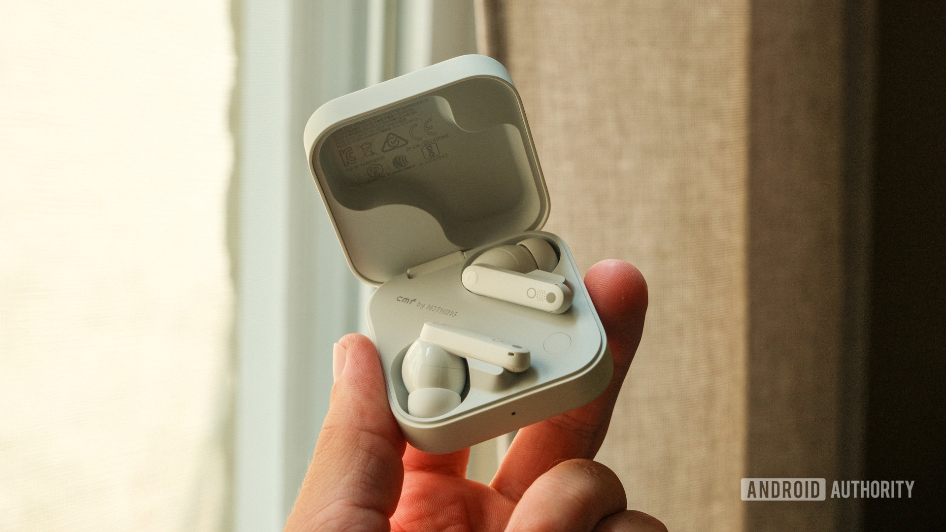
CMF Buds Pro 2 case in hand

Credit: Ryan Haines / Android Authority

I know you’d probably expect me to start at the top and work my way down through the CMF ecosystem, but for reasons that will eventually become clear, I’m going to do the opposite. Instead of starting with CMF’s debut Phone 1, which should be the star of the show, I’d rather kick things off with the supporting cast — a group that I actually think is much better than its lead. Up first in this impressive yet affordable group is the CMF Buds Pro 2.

Now, I’ll admit that I’m not always caught up on the latest developments in earbuds — I usually wear bone-conduction headphones while running for my safety — but I’ve been thoroughly impressed during my time with CMF’s Buds Pro 2. They’re a massive change from my last pair of budget buds, which was Google’s original Pixel Buds A-Series. Those earbuds came without noise canceling, a reliable IP rating against water or dust, and sat in a simple, shallow charging case that never felt very secure. Sure, I liked their simple controls and appreciated having Google Assistant in my ear by default, but they never punched above their $100 billing.

If there's one CMF product you should definitely buy, it's the Buds Pro 2.

The CMF Buds Pro 2, on the other hand, exceed their $60 price tag in just about every way. For less than the price of a new PlayStation 5 title, you get noise canceling, a workout-ready IP55 rating, and perhaps the best earbud case I’ve used in a long time. At the very least, the case’s customizable Smart Dial makes for an incredibly addicting fidget toy. And yes, I realize that some of my excitement comes from not having used budget-friendly earbuds in a while, but my colleagues at Sound Guys tend to agree — and they know a thing or two about audio.

Anyway, I’ll readily admit that I mostly worry about two things when it comes to earbuds: comfort and a good seal. The CMF Buds Pro 2, with their AirPods Pro-like design and soft ear tips, check both boxes. I find that I can keep the Buds Pro 2 in for a few hours at a time without reaching to adjust them — at least until my Spotify daylist switches or I convince myself that my cats are up to no good. When I’m done, the earbuds pop nicely back into their charging case with the help of some surprisingly strong magnets, ensuring that I can line them up easier than Samsung’s Galaxy Buds 3 Pro.

Of course, you will need the Nothing X app to customize the controls on your Smart Dial and the individual earbuds, but it also lets you tweak your equalizer and noise control (canceling) preferences, so I’d call it a valuable addition. I’ve also noticed that a few of the CMF Buds Pro 2 tap controls work better than others — fast forward works every time, even when I don’t want it to, while play and pause are hit or miss. I’m sure CMF can drill down its controls with a future update, though, so it’s not nearly enough of a problem to outweigh the remarkable value.

I’d recommend the Watch Pro 2, too

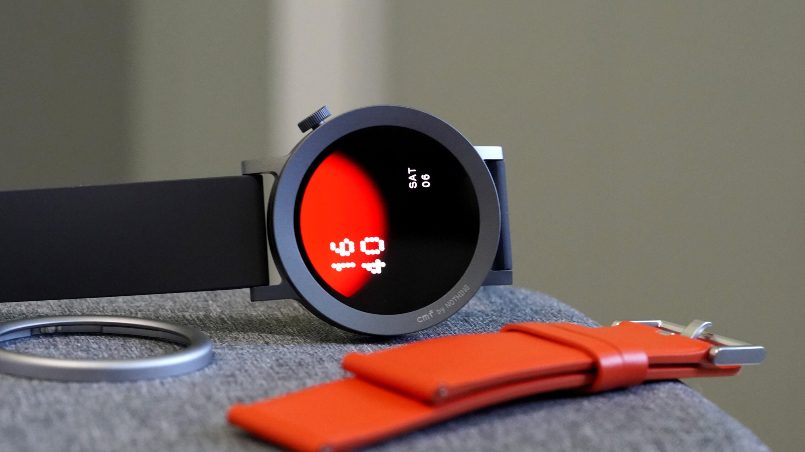
A CMF Watch Pro 2 by Nothing rests on its side, displaying a native watch face.

Credit: Kaitlyn Cimino / Android Authority

Moving on, I’m a little bit pickier with my smartwatches than I am with earbuds, typically preferring to keep a powerful Garmin or Coros GPS watch on my wrist. However, when the CMF Watch Pro 2 showed up, I was happy to try out a modular wearable, strapping it to my less-favored right wrist. And, at just $10 more than the Buds Pro 2, I was curious if anything would impress me about the seemingly simple watch.

Once again, the answer turned out to be yes. I might not be as impressed as I was by the Buds Pro 2 — after all, I have very high standards for the watch on my wrist — but it remains hard to argue against what you’re getting for just $70. CMF’s controls are simple and Coros-like, with a single button in the form of a rotating crown that, yes, actually serves a purpose (looking at you, Samsung and OnePlus). A press of the button from the watch face opens up a menu of options to scroll through, while a swipe left or right runs you through a set of widgets, all bearing Nothing’s signature dotted design language.

$70 for a watch with 11 days of battery life seems like a pretty good deal to me.

This brings me to my first issue — CMF’s mostly square widgets don’t feel like they’re optimized for the Watch Pro 2’s round AMOLED panel. Instead of giving each widget its own display, the Watch Pro 2 pairs them up, cramming the weather in with your Apple Watch-like tracking rings and shoving your recent calls, dialer, and contacts all onto one screen together. The shape of the widgets makes it feel like they were designed for a square display, while their size, even when combined, leaves plenty of space around the edges of the panel. And yet, the button-based menu, which uses the rotating crown, takes up the entire display and scrolls nicely with a rounded effect along the edge.

But, if you can live with the slightly unorthodox menus and widgets, the CMF Watch Pro 2 has much to offer. Its battery life is excellent — it claims 11 days of regular use or nine days of heavy use, and I’ve only had to charge it once since the watch arrived about two weeks ago.

Other touches, like the IP68 rating, 120 sport modes, and five auto-detectable activities, make the Watch Pro 2 sound like it should be an athlete’s dream and one of the best smartwatches for the money. It might turn out to be, but I can’t trust it with a few of my adventures. The few default bands I’ve used are made of a very plasticky faux leather material, which I can’t help thinking would become incredibly slippery during sweaty summer runs.

CMF’s interchangeable metal bezels are an interesting idea, too, allowing you to spice up your watch for several different occasions, but they seem like a nightmare for a frequent climber like me. They’re easy to twist on and off, only taking about a millimeter of travel, but I’ve already had a few times when the bezel hasn’t fully locked into place and come tumbling off in my living room. If you were, say, climbing in a gym and happened to smack your wrist against a hold, I could see it knocking the bezel loose or even damaging the metal itself. Have the same thing happen outside, and you might never see that bezel again.

And yet, I know that most people won’t go smacking their wrists into rocks or sweating their way through faux leather bands. For most people, their biggest headache will be the small, square widgets, while the long-lasting battery life, 80 watch faces at launch, and 24/7 health tracking will be more than worth the $70 price tag. This leaves us with one more piece of the CMF puzzle…

Reaching for the CMF Phone 1 isn’t quite so simple

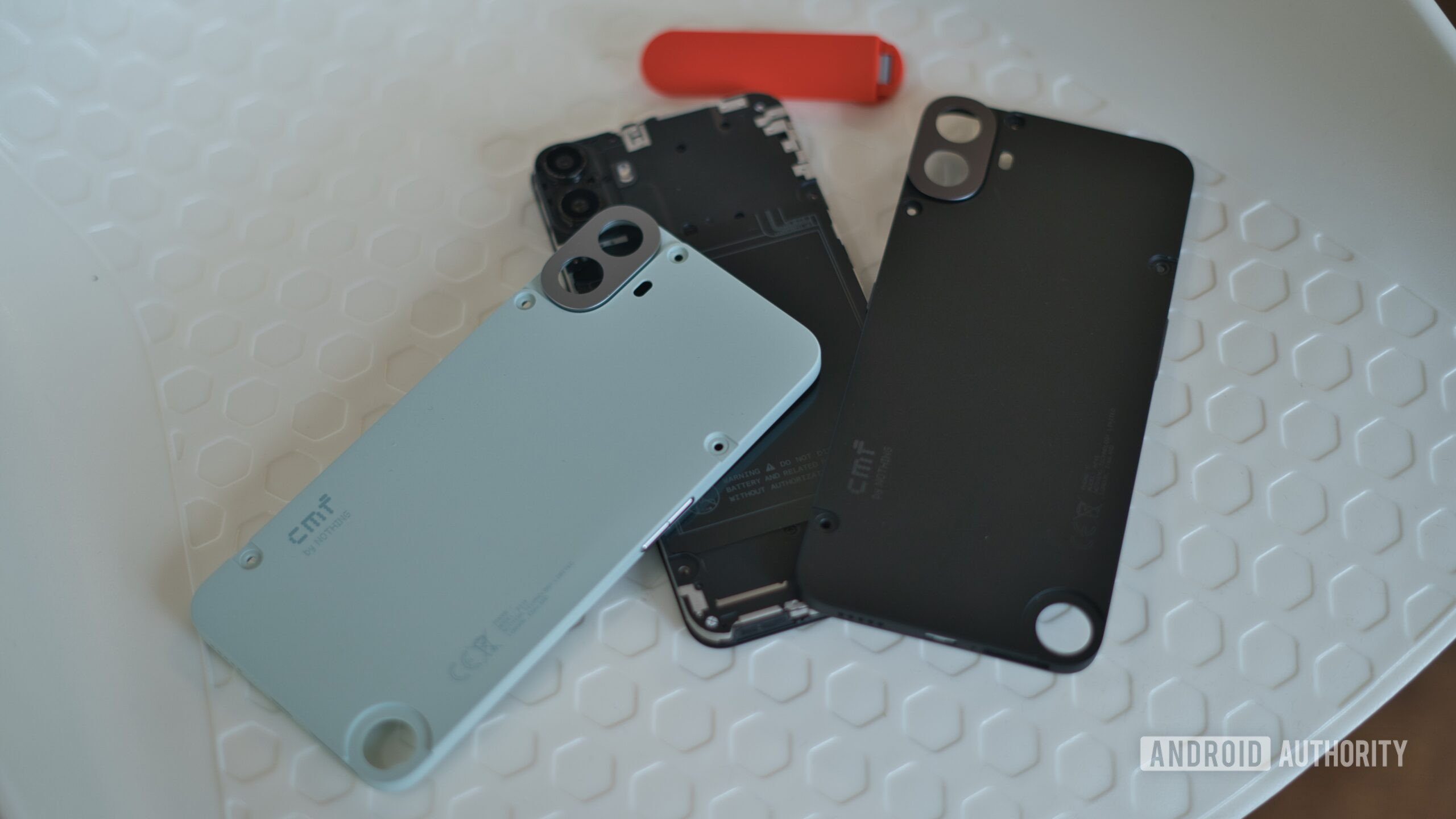
CMF Phone 1 Modular Design 2

Credit: Dhruv Bhutani / Android Authority

And finally, we have what should be the star of the show — the CMF Phone 1. I find myself saying it should be the star rather than it is the star for one fundamental reason: The CMF Phone 1 doesn’t work in the US. It follows in the footsteps of Nothing’s Phone 2a, which was launched earlier in the year and arrived as part of a developer’s program without the proper band support for any of T-Mobile, Verizon, or AT&T. As such, I can’t recommend it to most people I know to cap off their less-than-a-Pixel-8a spending spree.

But, while it’s a no-go for the Americans I know, there’s a lot to like about this $200-equivalent phone in the rest of the world, and that’s without even considering the interchangeable accessories. CMF’s 6.67-inch AMOLED panel is vibrant, its 120Hz refresh rate is smooth, and I can’t help but like the dot-matrix design of Nothing OS (yes, the CMF Phone 1 uses its parent company’s flavor of Android). The Phone 1’s 33W wired charging is a nice touch, too, out-pacing what Samsung and Motorola offer for their similarly priced devices.

The CMF Phone 1 would be a great value... if it worked in the US.

And, although you probably shouldn’t buy a phone for the accessories that it comes with, CMF’s modular options are worth mentioning. This is the first time I’ve ever had a phone case come with a screwdriver, and I actually dig the setup. It’s a strange feeling to remove four screws and a twist-off button to change the parts on your phone, but it feels very industrial — not to mention the fact that there’s no way a phone case is coming off after it’s been screwed in. CMF’s other accessories are equally secure, with the card case and stand slotting into the small wheel in the bottom corner. It feels like a new take on an Erector set, which I did not expect in 2024.

However, several situations highlight the CMF Phone 1’s budget limitations. The phone is predominantly made of plastic, and its interchangeable nature means the plastic on the back panel is pretty flimsy. It’s meant to be easy to swap in and out, but this mostly results in a device with soft buttons and a little bit too much give to its back. CMF will only bring two full Android updates to its debut device, followed by a third year of security patches — it’s not the worst update commitment at this price point, but that’s hardly a ringing endorsement. I also personally can’t stand Nothing’s notification chimes and ringtones — to me, they sound like R2-D2 being crushed by a trash compactor.

Again, though, none of this matters when buying the CMF Phone 1, at least not in the US. For most of us, the phone simply won’t work due to having the wrong set of bands for our major carriers. As such, it’s tough to recommend the CMF Phone 1 as the last piece of an affordable ecosystem. You’ll get excellent value out of the CMF Buds Pro 2 and a solid (if not the most athletic) experience from the CMF Watch Pro 2, but you might have to wait a little bit longer before trying out a modular phone for yourself.

If you’re still interested, you can check out all three CMF by Nothing launches below.

Samsung Galaxy A35 5G review: Should you buy it?


Should you buy the Samsung Galaxy A35 5G?

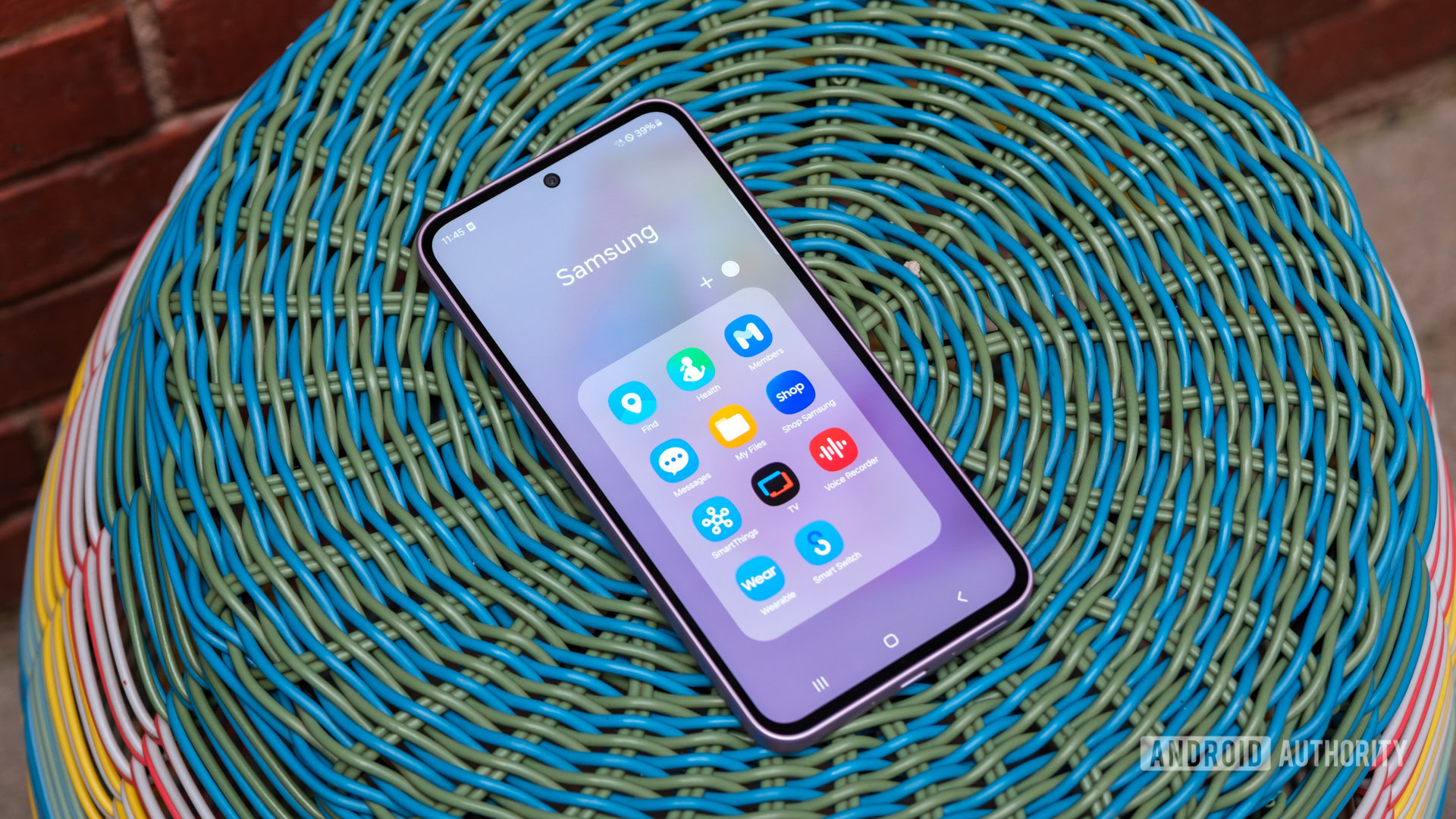
Samsung Galaxy A35 samsung folder

Credit: Ryan Haines / Android Authority

We’ve already worked our way through the rest of Samsung’s budget-friendly updates for 2024, but there’s still enough room for one more entry in the form of the Samsung Galaxy A35 5G. With no official launch for the Galaxy A55 5G in North America, the Galaxy A35 5G sits at the top of the lineup in the US. It also has the unenviable task of taking on one of the most competitive yearly slates of affordable Android phones we’ve ever seen. It’s surrounded by excellent offerings from Google, Motorola, Nothing, and even Samsung, which makes us wonder how the Galaxy A35 5G can stand out from the crowd.

Starting with the design, the Galaxy A35 5G, well, doesn’t exactly stand out. Instead, it looks a whole lot like Samsung’s Galaxy A25 5G, which looks a whole lot like the Galaxy A15 5G, which… you get the picture. The overall look is about as close to Samsung copying its own homework as you can get, with just a few tweaks to set it apart from the more affordable Galaxy A models. Some of those tweaks work in the Galaxy A35 5G’s favor, like ditching the cheaper models’ plastic backs and lower-tier Gorilla Glass for a premium sandwich of Gorilla Glass Victus Plus around the plastic frame. The Galaxy A35 5G also picks up a full IP67 rating against water and dust, giving it a clear durability advantage over Samsung’s other budget models, though as was the case with the Galaxy A34 5G, you do lose out on a headphone jack.

For the most part, though, the Galaxy A35 5G is just as easy to navigate as any other affordable Samsung phone. It still houses the power button and volume rocker on the right side, and there’s a down-firing speaker tucked next to the USB-C port on the bottom edge. This time, Samsung has moved its fingerprint reader from the power button to an in-display unit that sits low on the display — perhaps too low — and bumped the combination SIM tray and microSD slot to the top edge. I haven’t had any issues with speed or accuracy, but it’s also positioned in just a way where it’s tough to reach if you’re holding the bottom of the Galaxy A35 5G.

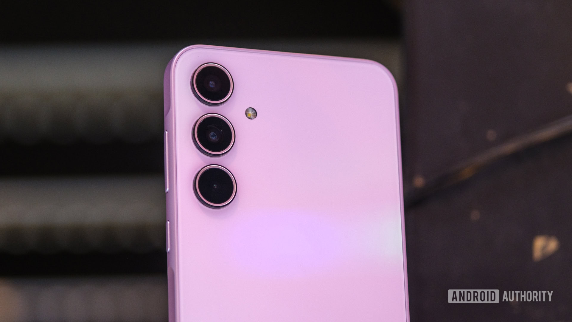
Besides that, most of Samsung’s tweaks to the Galaxy A35 5G help elevate it above its budget-friendly siblings. Although it looks and feels pretty much the same as the Galaxy A15 5G and A25 5G, swapping from simple plastic to Gorilla Glass Victus Plus gives it a more premium heft in hand. The swap adds enough weight and rigidity to the phone that you don’t notice the plastic frame — or at least I didn’t. Unfortunately, the Galaxy A35 5G brings back a high-gloss finish that picks up smudges and fingerprints like they’re going out of style. Our Awesome Lilac version has an almost iridescent finish to its pinkish glass, which looks great when the light hits it, provided you can keep it clean.

Around the front, Samsung hasn’t really changed the Galaxy A35 5G’s display over its predecessor — at least not beyond the upgrade in materials. It still has a 6.6-inch AMOLED panel, a 120Hz refresh rate (with an adaptive mode that can drop to 60Hz when idling), 1,000 nits of peak brightness, and even bezels on all four sides. Despite the lack of changes, the Galaxy A35 5G remains head and shoulders above its Galaxy A siblings, especially when used outdoors. I could easily see the Galaxy A35 5G’s display from odd angles while collecting camera samples on a sunny day, whereas I could only see the Galaxy A15 5G and A25 5G head-on with the display a few inches from my face.

Upgraded materials and a much better display put the Galaxy A35 5G far above its budget siblings.

While the retread design might not be enough to sell you on the Galaxy A35 5G, Samsung’s excellent software experience and long-term support might. The phone not only ships with Android 14 and One UI 6.1 right out of the box, but it’s in line for four years of Android version updates and a fifth year of security patches, carrying it almost to the end of the decade. This is only bettered by the Pixel 8a in the mid-to-budget space.

So far, Samsung has been on track with its security updates, too, already rolling out enough to bring the phone up to April 1, 2024. Unfortunately, you won’t find any Galaxy AI features tucked away on the Galaxy A35 5G, despite the phone popping up on a few AI-centric pages on Samsung’s website. There’s some of the usual bloatware when you set the phone up, too, but you can clear most of it out.

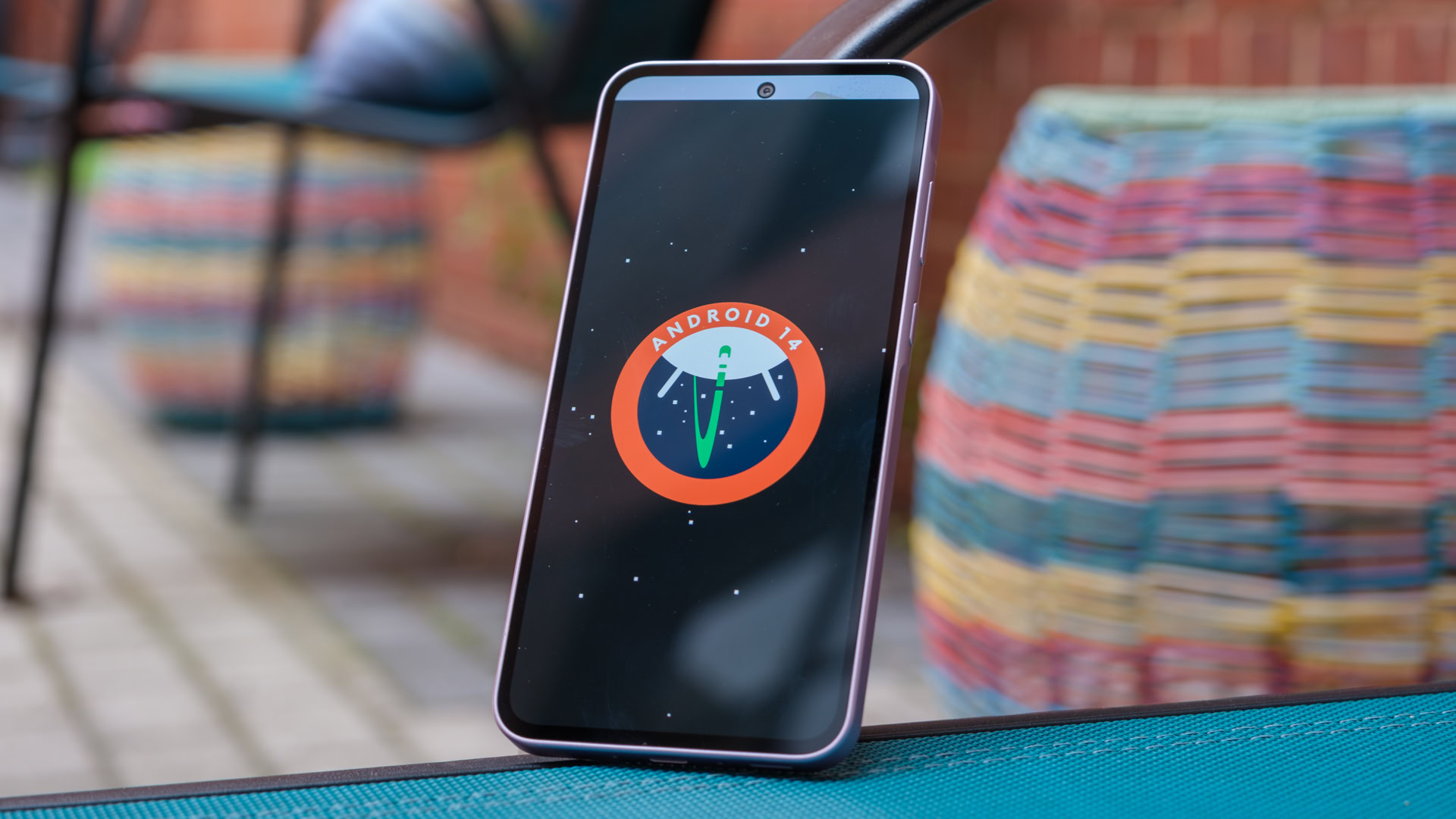
Samsung Galaxy A35 Android 14 easter egg

Credit: Ryan Haines / Android Authority

Under the hood, the Samsung Galaxy A35 5G packs an in-house Exynos 1380 chipset; the same chipset we saw on the Samsung Galaxy A54 5G in early 2023. It’s a generational upgrade over the Galaxy A25 5G’s older Exynos 1280, and it comes backed by 6GB of RAM and 128GB of expandable storage in the base configuration. Samsung’s in-house chipset feels significantly more comfortable in a slightly more affordable device, putting up CPU benchmark numbers that compare well against the more expensive Google Pixel 8a and Nothing Phone 2a and sometimes even beat the flagship-grade chipsets. Its Achilles’ heel is GPU testing, which gets points for stability, but is an obvious weakness compared to slightly pricier mid-range phones.

Samsung Galaxy A35 Wild Life graph

Credit: Ryan Haines / Android Authority

Thankfully, the Galaxy A35 5G often outperforms its price tag in day-to-day usage. I took it out as my primary device for a weekend of trail running with friends in rural Pennsylvania, and I was pretty impressed with how well it held up. The phone had no issues charging through two hours of GPS navigation to get me around Harrisburg at morning rush hour, and I pulled in with more than enough juice left to capture photos all day and pull up Strava for an ill-advised eight miles on the Appalachian Trail. I didn’t fall while on the trail, so I didn’t get to see how Gorilla Glass Victus Plus held up to the rocky, miserable stretch of trail through my home state, but it gave me enough peace of mind to take the trails quickly and know my phone would probably survive.

The Galaxy A35 5G kept chugging once we got off the trails, too, allowing me to hop between a little bit of social media streaming and light gaming (mostly Golf Clash and Marvel Snap) while we waited to grab dinner. I wouldn’t recommend heavier titles like Genshin Impact or Asphalt 9 unless you can live with low settings and frequent frame drops, but light titles are no issue. I also caught up on the first few episodes of Disney’s The Acolyte while I was away, with the Exynos 1380 only warming slightly because I was streaming from the comfort of an outdoor hammock.

Samsung Galaxy A35 cameras

Credit: Ryan Haines / Android Authority

Since we’re busy comparing the Galaxy A35 5G to the more affordable Galaxy A25 5G as an obvious alternative for those looking to save some cash, let’s move on to the cameras. All of Samsung’s budget camera setups look identical at a glance, and they’re all inspired by the flagship Galaxy S series, but they’re not quite created equal. The Galaxy A35 5G kicks off with a 50MP primary camera with a maximum aperture of ƒ/1.8, the same resolution and aperture as the Galaxy A15 5G and A25 5G offer, but its sensor is larger, offering slightly better low-light performance thanks to its larger individual pixels. The other two cutouts house an 8MP ultrawide and a 5MP dedicated macro sensor, giving the Galaxy A35 5G a slight leg up over its fellow Galaxy A devices in some cases.

However, that leg up isn’t a big one, as picking out the differences between photos from the three phones often feels like recreating the pointing Spider-Man meme — at least at 1x and 2x zoom. It’s not a problem, as Samsung’s 50MP primary sensor feels pretty well-tuned in well-lit scenarios, but it does mean you’re not getting too much extra punch by grabbing the Galaxy A35 5G over Samsung’s more affordable options.

You're not getting too much extra punch by grabbing the Galaxy A35 5G over Samsung's more affordable options.

Overall, though, I’m pretty pleased with the results it turned in during my testing, whether in well-lit or in slightly lower lighting. Samsung’s colors are surprisingly accurate in the bunch of pride balloons — no oversaturation on reds and greens this time — and the Galaxy A35 5G captured the stock cars rounding the dirt track without any motion blur. Although I’m not usually a big fan of budget ultrawide cameras, the Galaxy A35’s 8MP option is among the better I’ve used. It easily fits the entire sailboat in the image to the bottom right, and both the colors and details are better than what I’ve gotten out of the Galaxy A15 and A25. There’s a tiny bit of distortion in the planks of the dock in the corner and a bit of a bend to the horizon, but they’re worthwhile trade-offs so that I don’t have to move further back from the boat.

I’m not as thrilled with the dedicated macro shot of the purple flower, with the limitations of a 5MP sensor on full display, but somehow, that’s not the most disappointing shot in the gallery. That dubious honor goes to the 10x zoom image of lily pads on a local pond. Although the white flower and lily pads look fine, the Galaxy A35 5G struggled badly with the algae growth in the background, reducing it to a green pattern that almost looks AI-generated.

If you want to check out full-resolution versions of the samples above (especially the weird lily pad artifacting), you can do so at this Google Drive link.

Unfortunately, the underwhelming shot of the lily pads is a sign of the Galaxy A35 5G’s greater struggles with zoom. Because it has a dedicated macro sensor rather than a telephoto, you wind up relying on the primary sensor for, well, everything. It skates by at 2x zoom without too much issue, but by the time you hit 4x and even 10x zoom (the Galaxy A35 5G’s maximum), the details are in rough shape due to the lack of dedicated hardware and reliance on digital zoom. I’ll give it to Samsung that the colors are still accurate, but the shingles on top of the pagoda look like little more than horizontal stripes at longer lengths.

The Galaxy A35 5G’s selfie camera, on the other hand, surprised me. I had no expectations for the 13MP punch hole sensor, but it nailed the details through my hair and beard — something that budget selfie options from Motorola and OnePlus have repeatedly fumbled. It also accurately identified the edges of my hair in portrait mode, something else that doesn’t always happen perfectly.

On the video side, the Galaxy A35 5G matches the more affordable Galaxy A25 5G, with up to 4K recording at 30fps. You can also record in 1080p at either 30fps from the selfie camera or 60fps from the rear camera. Video stabilization is good, too — good enough to make memories with your kids or pets — but it’s not quite flagship-grade.

Although there are plenty of other differences between the Samsung Galaxy A devices, battery life and charging are the great equalizers. Like the more affordable models, the Galaxy A35 5G ships with a 5,000mAh battery and supports wired charging at up to 25W with a compatible charger (you don’t get one in the box). It takes a pretty consistent hour and a half to pick up a full charge, which is no surprise since the Galaxy A15 5G and A25 5G filled at the same rate.

The Galaxy A35 5G is the best of Samsung's budget crop for 2024.

That said, I’m impressed to see such consistency out of Samsung across its budget range, especially when rivals like Motorola offer different (and slower) charging speeds depending on which Moto G device you buy. Of course, the trade-off is that a few Moto G devices now support wireless charging for added flexibility, and several other alternatives from OnePlus and Nothing offer even faster wired charging.

As for the battery life itself, Samsung’s Galaxy A35 5G is no slouch. In our battery drain test, it nearly doubled the web browsing results of more expensive devices like the Pixel 8a and beat both the mid-range Pixel and the Nothing Phone 2a in our gaming tests. While a mixed day of usage will probably balance out some of the battery gains in one section or another, the Galaxy A35 5G easily packs enough juice to go a day and a half between charging. I’ve been using the phone throughout a heat wave here in the Mid-Atlantic, and it hasn’t knocked down the battery performance in any noticeable way.

All told, the Galaxy A35 5G is the best of Samsung’s budget crop for 2024 (at least in the US) and by far the easiest of the Galaxy A devices to recommend. Sure, it shares a lot with the Galaxy A15 5G and A25 5G in terms of the battery life, charging, software support, and primary camera, but the more durable materials, official IP67 rating, and much better display more than justify its $400 asking price. There are things that the Galaxy A35 5G could still improve, like adding wireless charging and trading its dedicated macro sensor for, well, anything else, but they’re small prices to pay when the rest of the phone is so well-rounded.

What are the best Samsung Galaxy A35 5G alternatives?

Samsung Galaxy A35 vs Moto G 5G vs Pixel 8a on table

Credit: Ryan Haines / Android Authority

Should you decide that the Samsung Galaxy A35 5G isn’t the budget phone for you, there are plenty of other options to check out. Whether you want to spend a little more or save some money, here are some Galaxy A35 5G alternatives:

  • Google Pixel 8a ( ): Google’s most affordable Pixel 8a has a few advantages over the Galaxy A35 5G, including wireless charging and even better software support, including Gemini AI features, but Samsung’s cameras are more flexible and Gorilla Glass Victus Plus beats a plastic back any day.
  • Motorola Moto G Stylus 5G (2024) ( ): The Moto G Stylus 5G (2024) is a high point for what the Moto G series has become. It’s the most affordable phone you can get with a stylus, and Motorola’s vegan leather back is comfortable in the hand. However, you’ll have to live with bad bloatware and a weak update commitment.
  • Samsung Galaxy A25 5G ( ): Samsung’s own Galaxy A25 5G is a good option if you’re on a tighter budget. It offers many of the same features as the Galaxy A35 but swaps to a plastic back and lower-tier Gorilla Glass display. You’ll get similar cameras, too, even if the sensors are slightly smaller.
  • Nothing Phone 2a ( ): The Nothing Phone 2a might be one of the best budget phones you can buy, but it’s tricky to recommend in the US. It scores big with a powerful Dimensity 7200 Pro chipset, a massive 6.7-inch display, and a pair of sharp 50MP cameras but loses points for iffy network support across the big three. If you’re outside the US, however, it’s an easy pick.
  • Apple iPhone SE (2022) ( ): If you really need an iPhone, this is the most affordable option—not that we’d recommend it. Apple’s most recent iPhone SE remains trapped in an iPhone 8’s body, complete with hefty top and bottom bezels and just one camera on the back. But hey, it’ll get plenty of software updates.

Samsung Galaxy A35 5G specs

Samsung Galaxy A35 5G
Display6.6-inch Super AMOLED
2340 x 1080 resolution
120Hz refresh rate
19.5:9 aspect ratio
Corning Gorilla Glass Victus+
ProcessorSamsung Exynos 1380
RAM6GB
Storage128GB
Expandable via microSD card
Battery5,000mAh
25W wired charging
Cameras50MP wide camera
ƒ/1.8 aperture
OIS

8MP ultra-wide camera, 123deg FoV
ƒ/2.2 aperture

5MP macro camera
ƒ/2.4 aperture
Connectivity5G
4G LTE
Wi-Fi 6
Bluetooth 5.3
Operating SystemOne UI 6.1
Android 14
Water resistanceIP67
ColorsIceblue, Lilac, Navy
Dimension and weight161.7 x 78 x 8.2mm
209 grams

Samsung Galaxy A35 5G review: FAQ

Does the Samsung Galaxy A35 5G have wireless charging?

No, the Samsung Galaxy A35 5G does not have wireless charging, only 25W wired charging.

Does the Samsung Galaxy A35 5G have a headphone jack?

No, the Samsung Galaxy A35 5G does not have a headphone jack.

Does the Samsung Galaxy A35 5G support eSIM and dual-SIM?

Yes, the Samsung Galaxy A35 5G supports dual-SIM in the form of a single nano-SIM and downloadable eSIM profile.

Does the Samsung Galaxy A35 5G support NFC?

Yes, you can use the Samsung Galaxy A35 5G to make wireless payments via NFC.

Is the Samsung Galaxy A35 5G waterproof?

Though it’s technically not waterproof, the Samsung Galaxy A35 5G has an IP67 rating, which means it can be submerged in one meter of water for up to 30 minutes.

Google Pixel 8a review: Should you buy it?

Should you buy the Google Pixel 8a?

Google Pixel 8a screen on table with screen on stock photo

Credit: Edgar Cervantes / Android Authority

Google’s mid-range Pixel A series exists in a confusing space. On the one hand, it offers much of the flagship Pixel experience with the same powerful image processing, sleek, colorful design, and smooth Android skin with a long-term update commitment — all good things. However, the Pixel A series exists at a price that, year after year, falls just a bit too close to Google’s base Pixel flagship when you account for the hefty discounts that tend to drop at the same time as the Pixel A series’ typical mid-year launch window. It started with the Pixel 6 series and continued with the Pixel 7 series, and now Google is back for another bite at the apple with the $500 Pixel 8a. On paper, it’s the most capable budget Pixel device yet, but can it survive in a world where the Google Pixel 8 is almost always on sale for just $100 more?

Obviously, stepping on its own toes doesn’t always work out for Google (or anyone else), but when it comes to the Pixel 8a’s design, it really, really does. I’ve always been partial to the Pixel’s camera bar and bright color options, and this mid-ranger takes them to new heights — just don’t expect top-shelf materials. At a glance, the Pixel 8a looks like a scaled-down cross between the Pixel 8 and Pixel 8 Pro, pulling the size of the former and combining it with the soft matte finish of the latter. But having held and tested all of them extensively at this point, I can tell you that the mid-ranger has rounder corners than either flagship, making it feel like a pebble you just fished out of a stream.

Maybe you’re anti-pebble, but the change makes the Pixel 8a fit perfectly in the hand. It doesn’t dig in nearly as much as its flagship counterparts, and its fingerprint-resistant finish is much appreciated when most budget phones opt for high-gloss finishes to look more premium. Although cutting corners works out well for the overall design, it’s not quite as welcome when it comes to the Pixel 8a’s materials. For a cool $499, you get a phone with a Gorilla Glass 3 display, aluminum frame, and colorful (see all the colors in hands-on images at the link) composite back — which is just a nice word for plastic. Low-grade Gorilla Glass and plastic are what we expect on actual budget phones, not mid-rangers that cost more than Samsung’s Galaxy A35 5G, a phone with Gorilla Glass Victus Plus protecting the display. On the brighter side, the Pixel 8a offers an IP67 rating against water and dust.

Another bright side (pun intended) is that the Pixel 8a features almost the same display as the Pixel 8 — just smaller and slightly less durable. It boasts the same 1,080 x 2,400 resolution and 60 to 120Hz refresh rate in a slightly smaller 6.1-inch panel. The Pixel 8a’s OLED panel also tops out at up to 2,000 nits of peak brightness. However, you should know that you need to opt into the semi-variable refresh rate, as the Pixel 8a is locked at 60Hz by default. Both settings feel smooth while using the Pixel 8a from day to day, though I appreciate the extra speed while scrolling through X or checking on Google Discover. The Pixel 8a’s display also houses its fingerprint reader, identical to the one on the Pixel 8 series. I haven’t had any issues with accuracy or speed, and the position is just high enough on the display to be comfortable.

Google might have skimped on the Pixel 8a's materials, but it nailed the overall design.

Moving on, perhaps the best reason to reach for the Pixel 8a over an older Pixel device is the software experience. You get the light, smooth, Google-ified Android experience you’d find on a flagship Pixel, and it’s combined with the same class-leading update commitment as the Pixel 8 series. That means the Pixel 8a will get seven years of Pixel updates, including Android versions, security patches, and regular feature drops, which not only beats other Android devices in its price range but tops flagship-level promises from OnePlus and Motorola, and also betters Samsung’s mid-to-budget phone update policies.

In addition to the long-term support, Google’s Pixel 8a is chock-full of AI-powered features, many of which we saw for the first time on the Pixel 8 series. I’ve become a true believer in AI-generated wallpapers, using just a few prompts to switch up the look of my Pixel 8a every few days. On a more practical front, Google’s Circle to Search feels like the next step in Google Lens and a far more practical application of what AI-centric upstarts like Rabbit want their “vision modes” to be.

Google Pixel 8a generative wallpaper

Credit: Ryan Haines / Android Authority

You can also tap into more advanced AI-powered features through Google’s Gemini platform, including summarizing emails and documents and brainstorming ideas for your next DIY project. Interestingly, the Gemini app isn’t installed on the Pixel 8a by default, so you’ll have to grab it from the Play Store. You’ll also have to switch your active assistant from Google Assistant to Gemini, removing some of the features you’re used to. Google has also confirmed that the Pixel 8a will get Gemini Nano on-device AI support in a future feature drop, which should enable more advanced features in the future (though you’ll need to dig into the phone’s developer settings to enable it).

Of course, one of the keys to Google’s AI-powered goals is its Tensor G3 chipset. Although we’ve mentioned more than once that the Tensor G3 doesn’t quite match rivals like Qualcomm’s Snapdragon 8 Gen 3 regarding flagship performance on the best Android phones, it feels right at home in the $500 segment. It still doesn’t set the world on fire with class-leading benchmark scores across the board, but it does put up a pretty good fight against the more expensive Nothing Phone 2 and Samsung Galaxy S23 FE. Samsung and Nothing have a very slight edge in the CPU-focused Geekbench 6 test with a bit of a wider margin in the overall PCMark Work test, but the three phones are almost indistinguishable in our 20-minute 3DMark graphics stress test — not bad, Google.

In a more practical, day-to-day sense, the Pixel 8a has no problem keeping up with its mid-range rivals. The Pixel 8a accompanied me on several days’ worth of travel, flying to Boston to visit my brother and then heading to New York for a work event, and I never felt stressed over how it would handle a long day. It hopped comfortably from social media scrolling to light gaming, all with downloaded Spotify podcasts streaming in the background. Google has also mostly addressed the Tensor G3’s thermal issues — the Pixel 8a never really warmed under basic usage — though I noticed a little extra warmth when searching for a connection after pulling the phone out of airplane mode. Check out our Pixel 8a performance deep dive (or watch the video above) for more details on what to expect.

Google Pixel 8a cameras close

Credit: Ryan Haines / Android Authority

Moving on, what Google Pixel device is complete without a capable set of cameras? We all know that Google isn’t the fastest to change or upgrade its camera sensors when it’s already among the best on a budget phone, so it’s hardly surprising to see the Pixel 8a land with the same dynamic duo as its predecessor. That means you’ll use the 64MP primary sensor — which bins to 16MP images by default — for the bulk of your shooting. It’s again paired with a 13MP ultrawide camera, complete with a 120-degree field of view. Even the selfie camera offers the same 13MP resolution, though it has a slightly wider 96.5-degree field of view — up from an even 95 degrees.

The main differences, however, come when you look at the Pixel 8a’s software features. It has a few new Tensor G3-powered extras, like Best Take and Audio Magic Eraser, which let you swap faces in your group photos and clean up background noise from your videos, respectively. The Pixel 8a also adds Magic Editor to the mix, which is the next step in the evolution of Magic Eraser, enabling you to move and resize subjects in your shots and use AI to fill in the space. I’ll admit that they all sound like cool features and are fun to play around with, but the artifacts that AI sometimes leaves behind make it tough to use Magic Editor results for much more than social media throwaways.

As mentioned, you’ll probably use the 64MP primary sensor to capture most of your images. Not because it’s an excellent sensor (though it is pretty good), but because there’s no telephoto option to zoom with. So, I’d wager you’ll spend most of your time split between the 1x and 2x zoom lengths, as that’s where the sensor feels most at home. The Pixel 8a nailed both the colors and the fine details in the collection of samples below, bringing the bright green of New York’s High Line to life in the top left but also pulling out the bright colors in the rack of kayaks without oversaturating them on an overcast day.

I’m also pleased with the Pixel 8a’s low-light performance, as seen in the image in the second row. It accurately captured the colors of the sunset and the architecture of the Saratoga Performing Arts Center, even if it couldn’t help me get a better view of the concert itself. True Night Sight is a little tougher for the Pixel 8a due to its slightly smaller megapixels, but it still captured accurate colors with a two-second exposure, as seen below. There’s also decent detail throughout the grass, and you can easily see both the sky and clouds between the trees. It’s just about identical to the performance we’ve seen from the Pixel 8 in low light, though the flagship’s larger individual megapixels might let it capture more light just a bit faster.

Although the Pixel 8a is perfectly comfortable at 1x and 2x zoom, it’s a little less confident once you pinch in further. Both the 4x and 8x zoom samples below show the limitations of digital zoom, holding onto the correct colors pretty effectively but losing the details in the boards of the dock and the rocks behind the boat. The boat’s name also comes out a bit fuzzy at the 8x zoom length, despite not being all that far away.

Thankfully, Google’s 13MP ultrawide camera makes the Pixel 8a much more reliable at 0.5x zoom. It’s the same field of view as we saw on the Pixel 7a, but it just seems to work well, especially in the heights of New York City. I particularly like the shot of the apartment building to the left, as the wider perspective helps to emphasize the funky architecture. There’s a little bit of lens flare, which is less appreciated, but the colors are again spot-on.

I don’t have many complaints about the punch hole selfie camera either — it doesn’t need to bin by default, and it hands in results with good colors and details. Best of all, Google doesn’t worry about the beauty filters we sometimes see on other budget phones. However, I can’t make heads or tails of the Pixel 8a’s default selfie portrait options. Your options are 1.7x and 2x zoom, and they’re almost impossible to tell apart.

On the video side, adding Audio Magic Eraser is the Pixel 8a’s only major upgrade. Otherwise, it’s still capable of 4K or 1080p recording at 60fps from either rear camera and up to 30fps from the selfie camera, just like the previous Pixel 7a. That said, Google seems to have improved its video stabilization — clips from the Pixel 8a have noticeably less bounce while walking than clips from the Pixel 7a. You can also check out full-size versions of the samples above and several more at this Google Drive link.

The last piece of Google’s Pixel 8a puzzle is its battery and charging setup. Although the phone is almost the same size as its predecessor, it has a battery about 100mAh larger, and the switch to the Tensor G3 chip means it can push that battery a bit further. Our controlled battery drain test showed that the newer mid-ranger easily beats the older Pixel 7a in simulated zoom calls, camera longevity in both video and stills, and 4K video playback, and comes up just a bit short in basic web browsing and gaming. The differences aren’t that big, though, and you might not notice them across a mixed day of usage since they’ll likely balance each other out.

Unfortunately, the similarities continue when you eventually run the Pixel 8a out of juice. It still offers the same speeds as the Pixel 7a, topping out at 18W wired and 7.5W wireless charging, neither of which is great in 2024. Motorola’s much cheaper Moto G Power (2024), for example, outpaces both charging standards — even if it can’t keep up in any other regard. In our experience, the Pixel 8a took a full 100 minutes to charge, which is, as my colleague Rob Triggs pointed out, slower than the Galapagos Tortoise runs the 400-meter dash. Oh, and you don’t get a charger in the box, so you might want to check out a few of our favorite Pixel 8a chargers if you think you’ll need to upgrade.

So, is the Pixel 8a Google’s most complete mid-range Android phone ever? Yes, certainly. It has the best update commitment for the money, solid performance, an ever-growing list of AI-powered features, and a design almost as good as the Pixel 5 (a phone I still miss). And, if you’re lucky, your carrier might offer you one for free.

However, the Pixel 8a also has so much in common with its predecessor and its flagship Pixel 8 counterpart that if you find the vanilla flagship on sale for around the $600 mark (something we’ve already seen multiple times in the past month or so), you should 100% ignore that the Pixel 8a exists and grab the better phone. You can save money and get the same cameras and charging experience from the Pixel 7a or splash some cash for better materials, faster charging, slightly better camera flexibility, and a larger display.

In a vacuum, Google has nailed the Pixel 8a; it’s a phone that no one would ever be unhappy with, but one that’s also been dropped into a no-win situation of Google’s own creation.

What are the best Google Pixel 8a alternatives?

You may have come this far only to realize that the Google Pixel 8a is not, in fact, the phone for you. If that’s the case, several others with similar specs and price tags are worth considering. Here are just a few Pixel 8a alternatives:

  • Google Pixel 8 ( ): You knew this was coming first — the Pixel 8 is essentially a more complete Pixel 8a, offering better materials, faster charging speeds, and more capable cameras on the front and back. Check out our full written comparison, or watch the video above for more.
  • Samsung Galaxy A35 5G ( ): If you’re not sold on Google’s Pixel ecosystem, the Galaxy A35 5G offers a great experience at a lower price. It combines Gorilla Glass Victus Plus with a flexible three-camera setup and Samsung’s unusual Key Island design for the power button and volume rocker. With no Galaxy A5X series phone in the US in 2024, it’s the closest Samsung has to a Pixel 8a competitor without you making the jump to the pricier Galaxy S23 FE.
  • Google Pixel 7a ( ): The outgoing Pixel 7a has plenty in common with the updated Pixel 8a, but you can grab it at a better price on sale. It has identical rear cameras and charging specs, though it misses the seven years of software support.
  • OnePlus 12R ( ): OnePlus is back to offering multiple flagships per year, or at least a flagship and a premium mid-range option. The OnePlus 12R offers the fastest wired charging on this list, as well as a durable Gorilla Glass Victus 2 display and a powerful Snapdragon 8 Gen 2 processor.
  • Nothing Phone 2a ( ): Although it’s only available in the US via a developer scheme and doesn’t have broad US carrier support, the Nothing Phone 2a is one of the best and quirkiest mid-range Android phones you can buy. It looks like a rejected (but cute) design from the movie Wall-E and comes with a pair of 50MP cameras on the back and a massive display.

Google Pixel 8a specs

Google Pixel 8a
Display6.1-inch OLED
120Hz refresh rate
2400 x 1080 resolution
20:9 aspect ratio
ProcessorGoogle Tensor G3
RAM8GB
Storage128/256GB
Battery4.492mAh
18W wired charging
7.5W wireless charging
No charger included
CamerasRear:
64MP wide camera
ƒ/1.89 aperture
OIS + EIS

13MP ultra-wide camera, 120deg FoV
ƒ/2.2 aperture

Front:
13MP (f/2.2)
Connectivity5G
4G LTE
Wi-Fi 6e
Bluetooth 5.3
NFC
Operating SystemPixel UI
Android 14
Water resistanceIP67
ColorsAloe, Bay, Obsidian, Porcelain
Dimension and weight152.4 x 73.7 x 10.1mm
192.8 grams

Google Pixel 8a review: FAQ

What's the difference between the Google Pixel 8 and Pixel 8a?

Google’s flagship Pixel 8 uses Gorilla Glass Victus on the front and back and offers faster charging speeds, a better IP rating, and slightly more flexible cameras than the partly plastic Pixel 8a.

Does the Google Pixel 8a have wireless charging?

Yes, the Pixel 8a charges wirelessly at up to 7.5W.

Does the Google Pixel 8a have a headphone jack?

No, the Pixel 8a does not have a headphone jack. Google removed the headphone jack from its Pixel A series after the Pixel 5a.

Is the Google Pixel 8a waterproof?

The Google Pixel 8a has an IP67 rating against water and dust, which means it can withstand submersion in water for up to 30 minutes.

Is the Google Pixel 8a dual-SIM with eSIM support?

Yes. The Pixel 8a has a single nano-SIM tray but supports dual-SIM with downloadable eSIM profiles.

Does the Pixel 8a support NFC?

Yes, the Google Pixel 8a supports NFC.

Does the Google Pixel 8a support 5G?

Yes, the Pixel 8a supports 5G.

Google Pixel 8a vs Pixel 8: What’s the difference and which should you buy?

https://www.youtube.com/watch?v=Q0rTgTp8DQ0

Some might say that Google is back to stepping on its toes again. And by that, I mean it just introduced the third member of its Pixel 8 series, the mid-range Pixel 8a, which sits remarkably close to its smaller flagship, the Pixel 8. As such, you might struggle to decide between the two when it comes time to upgrade your phone, and that’s where we come in. I’ve been testing both devices side-by-side, so let’s compare the Google Pixel 8a vs Google Pixel 8 to help you pick your next phone.

Google Pixel 8a vs Google Pixel 8: At a glance

I struggled through a whole day with the Rabbit R1 so you don’t have to — here’s how it went

By now, you’ve probably seen the Rabbit R1 — the $199, bright orange, AI-powered companion gadget — all over the internet. It’s been making waves for its retro-inspired design, reasonably approachable price tag (with one colossal asterisk), and its vaunted ability to quickly answer straightforward questions. Unfortunately, you’ve probably also seen almost every reviewer under the sun roasting the Teenage Engineering-designed companion for its limited set of day-one features, app integrations that only work with a healthy dose of luck, and its tendency to get the more complicated queries completely wrong.

So, which version of the Rabbit R1 is real, and which would vanish when put into a magician’s hat? Is it a capable AI companion powered by a cloud-based “Large Action Model,” or is it just specialized hardware for a platform that should be an app (and, in some ways, provably already is)? Let’s find out!

OnePlus 12 review: Should you buy it?


Should you buy the OnePlus 12?

oneplus 12 home screen

Credit: Ryan Haines / Android Authority

To reinvent or to refine, that is the question. At least, that’s the question if you’re an Android OEM gearing up to challenge the best phones on the market. In this case, OnePlus chose to refine, introducing a OnePlus 12 that looks and feels quite a lot like the previous OnePlus 11. However, its refinements come in just the right places, righting several of the OnePlus 11’s wrongs and pushing some of its better specs just a bit further.

The first change you’ll notice — or rather won’t notice — is the OnePlus 12’s updated design. There’s no question as to the phone’s lineage, sporting an almost identical circular camera bump to its predecessor, familiar green and black finishes, and a massive curved display that inches closer and closer to the 7-inch mark. More specifically, the OnePlus 12 now sports a 6.82-inch panel of curved Gorilla Glass Victus 2 with a variable 120Hz refresh rate that can drop to 1Hz as needed and a blinding 4,500 nits of peak brightness. You’ll almost never reach said peak outside of using ProXDR processing in bright sunlight, but it’s still an impressive mark.

It may not look much different, but the OnePlus 12 takes the best parts of the OnePlus 11 and pushes them even further.

As for the rest of the OnePlus 12’s premium build, well, everything is where you’d expect. The power button and volume rocker sit on the right side — much closer together this time, small-handed folks rejoice — while the alert slider sits on the edge of the camera bump. The Silky Black and Flowy Emerald (black and green) finishes come with color-matched glossy frames, which pick up fingerprints but offset the matte glass nicely. We received the Flowy Emerald version, which adds a bit of a marbled texture to OnePlus’ usually shiny green glass.

Unfortunately, we have to knock the OnePlus 12 for skipping a full IP68 rating. Instead, it offers IP65 protection, which means it’s safe from jets of water from all sides. There’s a chance that this is another case of OnePlus deciding not to pay for the extra certification, but when you’re spending $800 on a smartphone, I’m not going to take the chance. I took the phone out for a few runs in the rain and snow but rarely felt confident pulling it out to grab camera samples in adverse conditions.

Despite its relatively minor changes, the OnePlus 12 feels much better in the hand than its predecessor ever did. The slight texture of the rear glass keeps it from slip-sliding out of your hands, while the camera bump itself offers a comfortable grip when gaming in landscape orientation. Mentioning gaming, I think it’s the OnePlus 12’s secret power. It simply shines in just about any title you pick up, thanks to a massive dual vapor chamber design and graphics performance that leaves very little to chance. The cooling setup, which OnePlus ostentatiously calls Dual Cryo-velocity, essentially pairs a smaller vapor chamber that pulls heat away from key components like the chipset with a much larger chamber that actually tackles the hard work of cooling the phone. It results in a surprisingly cool customer, with the OnePlus 12 only warming slightly around the camera bump after nearly an hour of bouncing between titles like Railbound and Warhammer 40,000 Tacticus.

The OnePlus 12 works well outside of the gaming realm, too. Its combination of Qualcomm’s Snapdragon 8 Gen 3 processor with up to 16GB of RAM offers more than enough power to breeze through a full day of use. During my testing, it handily managed a split between doom-scrolling on Instagram, responding to emails ahead of MWC, and using Google Maps to navigate the ever-evolving construction in downtown Baltimore. I never once felt like I had to quit some apps to free up memory for others, nor did the OnePlus 12 warm up under daily loads like streaming or navigating.

However, some of the OnePlus 12’s benchmarking scores might try to convince you otherwise — especially its CPU performance. Surprisingly, the OnePlus 12 handed in a single-core Geekbench 6 score nearly 33% lower than that of the previous OnePlus 11, then turned around and delivered a multi-core score 12% higher than the older chipset. The OnePlus 12 is also dwarfed by the Galaxy S24 series and the iPhone 15 series in both metrics, though it easily set the pace in a graphically intensive 3DMark gauntlet of stress tests. Interestingly, this isn’t the first time we’ve seen a OnePlus device (or an OPPO device, for that matter) put up modest benchmarking scores only to blitz through day-to-day tasks.

We also put the OnePlus 12 through the same set of paces in its overclocked Performance Mode to see if the battery sacrifice is worth the power reward. The switch made a massive difference in the OnePlus 12’s Geekbench 6 score — both single and multi-core — bringing it right in line with the Samsung devices it previously struggled against and within striking distance of the iPhone 15. However, Performance Mode had almost no impact on the OnePlus 12’s graphics performance peak, picking up a fraction of a percentage point in each of the 3DMark tests. It did provide better sustained performance, however, raising the average score across our stress tests. Granted, that bump came with a related increase in temperature, so you’ll want to be careful how much you put the OnePlus 12 through in Performance Mode. Personally, I’d say it’s probably not worthwhile for most users, given the OnePlus 12’s already good performance outside of the benchmarking arena.

Although the OnePlus 12’s circular camera bump looks quite a lot like its predecessor, it actually has one key change to bring up — more megapixels. Like Samsung, OnePlus decided to give its telephoto shooter a major bump in resolution, jumping from 32MP to 64MP and shifting from 2x optical zoom to 3x. The new periscope telephoto sensor drops to a slightly narrower f/2.6 aperture, though the sensor itself is larger, meaning it can capture more light. OnePlus also swapped its primary sensor, adopting Sony’s stacked LYT-808 in hopes that it will keep the OnePlus 12 among the best camera phones. It stayed at an even 50MP, but the deeper photo sites mean that the OnePlus 12 can capture more light and a shallower depth of field at its f/1.6 aperture without needing a larger sensor. Around the front, the punch hole selfie shooter now sits centrally on the 6.82-inch display, and it, too, picked up a few extra megapixels. OnePlus swapped from a 16MP sensor to a 32MP one with smaller individual pixels that bin down to 8MP images by default.

The continued partnership with Hasselblad seems to be paying off for OnePlus, with all four cameras using an updated HDR algorithm to segment images and locate subjects. It still features a portrait mode that’s tuned against Hasselblad’s premium prime lenses at 1x, 2x, and 3x zoom, and the manual controls now reside under what OnePlus calls Master Mode. I’ve been pleased with most images from the OnePlus 12 so far, with solid details and much-improved color science from previous generations. I’ll pull out some specific examples below to talk through some issues I found with the OnePlus 12’s camera suite, but be sure to check out our full-res gallery, featuring shots taken by myself and some colleagues who also tested the OnePlus 12, in this Google Drive folder to get a feel for the phone’s overall photography chops.

Zoom is typically an area where more affordable flagship phones fall down, and while I don’t have any issues with the 10x or 20x samples below, the 30x shot has some noticeable chromatic aberration around the edges of the ship and even up the side of the building. The 60x and 120x images suffer the same fate, with chromatic aberration galore and the loss of detail to the point where low-poly Lara Croft would be right at home. Sure, you can still see the large shapes of the ship, but you wouldn’t use either shot for social media or anything else — not that any camera phone really does well once you start hitting triple digits.

The OnePlus 12 fares far better for everyday snaps. You can see plenty of detail in the images below, especially in the pathway of cobblestones at golden hour. I also like the shot of the tall grasses in front of the row of houses, though it’s tricky to find which stalks are in focus at first. Rather than pick out the first row, the OnePlus 12 seems to have grabbed the second and softened both the foreground grasses and parts of the buildings in the background. I probably would have preferred a wider focal plane to get all of the grasses in focus, but I’m still pleased with the color profile, which nicely matches the evening conditions.

The next shot, taken facing toward the dock, however, is extremely soft once you zoom in even a little bit. Individual tree branches look a bit too smooth, and the light poles seem to be missing textures in favor of sharper edges (especially the one to the right). This, unfortunately, seems to be a common thread with the OnePlus 12 — it’s not so good when the lights get low.

Though this isn’t a true night-mode photo, and I’ll admit that I struggled to capture any worth saving, it illustrates where the OnePlus 12 comes up short. The phone is a bit too quick to trade fine details for brightness, trading its high-resolution sensors for low-light photos that often look overexposed. It’s a similar effect to what I saw on the OnePlus Open, where I had to drop the exposure almost as low as it would go in order to get a usable image. Despite the struggle with details, I can’t argue with the colors in the image, as nothing feels particularly oversaturated, and you can still easily identify the different browns in the boardwalk, the grasses, and the trees.

Oxygen OS has gone through a few different phases in recent years, swinging from nice and light to Color OS-lite, but now it seems to be back in a good place, with its own identity while retaining some stylistic tweaks from parent company OPPO. OnePlus’ Android 14 skin doesn’t feel massively different from its Android 13 version, and I continue to enjoy having the ability to turn off the OnePlus Shelf — an extra dropdown menu that I rarely ever intend to open. OnePlus has also extended the software policy for its latest flagship, tacking on an extra year of Android and security coverage to bring the OnePlus 12 to four and five years, respectively. It’s an improvement, sure, but it’s behind both Google and Samsung with their seven years of support.

Unlike Google and Samsung, OnePlus doesn’t seem interested in jumping on the AI train, at least not in the US. Right now, the OnePlus 12 doesn’t offer access to photo editing features like Magic Editor or Photo Assist, nor does it pack search options like Circle to Search. Some AI features seem to be trickling out in China on the Color OS version, but we’ll have to wait and see if they come to OnePlus’ skin stateside.

Unlike Google and Samsung, OnePlus doesn't seem interested in jumping on the AI train... yet.

Perhaps the most impactful upgrade to hit the OnePlus 12 centers around its battery and charging setup. OnePlus boasted about the potential for a true two-day battery, and the 5,400mAh cell largely delivers. That’s right, a full 400mAh over both the Galaxy S24 Ultra and Pixel 8 Pro. I was regularly able to push the OnePlus 12 pretty close to its 48-hour claim, which I’m pretty happy with. I leaned heavily on the phone for gaming thanks to its graphics prowess but had no trouble rolling through social media or long Spotify playlists, either. It wasn’t the clear winner when put under artificial stress in our battery test suite, however, with the Galaxy S24 Ultra still dominating in most categories, with the stark exception being general camera use and Zoom call minutes — if you want a phone for lengthy video calls, this is a good bet!

Upon draining the battery, you face a long-awaited choice between wired and wireless charging. On top of its 80W wired speeds, OnePlus finally brought back 50W AirVOOC charging as an option. Both speeds are impressive, with the former filling the massive battery in less than half an hour. Of course, you’ll need a SuperVOOC or AirVOOC charger to hit the top speeds, but OnePlus still includes a charger in the box.

What are the best OnePlus 12 alternatives?

samsung galaxy s24 ultra vs oneplus 12 back in hand

Credit: Ryan Haines / Android Authority

If you decide that the OnePlus 12 isn’t for you, the Android world is your oyster. There are plenty of other options worth considering, including the best from Google and the very latest from Samsung. Here are just a few options:

  • Google Pixel 8 Pro ( ): If you’re interested in the OnePlus 12’s powerful cameras but wish it had more AI-powered features, the Pixel 8 Pro might be for you. Google’s top-tier flagship offers an update commitment that OnePlus doesn’t match, as well as the lightest Android skin you’ll find in 2024. It’s slightly smaller than the OnePlus 12 and doesn’t charge nearly as quickly, but it’s worth a look for features like Magic Editor and Now Playing.
  • Apple iPhone 15 Pro ( ): Looking outside of the OnePlus 12 doesn’t mean you have to stick with Android. If you’re considering iOS, the iPhone 15 Pro is your best bet. Yes, it’s smaller than the OnePlus 12 at just 6.2 inches, but it packs a powerful trio of rear cameras that shine when shooting video, and the Dynamic Island is still coming into its own.
  • Samsung Galaxy S24 Ultra ( ): Should you decide that you want the most capable Android phone on the market, it’s tough to look past the Samsung Galaxy S24 Ultra. It’s far more expensive than the OnePlus 12 (a whopping $500 difference), but it carries four rear cameras with several Galaxy AI features like Samsung’s version of Magic Editor and the ability to summarize webpages or rewrite text messages to change their tone.
  • OnePlus 12R ( ): Although the OnePlus 12 has plenty of power in its corner, some buyers might decide that it costs more than they want to spend. In that case, the OnePlus 12R is a great alternative and marks the first time the OnePlus R series has come stateside. It hangs onto a few specs from the OnePlus 11, like the Snapdragon 8 Gen 2 processor, but pairs them with a massive 5,500mAh battery and the same powerful cooling system as the OnePlus 12.
  • Samsung Galaxy S24 Plus ( ): We already put forth Samsung’s top flagship as an alternative, but its non-Ultra flagship, the Galaxy S24 Plus, is excellent too. The OnePlus 12 offers a larger battery and faster charging, but Samsung’s cameras are more refined, and its software commitment is best in class.

OnePlus 12 specs

OnePlus 12
Display6.82-inch AMOLED LTPO
3,168 x 1,440 resolution (QHD+)
120Hz refresh rate
402ppi
ProcessorQualcomm Snapdragon 8 Gen 3
RAM12/16GB LPDDR5X
Storage256/512GB UFS 4.0
Power5,400mAh battery
80W wired charging
50W wireless charging
10W reverse wireless charging
CamerasRear:
- 50MP wide, f/1.6, OIS
- 48MP ultrawide, f/2.2, autofocus
- 64MP 3x periscope, f/2.6, OIS

Selfie:
- 32MP, f/2.4
AudioStereo speakers
Dolby Atmos
Spatial Audio
Video8K/24fps
4K/30fps/60fps
480fps/720p
240fps/1080p
DurabilityGorilla Glass Victus 2 on the front
Gorilla Glass 5 on the back
Aluminum frame
IP65 rating
ConnectivityWi-Fi 7
Bluetooth 5.4
IR Blaster
BiometricsOptical in-display fingerprint sensor
Ports and switchesUSB 3.2 Gen 1 via USB-C
Alert Slider
SoftwareAndroid 14
Oxygen OS 14
Dimensions and weight164.3 x 75.8 x 9.15mm
220g
ColorsSilky Black
Flowy Emerald
In the box80W charger
USB-A to USB-C cable
USB-A to USB-C dongle
SIM ejector tool
Protective case
Pre-applied screen protector
Quick start guide

OnePlus 12 review: FAQ

Does the OnePlus 12 support wireless charging?

Yes, the OnePlus 12 supports up to 50W wireless charging with a compatible AirVOOC charger.

Does the OnePlus 12 come with a screen protector or a case?

The OnePlus 12 comes with a screen protector preinstalled but does not come with a case.

Is the OnePlus 12 waterproof?

The OnePlus 12 comes with an IP65 rating, which means it’s sealed against dust and offers protection from jets of water from all directions.

Does the OnePlus 12 support eSIM and dual-SIM?

Yes, the OnePlus 12 supports eSIM and Dual-SIM as either dual nano-SIM or one nano-SIM and one eSIM.

Does the OnePlus 12 support NFC?

Yes, the OnePlus 12 supports NFC for wireless payments.

Samsung Galaxy S24 Ultra vs Google Pixel 8 Pro: Which camera is better at night?

Google and Samsung competing for the title of best Android camera phone is a tale as old as time. On one side, we have the Pixel 8 Pro with its trio of cameras and Tensor G3-powered processing. On the other, Samsung’s Galaxy S24 Ultra counts on the Snapdragon 8 Gen 3 chipset and a mountain of megapixels to help it keep pace. Both setups are capable of impressive results in good lighting, but what happens when the lighting isn’t so good? Let’s look at the Samsung Galaxy S24 Ultra vs Google Pixel 8 Pro in a night mode showdown to find out.

How does night mode work again?

Galaxy s24 ultra vs pixel 8 pro night mode interface

Credit: Ryan Haines / Android Authority

At this point, you probably have at least a passing familiarity with night photography, or Nightography, as Samsung calls it. If not, let’s run through a quick refresher.

With a dedicated camera like a DSLR or a mirrorless setup, low-light photography relies on a careful balance of ISO, shutter speed, and aperture. To get a properly exposed shot, you either have to keep your shutter open longer, raise the ISO limit or grain within your photo, or open your lens wider to let in more light. Over time, photographers learn how to carefully balance all three of these elements while setting up a shot, knowing that any miscalculation can result in an underexposed photo, an overexposed photo, or just too much grain that you can’t make out your subject.

Night photography essentially takes a bunch of short exposures and combines them into one final image.

On a smartphone, however, much of that control is taken out of your hands. Low light photography on the Pixel 8 Pro and Galaxy S24 Ultra uses a series of varied exposures and post-processing algorithms to achieve the same balanced exposure as photographers do by hand. Night Sight has been around since Google introduced it on the single-lens Pixel 3, but it’s come a long way as mobile processors have become more powerful and smartphones have picked up additional sensors to work with.

What night mode looks like in practice is a short one- to three-second timer in your camera app. Once you press the shutter button, the countdown initiates, during which time you have to keep your phone as still as possible. Your phone then captures a series of exposures — some darker but sharper and others brighter but fuzzier — which it then merges in a process called bracketing. Those initial shots aren’t saved to your phone. Instead, they’re erased once the post-processing has run its course and your final image is added to your camera roll.

With that little Spark Notes refresher out of the way, let’s get to some samples. You can see the full-resolution and a few extra samples in this Google Drive folder.

Samsung Galaxy S24 Ultra vs Google Pixel 8 Pro Night Mode Shootout

Ultrawide

First, we have a set of ultrawide images facing Baltimore’s Inner Harbor. Although both capture many of the same details and offer similar fields of view, the first difference you’ll probably notice is the vastly different color science. Samsung’s Galaxy S24 Ultra, for example, pulls significantly more green coloring from the treated wood of the dock and the harbor water itself, while the Pixel 8 Pro leans toward a more natural shade of brown.

Google's upgraded 48MP ultrawide sensor helps it deliver a better photo.

The two photography flagships also differ in how they handle the lights that stretch across the harbor — both above and below the water. Samsung’s 12MP ultrawide sensor seems to pick up more detail above the waterline, especially to the left, where you see a bright red sign. It’s slightly closer to the words Rusty Scupper, which is the restaurant’s name, while the Pixel 8 Pro’s 48MP sensor reduces the same sign to a vague red rectangle. This probably comes from the Pixel 8 Pro binning its shots by default and trading brighter colors for sharper details.

The advantage flips, however, once you look below the waterline. Google’s Tensor G3 pulls much better details out of the blue reflection on the right side of the harbor where you can see the aquarium. It separates different blue shades from the waves below the neon signs, while the Galaxy S24 Ultra’s camera reduces them to a vague blue mass. Once again, this is probably a matter of resolution and post-processing, though I prefer the Pixel 8 Pro’s final result to the Galaxy S24 Ultra’s.

Telephoto

Our next pairing punches into 5x zoom, which happens to be the length of the optical telephoto sensors on the Pixel 8 Pro and Galaxy S24 Ultra — well, the second telephoto sensor on the Galaxy S24 Ultra. As such, we can test the lenses themselves rather than allow digital zoom to enter the discussion.

Anyway, the images show another Inner Harbor staple, lovingly called Mr. Trash Wheel, and they offer a better illustration of the detail that both phones can capture with a much closer subject. And, if I’m honest, this is one of the samples that surprised me most when testing both cameras. Put simply, the Galaxy S24 Ultra hands in a much better final result. It captured sharper details and much better colors, especially in the thin red strip of lights along the side of Mr. Trash Wheel and in the series of ropes that keep the barge in place.

Despite a similar 5x telephoto setup, the Galaxy S24 Ultra delivered a much better zoomed photo at night.

Google’s Pixel 8 Pro, on the other hand, processed a much fuzzier strip of lights and practically merged the ropes with the stone wall in the background. Unfortunately, Google’s Tensor G3 chipset had similar troubles with the grass and wood beams in the background, turning the former into a texture resembling digital camouflage.

I’d also like to point out how both smartphones handle the yellow strip of buoys that funnel trash toward the wheel itself. Samsung’s 50MP telephoto sensor accurately recreated the sharp edges and colors of each yellow buoy, while the Pixel 8 Pro’s 48MP telephoto sensor shifted closer to an orange hue in the final result.

In a surprising flip from the ultrawide test, the Samsung Galaxy S24 Ultra easily delivers a better low-light telephoto image.

Selfie

Flipping the camera around, the Galaxy S24 Ultra once again delivers a better image. Though being brighter isn’t necessarily an immediate key to success, Samsung’s selfie camera finds a better balance between brightness and detail. You can pick out individual hairs in my beard and the line of stitches across the brim of my cap, yet the Pixel 8 Pro struggles to keep up. It reduces my beard to a brown mass — the right color but sorely lacks details.

The Pixel 8 Pro also smooths some of the shadows across my face, creating a more even color where one doesn’t really exist. Samsung’s shot, though brighter, manages to recreate the clear division where the soft shadow from the streetlight ends across the bridge of my nose. There’s not a major difference in resolution between the two selfie shooters — Google’s punch hole packs 10.5MP to the Galaxy’s 12MP — so many of these differences come down to post-processing.

Once again, the Galaxy S24 Ultra grabbed more detail in the selfie photo.

Despite all the schtick we’ve given Samsung for loving reds and greens in its color science in the last few years, it once again nails the colors in our pair of selfies. The Galaxy S24 Ultra pulled out a much better shade of slate blue in my jacket and the red fleece liner, while the Pixel 8 Pro’s final product is a bit greener in my jacket with a much darker fleece lining.

Primary camera

In the video version of this comparison (at the top of this post), we teased this pair of images as a game of Guess Who. We teased them up top before circling back to the details later on, but that doesn’t work in a written article. So, let’s just pick out a few details to bring this night mode shootout home.

Samsung’s love of the color green is the first dead giveaway that the left image came from the Galaxy S24 Ultra, with brighter shades in both the harbor water (again) and the boat itself. The Galaxy S24 Ultra also captured significantly better details in the dock’s planks, and the metal supports that run along the waterline, which closely follows what we saw in our telephoto comparison.

Samsung's love of the color green is a dead giveaway for its photo, even at night.

Google, on the other hand, missed out on several of those same details, either due to its processing algorithms or the lower-resolution primary sensor. However, the Pixel 8 Pro’s color science is closer to reality in this case, offering an image that doesn’t feel as artificially brightened and shows off a more realistic shade of green on the ship’s hull.

Samsung Galaxy S24 Ultra vs Google Pixel 8 Pro: Which camera is better in low light?

Galaxy s24 ultra vs pixel 8 pro cameras side by side

Credit: Ryan Haines / Android Authority

Before I get to a be-all, end-all winner between these two excellent Android phones (though you could probably guess which way I’m leaning), I noticed a few things while testing both cameras. The first is that Samsung’s night mode is lightning-fast, significantly quicker than Google’s. I took all of the photos at the same time in the same lighting conditions with both devices, but I rarely had to hold the Galaxy S24 Ultra for more than a one-second countdown to the Pixel 8 Pro’s two or three seconds. This extra time could explain some of the Pixel’s trouble with finer details and might also make a tripod something to consider.

The Galaxy S24 Ultra took less time to capture night photos, but didn't kick in before it was way too dark.

Despite its slower capture, the Pixel 8 Pro is much quicker to kick into automatic Night Sight than the Galaxy S24 Ultra. It doesn’t need to be all that dark before Google jumps to a timer, while the Galaxy S24 Ultra tends to wait until it’s truly dark, and even then, it usually asks if you want to toggle night mode instead.

With those two observations out of the way, I’ll admit that the results of this one surprised me. I’ve trusted Google and its Tensor chip as my go-to for image processing for a few years now, but Samsung’s Galaxy S24 Ultra turned in a much stronger performance across three of our four categories. Samsung generally nailed its colors and details better than the Pixel 8 Pro, and it did so with shorter exposures across the board. There’s a new night mode king, and its name is the Samsung Galaxy S24 Ultra.

Samsung Galaxy S24 Ultra review: Doing (and costing) the most

Think of the biggest, most complicated Swiss Army Knife you’ve ever seen, one with more tools than you could ever use. Now, give it a USB-C port, a stylus, and four cameras on the back. Congratulations, you’ve got the Samsung Galaxy S24 Ultra. That might be oversimplifying one of the most capable Android phones on the market, but the analogy isn’t too far off. Let’s get into our Samsung Galaxy S24 Ultra review, and you’ll see what I mean.

What I like about the Samsung Galaxy S24 Ultra

Samsung Galaxy S24 Circle to Search lying on chair

Credit: Robert Triggs / Android Authority

There’s only one place to start with the Samsung Galaxy S24 Ultra, and that’s with AI — Galaxy AI, specifically. It’s the main event, the big idea, whatever else you want to call it. Samsung mentioned the phrase a whopping 50 times during its first Unpacked event of 2024, promising a laundry list of features to make your smartphone smarter and even more helpful. Now, take that with a grain of salt because we’re still very much in the experimentation phase of on-device AI, but I’ve found a few Galaxy AI features that should probably stick around.

We’ll come back to the photography features like Photo Assist (essentially Samsung’s version of Magic Editor) later, but there are plenty of other ways to make texting, calling, and even note-taking easier. One that I’ve been using is Chat Assist, which lives within the Samsung Keyboard. It reads through messages as you type them, offering tips for spelling and grammar, but it can also give you alternative tones to try. Chat Assist has tones like Professional and Casual for use with bosses and coworkers and a #Social tone, which loads your message with emojis and hashtags, like a tweet from back when X was Twitter.

Galaxy AI is the star of this show, and there's no real question about it.

As a writer, I can usually do without Chat Assist, but the Galaxy S24 Ultra’s Note Assist is a lifesaver. It covers a few different AI features, including the ability to summarize a webpage into a more concise set of notes, something I’ve sorely needed while researching how on-device AI works. Note Assist also covers transforming my horrendous S Pen handwriting into legible notes when I have to scribble out a quick reminder during a Zoom content meeting.

Some of the Galaxy S24 Ultra’s more refined AI features, however, are those co-developed with Google. Options like Circle to Search and the ability to generate wallpapers based on a few prompts are already available on the Pixel 8 series, and now they’re on Samsung’s latest flagships as well. Circle to Search works like Google Lens, though it’s a bit easier to control now that you can pick out specific elements from a more cluttered image. Samsung’s generative wallpapers are the same as those on the Pixel 8 Pro, right down to the list of prompts you can pick from, but they’re fun either way.

Our Galaxy S24 Ultra also came with Android 14 and One UI 6.1 out of the box. Samsung’s Android 14 experience doesn’t feel much different from its previous setup, though it has a few nice tweaks. The quick settings menu has been slimmed down, shifting to smaller buttons that seem to float above your home screen rather than block it out. Samsung’s color-coordinated theming is better, too, with more app icons matching your background color instead of exclusively the first-party options. The best software news is that the Galaxy S24 series is in line for seven years of upgrades — a solid bump from its previous four years of Android versions and five years of security patches, and one that puts it back in line with Google regarding update policies.

Once you move past the Galaxy S24 Ultra’s AI-fueled heart, you’re left with the phone itself. It feels like a Galaxy S23 Ultra with a bit more polish across all aspects. The two phones look almost identical, with boxy corners, camera rings that dot the satin-textured rear glass, and an S Pen that hides away along the bottom edge. So, if you like Samsung’s existing flagship design, you’ll probably find plenty to like about the updated version. And yet, those changes offer just enough quality-of-life improvement to make them worth mentioning.

For starters, Armor Aluminum is out, and titanium is in. Apple already switched from stainless steel to titanium on its iPhone 15 Pro series, and now it’s Samsung’s turn. However, Samsung is upgrading its frame for a very different reason. Whereas Apple made the change to save a few grams from its hefty Pro models, the Galaxy S24 Ultra adopted titanium purely for its improved durability. It only shaved about a gram off the weight of the previous Galaxy S23 Ultra, but the titanium frame has a slight texture, making it much more comfortable in hand than the previous model. Oh, and the textured finish is pleasingly fingerprint-averse, too.

Samsung also upgraded its top-tier flagship to the latest and greatest glass that Corning has to offer — as usual. The sweeping 6.8-inch Dynamic 2x AMOLED is now made of a special low-glare sheet of Gorilla Armor, while the rest of the Galaxy S24 series hangs onto Gorilla Glass Victus 2. We’ll have to wait and see if Gorilla Armor is the toughest glass that Corning has to offer, but the glare-resistant treatment is already an easy win for Samsung. It offers a night and day difference in how it handles bright sunlight compared to the previous display, making it much easier to use in broad daylight. The Galaxy S24 Ultra also tops out at 2,600 nits of peak brightness, which doesn’t hurt its performance on sunny days.

Samsung Galaxy S24 Ultra 7

Credit: Damien Wilde / Android Authority

Samsung’s final display modification is probably the one you’ll notice first — it’s flat. The Galaxy S24 Ultra now matches its more affordable siblings by dropping the curved edges, so you no longer have to worry about accidental presses or squeezes. As someone with smaller hands, I welcome the change, as I can keep the frame in a tighter grip while using this beast of a phone with two hands. Granted, the swap results in slightly more noticeable side bezels, but I’d call it a fair trade.

Although its Galaxy AI features briefly touch on the Galaxy S24 Ultra’s reputation as a power user’s best friend, there’s a lot more to cover when it comes to performance. For starters, Samsung has finally done away with split levels of RAM, putting all Galaxy S24 Ultra configurations on equal footing with 12GB instead of limiting the base model to just 8GB. The increased RAM pairs nicely with the Snapdragon 8 Gen 3 for Galaxy, an overclocked version of Qualcomm’s latest silicon to give Samsung the most power possible.

That extra power translates to some of the best benchmarking scores in an Android phone right now. The Galaxy S24 Ultra topped everything but the iPhone 15 Pro Max in our Geekbench 6 run, came up just a hair short of the ASUS ROG Phone 8 Pro (in its high-performance X-Mode) in the graphically intensive 3DMark tests, and topped the charts in our PCMark race. Samsung’s strong numbers were less inspiring during our stress tests, tailing off to more modest results after a few runs, but they were still good enough to stay ahead of most competitors. Although the Galaxy s24 Ultra was left behind by the ROG Phone 8 Pro, it achieved its results without trying to burn a hole through our desks, meaning that you could enjoy its performance, unlike the ASUS model. Check out our dedicated Galaxy S24 benchmarks article for a deeper dive.

Of course, none of this benchmarking performance means a thing if the day-to-day experience suffers. Thankfully, we know Samsung well enough to expect a user experience matching its lofty lab numbers. I thoroughly enjoyed how the entire Galaxy S24 Ultra package came together during my weeks with the phone, offering more than enough power for gaming, social media, and its generative AI features without ever really coming close to the thermal troubles of Google’s early generation Tensor offerings.

The Galaxy S24 Ultra landed right between a few of my busier periods of work travel, meaning that it got to be my adventure companion rather than a business partner, powering my GPS and Spotify playlist for a drive from Baltimore to Philadelphia and back. While in Philly for a friend’s birthday, I put the Galaxy S24 Ultra through plenty of work as a go-to camera for both stills and videos and also used it to stream the divisional round of the NFL playoffs using T-Mobile’s 5G network. Although the phone warmed while streaming the game, it never reached a point where it was uncomfortable to hold, nor did I feel like the battery drained too quickly.

Mentioning the battery, it hasn’t changed. I can still push the 5,000mAh cell beyond a day of mixed usage, averaging a day and a quarter to a day and a half before I have to reach for a charger. Of course, when I’m leaning on Samsung’s generative AI capabilities, the results are slightly lower, closer to an even day. And yes, it’s easy to toss out anecdotal battery results, but the Galaxy S24 Ultra backs it up in the lab, too.

We put it through a battery stress test, which covers 4K video recording, 4K video playback, web browsing, and a simulated Zoom call, among other common tasks, with the Galaxy S24 Ultra coming out ahead of its predecessor nearly across the board. The Snapdragon 8 Gen 3 powered Samsung’s latest flagship to a 45% improvement in 4K video playback, as well as smaller 16% bumps to gaming, web browsing, and video recording. There’s a good chance that Qualcomm’s more efficient chipset is to thank for many of the results, though its advanced image processing comes with a tradeoff of 33% lower camera performance. All of this means that yes, the Galaxy S24 Ultra offers better battery life than its predecessor, and you should easily be able to push it past a day of usage, but you’ll want to be mindful of how much time you spend on each task.

When you inevitably need a charger, the Galaxy S24 Ultra still supports 45W wired — with a USB PD PPS charger — and 15W wireless speeds. It takes a hair over an hour to cruise from an empty battery to a full one with a compatible charger (no, there still isn’t one in the box), which is slightly faster than the previous generation. Our wired charging test showed a final time of about 62 minutes for the Galaxy S24 Ultra compared to around 64 minutes for the Galaxy S23 Ultra — an improvement, but a minor one.

What I don’t like about the Samsung Galaxy S24 Ultra

By now, you’ve probably picked up on the fact that the Samsung Galaxy S24 Ultra gets a lot of things right. It’s as powerful as you can ask for, delivers solid battery life and charging, and sports an upgraded frame with tougher Corning Glass. However, all that success comes at a cost — both literal and figurative.

The literal half of that cost comes in the form of a $100 price bump exclusive to the Galaxy S24 Ultra. It demands an eye-watering $1,299 at the base configuration, while the top-tier version with 1TB of storage reaches all the way to $1,659 — just a hair below the folding Galaxy Z Fold 5. Of course, price increases happen, but it’s tougher to justify the Galaxy S24 Ultra’s bump when you break down what you’re getting — or rather, what others aren’t.

Samsung's $100 price increase puts the Galaxy S24 Ultra in a class of its own and makes the Galaxy S24 Plus that much more enticing.

For starters, the Galaxy S24 and the Galaxy S24 Plus get access to the same Galaxy AI features as the Ultra. That means you don’t have to pass the $1,000 barrier to use Photo Assist, Chat Assist, or translate your phone calls from one language to another in real time. Those two phones also get the same Snapdragon 8 Gen 3 for Galaxy chipset in the US (or the Exynos 2400 in many global markets) and the same seven years of software updates. Samsung’s Galaxy S24 Ultra is the only one to get a titanium frame, but even that doesn’t matter much once you add a protective case.

Even the previous generations of Galaxy devices will get access to some of Samsung’s best AI features. The company inadvertently let slip that Circle to Search, Live Translate, Note Assist, and Photo Assist would be coming to at least the Galaxy S23 series, and you won’t have to worry about a $100 price bump on any of them.

There’s room for the literal cost of the Galaxy S24 Ultra to increase, too, with Galaxy AI features only currently guaranteed to stay free through the end of 2025. That means, should you choose to keep your Galaxy S24 Ultra through the end of its life cycle in seven years, you’ll probably spend five of those years paying for the AI-powered features that you already paid extra for. Of course, Samsung has yet to detail its plans for Galaxy AI past the end of 2025, but it has suggested it might offset some of the expected subscription fees by introducing more new features — we’ll just have to wait and see.

Samsung Galaxy S24 Ultra vs Google Pixel 8 Pro vs Apple iPhone 15 Pro Max backs

Credit: Robert Triggs / Android Authority

As for the figurative half of the Galaxy S24 Ultra’s cost, it’s a massive phone — there’s no way around it. Samsung’s 6.8-inch display might offer more screen real estate than anyone needs, but it comes at the cost of being almost impossible to use one-handed. Granted, the presence of the S Pen suggests that you’re not supposed to use one hand anyway, but most people won’t use a stylus at all times. Pair that with the massive rectangular frame with its perpetually uncomfortable corners, and the Galaxy S24 Ultra becomes a tough device to pocket for the smaller among us. Honestly, I don’t always feel like I have the pocket space for it, even if I wanted to carry a phone this big.

Circling back to the Samsung Galaxy S24 Ultra’s AI features, just remember that we’re still in the relatively early days of on-device capabilities. As such, some of the features are still hit or miss, including the real-time translations and the Photo Assist edits. While effective for short, informal chats, Samsung’s translations get rough around the edges with more complicated sentences and subjects. Not all of the Chat Assist recommendations are particularly helpful, either. The #Social tone, in particular, feels like an out-of-date throwback with an overabundance of hashtags and emojis that I would have used in middle school. Asking the Galaxy S24 Ultra to translate, transcribe, and summarize a long text can also push its gears to their limit, sometimes bailing on the task halfway through.

Samsung Galaxy S24 Ultra camera review

Samsung Galaxy S24 Ultra camera housing

Credit: Robert Triggs / Android Authority

The Samsung Galaxy S24 Ultra’s camera doesn’t look different from its predecessor’s, which is a good thing. The Galaxy S23 Ultra earned its place as one of the best camera phones we used in 2023 with an impressive mix of long-range zoom and in-depth pro features, so it’s fair to expect the Galaxy S24 Ultra to slot right in the previous phone’s place. It largely does — don’t worry — but there are more changes to talk about than those that meet the eye, including many that take place after you press the shutter button.

We only have to spend a second or two on the hardware changes, as there’s only one worth mentioning. Samsung ditched its longstanding 10MP 10x optical telephoto sensor in favor of a shorter but higher resolution 50MP 5x optical telephoto sensor. That means the Galaxy S24 Ultra offers full-resolution photos at 5x zoom and applies a sensor crop for optical quality images up to 10x zoom, whereas the previous Galaxy S23 Ultra used a mix of digital zoom and post-processing for everything between 3x and 10x zoom. The new sensor also packs a wider maximum aperture of f/3.4 instead of f/4.9, which allows more light to reach the sensor as well as a shallower depth of field.

Outside the telephoto swap, the Galaxy S24 Ultra has the same 200MP primary sensor as its predecessor, complete with a wide f/1.7 aperture. It’s backed by 10MP 3x optical telephoto and 12MP ultrawide sensors, which remain unchanged from the previous generation. The 12MP punch hole selfie camera is unchanged, too.

Samsung’s default camera app hasn’t changed, either — it’s still loaded with customizable shooting modes and a mountain of pro features. However, the little Galaxy AI logo of stars pops up when you open your camera roll or the Samsung Gallery app. It’s both the button you tap on to begin making AI-powered edits and the tiny watermark that shows up as a reminder that Samsung’s algorithms played a role in your edited shot. Oh, and no, you can’t get rid of the watermark using AI, but you could crop it out of your shot — though that might also cut out the edits you so carefully generated. I’ll add some edited samples below, but first, a few unedited shots.

Samsung’s 200MP primary sensor delivers excellent shots in just about any kind of bright lighting condition. Whether it’s the bright, sunny pagoda or the pair of flags in the shade, the Galaxy S24 Ultra captured plenty of detail and recreated accurate colors — a welcome change from Samsung’s usual love of reds and greens. The close-up image of the balloons also shows good textures on each, with some appearing shinier, like the gray one to the right, while others are more matte. My portrait mode image of a duck also shows a pleasing depth of field, keeping the duck in focus but not immediately eliminating everything around it with artificial bokeh.

One aspect of Samsung’s cameras that is often critiqued is its issues with moving targets, and sadly, that remains an issue here. I won’t go into too much detail here as my colleague Rita El Khoury has already done that — check out her deep dive into how the Galaxy S24 Ultra handles people and pets for samples.

The change from a 10x optical zoom to 5x also works well for Samsung in bright daylight. Whereas the previous Galaxy S23 Ultra would have required a great deal of post-processing for the 5x shot of the Domino Sugar factory, the new camera captures it at full resolution before binning down to a 12.5MP final result. It picks up decent details for being on the far side of a wide harbor, with only a slight shift in the color profile where the building reflects on the water. Samsung’s 10x zoom shot uses a crop from the center of the schedule, which isn’t quite the same as true optical quality, but it’s a fair trade to get better mid-range photos. The factory’s 30x and 100x zoom images are noticeably softer, with most of the brick building being reduced to red and white rectangles — suitable for social media to show off that you can zoom so far, but that’s about it.

Testing the Galaxy S24 Ultra at night delivered perhaps the most surprising results during my time with the phone. I’m used to calling Google’s latest flagship the nighttime king, but the Galaxy S24 Ultra turned in better coloration in my selfie, more details above the water line in the ultrawide sample, and much, much better details in the 5x zoom image of Mr. Trash Wheel. The last of those three results is probably thanks to the higher resolution telephoto sensor, but Samsung’s Galaxy AI image processing shines across the entire slate of results.

Now, the editing test you’ve all been waiting for… it’s good, but not great. I expanded the image of my coffee cup and shifted the angle to see how Samsung would tackle generating part of my laptop, and it did just fine. It recreated Apple’s Starlight finish correctly but added a bit of texture to the otherwise smooth laptop and recreated the wood grain of the table as a series of lines. One of the more impressive details is that Samsung cut off the pot in the correct spot and correctly guessed the lighting by a window that wasn’t within the frame.

The sample photo of my cat tells a similar story — close but imperfect. It mostly erased my hand and my blue shirt, but rather than extending the blue of my pants off the side of the image, the Galaxy S24 Ultra halted it early, making my leg look more like a pillow than a human leg. Samsung didn’t bother to generate the rest of my cat’s paw, though the bokeh does a pretty good job of hiding what would probably be a stunted paw in a clearer picture.

I don’t have much to say about the Galaxy S24 Ultra’s selfie camera, mainly because it hasn’t changed since last year. It’s still a 12MP punch hole, which remains a more reliable bet than the previous 40MP monster from a few years back. Selfie cameras shouldn’t need to bin by default, especially when you’re probably not going to use the finished product for much more than social media. Samsung hasn’t modified its video capabilities too much, either, offering up to 8K quality at up to 30fps when using Pro Video mode or 4K resolution at up to 120fps.

Samsung Galaxy S24 Ultra specs

Samsung Galaxy S24 Ultra
Display6.8-inch AMOLED, QHD+ resolution
120Hz display refresh rate (1Hz-120Hz)
HDR10+
ProcessorQualcomm Snapdragon 8 Gen 3 for Galaxy
RAM12GB LPDDR5X
Storage256, 512GB, or 1TB
Power5,000mAh
45W wired charging
15W wireless charging
5W reverse wireless charging
No charger in box
CamerasRear:
- 200MP main
f/1.7, OIS

-12MP ultrawide, f/2.4, 120-degree FoV
1/3.52-inch sensor

- 50MP telephoto
5x optical zoom, 1.4 μm, f/3.4, 36-degree FoV
1/2.55-inch sensor
OIS

Front:
- 12MP
f/2.2, 8-degree FoV, AF
VideoRear:
8K at 24/30fps (main lens only)
4K at 30/60fps (all lenses)

Front:
4K at 30/60fps
AudioStereo speakers
Triple mics
No 3.5mm port
Connectivity5G (mmWave + Sub6)
Wi-Fi 7
Bluetooth 5.3
NFC support
USB 3.2 Gen 1
UWB
SIMSingle nano-SIM tray
eSIM support
SecurityUltrasonic under-display fingerprint sensor
7 years of security/OS updates
Durability/MaterialsIP68
Gorilla Glass Armor on the front and back
Titanium frame
SoftwareAndroid 14
One UI 6.1
S Pen supportYes
Dimensions and weight162.6 x 79 x 8.6mm
233g
ColorsTitanium Black, Titanium Yellow, Titanium Violet, Titanium Gray

Should you buy the Samsung Galaxy S24 Ultra?

Samsung Galaxy S24 Ultra 2

Credit: Damien Wilde / Android Authority

The Galaxy S24 Ultra is Samsung’s most refined ultra flagship to date. Its flat display does away with accidental presses, while the titanium frame is delightfully fingerprint-free, and it’s still tough to match the brilliance of Samsung’s high-end displays. The beast of a smartphone remains a dream for power users, too, with remarkable performance from the Snapdragon 8 Gen 3 chipset and several Galaxy AI features stepping in to make calling, texting, and even note-taking easier in your daily life.

We’ve come to expect greatness from Samsung’s Ultra year in and year out, and it continues to deliver. The Galaxy S24 Ultra packs four incredibly flexible rear cameras, offering some of the best zoom capability you’ll find on a flagship and a color profile that’s slowly but surely inching toward natural. Galaxy AI has a role here, too, especially when eliminating unwanted objects from your shots. Mix in an update promise that once again leads the Android class (or at least ties with Google), and it’s easy to see the Galaxy S24 Ultra earning a place in your pocket for a long time.

The Galaxy S24 Ultra offers all of the smartphone power you could ask for if you're willing to pay Samsung's sky-high price.

However, it’s just as easy to pass over the Galaxy S24 Ultra as an upgrade you don’t need. Its $100 price increase is tough to justify when the Galaxy S24 and Galaxy S24 Plus didn’t get the same treatment, and the Galaxy S24 Ultra seems to be missing a killer reason to upgrade now that many of its cloud-based Galaxy AI features have already been confirmed as coming to the older Galaxy S23 series. Samsung’s titanium frame isn’t a must-have, either, as it barely saves any weight, and you’ll probably forget it’s any different from Armor Aluminum as soon as you put your phone in a case.

If you decide the Galaxy S24 Utlra isn’t for you, its best alternative is just one step down the Samsung totem pole. The Samsung Galaxy S24 Plus ( ) is the easiest member of the trio to recommend, offering the vast majority of the Ultra experience without the full brunt of the high price tag. It’s just a tenth of an inch smaller at 6.7 inches but packs a 4,900mAh battery and identical charging specs to Samsung’s most expensive flagship. As mentioned, the Galaxy S24 Plus also gets the same slate of Galaxy AI features, meaning that you can circle to search, tap into call or chat assist, and edit your photos without the uncomfortable corners of the Galaxy S24 Ultra’s boxy frame digging into your hand. You’ll have to live without the second telephoto sensor and the S Pen, but the savings are more than worthwhile.

Samsung Galaxy S24 Ultra vs Apple iPhone 15 Pro backs standing

Credit: Robert Triggs / Android Authority

You might also decide to skip Samsung’s Galaxy ecosystem altogether, in which case it’s time to check out some of the best Galaxy S24 Ultra alternatives.

The first option that springs to mind is Google’s Pixel 8 Pro ( ). Although priced in line with the more affordable Galaxy S24 Plus, the Pixel 8 Pro is a true Galaxy S24 Ultra rival. It beat Samsung to the punch with Magic Editor for photos, its long-term update commitment, and even the swap from a curved display to a flat one. Of course, the in-house Tensor G3 chip still doesn’t hold a performance candle to Qualcomm’s powerful Snapdragon 8 Gen 3 for Galaxy, nor does the Pixel 8 Pro charge nearly as quickly as the Galaxy S24 Ultra. Ultimately, though, choosing between these two may come down to which flavor of Android you prefer — Google’s light, stock-like experience or Samsung’s heavier, feature-rich One UI.

Another wildcard worth looking at is the OnePlus 12 ( ). It’s once again more affordable than the Galaxy S24 Ultra (most phones are), but it packs a spec sheet that punches well above its price tag. The OnePlus 12 stuffs a massive 5,400mAh battery into its slim frame, then backs it with 80W wired charging and finally brings back 50W wireless charging after several years on hiatus. It matches the Galaxy S24 Ultra with a Snapdragon 8 Gen 3 chipset under the hood and either 12 or 16GB of RAM. The partnership with Hasselblad continues to pay off for OnePlus, too, with a trio of powerful, high-resolution sensors and a color profile that’s come a long way. That said, the OnePlus 12 puts the least emphasis on new AI-powered features, so it might be one to avoid if you’re looking to get generative.

Oh, and given the sky-high price of the Galaxy S24 Ultra with 1TB of storage, it might be worth looking at a foldable Android phone as a better use of your money. Both the Samsung Galaxy Z Fold 5 ( ) and OnePlus Open ( ) are excellent options, with the former offering many of the same software features as the Galaxy S24 Ultra. It won’t receive as many updates, nor does it have the same slate of AI features, but it lets you customize the internal and external displays independently — something most foldable phones ignore. The OnePlus Open is one of those foldables, but it makes up for the limitation with a much more usable cover display and lighter overall construction.

Should you choose to venture outside of Android altogether, Apple’s iPhone 15 Pro Max ( ) is the one iPhone worth considering. It’s the only device to outpace the Snapdragon 8 Gen 3 in our Geekbench 6 scores, and Apple’s top-tier flagship remains the camera to beat when it comes to shooting smartphone video. It grabbed a titanium frame before Samsung did, and Apple has finally softened its sharp iPhone edges, at least a little bit. The iPhone 15 Pro Max set the original standard for software update commitments, and it continues to match Google and Samsung each time they improve their promise. Of course, you’ll have to get used to iOS and its quirks, but you’ll finally show up as a blue bubble to all of your iMessage-toting friends.

All told, the Samsung Galaxy S24 Ultra is an excellent smartphone. It takes up the mantel of its predecessor and carries it further, adding a titanium frame and several Galaxy AI features to the mix while maintaining the already excellent camera setup. It’s Samsung’s most complete experience to date, offering power that can satisfy the most demanding of users at a price that’s high enough to potentially turn away almost all others.

Samsung Galaxy S24 Ultra review: FAQs

Is the Samsung Galaxy S24 Ultra waterproof?

The Samsung Galaxy S24 Ultra has an IP68 rating, which means it can be submerged in up to 1.5 meters of water for 30 minutes and is fully sealed against dust.

Does the Samsung Galaxy S24 have an SD card slot?

No, the Samsung Galaxy S24 Ultra has a single nano-SIM tray but does not support an SD card.

Does the Samsung Galaxy S24 Ultra have an S Pen?

Yes, the Galaxy S24 Ultra supports an S Pen, which is housed to the left of the USB-C port.

Does the Samsung Galaxy S24 Ultra come with a screen protector?

No, the Galaxy S24 Ultra does not have a pre-installed screen protector, but it does have an upgraded panel of Gorilla Armor.

Does the Samsung Galaxy S24 Ultra support 5G?

Yes, all models of the Samsung Galaxy S24 Ultra support 5G.

Does the Samsung Galaxy S24 Ultra have a headphone jack?

No, the Galaxy S24 Ultra does not have a headphone jack.

❌