FreshRSS

Zobrazení pro čtení

Jsou dostupné nové články, klikněte pro obnovení stránky.

Renesas RRH62000 multi-sensor indoor air quality monitoring module features particle, VOC, and gas sensors

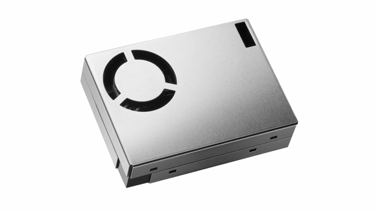
RRH62000 module

Renesas Electronics has introduced the RRH62000, a compact multi-sensor module for indoor air quality monitoring. It integrates particle detection, VOC, and gas sensing with an onboard Renesas MCU for sensor management. The module is designed for use in air purifiers, smoke detectors, HVAC systems, weather stations, and smart home devices.

The RRH62000 is an integrated sensor module that measures key air quality parameters, including particulate matter (PM1, PM2.5, PM10), total volatile organic compounds (TVOC), Indoor Air Quality Index (IAQ), estimated carbon dioxide (eCO2), temperature (T), and relative humidity (RH). These measurements are combined into a single package, with digital outputs available for each sensor, enabling simultaneous measurement. The module features a six-pin connector for easy plug-and-play integration.

The RRH62000 is available with the RRH62000-EVK evaluation kit, which simplifies the testing of the integrated sensor module. The module measures critical air quality parameters and connects to a Windows PC via USB. The evaluation kit includes a USB cable, ESCom board, RRH62000 sensor module, and a Quick Start Guide.

Renesas RRH62000 and RRH62000 EVK

 Renesas RRH62000 module specifications

  • MCU – Onboard Renesas microcontroller
  • Integrated multi-sensor module for air quality monitoring
    • Particulate matter (PM1, PM2.5, PM10)
      • Detects particle sizes from 0.3 µm to 10µm
      • Mass concentration measurement range: 0 to 1,000 µg/m³
      • Mass concentration resolution: 1 µg/m³
      • Number concentration range: 0 to 3,000 particles/cm³
    • Gas Sensor (ZMOD4410)
      • TVOC measurement range – 160 to 10,000 ppb
      • IAQ measurement range – 1 to 5 IAQ
      • Estimated CO2 (eCO2) range – 400 to 5,000 ppm
    • Humidity and Temperature Sensor (HS4003)
      • Humidity range: 0 to 100% RH
      • Humidity accuracy: ±5 to ±7% RH (20% to 80% RH range)
      • Temperature range: -40°C to 125°C
      • Temperature accuracy: ±0.4°C to ±0.55°C (-10°C to 80°C range)
  • Host interfaces – I2C and UART
  • Connector – ACES 51468-0064N-001 connector for data output and power
  • Power Supply
    • Input voltage: 4.5V to 5.5V
    • Current consumption during measurement – Max. 60mA
    • Current consumption during cleaning – Max. 70mA
    • Sleep mode current – Max. 50µA
  • Dimensions – 46.6 x 34.8 x 12 mm
  • Temperature Range
    • Operating temperature: -10 to 60°C
    • Storage temperature: -40 to 75°C
  • Humidity range – 0-90%RH, non-condensing
  • Qualified according to JEITA ED-4701
  • Siloxane resistant
  • Protected module housing
    • Dust accumulation prevention
    • High-speed fan self-cleaning mechanism
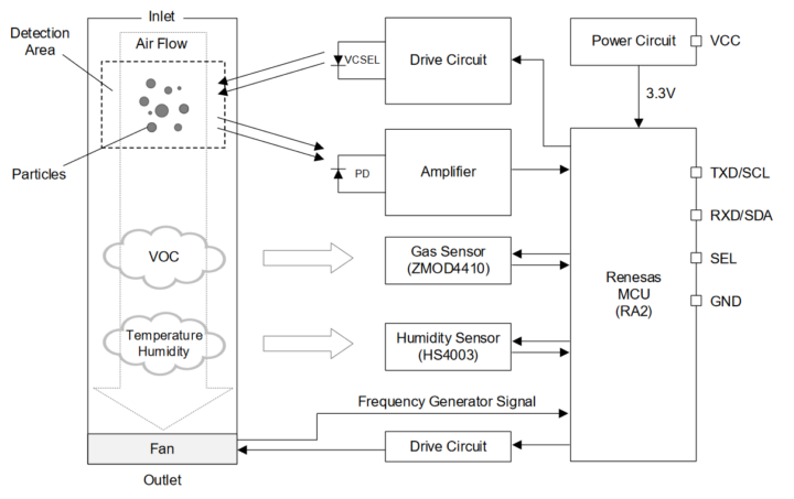
RRH62000 Block Diagram
RRH62000 Block Diagram.

Renesas RRH62000-EVK specifications

  • MCU – Renesas RA4M2
    • Core – Arm Cortex-M33 microcontroller @ 100MHz
    • SRAM – 128KB
    • Code flash memory – up to 512 KB
    • Data flash memory – 8KB
    • Package – 48-pin LQFP
  • Connectivity
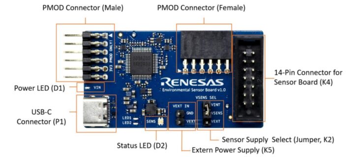
    • USB Type-C connector for connecting the communication board to the user’s computer
    • PMOD Connector (Female) for additional sensors via I2C interface
    • PMOD Connector (Male) for Renesas MCU EVKs
    • 14-pin connector for connecting the environmental sensor boards to the ESCom communication board
  • Compatible Sensors
    • ZMOD4410 & RRH46410 for TVOC, IAQ
    • ZMOD4510 for O3, NO2, OAQ
    • ZMOD4450 for RAQ
    • HS3001 & HS4001 for RHT
    • FS3000 for Air velocity
    • RRH62000 for PM, TVOC, RHT
  • Misc
    • Power LED – Blue when power is ON
    • Status LED –  Blue when ESCom is connected, blinks green when communication takes place
  • Power Supply
    • 5V via USB-C connector for internal power
    • 1.8V to 3.3V supply with external power supply pin
  • Dimensions – TBD
Jumper Settings and Connectors on the Environmental Sensor Communication Board

The RRH62000-EVK software, ES-Eval, provides a user-friendly graphical interface for configuring and evaluating the RRH62000 environmental sensor module. It features blocks for measurement control, sensor selection, algorithm configuration, signal analysis, and real-time data visualization, allowing users to easily manage and monitor the sensor’s performance. The software also automatically checks for and installs firmware updates for the ESCom communication board upon startup, ensuring optimal functionality. Users can download ES-Eval from the Software Downloads section on the Renesas website.

ES Eval software interface

The documentation for the kits includes a quick start manual, a list of components (BoM), circuit diagrams, and PCB design files for development and production purposes. all can be found on their respective product pages.

Earlier, we covered the STM32-based Indoor Air Quality Sensor, which connects to Raspberry Pi or Arduino. We also wrote about the Qsen-07, the AirGradient One, and Studio LUFF’s Air Quality Sensor, which is built around the ESP32-S3 wireless module. Feel free to check those if you are interested.

At the time of writing, I can see that all the major distributors have this board available on their websites including Mouser where the RRH62000 module is available for $38.08 and RRH62000-EVK is sold for $100.

The post Renesas RRH62000 multi-sensor indoor air quality monitoring module features particle, VOC, and gas sensors appeared first on CNX Software - Embedded Systems News.

WiCAN Pro – An ESP32-S3-powered OBD scanner for vehicle diagnostics with Smart Home integration (Crowdfunding)

wican pro

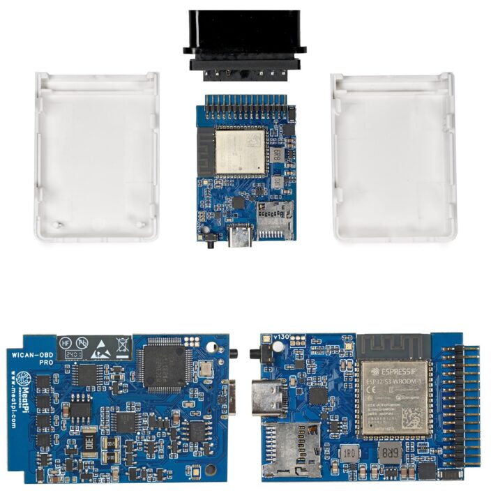
MeatPi Electronics introduced the WiCAN Pro, an ESP32-S3-based OBD scanner, and the successor to WiCAN-OBD. Equipped with an OBD-II interface IC, it provides full support for all legislated OBD-II protocols. It offers compatibility with multiple CAN Bus protocols, including three standard CAN Bus and single-wire CAN Bus.

The previous generation WiCAN module came in an OBD or USB-based version. The WiCAN Pro only has an OBD interface, but another significant difference from the previous product is that it features a USB host port. This port can power USB devices up to 1.5 amps at 5 volts and enables capabilities like adding GPS or cellular-based radios, like with meatPi’s ESPNetLink add-on.


WiCAN Pro

WiCAN Pro specifications:

  • Wireless Module – ESP32-S3-WROOM-1-N16R8
    • SoC – Espressif Systems ESP32-S3R8 dual-core Tensilica LX7 @ up to 240 MHz with vector instructions for AI acceleration, 512KB RAM, 8MB PSRAM
    • Storage – 16 MB flash
    • Wireless – 2.4 GHz WiFi 4 and Bluetooth
    • PCB antenna
  • USB – USB Type-C female connector for flashing ESP32 and optional peripherals such as LTE or GPS
  • Supports all OBD-II protocols with a dedicated chip
    • ISO 15765-4 CAN J1962
    • SAE J1939 CAN J1962
    • ISO 11898 raw CAN J1962
    • Medium Speed CAN MS-CAN J1962
    • GM high-speed J1962
    • Single Wire CAN GMLAN J1962
    • SAE J1850-PWM
    • SAE J1850-VPW
    • ISO 9141-2
    • ISO 14230-4 slow/fast
  • Compatible with multiple instruction sets
    • ELM327 instruction v2.3
    • ELM329 instruction v2.2
    • STN instruction
    • VT instruction
  • RTC for accurate timekeeping
  • MicroSD card logging
  • Multi-function push button

The WiCAN Pro plugs into the vehicle’s OBD port and is powered by the vehicle’s battery. The voltage range is 6.5V to 18V, consuming about 35mA during operation and 2.8mA in sleep mode.

ESP32-S3-based OBD scanner WiCAN Pro PCB front and back
ESP32-S3-based OBD scanner WiCAN Pro PCB

The device includes dual UARTs, one dedicated to flashing and debugging the ESP32-S3 and the other configurable for sending commands to the OBD chip, providing flexibility for developers working on custom automotive applications. According to the product page, WiCAN Pro can be integrated with Home Assistant and other IoT applications without requiring external apps. This feature enables users to incorporate vehicle data into a smart home ecosystem, allowing for automated vehicle diagnostics and monitoring.

Graphical Diagram of ESP32-S3-based WiCan Pro OBD
Graphical Diagram of WiCan Pro

The ESP32-S3-based OBD scanner WiCAN Pro runs on the versatile WiCAN firmware, which is already available and runs on an ESP32. This firmware can send MQTT messages about the vehicle’s health, integrate with Home Assistant, or drive a RealDash display with real-time information. Moreover, this open-source device is compatible with a range of established OBD diagnostic apps including Car Scanner, Torque Lite or Pro, OBD Auto Doctor, BimmerCode, and OBD Fusion.

RealDash dashboard example
RealDash dashboard example. More designs can be found in the RealDash gallery

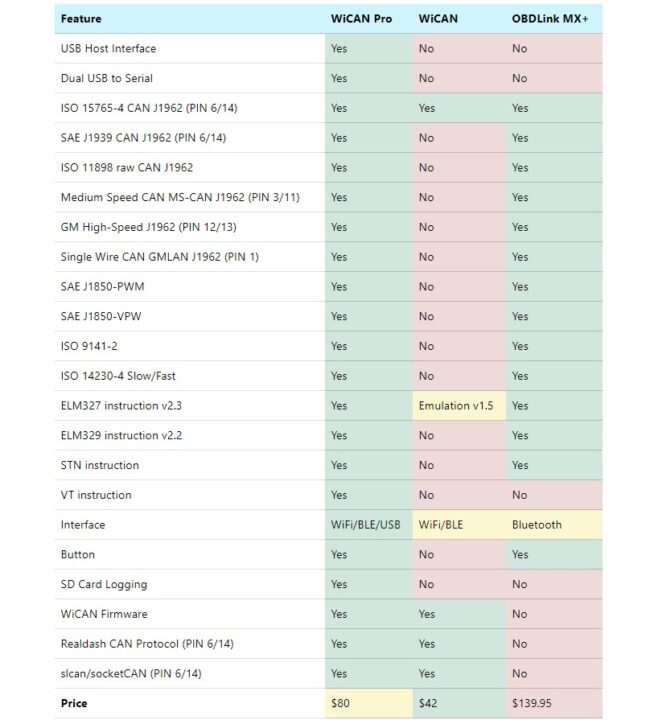
The company also offers a feature comparison between the WiCAN Pro, WiCAN, and the OBDLink MX+.

WiCAN Pro OBD vs WiCAN vs OBDLink MX+

The WiCAN Pro campaign launched on Crowd Supply and has raised $6,000 so far with 35 days remaining. The product is priced at $80, with an additional $8 for U.S. shipping and $18 for international shipping. Deliveries are expected to start by mid-February 2025.

The post WiCAN Pro – An ESP32-S3-powered OBD scanner for vehicle diagnostics with Smart Home integration (Crowdfunding) appeared first on CNX Software - Embedded Systems News.

Poll result: Google’s Pixel 9 weather app is proving incredibly polarizing

Alongside the new Pixel 9 series, Google rolled out its redesigned Pixel Weather app, which aims to please pluviophiles and minimalists alike. Google has a penchant for creating copies of apps it already has, especially since it only recently updated the older weather app. However, Pixel Weather will eventually trickle down to older Pixel models.

Beyond the visual changes, the app also introduces Gemini-powered summaries that reduce the swathe of weather factors and figures into a sentence or two that anyone can understand. The idea is to make checking a forecast as easy as possible without combing through numbers and icons across multiple hours.

That all sounds great, but what do our readers think of the Pixel Weather app?

Yes, the frog is gone

Googel Pixel 9 Pro Fold in hand

Credit: C. Scott Brown / Android Authority

For the most part, the app’s reception has been positive. In a poll visited by over 2,600 readers, 45.4% of respondents like the look of the new app, despite the changes. However, the doubters follow close behind. 38.5% of readers don’t like the app, which once again highlights how divisive app design can be. The remaining 16% of readers are “indifferent.”

The vote is on a knife-edge, but the comments explain why that might be the case. Those in the positive camp are happy with the inclusion of some metrics, like the air quality index (AQI), while others were won over by the “simple looks.” Others were more reductive: “I like it,” writes one reader.

On the other hand, those who dislike the app seem to focus on two absent features. “Noooo, let me keep my frog, please,” cries one reader, while another writes, “I demand for the frog to stay.” Unfortunately, Google’s fan-favorite frog has been relocated from the simplified design, and so has its cutesy, animated, weather-related habitat.

Others lament the lack of a weather radar, which would allow them to view conditions in real-time throughout the day. “As a person who works outside, I just need an easy-to-access radar section. I hate the Weather Channel, but I’m forced to use it because it has the best radar I’ve seen,” notes one user.

My biggest bugbear with the app is its lack of granular information. Yes, it offers plenty of immediate and long-term forecast information, but it lacks extended wind, rain, and pressure visualizations. The movable widgets are also an odd choice. They don’t display as much information as the cards on the outgoing app and take up far too much real estate on screen. If minimalism was the goal, these elements suggest otherwise.

This is a new app, so expect Google to implement updates and tweaks throughout its lifetime. It will be interesting to see which elements the company focuses on going forward.

It’s worth noting that those running Android 14 devices can also snag the APK and experience the app for themselves. I’ve installed it on a foldable, and the hourly and 10-day forecasts are surprisingly serviceable on larger displays. However, owing to the issues I raised in the previous paragraph, I don’t think I’d trade this app for my favorite weather apps anytime soon. It seems many readers feel this way, too.

Poll: How much do you pay for your phone plan every month?

Budgeting for a smartphone is an expensive undertaking. Do you fork out and grab one of the best phones around, or do you opt for something more affordable? There’s a lot to weigh up, but something that isn’t always considered alongside new hardware is the carrier plan. Whether you’re paying off your handset monthly or leaning on those voice minutes or high-speed 5G data, every modern user and handset needs a plan.

We’re spoiled for choice of phone plans in 2024, but one thing’s certain: no one wants to spend more than they really need. With that in mind, we want to know how much you spend monthly on your personal phone plan. We’re only interested in personal plans for a single user, not those covering multiple users or families. How much do you spend per month? Be sure to let us know by voting in our poll below.

We’re well aware that many of the feature-filled plans are priced above the $15 mark. Limited data and other cons often hamstring those paying less. After all, not all of us can afford unlimited plans. Moving to a postpaid plan is often a more attractive arrangement, especially if you don’t require a new handset. There are several plans at or below this price point worth your consideration, as detailed in our best prepaid deals for $15 or less guide.

When we last ran this poll in 2022, most users were paying $40 or more, with the $10 to $19.99 mark also proving quite popular. Importantly, we didn’t exclude family plans from that particular poll, but it’ll be interesting to see how inflation and other financial trends have changed users’ willingness or ability to spend.

Of course, our comments are always open. Be sure to include more details about your particular plan in the comments, including carrier, data, and other limits, and how it has treated you.

Poll result: Galaxy Watch 7’s latest update boosts battery life, but not for everyone

Every new device has its teething issues, and smartwatches are no exception. A few days after its release, the Samsung Galaxy Watch 7‘s battery life became the subject of users’ ire. Many new buyers took to forums and our comments sections to highlight their issues with their wearable’s longevity, with many failing to make it through a day on one charge.

Around a week later, at the beginning of August, Samsung issued a new update that addresses the device’s “battery stability.” That’s pretty vague, but it suggested that the company knew of the issue and implemented a fix — or so it believed. So, did the update improve the situation?

Yes, the update works (for most of you)

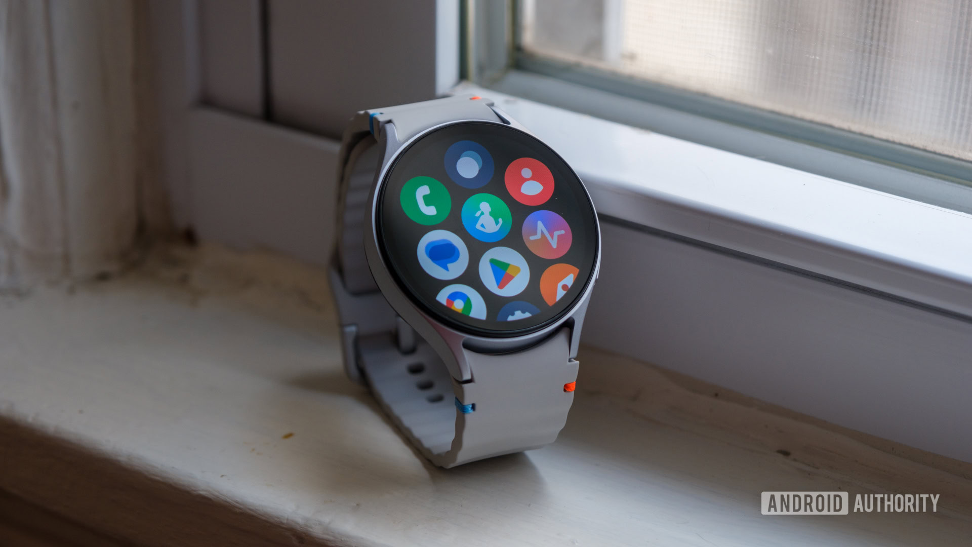
Samsung Galaxy Watch 7 apps

Credit: Ryan Haines / Android Authority

We polled readers about their experience post-update, and well, it’s a mixed bag.

The majority of users (56.1%) believed that the update had improved their device’s battery life to a varying degree. 30.6% were adamant that they’re now enjoying “solidly improved battery life,” while a quarter claimed that battery life is better, but not anything to write home about.

Curiously, just under 9% of readers note that their experience is worse now, while 35% claim that the update did not remedy the problem. These users are in the minority, but more than a third of users claiming that the fix hasn’t actually worked is fairly substantial.

Several readers in the comments section noted that they hadn’t received the update when this poll was published, while others voted only to view the immediate results. This somewhat skews the data. However, some are reaping the benefits of the patch.

“Fixed mine. USA, Watch 7. Was getting about 12 hours of battery life before update. Just got 25 hours with latest,” wrote one user. “I started experiencing the update on my Galaxy Watch 7 after I’d had it about 5 days. Was having to charge it multiple times a day. Charged up before bed, and down to 50% by morning. Finally got the update yesterday morning (Aug 1), and it has absolutely solved the issue. I was able to go all day without a charge. Charged before bed and was still at 91% this morning when I got up.”

Others who have received the patch see no difference. “Got the update and it didn’t make to much of a difference. With only tap to wake up on, I get a solid 2 days on a charge,” wrote another reader.

Remember that the Galaxy Watch 7 effectively comprises four models: two dial sizes and LTE and Bluetooth-only options. Each configuration offers a different battery life. We found that the smallest Galaxy Watch model offers subpar endurance compared to the larger device. While the update might work for one, it may not yield similar results for another.

Nevertheless, the update should be available to all users at the time of this writing, so be sure to let us know your latest experience in the comments section below. If you’re still struggling with your Galaxy Watch 7’s longevity, you might find some joy by following our troubleshooter to remedy your smartwatch problems.

Poll: What are your smartphone dealbreakers?

Even the very best smartphones have their pros and cons. As consumers, we take great joy in outlining the positives and enjoying the improvements or novel smarts an updated model brings. However, it’s the negatives that ultimately make or break a device.

A phone could offer the best-in-class performance, but if limited battery life or overheating tampers the experience, it rather negates the feat. Similarly, there’s no point in boasting a crazy quintuple camera array if all five are ordinary. Some manufacturers nerf some features to cut costs or elevate other models in the lineup.

What is your smartphone dealbreaker?

While some users can live with mediocre cameras or battery life if that means a large display or performant base, each one of us will have a different dealbreaker. So, what is yours? We’d love some consumer input from our readers, so vote in our poll below.

We’ve touched on this topic a few times before. In 2017, two of our primary dealbreakers were the lack of a headphone jack and no water resistance — how times have changed. We also polled readers in 2021, with the majority outing poor battery life and a lack of software updates as their bugbears — two problems that still rear their heads. A low-quality display was also among our readers’ top annoyances, but the issue is largely extinct in 2024.

My biggest dealbreaker is battery life, followed by camera performance and durability. If I forget to charge my phone, I want to ensure it’ll still wake me up in the morning. I’m still clinging onto my older phone because it’s built like a shiny tank, and the camera remains impressive. These might be small details, but they matter to me.

Unfortunately, the poll above allows you to pick only one dealbreaker. Ensure that you really give the topic some thought. However, be sure to leave a comment detailing your choice, or tertiary dealbreakers if you are so inclined.

XIAO RA4M1 stamp-sized Renesas RA4M1 USB-C board features 14-bit ADC, 12-bit DAC, CAN Bus interfaces

Seeed Studio XIAO RA4M1

Seeed Studio has added yet another member to their XIAO board family with the XIAO RA4M1 powered by Renesas’ RA4M1 32-bit Arm Cortex-M4 MCU. This compact board includes 256KB Flash, 32KB SRAM, a 14-bit A/D converter, a 12-bit D/A converter, a CAN bus interface, and onboard charging circuitry. It’s designed for low-power, battery-powered applications.

The company started the XIAO family with the Seeeduino XIAO (Microchip SAMD21G18) in 2020, and since then they’ve made several other variants with different processors including the XIAO RP2350, XIAO RP2040, XIAO ESP32C3, XIAO ESP32S3, XIAO ESP32C6, and the nRF52840-based XIAO BLE. Feel free to check them out if you are interested in these boards.

Seeed Studio XIAO RA4M1

XIAO RA4M1 Specification:

  • Microcontroller – Renesas RA4M1 (R7FA4M1AB3CFM) as found in Arduino UNO R4
    • CPU – Arm Cortex-M4F operating at up to 48 MHz
    • Memory – 32KB SRAM
    • Storage
      • 256 KB code flash memory
      • 8 KB data flash memory
  • USB – 1x USB type C port for power and programming
  • Expansion I/Os
    • 2x 7-pin 2.54mm pitch headers and castellated holes with
      • Up to 11x GPIO
      • 1x SPI, 1x UART, 1x I2C
      • 1x CAN Bus
      • Up to 6x 14-bit analog inputs
      • 1x 12-bit DAC (on D0/P014, not shown on pinout diagram…)
      • 5V, 3.3V, and GND
    • 8x solder pads with
      • Up to 8x GPIO/Digital
      • 1x SPI, 1x UART, 1x I2C
      • 3x 14-bit ADC
      • 1x CAN Bus (TBC)
  • Security – AES128/256, secure boot, hardware encryption, key storage
  • Debugging – SMD solder pads
  • Misc
    • User LED, power LED
    • Reset and Boot buttons
    • RGB LED
  • Power
    • 5V via USB-C port
    • 3.8V battery input via battery pads (BAT +/-)
    • Low current consumption (45μA)
  • Dimensions – 21 x 17.5 mm
  • Working Temperature: -20°C to +70°C
XIAO RA4M1 pinout
XIAO RA4M1 pinout diagram

The XIAO RA4M1, the 10th member of Seeed Studio’s XIAO family, is fully compatible with the Arduino IDE for easy project development and prototyping. It retains the classic XIAO design, making it ideal for space-limited projects like wearables or as a production-ready module for PCB designs. The company provides detailed instructions and a schematic diagram on its wiki page to help you get started.

Seeed Studio sells the XIAO RA4M1 in its official store for $4.99 without shipping charges. The company also provides two 7-pin headers in the package.

The post XIAO RA4M1 stamp-sized Renesas RA4M1 USB-C board features 14-bit ADC, 12-bit DAC, CAN Bus interfaces appeared first on CNX Software - Embedded Systems News.

ASUS N97T-IM-A – A thin mini-ITX motherboard powered by an Intel Processor N97 Alder Lake-N CPU

Asus N97T IM A

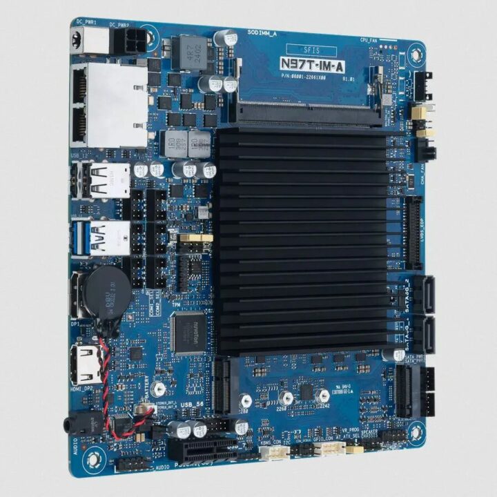
The ASUS N97T-IM-A is a thin Mini-ITX motherboard for industrial and embedded use, featuring the Intel N97 Alder Lake-N processor (4 cores, 2.0–3.6 GHz) with up to 16GB of DDR5 memory at 4800 MHz, and two gigabit Ethernet ports using Realtek RTL8111H controllers.

The board also includes two SATA III 6Gbps ports, a PCIe 3.0/2.0 x1 slot, and dual M.2 slots for NVMe and Wi-Fi/Bluetooth. It supports HDMI 2.0, DP++, and LVDS video outputs, with optional eDP, and can handle resolutions up to 4K at 60 Hz. Built for durability, the N97T-IM-A is designed for demanding environments with a seven-year product lifecycle.

In one of our last posts, we wrote about the Jetway JNUC-ADN1, another Intel N97-powered SBC, but in a smaller Next Unit of Computing (NUC) form factor and the Jetway JMTX-ADN8 another N97 mini-ITX motherboard. Other than that we have also written about similar motherboards in the mini-ITX form factor including ASUS PRIME N100I-D D4Radxa ROCK 5 ITXMW-100-NAS, and ASRock IMB-A8000. Feel free to check if you are interested in mini-ITX motherboards.

ASUS N97T-IM-A Mini-ITX SBC

Asus N97T-IM-A thin mini-ITX motherboard specification

  • SoC – Intel Processor N97 quad-core Alder Lake N-series processor with Intel Gen 12 UHD graphics; 12W TDP; 3.6 GHz Max. Turbo Frequency
  • Memory – Up to 16GB DDR5 @ 4800MT/s with In-Band ECC (IBECC)
  • Storage
    • M.2 Key-M slot for SATA 3.0 or PCIe x2 for SSD
    • 2x SATA Gen 3.0, Up to 6Gb/s (If an M.2 SSD in SATA mode is installed in the M.2 M key slot, SATA port 2 will be disabled)
  • Display
    • HDMI 2.0, up to 4096×2160 @ 60 Hz at 60Hz
    • DP++ 1.2, up to 4096×2160 @ 60Hz
    • LVDS up to 1920×1200 @ 60Hz
    • DP++ 1.4, up to 4096×2160 @ 60Hz (colay with HDMI, optional upon request)
    • eDP up to 4096×2160 @ 60Hz (colay with LVDS)
    • Tripple displays support (HDMI + DP+ LVDS, or HDMI + DP + eDP, DP + DP + LVDS, DP + DP + eDP)
  • Audio
    • Code – Realtek ALC897
    • Default Line-out, switch to line-in by retasking
    • 3.5mm audio jack
    • Front panel audio header
    • Speaker header
    • 2x internal stereo speaker headers (2-pin, supporting 3 watts per channel)
  • Networking – 2x gigabit Ethernet RJ45 ports via Reaktek RTL8111H controllers; WOL/PXE support
  • USB
    • 2x USB3.2 Gen1
    • 2x USB 2.0
    • 3x internal USB 2.0 headers
  • Serial
    • 4x RS232
    • 1x RS232 with Ring/5V/12V select via jumper
    • 1x RS232/422/485 with Ring/5V/12V select via jumper
  • Expansion
    • 1x PCIe 3.0/2.0 slot
    • 1x M.2 E-key socket, type 2230 for WiFi/Bluetooth devices, supporting PCIe x1 & USB 2.0 & CNVI
    • 1x M.2 M-key socket, type 2242/2260/2280 (PCIe x2/ SATA mode) supports NVMe
    • 8-Bit GPIO
    • I2C header
  • Security – SPI TPM header
  • Misc
    • Watchdog Timer
    • Chassis Fan header (PWM Mode)
    • System Panel Header for HDD LED, PWR LED, Power Button, Reset
    • PS/2 Keyboard and Mouse header
    • RTC with lithium CMOS battery
    • Chassis Intrusion
    • Large heatsink for fanless cooling
  • Power – 9V-36V DC-in via DC Jack or  4-pin ATX power connector
  • Temperature Range – Operating: 0 ~ 60°C; storage: -40 ~ 85°C
  • Operating humidity – 10%~95% @ 40°C
  • Certifications
    • EMC – CE, FCC, VCCI, BSMI, RCM
    • Safety – CE-LVD
  • Dimensions – 170 x 170mm (mini-ITX form factor)
Asus N97T IM A Mini ITX Motherboard Block Diagram
Asus N97T-IM-A thin mini-ITX motherboard block diagram

In terms of software, this Intel N97 thin Mini-ITX motherboard supports Microsoft Windows 10 (64-bit) and Windows IoT Enterprise, as well as Linux distributions like Ubuntu, RedHat Enterprise, and OpenSUSE. It also comes with the ASUS IoT Suite, featuring a HW Monitor, Power Scheduling, Fan Control, Watch Dog Timer, and GPIO. The suite provides both API and GUI options for user interface control. The company provides relevant drivers and tools on the product page.

ASUS N97T IM A Motherboard Layout
Asus N97T-IM-A motherboard ports

The ASUS N97T-IM-A thin mini-ITX motherboard is available for $234 including shipping in the official ASUS store. ASUS offers a seven-year product lifecycle for long-term support and availability, along with a three-year manufacturer warranty.

The post ASUS N97T-IM-A – A thin mini-ITX motherboard powered by an Intel Processor N97 Alder Lake-N CPU appeared first on CNX Software - Embedded Systems News.
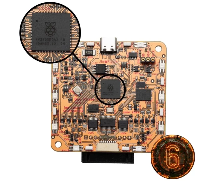
Bus Pirate 5XL and 6 hardware debugging tools utilize Raspberry Pi RP2350A and RP2350B microcontrollers

Dangerous Prototypes Bus Pirate

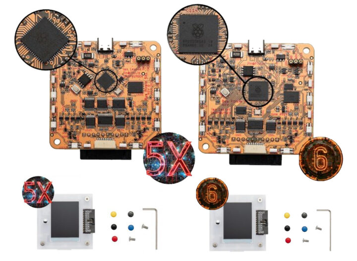
The Bus Pirate 5XL and 6 are open-source hardware debugging tools respectively based on Raspberry Pi RP2350A and RP2350B and designed to simplify interaction with various bus protocols like 1-Wire, I2C, SPI, UART, several LEDs, and more. The idea is to send commands to a chip or sensor and get the response, without writing a single line of code making it ideal for hardware hacking and tinkering.

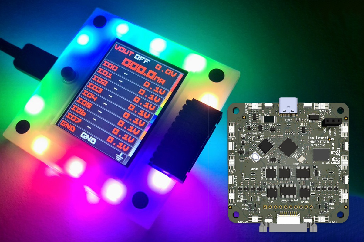
The devices feature buffered I/O pins with voltage and current measurement, a programmable power supply with current limiting, an RGB LCD  for pin status and info, and an auxiliary header for connecting logic analyzers. All these features make this device useful for applications like debugging circuits, prototyping projects, and reverse engineering devices.

Dangerous Prototypes Bus Pirate 5 Board

The new devices are updates to the Bus Pirate 5 based on Raspberry Pi RP2040 MCU. You’ll find Bus Pirate specifications for the three models in the table below.

FeatureBus Pirate 6Bus Pirate 5XLBus Pirate 5
CoresRP2350B ARM M33 x 2RP2350A ARM M33 x 2RP2040 ARM M0 x 2
Speed133MHz133MHz125MHz
RAM512Kbytes512Kbytes264Kbytes
Flash128Mbits128Mbits128Mbits
PIO state machines12128
Flash storage1Gbit NAND (100MB usable)1Gbit NAND (100MB usable)1Gbit NAND (100MB usable)
Look behind buffer8 pins--
Display320x240 IPS all-angle320x240 IPS all-angle320x240 IPS all-angle
IO pins8 @ 1.2-5.0volts8 @ 1.2-5.0volts8 @ 1.2-5.0volts
LEDs18 RGB LEDs18 RGB LEDs18 RGB LEDs
Pull-up resistorsAll pinsAll pinsAll pins
Voltage measurementAll pinsAll pinsAll pins
Power supply1-5 volts1-5 volts1-5 volts
Current sense0-500mA0-500mA0-500mA
Programmable fuse0-500mA0-500mA0-500mA
Bus Pirate 6 RP2350B

The original Bus Pirate was launched in 2008 and became a versatile tool for various bus types like 1-Wire, I2C, SPI, and UART. It offered features like traffic sniffing, frequency measurement, pulse generation, and automatic device identification, and could also be used as a low-speed logic analyzer. So, after this new release, the features are even more advanced and comprehensive.

The Bus Pirate 5, 5XL, and 6 models feature major updates including full-color LCD, and a Raspberry Pi RP2040/RP2350 MCU replacing the older 16MHz PIC24F. It also features PIO blocks used as a “magic peripheral” in place of the PIC’s Peripheral Pin Select capabilities. The terminal interface now emulates a VT100 color terminal with a live status bar. Additionally, it includes 18 RGB LEDs, eight I/O pins with 1.2V to 5V signal levels, analog voltage measurement, and 100MB of flash storage, surpassing the capabilities of the previous V3 model.

Bus Pirate 5, 5XL & 6 VT100 color text terminal
The new Bus Pirate comes with a new interface using color VT100 terminal emulation.

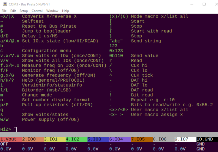
Commands are entered into a serial terminal. A new VT100 mode supports color text and a status toolbar that displays the function and voltage of each pin.

More information about the Dangerous Prototypes Bus Pirate 5, 5XL, and 6 can be found on the company hardware wiki page, additional hardware design files and firmware source code are available on the company’s GitHub page.

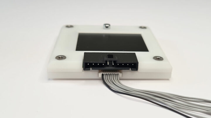
Bus Pirate 5, 5XL & 6 In encloser

Previously we have written about similar hacking tools including the Flipper Zero, HackyPi, CanLite ESP32 board, and more feel free to check those out if you are interested in the topic.

The previous generation Bus Pirate 5 REV10 with enclosure can be purchased from DirtyPCBs for $42.50, and the new models are a bit more expensive at $63.50 for the RP2350A-based Bus Pirate 5XL and $82.50 for the Bus Pirate 6 using the larger RP2350B microcontroller.

Dangerous Prototypes Bus Pirate PCB and Encloser

The post Bus Pirate 5XL and 6 hardware debugging tools utilize Raspberry Pi RP2350A and RP2350B microcontrollers appeared first on CNX Software - Embedded Systems News.

SparkFun Pro Micro – RP2350 development board comes with 16MB flash, 8MB PSRAM

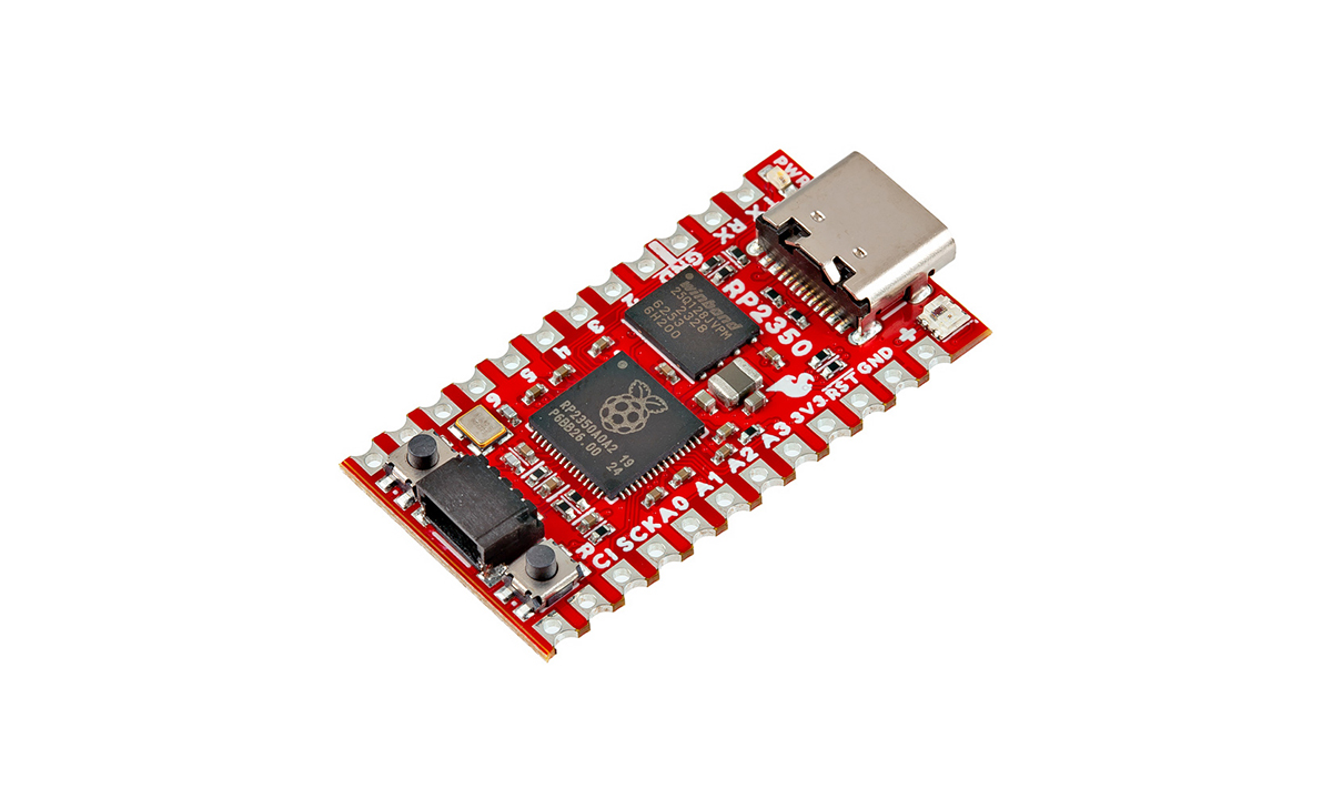
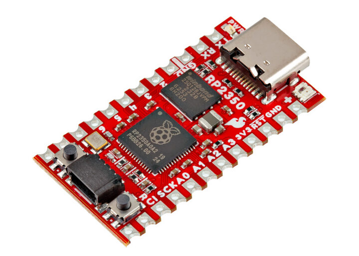
SparkFun RP2350 Pro Micro DEV

The SparkFun Pro Micro – RP2350 is a compact and powerful development board built around the RP2350 chip from Raspberry Pi and equipped with 16MB flash and 8MB PSRAM. It follows the updated Pro Micro design and includes a USB-C connector, Qwiic connector, WS2812B RGB LED, Boot and Reset buttons, resettable PTC fuse, and both PTH and castellated solder pads.

Last week, besides the Raspberry Pi Pico 2, we wrote about more boards with the Raspberry Pi RP2350, like the XIAO RP2350, Solder Party’s RP2350 Stamp, and Cytron MOTION 2350 Pro. Feel free to check them out if you are interested in these boards.SparkFun RP2350 Pro Micro DEV Board

SparkFun Pro Micro – RP2350 specification

  • Microcontroller Raspberry Pi RP2350A MCU
    • CPU
      • Dual-core Arm Cortex-M33 @150MHz with Arm Trustzone for secure boot
      • Dual-core 32-bit Hazard3 RISC-V @ 150MHz
      • Up to two cores can be used at the same time
    • Memory – 520 KB on-chip SRAM in 10 banks
    • 8kB OTP storage
    • Security features
      • 8KB of anti-fuse OTP for key storage
      • Secure boot (Arm only)
      • SHA-256 acceleration
      • Hardware TRNG
  • Memory – 8MB external QSPI PSRAM
  • Storage – 16MB external QSPI flash (W25Q128)
  • USB – Type-C connector for primary power and programming
  • Expansion
    • 2x 12-pin headers with 2x UART, 1x SPI, 10x GPIO (4x used for UART1 and UART0), 4x ADC, I2C, 3.3V and GND
    • Qwiic Connector with I2C connected to GPIO 16 (SCL) and GPIO 17 (SDA) with 3.3V pull-up resistors
  • LED
    • Red Power LED on 3.3V line
    • WS2812 RGB LED connected to pin 25
    • Solder pad for daisy-chaining more WS2812 LEDs
  • Buttons – Two push buttons switch for Reset and Boot
  • Solder Jumpers
    • PWR jumper (closed by default) – controls Power LED circuit
    • SHLD jumper (closed by default) – ties USB-C shield pin to ground, can be opened to isolate
  • Power Supply
    • 5V input via Type-C USB
    • RAW PTH pin (max 5.3V input)
  • Dimension – 33.02 x 17.78mm

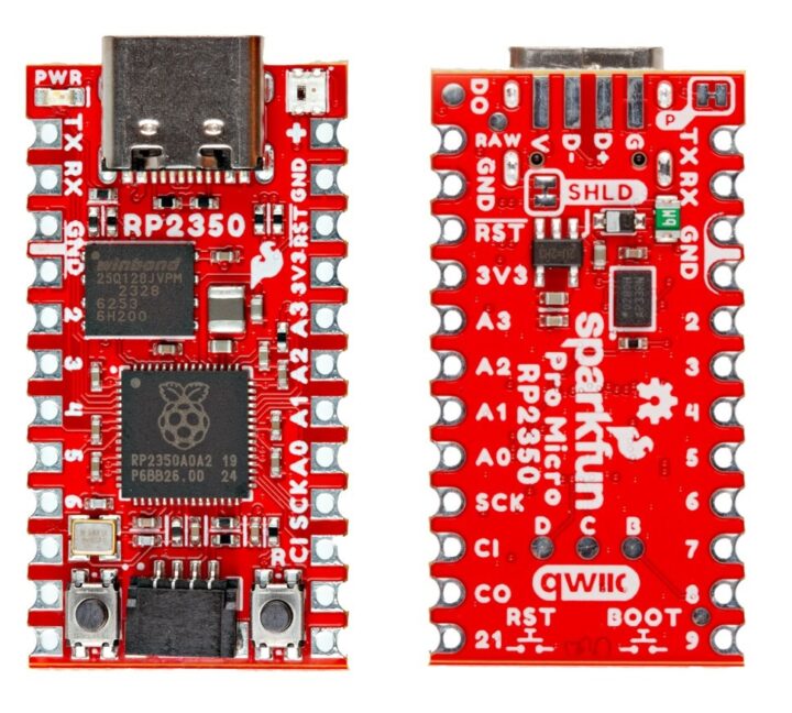
Pro Micro RP2350 Front and back

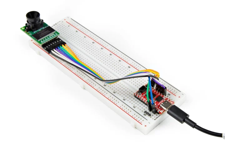
The Pro Micro – RP2350 uses a UF2 bootloader for easy code flashing, appearing as a USB storage device without requiring drivers on Windows, Mac OSX, or Linux. This bootloader supports both Pico C/C++ and MicroPython SDKs. Additionally, the RP2350 is compatible with ArduCAM, and the example page includes a demo code showing how to set up and use PSRAM on the Pro Micro – RP2350 with the Pico SDK used for image processing and transmitting images over USB.

Arducam Raspberry Pi RP2350 board
Sparkfun Pro Micro – RP2350 board connected to Arducam

Like most SparkFun products, the Pro Micro RP2350 is open-source, with schematics, Gerber files, firmware, and other documentation published on the product page and the Hookup Guide page.

The SparkFun Pro Micro – RP2350 development board is available at SparkFun’s official store for $14.95, with discounts for bulk purchases.

The post SparkFun Pro Micro – RP2350 development board comes with 16MB flash, 8MB PSRAM appeared first on CNX Software - Embedded Systems News.

Stellar Blade studio says a PC version is coming 'in the near future'

Korean developer Shift Up has now seemingly confirmed that Stellar Blade is coming to PC, saying in its most recent financial report that a PC release is expected soon.

Stellar Blade launched in April 2024 as a PlayStation 5 exclusive, and was quite well received. We didn't review it—that whole PS5 exclusive thing, you know—but GamesRadar called it "a solid 20 to 30 hours of fun," with "stylish and satisfying combat [and] some gorgeous environments," as long as you could put up with some jank and repetition. It also holds an 81 aggregate score on Metacritic, and that's not bad at all.

Shift Up said it was "considering" a PC version of Stellar Blade back in May, and now in August it's apparently decided to go for it. "To continue the excitement of the ‘Stellar Blade’ IP, we are preparing for its release on PC in the near future, and we expect better results on PC than on consoles," the studio said in its Q2 2024 financial report (via Genki_JPN).

The report is Google translated and that always leaves room for inaccuracies or general wonkiness, but in this case it seems definitive: Stellar Blade is coming our way, and soon. The expectation of "better results on PC" is interesting. Shift Up also said in its report that Stellar Blade sold more than one million copies within two months of its PS5 release, but that sales have declined since then, although it's still selling "steadily." Whether the statement means Shift Up thinks Stellar Blade will sell better on PC than it did on PS5 or simply revive flagging sales, isn't clear, but there's clearly interest in the game on our platform of choice and a PC release is bound to generate a meaningful uptick.

The report also touches on Shift Up's next game, currently known as "Project Witches." Unlike Stellar Blade, that one may come to PC right off the hop: "Based on the success of Goddess of Victory: Nike on mobile and PC, and the success of Stellar Blade on consoles, we are planning to release our next game Project Witches as a cross-platform product." Details on Project Witches are expected to be shared publicly sometime in 2025.

I've reached out to Shift Up for confirmation of the planned PC release of Stellar Blade, and will update if I receive a reply.

© Shift Up

Indiana Jones and the Great Circle is coming in December, drops a big new trailer at Gamescom

Bethesda dropped a new trailer for Indiana Jones and the Great Circle at tonight's Opening Night Live showcase at Gamescom, revealing that the anticipated adventure romp will be out on December 9.

Narrated by Troy Baker, who portrays the famous Dr. Jones in the new game, the new trailer showcases the breadth of Indy's adventures in the new game.

"Mysterious artifacts, cunning villains, ancient discoveries, hard hitting action," Baker says in a voice I can only assume in his own. "It's a world of constant danger where you've got to think on your feet to stay alive. The great circle spans the entire globe, from snake filled jungle temples to scorpion riddled desert tombs. Stunning open areas to explore freely, full of secrets for you to discover."

As a renowned archaeologist, Indiana Jones has more tools at his disposal than just his whip and pistol: He'll also make use of a camera and a journal to track his discoveries and the details found in the world around him, which will be "key to solving the ancient puzzles that hold the secrets you're after."

We took a closer look at what MachineGames is doing with Indiana Jones and the Great Circle in a new Gamescom preview: It's a very ambitious undertaking, but if all the pieces come together, PC Gamer editor in chief Phil Savage reckons "we could be looking at another classic." 

Indiana Jones and the Great Circle is available for pre-purchase now on Steam. Springing for the premium or collector's edition of the game will get you into it up to three days early, along with a digital art book, an outfit, and The Order of Giants story DLC. 

© Bethesda Softworks

Marvel Rivals reveals December release date, Captain America and the Winter Soldier join the team

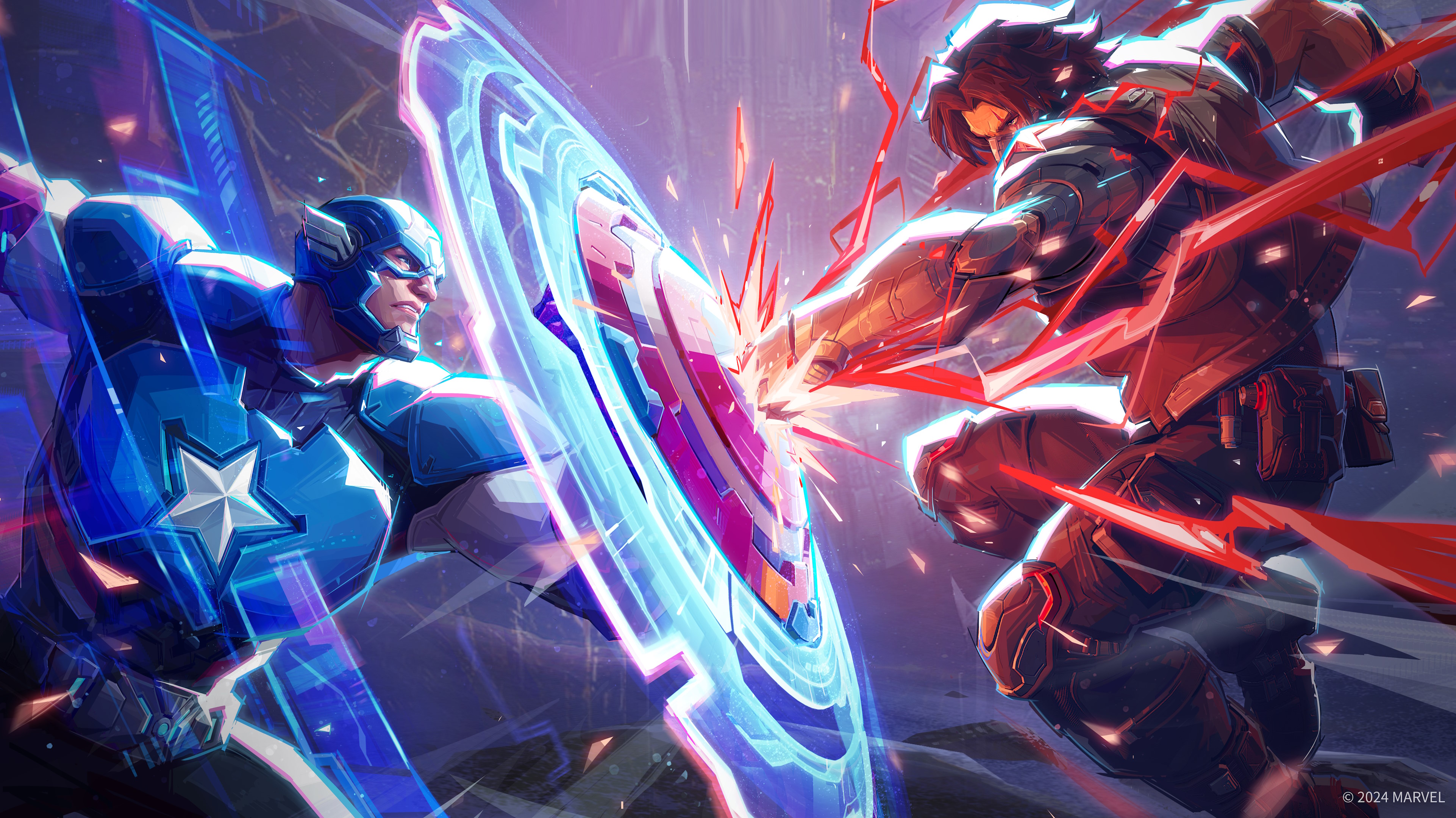
The team-based hero shooter Marvel Rivals dropped a new trailer at Gamescom's Opening Night Live showcase tonight, revealing two new playable heroes and, more importantly, a release date of December 6.

The new heroes, who will be playable at launch, are Captain America—who honestly I'm a little surprised wasn't included right from the start—and his perennial frenemy, the Winter Soldier. Details on the characters haven't been revealed yet, but we'll no doubt be hearing more about that soon.

The bigger deal, of course, is the release date. Marvel Rivals ran a closed beta test earlier this year that didn't exactly knock our socks off—online editor Fraser Brown called it "aggressively bad," while news writer Elie Gould took a more charitable view, describing it as "pretty agreeable" and also noting that it was still early days for the game.

The obvious hope is that developer NetEase has made the changes and adjustments necessary to improve the experience, and the good news is that it won't cost you anything to find out: One big advantage that Marvel Rivals holds over its obvious competitor Overwatch 2 is that Rivals is completely free to play, with all heroes unlocked at launch.

NetEase also confirmed that future Marvel Rivals beta tests are on the way ahead of the full release—you can sign up to take part at marvelrivals.com.

© NetEase

Watch a latex-clad billionaire punch out poor people in the debut gameplay trailer for Batman: Arkham Shadow

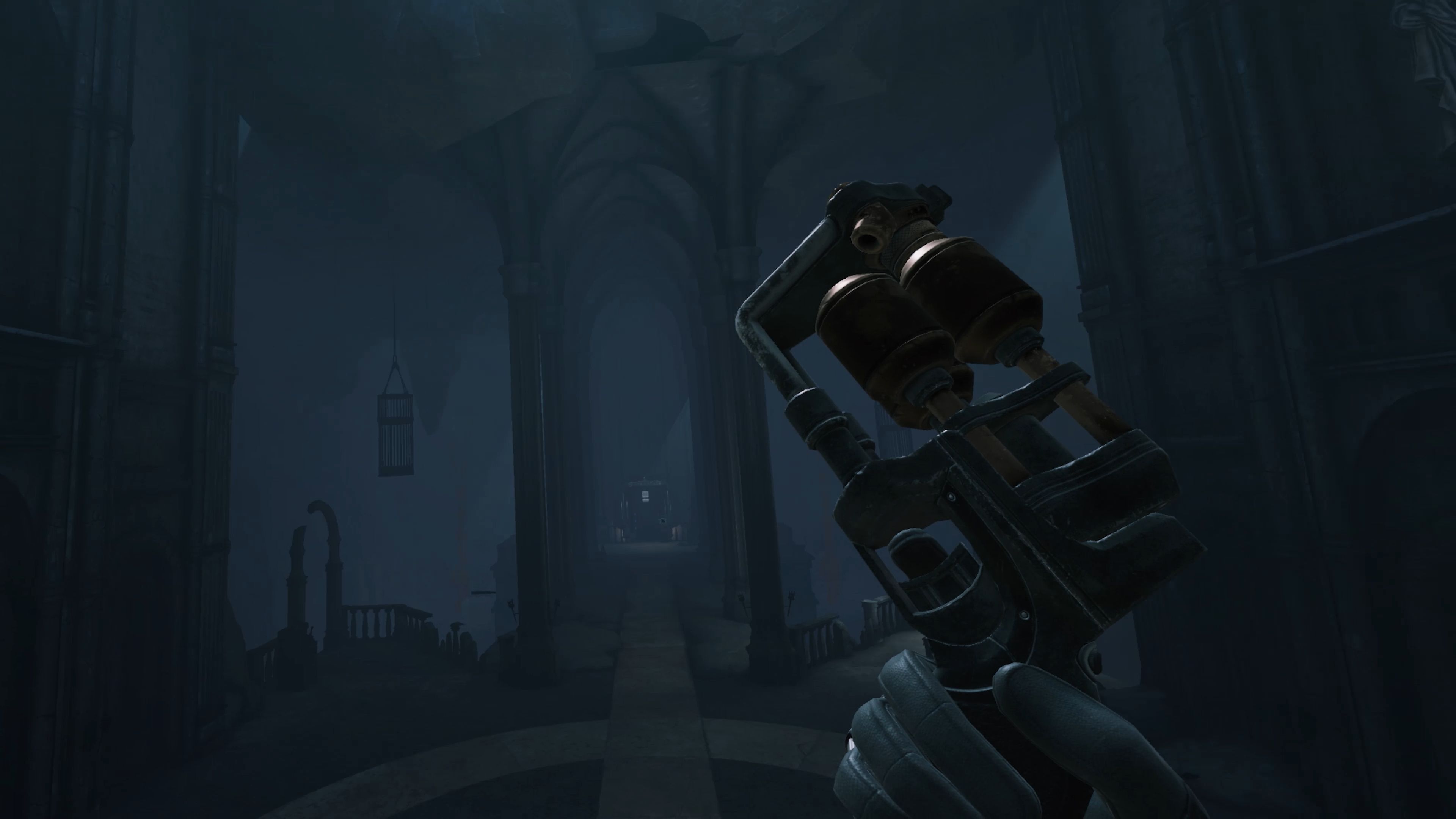
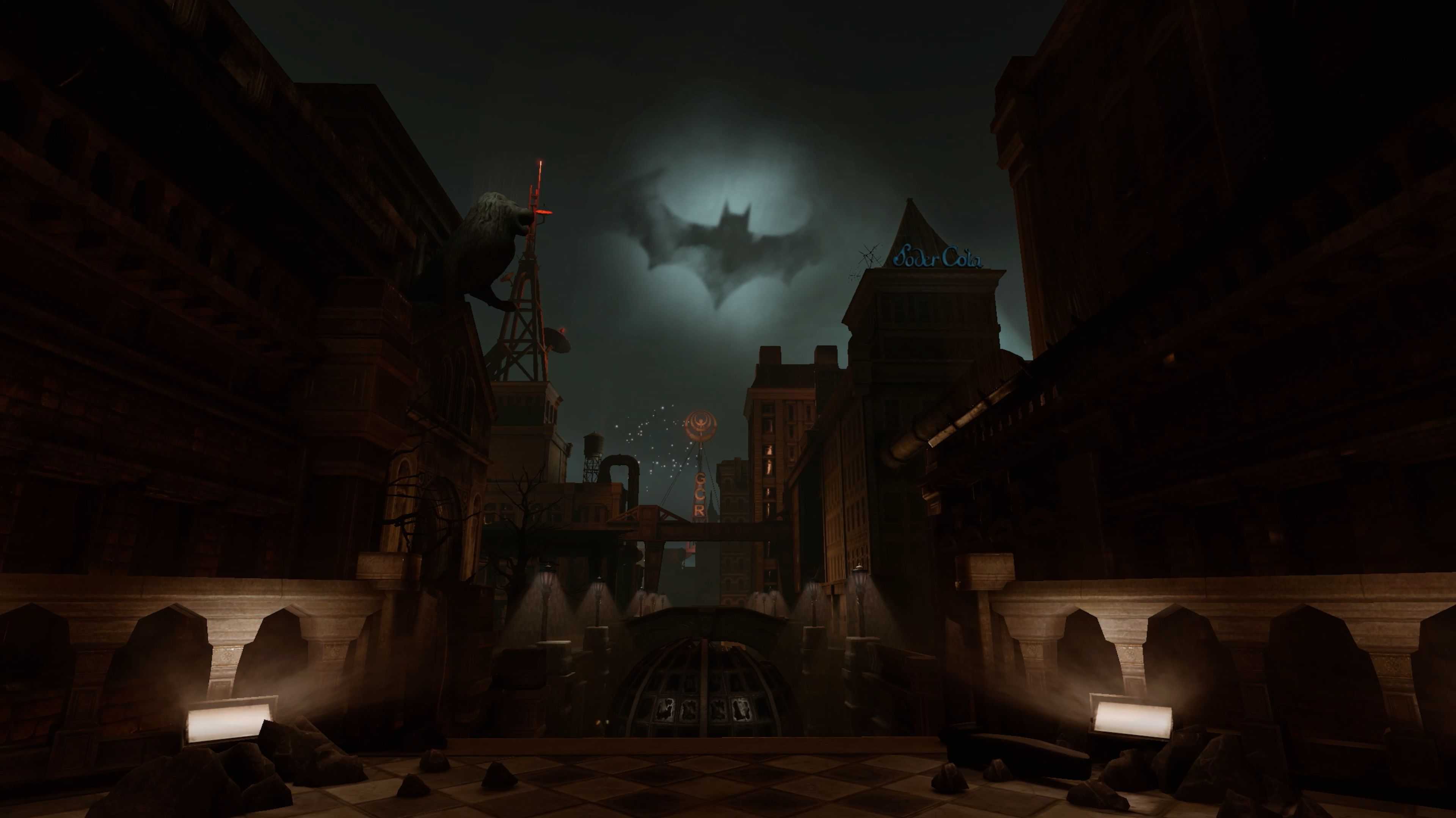
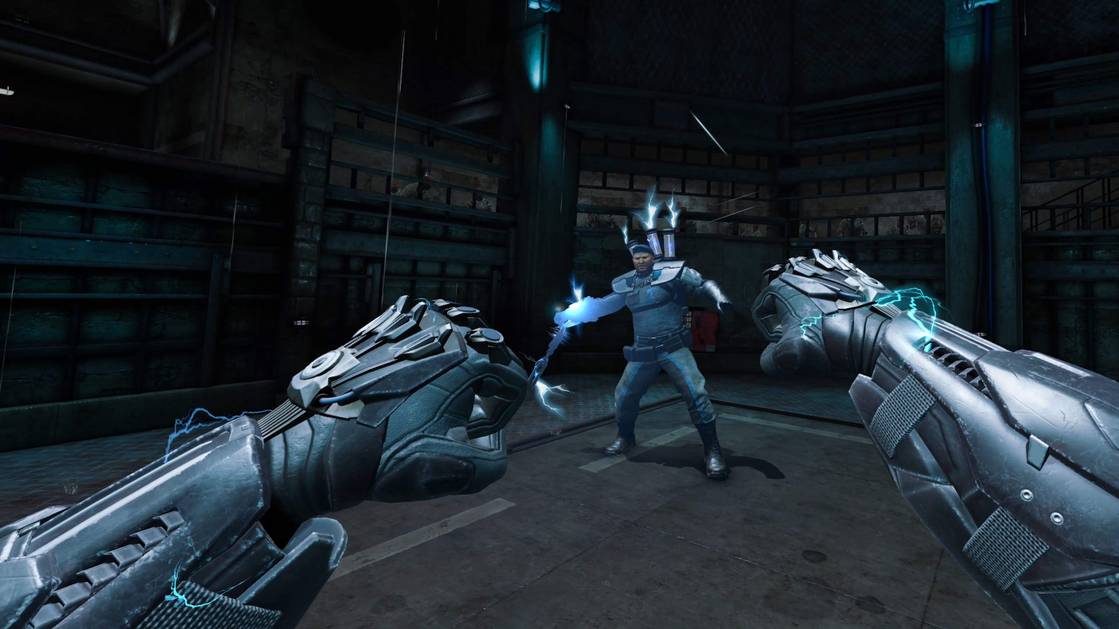
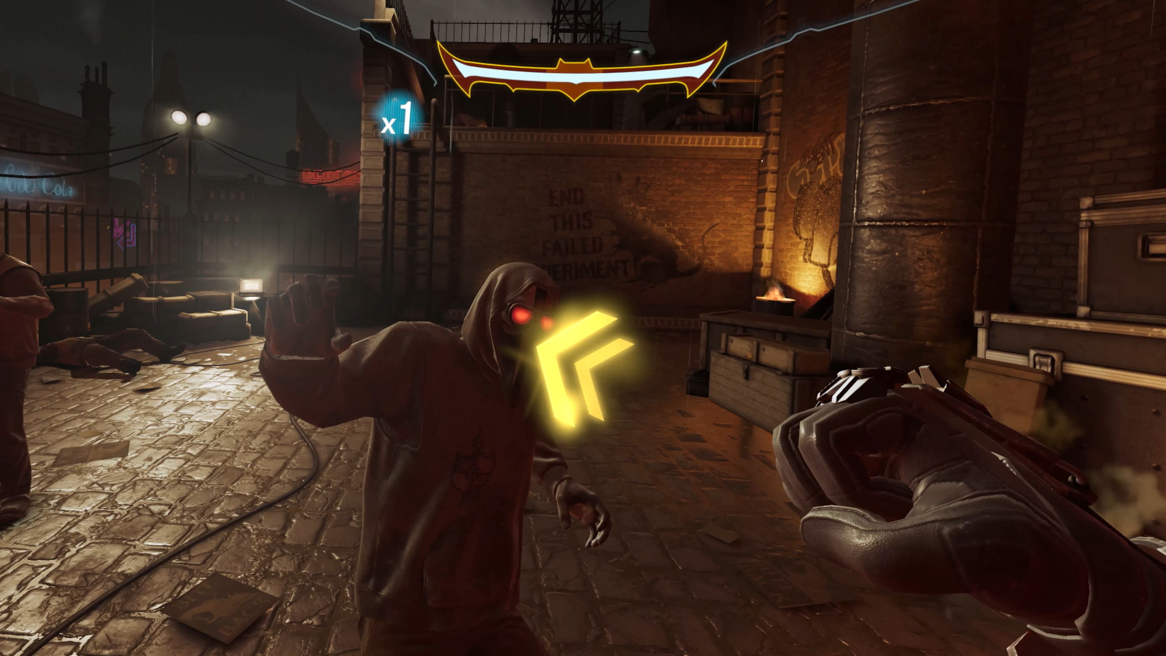
The first-ever gameplay trailer for the upcoming Batman: Arkham Shadow appeared at Gamescom's Opening Night Live showcase tonight, giving us our first proper look at the upcoming VR take on the adventures of the most therapy-averse billionaire in history.

The new trailer focuses on exploration, dialogue, and of course plenty of fisticuffs, as the world's greatest detective whomps the living hell out of dozens of flunkies and underlings on his way to ensuring that nothing ever really gets better in the bleak, crumbling metropolis of Gotham City. 

"A corrupt system has failed you," the villainous Rat King (at least, I assume that's the Rat King) says at one point. "Are you not angry? Fight back!" The man has a point, right? If your life is an endless swamp of futility and hopelessness, and the best the people in power can offer is a sock in the chops from a guy dressed up like a flying rat, well, I think I'd be a little angry about things too.

Anyway, back to the matter at hand. Batman: Arkham Shadow developer Camouflaj says it's "reimagined the core Arkham experience for VR," and was particularly inspired by the "intricate and interconnected level design" of Arkham Asylum. The new game is set between the events of Arkham Origins and Arkham Asylum, and will feature Roger Craig Smith—the voice of Batman in Arkham Origins—in the title role, alongside fellow Arkham veterans Troy Baker as Harvey Dent, Tara Strong as Dr. Harleen Quinzel, Mark Rolston as James Gordon, and Martin Jarvis as Alfred Pennyworth.

"Batman: Arkham Shadow will push Meta Quest 3 to its limits, giving players an up-close look at Gotham City and delivering an Arkham experience that will resonate with longtime fans," Meta said in a press blurb. "We’re very excited about this one, and can’t wait to get it in your hands come October."

Image 1 of 11

Batman: Arkham Shadow screenshot

(Image credit: Camouflaj)
Image 2 of 11

Batman: Arkham Shadow screenshot

(Image credit: Camouflaj)
Image 3 of 11

Batman: Arkham Shadow screenshot

(Image credit: Camouflaj)
Image 4 of 11

Batman: Arkham Shadow screenshot

(Image credit: Camouflaj)
Image 5 of 11

Batman: Arkham Shadow screenshot

(Image credit: Camouflaj)
Image 6 of 11

Batman: Arkham Shadow screenshot

(Image credit: Camouflaj)
Image 7 of 11

Batman: Arkham Shadow screenshot

(Image credit: Camouflaj)
Image 8 of 11

Batman: Arkham Shadow screenshot

(Image credit: Camouflaj)
Image 9 of 11

Batman: Arkham Shadow screenshot

(Image credit: Camouflaj)
Image 10 of 11

Batman: Arkham Shadow screenshot

(Image credit: Camouflaj)
Image 11 of 11

Batman: Arkham Shadow screenshot

(Image credit: Camouflaj)

Of course, most "longtime fans" of the Arkham games won't get much out of this one. Regardless of how good it ultimately proves to be, being a VR game—a Meta Quest 3 exclusive at that—puts it beyond the reach of most gamers. For those packing Meta's latest and greatest VR rig, Batman: Arkham Shadow looks like it might be pretty solid, but after nearly 10 years since the last proper Arkham game, that being Arkham Knight in 2015 (no, I am not counting Suicide Squad here), you can understand why Arkham fans as a whole might be a little disappointed.

A release date for Batman: Arkham Shadow hasn't been set at this point, but it's slated to arrive sometime in October.

© Camouflaj

Borderlands 4 is coming in 2025

One of the worst-kept secrets in videogames was finally confirmed tonight at the Opening Night Live showcase at Gamescom: Borderlands 4 is in development, and it's set to arrive in 2025.

No gameplay was revealed in the trailer, or much of anything else really, but that's definitely Borderlands. And while we didn't know the game would be revealed at Opening Night Live, it's not entirely a surprise. Gearbox boss Randy Pitchford said in June, "I don't think I've done a good enough job of hiding the fact that we're working on something … And I think people that love Borderlands are going to be very excited about what we're working on."

The Borderlands 4 Steam page is already live (it's also coming to the Epic Games Store, but isn't listed there yet), and while it doesn't have much to say about the game—"See if you have what it takes to go down in history as a legendary Vault Hunter as you search for secret alien treasure, blasting everything in sight," which is par for the course for Borderlands—you can at least smash it onto your wishlist. 

"The team and I at Gearbox have a lot we’ve wanted to do with Borderlands since we first introduced the looter shooter genre to the world with our original game," Pitchford said. "All of us at Gearbox have massive ambitions for Borderlands 4 and are putting everything we have into making everything we love about Borderlands better than ever before while taking the game to new levels in exciting new directions."

So, there we have it: It's happening! We'll keep our eyes open for details and share more when we have them.

© Gearbox Software

Microsoft gave Todd Howard an exclusive 1,000-Gamerscore achievement in 2016, and we finally know what it is

There is at least one Xbox achievement that you will never have, and the reason is simple: It was custom made for Bethesda creative chief Todd Howard, and nobody can have it except him. But after years of secrecy, thanks to a discovery by achievement tracker site TrueAchievements (via GamesRadar), we can now at least see what it is.

The story begins in 2016, when Howard was given a Lifetime Achievement Award at GDC. During his acceptance speech, which he reminisced about in a blog post he put up after Microsoft announced its acquisition of Bethesda in 2020, he jokingly wondered how many achievement points a Lifetime Achievement Award was worth.

"At the end of the ceremony, some good friends from Microsoft congratulated me and said they’d find out," Howard wrote. "A few months later I was given a code to a game they had created, named after me and locked to my account. When ran, it unlocks a single achievement—'Lifetime - 1000pts.' It still sits in my list when I check, and I smile every time."

That game can actually be seen at Xbox.com, although of course it's not available for purchase or download. But the achievement text had remained secret until TrueAchievement's recent discovery. "Lifetime," as the achievement is known, "Reflects on the amazing craft of Todd Howard and his team in making worlds as real as any on Earth."

I was a little baffled when I first looked at the achievement, because it was still showing as "secret," and without the reported description. This, a TrueAchievements rep helpfully explained, is the nature of the site. By default, the site does not show unlocked achievement descriptions to people who haven't earned them—and since no one but Todd Howard has earned this one, no one but Todd Howard gets to see it. 

To get around this cheevo secrecy layer, go into your account settings (and yes, you'll need a TrueAchievements account to do this) and select "site settings," then enable the "always show unlocked achievement descriptions" setting. And just like that, there it is.

Todd Howard's

(Image credit: Microsoft (via TrueAchievements))

That's a nice gesture, isn't it? The response to the newly-revealed achievement is quite positive, and naturally—because this is the internet—it has inspired a few users to post guides explaining how to unlock the achievement. Some are quite in-depth, such as one from Cpl Kane ZA, which requires facial reconstruction surgery, a time machine, and a possible murder; others, like paramoreRyan's submission, are more to the point: "Be Todd Howard."

Well, we can't all be Todd Howard, but we can acknowledge that if anyone deserves their own custom cheevo, it's probably him. Howard's list of credits is enviable to say the least, beginning with The Terminator: Future Shock in 1995 and running through Morrowind, Oblivion, Fallout 3, Skyrim, Fallout 4, and Starfield. He's currently serving as executive producer on the much-anticipated Indiana Jones and the Great Circle, and we also maintain hope that he's squeezing some time with The Elder Scrolls 6 and Fallout 5 in there, too.

© Bethesda

Vecow TGS-1000 – A fanless, stackable embedded computer with Intel Core Ultra Meteor Lake SoC

TGS 1000 Series Mini PC

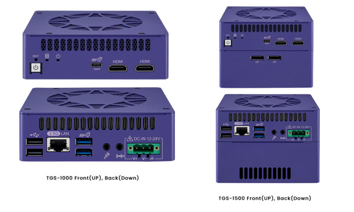
The Vecow TGS-1000 Series is an ultra-compact, fanless, stackable embedded computer that includes the TGS-1000 and TGS-1500 models, powered by the latest Intel Core Ultra Metero Lake processors with integrated CPU, GPU, and NPU. It supports up to 96GB DDR5 memory and stackable expansion options for networking, serial, wireless, and more. This series is optimized for edge AI applications, offering up to 14% increased CPU productivity and enhanced graphics capabilities.

The TGS-1000 Series offers up to five independent displays through two HDMI and three DP ports. It features a variety of I/O connections, including up to 5 USB 3.0 ports (4x Type-A and 1x Type-C) and one 2.5GbE LAN supporting TSN, making it ideal for vision and automation applications. Its modular design allows flexible expansion for USB, isolated DIO, COM, LAN, or 4G/LTE, suitable for AI, smart retail, office communication, and gaming. The TG-1500 series adds support for MXM graphics cards.

Previously, we wrote about the stackable Intel Atom-based industrial mini PC ADLEPC-1520 and the Intel Celeron-based Acer Revo Build mini PC. We’ve also covered other Intel Core Ultra processor-based mini PCs and SBCs, like the DFI X6-MTH-ORN, UP Xtreme i14, AAEON PICO-MTU4, and Vecow SPC-9000. Feel free to check these out if you’re interested in similar products.

Vecow TGS-1000 stackable PC

Vecow TGS-1000 series specification

  • SoC
    • Intel Core Ultra 7 165H 16-core (6P+8E+2LPE) processor @ 1.4 / 5.0 GHz with 24MB cache, Intel AI Boost NPU
    • Intel Core Ultra 5 135H 14-core (4P+8E+2LPE) processor @ 1.7 / 4.6 GHz with 18MB cache, Intel AI Boost NPU
  • GPU
    • TGS-1000 – Built-in processor graphics Intel Arc GPU
    • TGS-1500 – Adds independent MXM Graphics
      • GPU architectures
        • NVIDIA Ada Lovelace/Ampere/Turing supports max 9728 NVIDIA CUDA cores, 384 Tensor Cores, or 76 RT Cores, delivering max 41.15 TFLOPS peak FP32 performance. Suitable for high-performance computing, gaming, and professional applications.
        • Intel Xe HPG microarchitecture is a High-Performance graphics designed to deliver up to 72 TOPS for AI processing.
      • Compact MXM Accelerator
        • NVIDIA MXM Modules – RTX Series: NVIDIA RTX A2000, RTX A3500 Ada, RTX 5000 Ada and Quadro Series: NVIDIA Quadro T1000, Quadro RTX 3000, Quadro RTX 5000.
        • Intel MXM Modules – Intel Arc A370M
  • SIO – IT8659E chipset
  • System Memory – 2 x DDR5 5600MHz SO-DIMM, up to 96GB
  • Storage
    • 1x M.2 Key M Socket (2280, PCIe 4.0 x4)
    • 1x M.2 Key M Socket (2242, PCIe 4.0 x4)
  • Video Output
    • 2x HDMI 2.1 ports up to 4096 x 2304 @ 60Hz
    • 1x DisplayPort (DP) 1.4 up to 3840 x 2160 @ 60Hz by USB Type-C
    • TGS-1500 additional ports – 2x Display Port (DP) 1.4 up to 4096 x 2304 @60Hz by MXM
  • Audio – Realtek ALC888S-VD, 7.1 Channel HD Audio with 1 Mic-in and 1 Line-out
  • Networking – Intel I226 2.5GbE LAN with TSN support
  • USB
    • 2x USB 3.2 Gen 2 Type A
    • 1x USB 3.2 Gen 2×2 Type C (5V/3A)
    • 2x USB 2 Type A
  • Expansion
    • 1x M.2 Key E Socket (2230, PCIe x1/USB)
    • 2x expansion connector for docking module
  • Optional stackable docking modules
    • TGS-101 – 16-bit GPIO
    • TGS-102 – 16-bit Isolated DIO (8 DI, 8 DO)
    • TGS-103 – Type-A MXM GPU (without MXM GPU)
    • TGS-104 – 2 Isolated COM (RS-232/422/485)
    • TGS-105 – Dual USB 3.0
    • TGS-106 – Dual 1GbE LAN
    • TGS-107 – 4G LTE module with SIM socket
  • Accessories module
    • WiFi & Bluetooth module with antenna
    • Mini PCIe 4G/GPS module with antenna
    • M.2 Key-M storage module
  •  Misc
    • Power, HDD LEDs
    • Watchdog Timer – Reset 1 to 255 sec./min. per step
    • Smart Management – Intel vPro, TCC, TSN, PXE, Wake on LAN
    • HW Monitor – Monitoring temperatures and voltages. Auto throttling control when CPU overheats.
  • Power Supply
    • TGS-1000 – DC 12V to 24V with V+, V-, Frame Ground
    • TGS-1500 – DC 24V Only with V+, V-, Frame Ground
  • Dimensions & Weight
    • TGS-1000 – 117 x 120 x 38mm | 900 grams
    • TGS-1500 – 117 x 120 x 88.3mm |  1.4 kg
  • Temperature Range
    • Operating
      • TGS-1000 : 0°C to 55°C
      • TGS-1500 : 0°C to 45°C
    • Storage – -40°C to 85°C
  • Humidity – 5% to 95% Humidity, non-condensing
  • Shock – IEC 61373: 2010
  • Vibration – Rolling Stock Equipment, Shock and Vibration Tests
  • EMC – CE, FCC, ICES, EN50155, EN50121-3-2
Specifications
TGS-1000 (left) and TGS-1500(right)

The system can be wall-mounted with a bracket, and Vecow also offers VESA or DIN Rail mounts as options. The company supports Windows 11/10 and Linux on the fanless TGS-1000 Series embedded system. Vecow also mentions VHub AI Developer, VHub ROS, and VHub EtherCAT as optional software, with OpenVINO toolkits supporting 500+ AI models optimized for AI computing.

TGS 1000 Series
TGS-1000 (left) and TGS-1500(right)

Vecow stackable embedded computer is available in four variants: TGS-1000-165H/135H and TGS-1500-165H/135H. The company hasn’t provided availability or pricing details, but this type of system is expected to cost a thousand dollars and up. More information about the TGS-1000 and TGS-1500 can be found on the product page.

The post Vecow TGS-1000 – A fanless, stackable embedded computer with Intel Core Ultra Meteor Lake SoC appeared first on CNX Software - Embedded Systems News.
MechDog AI Robot Dog features ESP32-S3 controller, supports Scratch, Python, and Arduino programming

MechDog Hiwonder AI robot dog

Hiwonder’s MechDog is a compact AI robot dog powered by an ESP32-S3 controller that drives eight high-speed coreless servos. It features built-in inverse kinematics for precise and agile movements and has ports for various I2C sensors such as ultrasonic and IMU sensors. The robot is equipped with a durable aluminum alloy frame and a removable 7.4V 1,500mAh lithium battery for power.

MechDog integrates with the ESP32-S3 AI vision module, supporting dual-mode network communication either AP Hotspot Direct Connection Mode or STA LAN Mode so that users can access a designated URL webpage via an app or PC for real-time monitoring using a high-definition camera. Also, this robot dog supports various sensor modules, including a touch sensor, light sensor, dot matrix display, and programmable MP3 module, allowing for secondary development and expansion, offering extensive creative possibilities.

Previously, we wrote about the Waveshare UGV AI Rover, which features a 2mm thick aluminum body, six 80mm shock-absorbing tires, and a four-wheel drive system controlled by an ESP32 sub-controller. It uses Raspberry Pi 4B or Raspberry Pi 5 as a primary controller. We also reviewed SunFounder PiCar-X 2.0, an AI-powered self-driving robot car using the Raspberry Pi 3/4 as the main processing board. Other AI-enhanced robot dogs include Petoi Bittle, CM4 XGO Lite, XGO 2, and others.  Feel free to check them out if you are interested in these products.

MechDog Robot Dog

MechDog Hiwonder AI robot dog specification

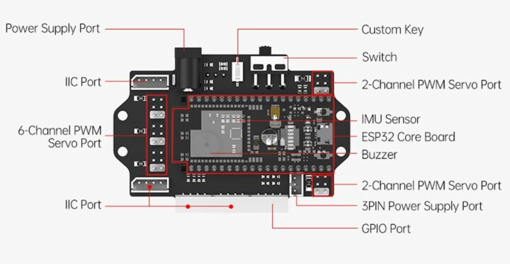
  • Controller – ESP32 High-Performance robot controller board
    • SoC – ESP32-S3 dual-mode SoC chip
    • Build in IMU sensors (3-axis accelerometer/3-axis gyroscope) for real-time posture tracking
    • Interface
      • 1x GPIO Interfaces
      • 4-channel I2C Interfaces
      • 10-channel PWM servo Interfaces
    • Buzzer and customizable button
    • Power ON/OFF switch
  • Degree of Freedom – 8DOF Structure
  • Servo – Hiwonder HPS-0618SG Coreless Digital Servo
    • Rotation speed – ≤0.06sec / 60° 8.4V
    • Stalled rotor torque – 8KG.cm 8.4V
    • PWM pulse width range – 500~2500us, corresponding to 0~180°
    • Rotation range – 0~180°
    • Communication method – PWM pulse width control
    • Gear type – stainless steel gear
    • Line length – 180mm
    • Working voltage – 6V-8.4V
  • Sensor – Glowy Ultrasonic I2C (0x77) sensor with a 2 to 400cm range
  • Expansion
    • ESP32-S3 AI Vision Module
      • ESP32-S3 chip with Internal 512KB RAM and External 16MB PSRAM
      • Flash memory – 16MB SPI Flash
      • Camera – 2-megapixel (320×240) camera with 123° field of view
      • Connectivity – 802.11 b/g/n Wifi 4 and Bluetooth 5, Bluetooth Mesh
      • Port – UART, I2C
      • Power supply – 4.75V – 5.25V
    • MP3 Module (I2C) for MP3, WAV, WMA format audio
    • 8×16 Dot Matrix Module with 8 levels of brightness
    • Touch sensor to light up the LED when touch is detected
    •  Light sensor –  includes QT523C photodiode and LM358 chip voltage comparator
  • Battery – Removable 7.4V 1500mAh 5C lithium battery
  • Power – 8.4V / 2A charger
  • Dimension – 214 x 138 x 126mm (when it is powered on) and 214 x 96 x 126mm (when it is power off)
  • Weight – About 560 grams

ESP32 Robot Controller

Hardware and expansions Gears
Hardware and expansions

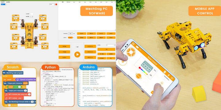
MechDog open-source robot dog supports Arduino, Scratch, and Python programming, allowing versatile project development. You can attach various sensors to enhance its perception and AI capabilities. The visual PC action editing software lets you set end coordinates for each leg, while the app offers 16 preset actions for easy control. Arduino, Scratch, and Python programming provide flexible and accessible development options.

MechDog Software

The company provides essential tutorial videos on getting-started guides, app control, and programming. You can also find all specifications, schematics, PC software, mobile apps, demo programs, firmware flashing tools, and firmware on the Hiwonder download page that points to a Google Drive share…

Hardware Structure

The MechDog Hiwonder AI Robot Dog kit is available in two packages in all stores. The standard kit is priced at $299.99 on Amazon and $428.66 on AliExpress with shipping charges, and you’ll also find the advanced kit adding optional sensor modules on the same pages for respectively $399.99 on Amazon and $556.17 on AliExpress.

The post MechDog AI Robot Dog features ESP32-S3 controller, supports Scratch, Python, and Arduino programming appeared first on CNX Software - Embedded Systems News.
Street Fighter 6 – M.Bison Returns

The Day Bison Graced Street Fighter 6 Was The Most Important Day Of Your Life. To Him, It Was Tuesday!  

Well more accurately it was a Wednesday. Paraphrased Raul Julia quotes aside, on the 26th June year two of Street Fighter 6 kicked off. What a way to start the year too with the revival of one the series most iconic villains. 

For those in need of a recap on the quite frankly ludicrously deep lore and story in the Street Fighter series. The last time we saw M.Bison in Street Fighter 5 was under a pile of rubble after a climactic fight with Ryu, presumed dead of course! This is not M.Bison’s first rodeo in falling off the mortal coil though, so we shouldn’t be surprised on his return.

The M.Bison we received has seen quite the redesign. He is an amnesiac fuelled by psycho energy with a thirst for power, in search of his lost name and personality. His introduction into this world is naked in an alleyway being assaulted by thugs. Surprisingly the thugs meet a quick demise and M.Bison repurposes their possessions to reclaim his dignity. A tattered rag fashioned into a suitable menacing hooded shoal covering an almost zombified face warped by psycho. His bottoms are a stark reference to his former position of power, with a look most will recognise. The new style may not be for everyone but the evil drifter look really does it for me. To those who disagree the classic iconic costume is available to unlock, or purchase.

His fighting style is what we are familiar with from previous series entries. Heavy and brutal close up attacks with brilliant mid to long range capabilities with his signature Psycho Crusher. The aforementioned move can be pulled off with one button now thanks to modern controls. Making one of the series most famous moves accessible to all players.

World Tour players will be happy to know that M.Bison will become your master albeit after a fair few prerequisites. Any would be pupils are sure to rejoice when causing psycho based havoc on the denizens of Metro City after his teachings.

This explosive start to year two is exactly what players like me wanted. The future of Street Fighter 6 is looking extremely healthy with the crossover characters Terry and Mai from Fatal Fury, as well as the capoeira master Elena. Certainly a lot to look forward to in one of the premier fighter game franchises.

Oh did I mention M.Bison has a horse. You know, like Raul Julia did portraying him!     


The post Street Fighter 6 – M.Bison Returns appeared first on GameHype.

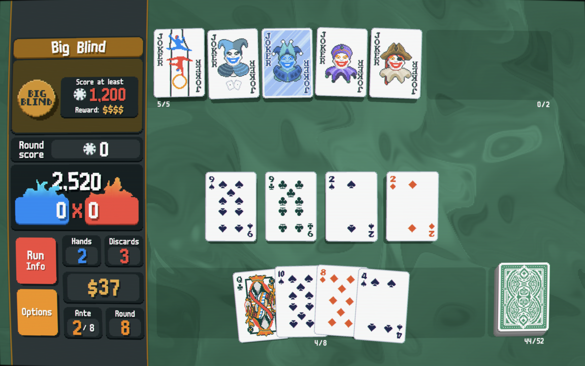
Balatro

THE HOUSE ALWAYS WINS … BUT ITS FUN TRYING!

Balatro is a unique poker themed deck building roguelike created by solo anonymous developer Local Thunk. Released on all current home consoles and previous generation entries for both Sony and Microsoft users. A release is also in the works for smartphone users both on Android and iOS, however no date has currently been announced. For the sakes of this piece I found myself gravitating towards the PC Steam (specifically on the Steamdeck & Mac port) & Nintendo Switch releases.

Going back to the first line I’m aware I used a lot of word to describe the genre of the game. As gamers we are very used to hearing FPS or RPG and getting it. This beast is a little more difficult to put in a specific corner like a lot of other games. I guess if pushed I would call it a card game but that’s severely underselling what Local Thunk has offered us here. It feels almost Slay The Spire like without the action and gambling instead of dungeon crawling; even that feels like a slightly inaccurate description. Now we are all positively confused we will delve into the core game play loop as that’s what makes or breaks a roguelike. 

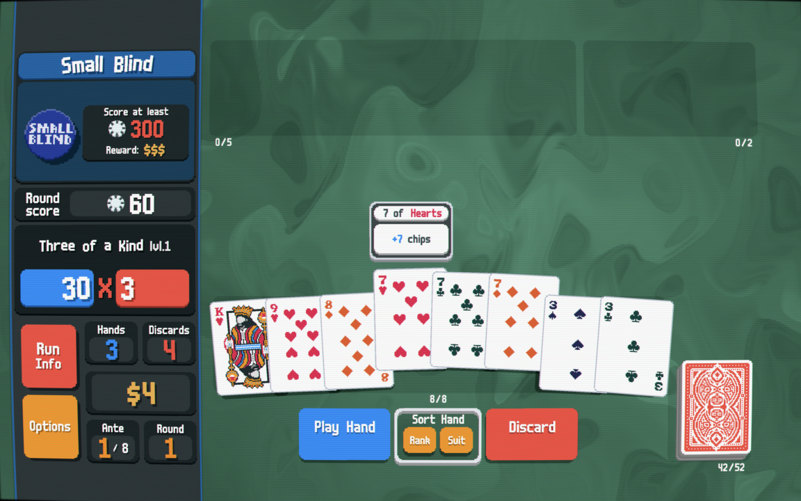
Upon starting a run you are faced with a screen giving you details of a small blind, big blind and boss blind. Each blind with all intent and purpose is a game of poker with the goal of how many chips you need to win to either progress or meet your inevitable end. Tasked with going from small blind to boss blind you are presented with the option, play or skip. You choose play and the casino classic begins your hand dealt and ready to place a scoring collection of cards from your hand. Skipping will give you a small bonus ranging from profoundly trivial to game saving. To those with no to passing knowledge of the light flashing, tinnitus inducing parlour game extraordinaire that is the house fear not, at all times you can hit run info to be told what a flush is and how good at making money it is or not. You will have a couple of hands to try and hit the blind chip goal, also some discards to try to curate your plays as best you can. Try that one in the Casino, I dare you. Then you go to play your first hand and its important to remember its you versus the dealer, so no need to practise your poker face with this one. Fingers crossed you drop down a royal flush typically the highest scoring hand and decimate the first, potentially last actual poker game of the run.

After a fleeting moment of Im James Bond in certain Royale film passes, a breakdown of how you played and cash earned will show with a invite to a shop. Offers of Jokers, Card Packs, Consumables & Vouchers will greet you will open arms. 

Jokers act as passive buffs to equip, the most basic of which is a simple addition of a 4 times multiplier. The rarer joker cards afford you increasingly crazier passive effects. An early favourite of mine the “Shortcut” joker, allows you to play non consecutive straights (For the uninitiated a straight is a consecutive hand 2/3/4/5/6 for example; this would allow 2/4/6/8/10 to count as a straight).

Vouchers are small passive bonuses the aren’t equipped like the jokers. So you don’t have to manage the number you are using at once unlike a joker. They will tend to set you back a bit more money than a joker as they offer upgrades to your run that are often unconditional. 

Card packs are similar to a pack of ‘Magic The Gathering’, could be gold could be trash. Different packs exist that could populate the shop. Celestial packs grant a planet card which increase the level of a poker hand making it a more valuable hand.  This can snowball to the point where a pair hand is a more fruitful play than a royal flush hand. The Arcana pack will grant you tarot cards which have altering effects that mostly modify the cards in your deck. The World card as a quick example changes up to three selected cards to the suit of spades, now your deck is more likely to get a spade flush. Spectral packs are very similar to Arcana packs but the cards modify to a much higher extent and often come with gambles or disadvantages. The Buffoon pack is a collection of joker cards which we touched on earlier. Standard packs give you the option to add a playing card to your deck. Want an extra king you got it, some more aces your in luck. See I told you Balatro was a deck builder and now you have decks that can play impossible hands such as five of a kind.

Adding to the deck building mechanic is variables that can effect any card. A foil card which will give you extra chips if played. A purple seal that can help generate you extra tarot cards if said card is discarded. With much more effects available. A personal favourite of mine is the polychromatic which gives you a multiplier of your multiplier in game, which if on a suitable joker can help send your chips into the stratosphere.  

There is a good chance you have come across a hard synergy and blinds are being blown away by you. Dropping a pair with a joker that multiplies your spade cards and would you look at that, the pair has a spade in it. Chips are piling in and it feels good, a little too good. The next hand you drop has literally set the score counter on fire it was so good, the grey matter in your head washed with dopamine.  That fun needs to come to an end with the boss blind.

Boss blinds play the same way as any other blind with an extra mechanic that can act as real roadblock. The extra mechanics range from debuffing certain suits to expecting a seriously high amount of chips from you, or giving you your cards face down to let luck fully decide the fate of this run. If the boss blind is overcome you will up your ante where we continue play with higher amounts of chips required and potentially more brutal boss mechanics.

Managing to get through eight antes will be a victory for the run. You will be feeling like a champion amongst the cards. Then Balatro offers something that normally turns me totally off in roguelikes, an endless mode. In my experience what tends be a monument to tedium, as your indestructible build melts anything that attempts to pose a threat. In the case of Balatro you have nothing to fight its just the draw of the cards and increasingly higher numbers of chips to chase to really test how good your deck actually was. Now at this point its important to say, you will lose. The house always wins in endless mode, its just how much of a fight your deck can put up. The inevitability of your upcoming failure is what to me makes this post game victory lap truly thrilling. It is a testament to Balatro and its quality that it made a fun yet maybe inaccurately named endless mode.

The more hands and runs that are played the more cards are unlocked to play with offering further chaos with potential synergies. Extra decks can also be unlocked that play different right from the start of the run.  Those who need a bit more spice will look forward to unlocking the challenge runs. These start with a set of cards or jokers with a designed mechanic either to battle for or against you during the run. Pre-designed mechanics not your cup of tea but want further challenge? After having a successful run you can increase the stake of your deck making the next run harder in some way. 

If you don’t want to fully commit to unlocking everything the game has to offer, an unlock everything option is available. I don’t know how much I would recommend this for new players as it could be a little too much at once. Alas for console hoppers like myself, its a great option for veterans of Balatro to jump into a fresh save on another platform with everything ready to go. If you also like playing online slots, you can download joker123 apk.

Balatro has a truly unique game feel that I have personally never experienced. With a fitting art style of a seedy video poker machine on a CRT it evokes that gambling feel. It’s endless amount of build possibilities will keep you coming back for more. With it’s easy to pick up hard to master gameplay, Balatro really captures that one more run feeling that any rougelike worth its salt needs. A game like Balatro doesn’t come round often so if you take anything from me go play it yourself. Your experience will be worth more than anything I can put into words, trust me.

The post Balatro appeared first on GameHype.

Review – Seed Of Life (Nintendo Switch)

A Puzzling Port…

Seed of Life is a adventure/puzzle game developed by Madlight and originally released on PC. Working on the console ports was NXY Digital LTD, which is the release I’m currently having a look at on Nintendo Switch. Set in a dystopian world, in which our protagonist Cora must save the planet. Will ‘Seed Of Life’ germinate into something beautiful or should it be left as bird feed? Let’s find out!We launch into the world of Lumia, which is a dying planet. To make things worse a looming dying star dominates the atmosphere, think more giant blue-fiery spacehopper, less famous Zelda scenario. We meet our protagonist of the piece: Cora as she is monologuing about the poor condition of her home planet. Cora also refers to her rather unhelpful Grandpa who “doesn’t tell me things” (her words, not mine). Despite the lack of ‘things’ Cora has been told, she has seen ‘The Seed’ which she believes can bring back life and cure the quarrelsome inconvenience of her dying planet and sun.

With the ‘save the world’ plot laid out and the speech over, we take control of Cora and walk her outside her quaint looking medieval cottage into the wasting away Lumia. Thrust out into adventure we begin to explore our surroundings; exploration is very much the name of the game here. In the introductory area you a met by a number of interact-able objects marked with a helpful red ring; upon interacting, Cora will dive into soliloquy to add extra flavour to what seem rather bland surroundings. A nearby lantern that Cora began tapping on after a contextual button press, produced a pop up that felt suspiciously like a budget game achievement (Very much confirmed viewing Steam Achievements). Wandering shortly past the area directly outside Cora’s house you’re greeted by a bandstand like gazebo known as a pedestal. Pedestals act as the in game checkpoint system and will also refill Cora’s health and resources. The boundaries of the pedestal’s locale are blocked by a purple barrier. Disabling the barrier requires Cora to find what I can only describe as a terminal that gives Cora a ‘Petal’ and disables the barrier.

At this point approximately 4 minutes into the game I ran into a giant roadblock. I had no clue where to go and found myself aimlessly wandering for significantly longer than necessary. The game at the start at least does not hold your hand in the slightest, the only suggestion given to you is an objective to cross the river; no map, objective marker or magic breadcrumb trail. Usually I am a fan of games with no maps forcing you have to learn yourself picking up clues from the detailed environment or riddles by estranged NPC’s. The environments sadly do not provide the detail needed for any self driven adventure. Moving onto the graphics, If you are old like me, you think back to the good old days playing deathmatch on Gridlock in Gears Of War. The first couple of seconds may come to mind. To the uninitiated or frightfully young, the first moments of a match the textures are loading in. Thus making an otherwise great looking game momentarily look like play dough. I bring this up as the entirety of this port of ‘Seed Of Life’ looks like textureless plasticine. The mountains and hills are brown and orange lumps of nothingness. Foliage is reduced to extra low pixel count sprites, which could be passable if it wasn’t populating a 3D world. Cora herself has a model that would have been heavily criticised anytime post PS2 era, with no real detail to enunciate who she is as a character. The E-Shop blurb of this game claims “Triple-A Quality Graphics”. That quote must be a copy and paste job from the PC synopsis, as I failed to find the blockbuster visuals.

The poor graphics make traversal of this land a lot harder than it should be. Passages within the mountainous terrain just seem to blend into the bland scenery. During my playtime I missed many routes, unable to make out they even existed until I started wall hugging as a last resort. After tedious and poor first impressions of this game I crossed the river which I was initially tasked. Cora suddenly dives for cover as alien ships are seen flying over the skies above. Drones drop from the craft making Cora want to investigate.  The path further travelled reveals the drones, insta-kill guardians to the first power up the world has to offer. Surrounding the drones is a huge red circle of vision, goodnight Cora if she steps within. I don’t want to use the term stealth mechanic, as it was a ‘don’t go in the red circle’ and nothing more. Navigating past the circles of doom Cora picks up the Talisman. This shows in numerical form Cora’s health, Lumium (energy) and objective marker compass on her back. It screams of an earlier time in game development when UI elements were desperately trying to be hidden. Somewhat confusing considering the games interface already has two icons displaying health and Lumium in a stylised manner that looks infinitely better. The Talisman also gives Cora the ability to push away the killer drones, if she has the Lumium to do so.

Luckily more power ups are available to Cora to help traverse Lumia. They are acquired from larger pedestals that Cora can interact with; upon doing so, a small alignment puzzle presents itself. These puzzles felt quite basic considering the genre of game; after a quick circle spin, you can use your petals previously collected. When the power-up pedestal is satisfied with the amount of petals offered, the power up is yours for the taking. The first of which allows Cora to see invisible platforms in the world at a hefty cost of Lumium. A larger maximum pool of this resource can be extracted from Lumium plants dotted through out the land; more Lumium allows Cora to use her power ups for longer, unlock various doors and landmarks. However rather unexpectedly it introduces a souls-like mechanic, where if Cora fails to make it back to a pedestal alive she will lose her newly extracted maximum capacity of Lumium, forcing you to go hunt the plants once again; luckily they are stationary and visible with Cora’s vision ability. 

I suffered the most from my least favourite mechanic in the game, the corruption. Areas with corruption will slowly chip away at Cora’s health until she succumbs to the sweet release of death. The major issue with this is not all corrupted areas have a visual style suggesting they are dangerous, resulting in health decreasing seemingly at random. The corruption can be staved away using a regeneration power or standing by a Lumium plant. This should regenerate Cora’s health if it hasn’t recently been extracted. In my case the Lumium plants didn’t always offer the restorative qualities promised to me and Cora would pass away in what should have been a safe zone. The corruption just adds a ticking time bomb to you which in more open areas just adds stress rather than enjoyable exploration. It felt like a padding mechanic as I never had time to plan my route of traversal, making me use the tactic of running Cora in a random direction trying desperately to memorise anything of value. Open areas of ‘Seed Of Life’ are where the cracks of this port really start to show. Lets get this straight, none of what I played had a particularly great frame rate, but it was at least playable, however in the larger environments the frame rate can dip quite harshly. If an enemy, object or invisible platform is in one of these areas, the frame rate can plummet into single digits. If you have the displeasure of being in a platforming section when this happens, the game feels totally unresponsive and you will end up sending Cora to her gravity based demise. The combination of the time bomb styled corruption, formless graphics and technological shortcomings was enough for me; I had to stop playing this game.

‘Seed Of Life’ was released previously on PC so I opted to look at video footage to vicariously experience more. A lava biome with more involved platforming and puzzles looked like a promising slice of gameplay. Performance on PC was significantly better with more detailed visuals, at least from what I was seeing; which lead me to the question was the port poorly optimised, or is the Nintendo Switch showing it’s age?

The post Review – Seed Of Life (Nintendo Switch) appeared first on GameHype.

Has Google ruined Fitbit?

I got my first Fitbit nearly a decade ago. Back then, you could argue that Fitbit was a proprietary eponym — a brand name that inadvertently became synonymous with similar products due to its success or popularity. This couldn’t be further from the case in 2024. The company’s decline started well before Google’s acquisition three years ago, but stalwart Fitbit fans will argue that Mountain View’s influence is the reason for its continued downfall. I’d argue that it’s a little more complicated than that.

When Fitbit was founded in the late 2000s, it was one of a few companies that seriously considered the fitness tracker space a budding technology segment. Initial products weren’t feature-packed, but the brand built a loyal following by introducing heart rate tracking technology at a time when few other consumer products did. Following its growing success, Fitbit listed publicly in 2015, making it one of the year’s hottest IPOs. However, that initial searing heat would dissipate rapidly in the coming years due to low sales, encroaching competition from Apple and others, and a series of troubled launches.

Understandably, when Google came knocking at the end of 2019, a wounded Fitbit was more than happy to listen. I’m sure that plenty of Fitbit users were, too. The company was faltering; financial and developmental backing from a tech giant would be a big shot in the arm. The deal was completed in January 2021, ushering in the Google Fitbit era.

The Google-Fitbit era

Fitbit App Visual Refresh
Credit: Kaitlyn Cimino / Android Authority

In reality, Google hasn’t been the greatest custodian of the fitness marque. Its priority has been implementing Fitbit’s smarts into its own refreshed health push rather than accommodating those already part of the ecosystem. Since it changed hands to Mountain View in 2021, Fitbit users have seen sweeping changes to the platform. While Google has integrated the Fitbit platform and technology with its Pixel Watch series, it has gutted other aspects of the overall experience to align with its vision.

It killed the popular Challenges, Adventures, Trophies, and Open Groups — fan-favorite gamification and social features. A few months later, it introduced a divisive app update with Google’s design language, lots of white space, and a layout that makes quick glances at key metrics a challenge.

Google's priority has been consuming Fitbit's smarts into its own health push rather than accommodating existing users.

Despite a loud and incessant user outcry, Google’s changes didn’t stop there. At the end of 2023, Google announced Fitbit’s exit from over 30 markets, more than halving its regional availability, to align the brand with Google’s own official product presence. This move was perhaps the most painful of Google’s decisions thus far, at least for me. It stripped the Fitbit brand from regions like South Africa, where it had operated for decades.

More turmoil came this month when the company shut down Fitbit’s online dashboard. It was the only other way users could view their Fitbit stats, input data, and control their devices beyond the app. Google’s forced shutdown and lack of a genuine web-based successor further alienated established users and gave those who explicitly relied on the interface no alternative. The requirement for Fitbit users to migrate to Google accounts is also rapidly approaching, forcing those with legacy Fitbit accounts to merge them with their Google profiles. Many users don’t want to serve Google their medical history.

Once a hardware company

fitbit sense review design display watch face 4

Sense
Credit: Jimmy Westenberg / Android Authority

Sure, these are arguably all fixable issues. Google could always revise its market availability, tinker with the app, or allow Fitbit accounts to remain siloed. These problems are small compared to the real issue: Fitbit’s waning hardware appeal. The devices released since Google’s acquisition make Fitbit’s place in Google’s wearable strategy more apparent.

There have been eight major device launches under the Fitbit banner since 2021, most notably the Charge 5, Versa 4, and Sense 2. The former launched without issue, but the fitness tracker has been plagued by software update issues that left many users’ devices bricked. Fitbit acknowledged the issue by July 2023. A year later, the company has yet to implement a fix.

Google-merger issues are small compared to Fitbit’s waning hardware appeal.

In 2023, the flagship Fitbit Sense 2 and second-string Versa 4 were the first smartwatches to debut under Google’s wing; however, they were a shadow of their predecessors. While the Sense 2 gained all-day stress monitoring and the Versa 4 a cleaner design, their support for third-party apps, smartphone media controls, and Google Assistant were stripped from the devices to artificially set the Pixel Watch apart as the range’s flagship.

With the Pixel Watch 2 following on in 2023 and no new Sense or Versa model released since, Google’s wearable strategy is pretty clear — Fitbit is no longer a serious hardware company. There’s a clear lack of vision at the top end of Fitbit’s range. While the Charge series is likely to continue, the Sense and Versa lines’ future is bleak.

Glimpses of the old Fitbit

A Fitbit Charge 6 displays its watch face.

Credit: Kaitlyn Cimino / Android Authority

There’s no doubt that Fitbit has changed under Google’s leadership. However, it’s worth noting that Fitbit has had some successes during this period, too.

Fitbit’s last significant device, the Charge 6, is among its best launches in years. Instead of stripping features from the troubled Charge 5, it took users’ issues to heart, replaced the idiotic touch-sensitive button with a physical pusher, updated its core health tracking accuracy, and introduced Google apps that were previously limited to smartwatches. This launch gave us a glimmer of hope — it proved that Fitbit under Google is still willing to build on its core tenets.

Since then, Google also rolled out the Ace LTE, not only Fitbit’s first connected smartwatch, but one that injects a fun new take on fitness tracking that would be great on adult devices, too. A Fitbit device with a personality in 2024? Is this really Google’s Fitbit?

To be contrarian for a moment, Fitbit's app redesign is growing on me.

Google has since rolled out more of its apps to the Sense 2 and Versa 4. Yes, it’s slow progress, but progress nonetheless.

To be contrarian for a moment, Fitbit’s app redesign is growing on me. It’s lacking compared to Samsung Health and Garmin Connect, but it’s zippy, easier to navigate, and more pleasant to look at. Last week, I strapped on the Sense 2 in preparation for this piece, and in terms of fit and comfort, I often forgot I was even wearing it. Stuck in bed with a bout of flu, the watch kept me up to speed with my sleep quality, rising resting heart rate, and spiking temperature. As a Galaxy Watch user for the past few years, I missed these intricate insights. Anecdotally, Fitbit offers more nuance when tracking and transcribing these metrics. It’s clear that Fitbit still excels in core areas that once made me a fan.

Fitbit isn’t ruined, yet

Pixel Watch 2 Fitbit Apps

Google Pixel Watch 2
Credit: Kaitlyn Cimino / Android Authority

We’re quick to judge Google, and who can blame us? The list of properties the company has spawned or bought and then culled is lengthy and lengthening annually. Naturally, Fitbit users are wondering if it will soon join the pile, and there’s evidence that Google prefers to cut features rather than transform them. There’s no ignoring the building chorus of users taking to Reddit and other forums to air their displeasure at Google’s influence over Fitbit. And yes, Google’s interest in Fitbit is more aligned with its eponymous products, molding it into a platform for its smartwatches and neglecting the users it adopted. Still, I don’t believe it’s binning Fitbit any time soon.

Google continues to update Fitbit’s devices. This month, it rolled out Versa 4 and Sense 2 updates, including reworked heart rate tracking and GPS accuracy, YouTube Music control support, and other quality-of-life updates. Even the Inspire 3, the company’s cheapest tracker, saw some love. Google is also planning broader generative AI updates within the Fitbit app, providing users with data-based insights.

So, to answer my initial question: no. Google hasn't ruined Fitbit, but it's well on its way.

All this suggests that Google is trying to keep Fitbit alive, but it’s obvious that the brand, its legacy users, and new Fitbit-branded hardware are not the priority. That is understandable. Google’s Pixel Watch series has proved successful, while Wear OS is stronger than ever. However, the more Google focuses on future Pixel Watch buyers, the more this approach will push the users it inherited away from the platform it’s trying to build. Fitbit remains a popular brand with swathes of users globally. Google risks alienating and losing the trust of these users in the long run for short-term gain with its Pixel Watch series. There aren’t many Fitbit alternatives in the $100 to $250 segment, and if Google remains parsimonious, it may relinquish this market to the likes of Garmin and Xiaomi.

So, to answer my initial question: no. Google hasn’t ruined Fitbit, but it’s well on its way. Fitbit is the company that got me into wearables, but I will likely never buy another device from the brand. Judging by Fitbit forums and other online communities, many users feel the same way.

Samsung let me down with the Galaxy Watch Ultra

I was one of the few Samsung Galaxy Ultra defenders before its launch. The early leaked images had some covering their children’s eyes, but I gazed on, intrigued by the quirky styling. In my original opinion piece, I stated that Samsung’s “chunky and brutish styling” could theoretically allow more room to innovate. However, the new ultra-expensive Samsung wearable hasn’t done much to maximize its divisive design. And if anything, I’ve been left disappointed by an overpriced smartwatch that doesn’t bring anything revolutionary to my wrist.

Sauce with little substance

Galaxy Watch Ultra 1

Credit: Lanh Nguyen / Android Authority

A few weeks before its debut, I wrote that Samsung’s exciting new design and thicker body could allow for more innovative packaging, including space for a larger battery and a host of additional kit. Of course, this was well before any tangible details of the device were available. However, Samsung has opted for a more conservative approach than I had hoped, which doesn’t maximize the design’s potential.

Despite its revised design, it uses the same size battery as the Galaxy Watch 5 Pro and the same size display as the Galaxy Watch 6 Classic — two older, cheaper, and more approachable smartwatches.

Unless you're planning a trek up Everest or a dive along the Great Barrier Reef, you'll never test the watch's 10ATM durability or altitude/temperature credentials.

Samsung would argue that the new Ultra design allows for a theoretically indestructible smartwatch thanks to its grade 4 titanium shell and protective display bumpers. Unless you plan a trek up Everest or a dive along the Great Barrier Reef, you’ll never test the watch’s 10ATM durability or altitude/temperature credentials. If anything, the more extreme users this watch is trying to attract will likely opt for specialized equipment. The lack of a meaningful battery capacity upgrade and broader display to match the larger dial disappoints general users like me.

Beyond its divisive skin, most of the Galaxy Watch Ultra’s core new features are software-based, making the hardware largely redundant. Granted, it features a third button, an emergency siren, more LEDs for better health tracking, and a new strap fastening system. However, most users will gain more tangible benefits from Wear OS 5, which will land on Samsung’s older watches in due course.

Additionally, it shares its internals with the cheaper Galaxy Watch 7. Most new features, including Energy Score, sleep apnea monitoring, and Galaxy AI-powered features, will still require a Galaxy smartphone, making upgrading a fruitless prospect for other Android phone users.

Higher price, less value

The Samsung Galaxy Watch Ultra's buttons.

Credit: Hadlee Simons / Android Authority

More importantly — and as the most glaring strike against the Ultra — its upgrades are not worth the steep asking price. At $649, the Galaxy Watch Ultra is the most expensive Samsung smartwatch, dwarfing its predecessors by hundreds of dollars.

If you can’t quantify that number, here’s a more tangible comparison. You can purchase two Galaxy Watch 7 models for $50 less than one Galaxy Watch Ultra. You can also purchase the Galaxy Ring and one Galaxy Watch 7 for just $50 more than the Ultra. And here’s the real kicker: I can buy a Galaxy S24 Plus in South Africa for the same price as the Galaxy Watch Ultra. This won’t be true in every region, but it demonstrates how inflated the smartwatch’s price is.

If you want a rugged Samsung smartwatch, grab a Galaxy Watch 7 and slap a case on it. You'll save hundreds.

The Galaxy Watch 7 should provide the same core experience, with the same chipset, the same software and fitness tracking smarts, and the same Galaxy AI features at a much lower price. The 44mm model also shares its display with the Galaxy Watch Ultra. I’d even argue that the key differences between the two models, namely the titanium build, the larger battery, and the third button, aren’t that significant either.

If you want a rugged Samsung smartwatch, grab a Galaxy Watch 7 and slap a case on it. You’ll save hundreds. Ironically, browsing various forums this week, I’ve seen so many users shrouding their Galaxy Watch Ultra in a case anyway.

I’ve argued that the Galaxy Watch 5 Pro is also a much smarter investment if you’re looking for an outdoor smartwatch with more endurance and durability. Although it’s two years older and has dated hardware, the wearable makes a lot more financial sense.

What does the Galaxy Watch Ultra want to be?

A Samsung Galaxy Watch Ultra rests alongside an Apple Watch Ultra, each highlighting its own Action button.

Credit: Kaitlyn Cimino / Android Authority

This brings me to my final point: the Galaxy Watch Ultra lacks a clear identity.

Despite its durability badges, it isn’t an extreme outdoor watch or an easy-wear smartwatch. It sits in an awkward middle ground between the two. It’s competing with the Apple Watch Ultra but can’t pair with iPhones. It’s adopted stylings from Garmin, but it can’t hold a candle to its fitness tracking metrics or battery life.

Unlike its Ultra phone, Samsung's Ultra watch doesn't stretch the limits of features or design.

Samsung markets the Ultra as a tough, impact-ready smartwatch with Galaxy AI smarts, but all that means is it’s a Galaxy Watch 7 in an armored shell. Yes, the smartwatch features give the Galaxy Ultra a leg up against its Apple and Garmin rivals. However, these features aren’t unique to the Samsung smartwatch line.

Unlike its Ultra smartphone line, Samsung’s Ultra watch doesn’t stretch the limits of features and design as I hoped it would. I want to believe that Samsung is planning sweeping upgrades in the future and that this iterative upgrade is only part of its larger plan. Perhaps I expected too much and saw a striking design with big possibilities. Either way, what Samsung is selling has left me wanting more or demanding a more reasonable price.

What are modded Android games and are they safe?

There is no shortage of great Android games available online, but there may be some that you feel could use a few changes — a few modifications. Modified or modded Android games and apps are a thing, but before you hop online and download them, there are some details you should know.

In this guide, we’ll cover modded Android games that aren’t supported by the developer and community mods that are encouraged by the developer or publisher. Although they may appear similar, there are important differences. Here’s everything you need to know about modded Android games.

What is a modded Android game?

As the intro mentions, there are two breeds of modded Android games. First, there are original titles that are modified and redistributed as an APK or an altered version of an entire game. Second, there are games that allow and support mods from community members.

Let’s discuss the first idea in more detail. Modded Android games (available as APK files) are altered, unofficial versions of a published and available title. These modifications can introduce new details, alter existing items or design details, or unlock things usually gated behind level locks or in-game currency. In short, a modded Android game uses an existing title as a base and builds on it.

It’s essential to know where the mod comes from, who the modder is, and whether the original game developer allows mods. Tinkering with and distributing another person’s digital property without permission can have potential legal implications.

In short, a modded Android game uses an existing title as a base and builds on it.

Alternatively, a developer may approve mods, and the game itself may be built around this idea, but this ultimately comes down to the game creator. To give a PC and console example, Bethesda actively encourages users to create mods for Fallout 4. However, the game has a built-in system and a developer-approved creation kit to facilitate this. Generally, modified Android games lack these aspects, but some exceptions exist. Stardew Valley developer ConcernedApe actively welcomes community mods through a dedicated mod loader and repository.

What are the benefits of a modded Android game?

ROG Phone 2 Minecraft Demonstration

Credit: Curtis Joe / Android Authority

Modded Android games offer many apparent benefits. Most obviously, mods allow users more control of their gaming experience than the developer could offer or intended initially.

As an example, for those who hate grinding, mods can break down level locks and other walls within the game, making all content available immediately and without the need to earn any of these privileges. Modded games can also give the player unlimited in-game currency or limit the need for real-world currency in pay-to-play titles. Mods may also remove other aspects of a title, including an unlock fee, trackers, or advertising.

Mods allow users more control of their gaming experience, beyond what the developer originally intended.

Community mods to a game that supports them may also offer advantages. They may tweak some items of a title that a developer hasn’t addressed, like a bug, a gameplay mechanic that doesn’t work, or other factors, like colors, audio, or character design. Mods can make existing titles more challenging, lengthening the game’s life and improving replayability. For developers, opening mod support gives the community agency and encourages a more active, involved user base.

Are modded Android games safe?

The original developer does not usually sign off on a modified APK, so there’s an inherent risk of downloading a modded Android game. While the developer is usually a trusted figure recognized within the community, these APK modders are not and may have ill intent. There’s always the possibility that a modded game could readjust in-app purchases or add malware to the game itself. This may not always be the case, but the issue is that you cannot know for sure. As a result, it’s not safe to download modded game APKs from third parties. Importantly, you also risk getting banned for using modded Android games that require an online connection.

There's an inherent risk downloading a modded Android game, as you can't guarantee the modder's intentions.

Alternatively, if you download mods for a game that supports them from a trusted repository backed by the developer, you shouldn’t encounter any issues. These mods rely on crowdsourced approval and ratings, so users will call out truly nefarious or problematic mods. There’s no room to hide in a community mod repository for popular games. That said, ensure you read reviews of any mod you plan to install. Do your research.

Where can I get modded Android games?

GameSir X3 controller in hand with Genshin Impact

Credit: Dhruv Bhutani / Android Authority

It’s generally easy to find modded Android games wrapped up as an APK file online, but you won’t find them on any of the major app stores, including F-Droid or the Google Play Store. You’ll generally have to scour the internet and visit various forums to find modded files. I don’t recommend installing redistributed modified APK games, so I won’t mention any sources for these in this guide.

I will say that Reddit’s r/moddedandroidapps is a good place to start, especially if you’re searching for a general discussion of modified apps, recommendations, and further guidance. Although the subreddit is centered around all modified Android apps, there are frequent discussions about modified games.

There are many mods for popular games, but be sure to check if the game allows mods before installing them. You’ll find approved mods on several trusted repositories online. Nexus Mods is perhaps the most widely recommended, but some games have dedicated repositories. Stardew Valley’s SMAPI lets users easily search for and install mods on Android and other platforms.

How to install modded Android games

Modded Android games are usually distributed as single APK files, which allows users to install them through a third-party file manager. Our guide to installing third-party apps without the Play Store covers this process in detail. Alternatively, the APK may be distributed in pieces. In this case, you’ll need an app to piece and install the game together. Split APK Installer is a decent app for accomplishing this.

Each game that supports mods will have its own installation method. If you’re lucky, the developer will outline the process. Some games, such as the aforementioned Stardew Valley, make this process easy as pie. It relies on a dedicated mod installer, making it easy for users to search for and add mods to the original game. Other titles, like Baldur’s Gate, may have you trawling through its developer’s forums for an answer.

ReSpeaker Lite Voice Assistant Kit combines XMOS XU-316 and ESP32-S3 for advanced voice processing, Home Assistant integration

ReSpeaker Lite and Voice Assistant Kit

Seeed Studio’s ReSpeaker Lite Series includes the ReSpeaker Lite 2-Mic Array and Voice Assistant Kit, featuring the XMOS XU-316 AI sound chip for advanced voice processing and integration with Home Assistant via ESPHome. It’s perfect for smart home control with far-field voice capture and noise cancellation.

The kit combines the ReSpeaker Lite dual-microphone array with the XIAO ESP32S3 module for voice recognition, noise reduction, and processing. It supports WiFi, BLE 5.0, and has a 2.4GHz rod antenna. It also offers I2S and USB connectivity for use with microcontrollers and SBCs, making it ideal for smart voice assistants and home automation.

We’ve previously covered the NXP i.MX RT106F & RT106A/L, where NXP i.MX RT106A  can run voice assistant software with features like acoustic echo cancellation, ambient noise reduction, beamforming, barge-in, and playback processing. We’ve also written about other ReSpeaker boards, such as the ReSpeaker 4-Mic Array board, ReSpeaker Core board, and ReSpeaker Core v2. Feel free to check if you are interested in this product.

ReSpeaker Lite and Voice Assistant Kit

Seeed Studio’s ReSpeaker Lite specification

  • Wireless Module – XIAO ESP32S3
    • MCU – Espressif Systems ESP32-S3R8 dual-core Tensilica LX7 microcontroller @ 240 MHz, 512KB RAM, 8MB PSRAM
    • Storage – 8MB SPI flash
    • Wireless – 2.4 GHz WiFi 4 and Bluetooth 5,  Bluetooth mesh
    • Antenna – External 2.4GHz rod antenna
  • Audio
    • Controller – XMOS XU-316 AI sound and audio chip
      • Sampling Rate – 16KHz maximum
      • Automatic Speech Recognition Algorithms – Interference Cancellation, Acoustic Echo Cancellation, Noise Suppression, Voice-to-Noise Ratio (VNR), and Automatic Gain Control (AGC)
    • Microphone – 2x Digital PDM MEMS microphones
      • Sensitivity – -26 dBFS
      • Acoustic Overload Point – 120 dBL
      • SNR – 64 dBA
      • Far-Field Voice Capture – Up to 3m with Advanced noise-cancellation
    • Speaker – Mono Enclosed Speaker
      • Input Power – 5W
      • Impedance – 4ohm±15%
      • Output S.P.L – 88±3dB
      • Distortion – 10% Max
      • Frequency Range – FO—-20kHz
      • Resonant Frequency – Fb: 125Hz ±20% and Fo: 500Hz ±20%
    • Audio Output – Speaker Connector and 3.5mm Headphone Jack
  • USB – USB Type-C Port for power and data transmission.
  • Interfaces – I2S and USB
  • Misc
    • Programmable WS2812 RGB LED provides visual feedback
    • Power LED and Mute LED
    • Buttons for User and Mute
  • Power Supply – 5V via Type-C USB port or external 5V
  • Dimensions – 95 x 92 x 42mm (Full kit)

ReSpeaker Lite board Front

ReSpeaker Lite board back
ReSpeaker Lite board

ReSpeaker Lite Voice Assistant Kit integrates with Home Assistant via ESPHome firmware, supports Amazon Alexa and Google Assistant, and is compatible with Arduino, PlatformIO, MicroPython, and CircuitPython. The kit supports custom firmware updates via DFU-Util and offers I2S and USB connections for use with MCUs, SBCs, and PCs like Raspberry Pi. You’ll find a getting-started guide and can explore various testing and applications such as I2S Test, Streams Generator, CSV Converter, MP3 Player, Keyword Spotting, and MQTT Audio Streaming on the wiki. The guides also include instructions for building a Voice Assistant for Home Assistant using custom wake words.

MQTT data
ESPHome Node-RED MQTT audio streaming and Home Assistant integration

The ReSpeaker Voice Assistant Kit with 5W speaker and black acrylic enclosure is now available for $33.91 on the Seeed Studio store, and you’ll find the ReSpeaker Lite board only for $24.90 and the ReSpeaker Voice Assistant Kit for $29.91 on the same page.

The post ReSpeaker Lite Voice Assistant Kit combines XMOS XU-316 and ESP32-S3 for advanced voice processing, Home Assistant integration appeared first on CNX Software - Embedded Systems News.
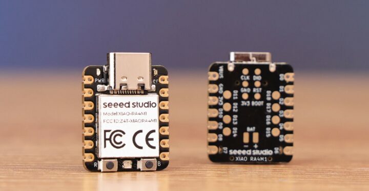
Waveshare UPS HAT (E) for Raspberry Pi 5/4/3B+ takes four 21700 Lithium batteries, supports USB PD 3.0

UPS HAT E

The Waveshare UPS HAT (E) is a UPS expansion board for Raspberry Pi 5/4B/3B+ that supports four 21700 Lithium batteries and includes a battery fuel gauge IC for monitoring voltage, current, and capacity. The USB Type-C port is compliant with the PD 3.0 standard and allows for 40W fast bi-directional charging, and a high-power buck chip provides a 5V/6A output. Additionally, it supports I2C for real-time status updates.

Previously, we wrote about the wider SupTronics Raspberry Pi 5 UPS HAT, which supports four 18650 batteries and delivers up to 5V with a higher current output of 5A. This HAT has no Type-C support and uses a DC jack and XH2.54 connector for 6V-18V input. Feel free to check it out if you’re interested in this product.

Waveshare UPS HAT (E)

Waveshare UPS HAT (E) specifications:

  • Compatibility – Raspberry Pi 5 / 4B / 3B+
  • USB Interfaces
    • USB Type-C Input/Output – Supports multiple voltage levels (5V, 9V, 12V, 15V, 20V)
    • USB Type-A Output – Provides 5V power for other boards
  • Battery support – 4-cell 21700 Li-ion battery holder
  • Battery Monitoring – Onboard battery fuel gauge IC for voltage, current, power, and remaining capacity
  • Onboard ICs
    • Battery Fuel Gauge IC – Measures voltage, current, and battery capacity
    • High-Power Buck Chip – Ensures consistent 5V 6A output
    • MCU Management – Detects power connection and manages Raspberry Pi booting
  • Automatic Switch Over – Switches to battery power if the external supply fails
  • LED Indicators
    • Indicators for battery connection and charging status
    • Warning alerts if the battery is incorrectly connected.
  • Power Supply
    • 5V/5A USB Type-C power supply recommended
    • 2x pogo pin to power the Raspberry Pi
    • Charging
      • USB Type-C Port – Supports INA219 IC for bi-directional fast charging up to 40W, compatible with PD 3.0
      • Simultaneous Operation – Can charge batteries and provide power output at the same time
  • Dimensions – 88 x 56mm

UPS HAT E details

The company shares a list of mostly generic safety instructions and warnings. Some of the most important points are

  • Li-ion and Li-po batteries can be unstable; improper use can cause fire, injury, or damage.
  • Do not reverse polarities when charging or discharging.
  • Use only quality chargers to recharge batteries.
  • Do not mix old and new batteries or use different brands of batteries together.
  • Ensure battery specifications match the expansion board.
  • Replace batteries after their cycle life ends or after two years of use.

To use the Waveshare UPS HAT (E) with Raspberry Pi, some Python commands enable the I2C interface, INA219 battery level detection, and battery level logo on the display. You can also set the required current to boot and adjust the booting time based on the power applied.

Command Output

For more information about hardware and software, you can visit the product’s wiki page although the company does not provide specific hardware details such as IC part numbers or schematics.

The Waveshare UPS HAT (E) for Raspberry Pi is available for purchase on AliExpress for $37.47 including shipping, on Amazon for $44.99, and on the official Waveshare store for $32.99 plus shipping.

UPS HAT E details dimension


The post Waveshare UPS HAT (E) for Raspberry Pi 5/4/3B+ takes four 21700 Lithium batteries, supports USB PD 3.0 appeared first on CNX Software - Embedded Systems News.

NBIOT/LTE-M Air Monitor – A solar-powered ESP32-S3 multi-sensor board with SIM7080G NB-IoT & LTE-M modem

nbiotlte m air monitor air temperature humidity light co2

The NBIOT/LTE-M Air Monitor is a solar-powered device that utilizes a combination of ESP32-S3 and SIM7080G modules for remote environmental monitoring. It monitors and transmits environmental parameters such as temperature, humidity, CO2, TVOC, and light intensity using low-power wide-area network (LPWAN) technology ensuring efficient power consumption, durability, and reliable data transmission.

Previously we have written about similar environment monitor devices like the Airlytix ES1,  Sonoff SC WiFiV-Air Monitro, and devices like Arduino MKR IoT Carrier Rev2Radair mini gateway, and Nicla Sense ME  designed for environment monitoring applications. Feel free to check those out if you are interested in this type of product.

NBIOT/LTE-M Air Monitor - temperature humidity light co2

NBIOT/LTE-M Air Monitor specification

  • Wireless Module – ESP32-S3-WROOM-1-N16R8
    • Espressif Systems ESP32-S3R8 – Dual-core Tensilica LX7 @ up to 240 MHz with vector instructions for AI acceleration, 512KB RAM, 8MB PSRAM
    • Storage – 16 MB flash
    • Wireless – 2.4 GHz WiFi 4 and Bluetooth
    • PCB antenna
  • Cellular connectivity
    • Module – SIMCom SIM7080G LTE Cat M1/NB-IoT module with GNSS
    • Bands
      • Cat-M – B1/B2/B3/B4/B5/B8/B12/B13/B14/B18/B19/B20/B25/B26 /B27/B28/B66/B85
      • NB-IoT – B1/B2/B3/B4/B5/B8/B12/B13/B18/B19/B20/B25/B26/B28 /B66/B71/B85
    • Data rate
      • LTE Cat-M1 – Uplink: 589Kbps, downlink: 1119Kbps
      • LTE Cat-NB2 – Uplink: 136Kbps, downlink: 150Kbps
    • GNSS Positioning – GPS, GLONASS, BeiDou, and Galileo
    • SIM card socket
  • Antennas
    • PCB antenna on ESP32-S3 module for Wi-Fi and Bluetooth
    • External NBIOT/LTE-M antenna
    • External LTE antenna connector
    • External GPS antenna connector
  • Environmental Monitoring Sensors
    • ASAIR ATH10 Temperature and humidity sensor
      • Humidity Measurement Range: 0 – 100% RH
      • Humidity Measurement Accuracy: +/- 2% RH
      • Temperature Measurement Range: -40°C – 85°C
      • Temperature Measurement Accuracy: +/- 0.3°C
    • SENSIRION SGP30 TVOC and CO2eq Measurements Sensor
      • CO2eq signal Range: 400~60000ppm
      • CO2eq signal Accuracy: 10% of meas. value
      • TVOC signal Range: 0 to 60000 ppb
      • TVOC signal Accuracy: 15% of meas. value
    • ROHM BH1750 Ambient Light Sensor
      • Light intensity Range: 1 – 65535 lx
      • Light intensity Accuracy: 0.96 to 1.44 S/A times
  • Misc
    • On/off switch
    • Flash, WiFi, RST, PWK, and Boot buttons
  • Power Management
    • Input Voltage – 4.5 to 28V for solar panel input
    • Internal 18650 LiPo battery socket
    • BMS – DW06 one-cell battery protection IC
      • Protection of charger reverse connection
      • Protection of battery cell reverse connection
      • Over temperature protection
      • Overcharge current protection
      • Over-discharge protection
    • MPPT – CN3791 for solar maximum power tracking charging management
  • Temperature Range – -40°C to +85°C

NBIOT/LTE-M Air Monitor components points

As I noticed, there is only a programming pin available. To program, plug the USB2UART CH340K module into the “P1” header (‘The “P1” connector is a 6-pin programmable header for the ESP32, including pins for RST, BOOT, TXD, RXD, GND, and VOUT.). This module provides USB to serial conversion and includes the necessary circuits for ESP8266/ESP32 programming.

NBIOT/LTE M Air Monitor with ESP32 Programmer

Makerfabs highlights Arduino support with the ESP32-S3 wireless module and also explains how to send an email from the air monitor and integrate it with ThingSpeak IoT cloud. You will find more information about hardware, programming, drivers, and firmware on the wiki and GitHub pages.

Sensor data charts with Thingspeak integration
Example charts in Thingspeak with data from the NBIOT/LTE-M Air Monitor

The NBIOT/LTE-M Air Monitor is available on its official Makerfabs store for $68.80 plus shipping. The additional ESP32 Programmer board (USB2UART CH340K) is also available in the same store at $3.90.

The post NBIOT/LTE-M Air Monitor – A solar-powered ESP32-S3 multi-sensor board with SIM7080G NB-IoT & LTE-M modem appeared first on CNX Software - Embedded Systems News.
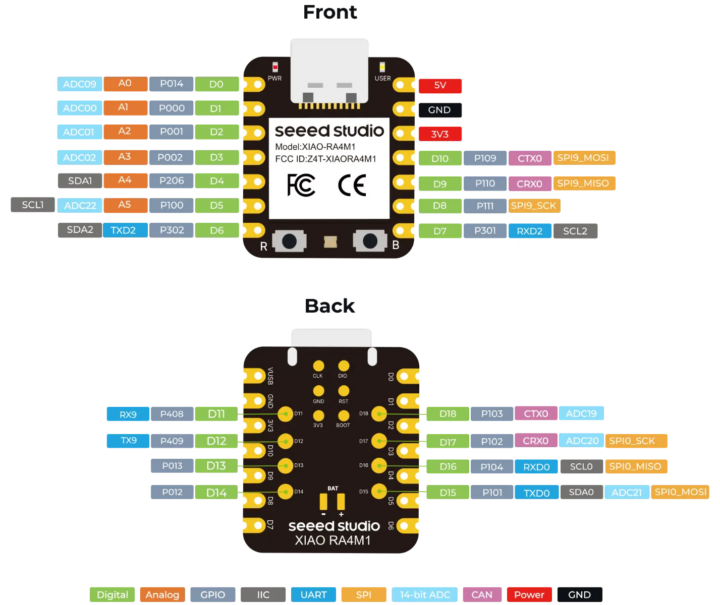
Has Google ruined Fitbit?

I got my first Fitbit nearly a decade ago. Back then, you could argue that Fitbit was a proprietary eponym — a brand name that inadvertently became synonymous with similar products due to its success or popularity. This couldn’t be further from the case in 2024. The company’s decline started well before Google’s acquisition three years ago, but stalwart Fitbit fans will argue that Mountain View’s influence is the reason for its continued downfall. I’d argue that it’s a little more complicated than that.

When Fitbit was founded in the late 2000s, it was one of a few companies that seriously considered the fitness tracker space a budding technology segment. Initial products weren’t feature-packed, but the brand built a loyal following by introducing heart rate tracking technology at a time when few other consumer products did. Following its growing success, Fitbit listed publicly in 2015, making it one of the year’s hottest IPOs. However, that initial searing heat would dissipate rapidly in the coming years due to low sales, encroaching competition from Apple and others, and a series of troubled launches.

Understandably, when Google came knocking at the end of 2019, a wounded Fitbit was more than happy to listen. I’m sure that plenty of Fitbit users were, too. The company was faltering; financial and developmental backing from a tech giant would be a big shot in the arm. The deal was completed in January 2021, ushering in the Google Fitbit era.

The Google-Fitbit era

Fitbit App Visual Refresh
Credit: Kaitlyn Cimino / Android Authority

In reality, Google hasn’t been the greatest custodian of the fitness marque. Its priority has been implementing Fitbit’s smarts into its own refreshed health push rather than accommodating those already part of the ecosystem. Since it changed hands to Mountain View in 2021, Fitbit users have seen sweeping changes to the platform. While Google has integrated the Fitbit platform and technology with its Pixel Watch series, it has gutted other aspects of the overall experience to align with its vision.

It killed the popular Challenges, Adventures, Trophies, and Open Groups — fan-favorite gamification and social features. A few months later, it introduced a divisive app update with Google’s design language, lots of white space, and a layout that makes quick glances at key metrics a challenge.

Google's priority has been consuming Fitbit's smarts into its own health push rather than accommodating existing users.

Despite a loud and incessant user outcry, Google’s changes didn’t stop there. At the end of 2023, Google announced Fitbit’s exit from over 30 markets, more than halving its regional availability, to align the brand with Google’s own official product presence. This move was perhaps the most painful of Google’s decisions thus far, at least for me. It stripped the Fitbit brand from regions like South Africa, where it had operated for decades.

More turmoil came this month when the company shut down Fitbit’s online dashboard. It was the only other way users could view their Fitbit stats, input data, and control their devices beyond the app. Google’s forced shutdown and lack of a genuine web-based successor further alienated established users and gave those who explicitly relied on the interface no alternative. The requirement for Fitbit users to migrate to Google accounts is also rapidly approaching, forcing those with legacy Fitbit accounts to merge them with their Google profiles. Many users don’t want to serve Google their medical history.

Once a hardware company

fitbit sense review design display watch face 4

Sense
Credit: Jimmy Westenberg / Android Authority

Sure, these are arguably all fixable issues. Google could always revise its market availability, tinker with the app, or allow Fitbit accounts to remain siloed. These problems are small compared to the real issue: Fitbit’s waning hardware appeal. The devices released since Google’s acquisition make Fitbit’s place in Google’s wearable strategy more apparent.

There have been eight major device launches under the Fitbit banner since 2021, most notably the Charge 5, Versa 4, and Sense 2. The former launched without issue, but the fitness tracker has been plagued by software update issues that left many users’ devices bricked. Fitbit acknowledged the issue by July 2023. A year later, the company has yet to implement a fix.

Google-merger issues are small compared to Fitbit’s waning hardware appeal.

In 2023, the flagship Fitbit Sense 2 and second-string Versa 4 were the first smartwatches to debut under Google’s wing; however, they were a shadow of their predecessors. While the Sense 2 gained all-day stress monitoring and the Versa 4 a cleaner design, their support for third-party apps, smartphone media controls, and Google Assistant were stripped from the devices to artificially set the Pixel Watch apart as the range’s flagship.

With the Pixel Watch 2 following on in 2023 and no new Sense or Versa model released since, Google’s wearable strategy is pretty clear — Fitbit is no longer a serious hardware company. There’s a clear lack of vision at the top end of Fitbit’s range. While the Charge series is likely to continue, the Sense and Versa lines’ future is bleak.

Glimpses of the old Fitbit

A Fitbit Charge 6 displays its watch face.

Credit: Kaitlyn Cimino / Android Authority

There’s no doubt that Fitbit has changed under Google’s leadership. However, it’s worth noting that Fitbit has had some successes during this period, too.

Fitbit’s last significant device, the Charge 6, is among its best launches in years. Instead of stripping features from the troubled Charge 5, it took users’ issues to heart, replaced the idiotic touch-sensitive button with a physical pusher, updated its core health tracking accuracy, and introduced Google apps that were previously limited to smartwatches. This launch gave us a glimmer of hope — it proved that Fitbit under Google is still willing to build on its core tenets.

Since then, Google also rolled out the Ace LTE, not only Fitbit’s first connected smartwatch, but one that injects a fun new take on fitness tracking that would be great on adult devices, too. A Fitbit device with a personality in 2024? Is this really Google’s Fitbit?

To be contrarian for a moment, Fitbit's app redesign is growing on me.

Google has since rolled out more of its apps to the Sense 2 and Versa 4. Yes, it’s slow progress, but progress nonetheless.

To be contrarian for a moment, Fitbit’s app redesign is growing on me. It’s lacking compared to Samsung Health and Garmin Connect, but it’s zippy, easier to navigate, and more pleasant to look at. Last week, I strapped on the Sense 2 in preparation for this piece, and in terms of fit and comfort, I often forgot I was even wearing it. Stuck in bed with a bout of flu, the watch kept me up to speed with my sleep quality, rising resting heart rate, and spiking temperature. As a Galaxy Watch user for the past few years, I missed these intricate insights. Anecdotally, Fitbit offers more nuance when tracking and transcribing these metrics. It’s clear that Fitbit still excels in core areas that once made me a fan.

Fitbit isn’t ruined, yet

Pixel Watch 2 Fitbit Apps

Google Pixel Watch 2
Credit: Kaitlyn Cimino / Android Authority

We’re quick to judge Google, and who can blame us? The list of properties the company has spawned or bought and then culled is lengthy and lengthening annually. Naturally, Fitbit users are wondering if it will soon join the pile, and there’s evidence that Google prefers to cut features rather than transform them. There’s no ignoring the building chorus of users taking to Reddit and other forums to air their displeasure at Google’s influence over Fitbit. And yes, Google’s interest in Fitbit is more aligned with its eponymous products, molding it into a platform for its smartwatches and neglecting the users it adopted. Still, I don’t believe it’s binning Fitbit any time soon.

Google continues to update Fitbit’s devices. This month, it rolled out Versa 4 and Sense 2 updates, including reworked heart rate tracking and GPS accuracy, YouTube Music control support, and other quality-of-life updates. Even the Inspire 3, the company’s cheapest tracker, saw some love. Google is also planning broader generative AI updates within the Fitbit app, providing users with data-based insights.

So, to answer my initial question: no. Google hasn't ruined Fitbit, but it's well on its way.

All this suggests that Google is trying to keep Fitbit alive, but it’s obvious that the brand, its legacy users, and new Fitbit-branded hardware are not the priority. That is understandable. Google’s Pixel Watch series has proved successful, while Wear OS is stronger than ever. However, the more Google focuses on future Pixel Watch buyers, the more this approach will push the users it inherited away from the platform it’s trying to build. Fitbit remains a popular brand with swathes of users globally. Google risks alienating and losing the trust of these users in the long run for short-term gain with its Pixel Watch series. There aren’t many Fitbit alternatives in the $100 to $250 segment, and if Google remains parsimonious, it may relinquish this market to the likes of Garmin and Xiaomi.

So, to answer my initial question: no. Google hasn’t ruined Fitbit, but it’s well on its way. Fitbit is the company that got me into wearables, but I will likely never buy another device from the brand. Judging by Fitbit forums and other online communities, many users feel the same way.

Samsung let me down with the Galaxy Watch Ultra

I was one of the few Samsung Galaxy Ultra defenders before its launch. The early leaked images had some covering their children’s eyes, but I gazed on, intrigued by the quirky styling. In my original opinion piece, I stated that Samsung’s “chunky and brutish styling” could theoretically allow more room to innovate. However, the new ultra-expensive Samsung wearable hasn’t done much to maximize its divisive design. And if anything, I’ve been left disappointed by an overpriced smartwatch that doesn’t bring anything revolutionary to my wrist.

Sauce with little substance

Galaxy Watch Ultra 1

Credit: Lanh Nguyen / Android Authority

A few weeks before its debut, I wrote that Samsung’s exciting new design and thicker body could allow for more innovative packaging, including space for a larger battery and a host of additional kit. Of course, this was well before any tangible details of the device were available. However, Samsung has opted for a more conservative approach than I had hoped, which doesn’t maximize the design’s potential.

Despite its revised design, it uses the same size battery as the Galaxy Watch 5 Pro and the same size display as the Galaxy Watch 6 Classic — two older, cheaper, and more approachable smartwatches.

Unless you're planning a trek up Everest or a dive along the Great Barrier Reef, you'll never test the watch's 10ATM durability or altitude/temperature credentials.

Samsung would argue that the new Ultra design allows for a theoretically indestructible smartwatch thanks to its grade 4 titanium shell and protective display bumpers. Unless you plan a trek up Everest or a dive along the Great Barrier Reef, you’ll never test the watch’s 10ATM durability or altitude/temperature credentials. If anything, the more extreme users this watch is trying to attract will likely opt for specialized equipment. The lack of a meaningful battery capacity upgrade and broader display to match the larger dial disappoints general users like me.

Beyond its divisive skin, most of the Galaxy Watch Ultra’s core new features are software-based, making the hardware largely redundant. Granted, it features a third button, an emergency siren, more LEDs for better health tracking, and a new strap fastening system. However, most users will gain more tangible benefits from Wear OS 5, which will land on Samsung’s older watches in due course.

Additionally, it shares its internals with the cheaper Galaxy Watch 7. Most new features, including Energy Score, sleep apnea monitoring, and Galaxy AI-powered features, will still require a Galaxy smartphone, making upgrading a fruitless prospect for other Android phone users.

Higher price, less value

The Samsung Galaxy Watch Ultra's buttons.

Credit: Hadlee Simons / Android Authority

More importantly — and as the most glaring strike against the Ultra — its upgrades are not worth the steep asking price. At $649, the Galaxy Watch Ultra is the most expensive Samsung smartwatch, dwarfing its predecessors by hundreds of dollars.

If you can’t quantify that number, here’s a more tangible comparison. You can purchase two Galaxy Watch 7 models for $50 less than one Galaxy Watch Ultra. You can also purchase the Galaxy Ring and one Galaxy Watch 7 for just $50 more than the Ultra. And here’s the real kicker: I can buy a Galaxy S24 Plus in South Africa for the same price as the Galaxy Watch Ultra. This won’t be true in every region, but it demonstrates how inflated the smartwatch’s price is.

If you want a rugged Samsung smartwatch, grab a Galaxy Watch 7 and slap a case on it. You'll save hundreds.

The Galaxy Watch 7 should provide the same core experience, with the same chipset, the same software and fitness tracking smarts, and the same Galaxy AI features at a much lower price. The 44mm model also shares its display with the Galaxy Watch Ultra. I’d even argue that the key differences between the two models, namely the titanium build, the larger battery, and the third button, aren’t that significant either.

If you want a rugged Samsung smartwatch, grab a Galaxy Watch 7 and slap a case on it. You’ll save hundreds. Ironically, browsing various forums this week, I’ve seen so many users shrouding their Galaxy Watch Ultra in a case anyway.

I’ve argued that the Galaxy Watch 5 Pro is also a much smarter investment if you’re looking for an outdoor smartwatch with more endurance and durability. Although it’s two years older and has dated hardware, the wearable makes a lot more financial sense.

What does the Galaxy Watch Ultra want to be?

A Samsung Galaxy Watch Ultra rests alongside an Apple Watch Ultra, each highlighting its own Action button.

Credit: Kaitlyn Cimino / Android Authority

This brings me to my final point: the Galaxy Watch Ultra lacks a clear identity.

Despite its durability badges, it isn’t an extreme outdoor watch or an easy-wear smartwatch. It sits in an awkward middle ground between the two. It’s competing with the Apple Watch Ultra but can’t pair with iPhones. It’s adopted stylings from Garmin, but it can’t hold a candle to its fitness tracking metrics or battery life.

Unlike its Ultra phone, Samsung's Ultra watch doesn't stretch the limits of features or design.

Samsung markets the Ultra as a tough, impact-ready smartwatch with Galaxy AI smarts, but all that means is it’s a Galaxy Watch 7 in an armored shell. Yes, the smartwatch features give the Galaxy Ultra a leg up against its Apple and Garmin rivals. However, these features aren’t unique to the Samsung smartwatch line.

Unlike its Ultra smartphone line, Samsung’s Ultra watch doesn’t stretch the limits of features and design as I hoped it would. I want to believe that Samsung is planning sweeping upgrades in the future and that this iterative upgrade is only part of its larger plan. Perhaps I expected too much and saw a striking design with big possibilities. Either way, what Samsung is selling has left me wanting more or demanding a more reasonable price.

What are modded Android games and are they safe?

There is no shortage of great Android games available online, but there may be some that you feel could use a few changes — a few modifications. Modified or modded Android games and apps are a thing, but before you hop online and download them, there are some details you should know.

In this guide, we’ll cover modded Android games that aren’t supported by the developer and community mods that are encouraged by the developer or publisher. Although they may appear similar, there are important differences. Here’s everything you need to know about modded Android games.

What is a modded Android game?

As the intro mentions, there are two breeds of modded Android games. First, there are original titles that are modified and redistributed as an APK or an altered version of an entire game. Second, there are games that allow and support mods from community members.

Let’s discuss the first idea in more detail. Modded Android games (available as APK files) are altered, unofficial versions of a published and available title. These modifications can introduce new details, alter existing items or design details, or unlock things usually gated behind level locks or in-game currency. In short, a modded Android game uses an existing title as a base and builds on it.

It’s essential to know where the mod comes from, who the modder is, and whether the original game developer allows mods. Tinkering with and distributing another person’s digital property without permission can have potential legal implications.

In short, a modded Android game uses an existing title as a base and builds on it.

Alternatively, a developer may approve mods, and the game itself may be built around this idea, but this ultimately comes down to the game creator. To give a PC and console example, Bethesda actively encourages users to create mods for Fallout 4. However, the game has a built-in system and a developer-approved creation kit to facilitate this. Generally, modified Android games lack these aspects, but some exceptions exist. Stardew Valley developer ConcernedApe actively welcomes community mods through a dedicated mod loader and repository.

What are the benefits of a modded Android game?

ROG Phone 2 Minecraft Demonstration

Credit: Curtis Joe / Android Authority

Modded Android games offer many apparent benefits. Most obviously, mods allow users more control of their gaming experience than the developer could offer or intended initially.

As an example, for those who hate grinding, mods can break down level locks and other walls within the game, making all content available immediately and without the need to earn any of these privileges. Modded games can also give the player unlimited in-game currency or limit the need for real-world currency in pay-to-play titles. Mods may also remove other aspects of a title, including an unlock fee, trackers, or advertising.

Mods allow users more control of their gaming experience, beyond what the developer originally intended.

Community mods to a game that supports them may also offer advantages. They may tweak some items of a title that a developer hasn’t addressed, like a bug, a gameplay mechanic that doesn’t work, or other factors, like colors, audio, or character design. Mods can make existing titles more challenging, lengthening the game’s life and improving replayability. For developers, opening mod support gives the community agency and encourages a more active, involved user base.

Are modded Android games safe?

The original developer does not usually sign off on a modified APK, so there’s an inherent risk of downloading a modded Android game. While the developer is usually a trusted figure recognized within the community, these APK modders are not and may have ill intent. There’s always the possibility that a modded game could readjust in-app purchases or add malware to the game itself. This may not always be the case, but the issue is that you cannot know for sure. As a result, it’s not safe to download modded game APKs from third parties. Importantly, you also risk getting banned for using modded Android games that require an online connection.

There's an inherent risk downloading a modded Android game, as you can't guarantee the modder's intentions.

Alternatively, if you download mods for a game that supports them from a trusted repository backed by the developer, you shouldn’t encounter any issues. These mods rely on crowdsourced approval and ratings, so users will call out truly nefarious or problematic mods. There’s no room to hide in a community mod repository for popular games. That said, ensure you read reviews of any mod you plan to install. Do your research.

Where can I get modded Android games?

GameSir X3 controller in hand with Genshin Impact

Credit: Dhruv Bhutani / Android Authority

It’s generally easy to find modded Android games wrapped up as an APK file online, but you won’t find them on any of the major app stores, including F-Droid or the Google Play Store. You’ll generally have to scour the internet and visit various forums to find modded files. I don’t recommend installing redistributed modified APK games, so I won’t mention any sources for these in this guide.

I will say that Reddit’s r/moddedandroidapps is a good place to start, especially if you’re searching for a general discussion of modified apps, recommendations, and further guidance. Although the subreddit is centered around all modified Android apps, there are frequent discussions about modified games.

There are many mods for popular games, but be sure to check if the game allows mods before installing them. You’ll find approved mods on several trusted repositories online. Nexus Mods is perhaps the most widely recommended, but some games have dedicated repositories. Stardew Valley’s SMAPI lets users easily search for and install mods on Android and other platforms.

How to install modded Android games

Modded Android games are usually distributed as single APK files, which allows users to install them through a third-party file manager. Our guide to installing third-party apps without the Play Store covers this process in detail. Alternatively, the APK may be distributed in pieces. In this case, you’ll need an app to piece and install the game together. Split APK Installer is a decent app for accomplishing this.

Each game that supports mods will have its own installation method. If you’re lucky, the developer will outline the process. Some games, such as the aforementioned Stardew Valley, make this process easy as pie. It relies on a dedicated mod installer, making it easy for users to search for and add mods to the original game. Other titles, like Baldur’s Gate, may have you trawling through its developer’s forums for an answer.

Do you use smart lights, and if so, which brand?

Smart lights are an essential part of anyone’s smart home ecosystem. They illuminate on demand and fill your abode with ambiance and color. More importantly, they can lean on your existing smart home ecosystem and devices, making them infinitely useful as a part of larger routines.

Perhaps the biggest problem with smart lighting is choosing a brand. There are a dizzying array of options across the segment. While choice is great for a consumer, making the right choice also becomes more important.

That said, if you use smart lights in your home, which brand do you use? We also want to know how you made your decision, so be sure to vote in our poll below and let us know your reasons in the comments.

Some more common brands include Philips Hue, LIFX, and Nanoleaf, but there are a slew of other options that produce great results. Notably, many brands’ products now support Matter, so if you have a product that includes that particular protocol, be sure to cast your vote in that particular poll, too.

Personally, I have one smart light in my entire apartment, which is used mainly as an accent light, although I really should consider grabbing smart grow lights for my indoor plants. In this case, I wouldn’t need to remember to switch them on.

Of course, remember to mention details relating to your setup in the comments section, too; we’re intrigued by your particular arrangement.

The best new Android apps and games for August 2024

Many new Android apps are out there, but keeping track of them is tough. But we’re happy to do that hard work for you. We’ve scoured the internet to find the best new Android apps and new Android games available, focusing on titles that offer something different to the status quo. Be sure to visit our list of the best Android apps of all time, best Android games ever, and our selection of the best new Android apps released in 2023 for more.

The best new Android apps and games for August 2024

  1. Claude
  2. Subway Surfers City
  3. Flying Calmly
  4. Superliminal
  5. Dragon Prince: Xadia
  6. Disney Speedstorm


Claude

Another big ChatGPT rival that emphasizes AI safety, hits Android devices.

  • Price: Free
  • Developer: Anthropic PBC

Claude AI has been overshadowed by more impactful chatbots, like ChatGPT and Google Gemini, largely due to its lack of a presence on Android. The company behind the platform, Anthropic, has now debuted a dedicated app.

Unlike its contemporaries, Claude cannot access the internet, but this is a good thing. Its focus is drilling down into the content that you feed it, such as a set of graphs, a PDF, or a text file. While this limits its usefulness in providing contextual answers to current events, it doesn’t affect its ability to crunch hard data.

We’ve had plenty of fun experimenting with ridiculous questions, and Claude produced some remarkably grounded (albeit hilarious) answers. If you’re interested in its “constitutional AI” learning approach or like the idea of a chatbot cut off from the internet, you should give it a go.

Subway Surfers City

A newer version of the classic endless runner.

  • Price: Free trial / In-app purchase from $1.99 to $99.99 per item
  • Developer: SYBO Games

Subway Surfers is one of the most successful mobile game franchises in history. The endless runner is simple in concept but the challenge ramps up the deeper you progress in the game. But now there’s a new version, a sequel, if you will, dubbed Subway Surfers City.

The new game retains much of the old title’s mechanics, just set in prettier environments and offering more responsive controls. New music also permeates the title, which established users might not enjoy too much. Nevertheless, there are refreshed missions and new maps with a lot of verticality.

Importantly, Subway Surfers City is approachable for new users while offering more challenges for long-standing gamers. It strikes the perfect balance.

Flying Calmly

Keep tabs on potential turbulence before your flight.

  • Price: Free / In-app purchases from $1.99 per item
  • Developer: Aviles Software

We’ve heard many reports of turbulence plaguing various flights around the world in recent years. While the phenomenon is difficult to predict, some apps can offer some insight into the likelihood of a bumpy flight. Enter Flying Calmly.

The app uses NOAA weather data and applies its smarts to better predict the likelihood of a bumpy ride. It also offers a nifty aircraft positioning tool that uses your phone’s sensors to judge the plane’s pitch, roll, bump severity, and air pressure.

It should be noted that turbulence is challenging to forecast, so this app should only be used for civilian guidance.

Superliminal

Being stuck in a dream has never been this fun.

  • Price: Free trial / In-app purchases from $4.99 to $7.99 per item
  • Developer: Noodlecake

superliminal app 1

Superliminal first landed on Steam back in 2019. The first-person surreal walking simulator/puzzle game was pretty dizzying on the large screen, but now it’s available on Android, too.

In short, the game is set in one’s dream and introduces various puzzle elements, illusions, and forced perspectives. The title includes various scenes that are thick with atmosphere and character. Your task is to solve these puzzles by thinking as unconventionally as the world. It’s a wild but short ride, and I recommend it for an afternoon playthrough.

The Dragon Prince: Xadia

An action RPG based on Netflix’s The Dragon Prince.

  • Price: Free / Requires a Netflix subscription
  • Developer: Wonderstorm / Netflix

Netflix is building up quite the game repository, and Dragon Prince: Xadia is its latest addition. This top-down action RPG takes place in the fantasy world of Xadia, which harbors various environments, each with its own atmosphere and peril. For the most part, the game is easy to grasp. You travel across the world, kill baddies, and snag loot.

It’s a game that’s easy to drop in and drop out, making it an ideal time sink. As a Netflix title, you will need a Netflix subscription to play it, though.

Disney Speedstorm

Think Mario Kart or CTR, but Disney characters and Asphalt mechanics.

  • Price: Free / In-app purchases from $1.99 to $99.99 per item
  • Developer: Gameloft SE

Finally, we have Disney Speedstorm, one of the more addictive titles I’ve played in a while. The title has been present on Windows and major consoles since September 2023, but only this month landed on iOS and Android.

It’s an arcade racing game with Disney characters and stars piloting the vehicles. The controls and physics feel similar to Asphalt, and each character boasts a unique set of strengths and skills. As you progress, you’ll unlock new characters with earned currency, keeping gameplay fresh.

Speedstorm will appeal to Disney and racing title fans — an interesting combo.


Waveshare UPS HAT (E) for Raspberry Pi 5/4/3B+ takes four 21700 Lithium batteries, supports USB PD 3.0

UPS HAT E

The Waveshare UPS HAT (E) is a UPS expansion board for Raspberry Pi 5/4B/3B+ that supports four 21700 Lithium batteries and includes a battery fuel gauge IC for monitoring voltage, current, and capacity. The USB Type-C port is compliant with the PD 3.0 standard and allows for 40W fast bi-directional charging, and a high-power buck chip provides a 5V/6A output. Additionally, it supports I2C for real-time status updates.

Previously, we wrote about the wider SupTronics Raspberry Pi 5 UPS HAT, which supports four 18650 batteries and delivers up to 5V with a higher current output of 5A. This HAT has no Type-C support and uses a DC jack and XH2.54 connector for 6V-18V input. Feel free to check it out if you’re interested in this product.

Waveshare UPS HAT (E)

Waveshare UPS HAT (E) specifications:

  • Compatibility – Raspberry Pi 5 / 4B / 3B+
  • USB Interfaces
    • USB Type-C Input/Output – Supports multiple voltage levels (5V, 9V, 12V, 15V, 20V)
    • USB Type-A Output – Provides 5V power for other boards
  • Battery support – 4-cell 21700 Li-ion battery holder
  • Battery Monitoring – Onboard battery fuel gauge IC for voltage, current, power, and remaining capacity
  • Onboard ICs
    • Battery Fuel Gauge IC – Measures voltage, current, and battery capacity
    • High-Power Buck Chip – Ensures consistent 5V 6A output
    • MCU Management – Detects power connection and manages Raspberry Pi booting
  • Automatic Switch Over – Switches to battery power if the external supply fails
  • LED Indicators
    • Indicators for battery connection and charging status
    • Warning alerts if the battery is incorrectly connected.
  • Power Supply
    • 5V/5A USB Type-C power supply recommended
    • 2x pogo pin to power the Raspberry Pi
    • Charging
      • USB Type-C Port – Supports INA219 IC for bi-directional fast charging up to 40W, compatible with PD 3.0
      • Simultaneous Operation – Can charge batteries and provide power output at the same time
  • Dimensions – 88 x 56mm

UPS HAT E details

The company shares a list of mostly generic safety instructions and warnings. Some of the most important points are

  • Li-ion and Li-po batteries can be unstable; improper use can cause fire, injury, or damage.
  • Do not reverse polarities when charging or discharging.
  • Use only quality chargers to recharge batteries.
  • Do not mix old and new batteries or use different brands of batteries together.
  • Ensure battery specifications match the expansion board.
  • Replace batteries after their cycle life ends or after two years of use.

To use the Waveshare UPS HAT (E) with Raspberry Pi, some Python commands enable the I2C interface, INA219 battery level detection, and battery level logo on the display. You can also set the required current to boot and adjust the booting time based on the power applied.

Command Output

For more information about hardware and software, you can visit the product’s wiki page although the company does not provide specific hardware details such as IC part numbers or schematics.

The Waveshare UPS HAT (E) for Raspberry Pi is available for purchase on AliExpress for $37.47 including shipping, on Amazon for $44.99, and on the official Waveshare store for $32.99 plus shipping.

UPS HAT E details dimension


The post Waveshare UPS HAT (E) for Raspberry Pi 5/4/3B+ takes four 21700 Lithium batteries, supports USB PD 3.0 appeared first on CNX Software - Embedded Systems News.

NBIOT/LTE-M Air Monitor – A solar-powered ESP32-S3 multi-sensor board with SIM7080G NB-IoT & LTE-M modem

nbiotlte m air monitor air temperature humidity light co2

The NBIOT/LTE-M Air Monitor is a solar-powered device that utilizes a combination of ESP32-S3 and SIM7080G modules for remote environmental monitoring. It monitors and transmits environmental parameters such as temperature, humidity, CO2, TVOC, and light intensity using low-power wide-area network (LPWAN) technology ensuring efficient power consumption, durability, and reliable data transmission.

Previously we have written about similar environment monitor devices like the Airlytix ES1,  Sonoff SC WiFiV-Air Monitro, and devices like Arduino MKR IoT Carrier Rev2Radair mini gateway, and Nicla Sense ME  designed for environment monitoring applications. Feel free to check those out if you are interested in this type of product.

NBIOT/LTE-M Air Monitor - temperature humidity light co2

NBIOT/LTE-M Air Monitor specification

  • Wireless Module – ESP32-S3-WROOM-1-N16R8
    • Espressif Systems ESP32-S3R8 – Dual-core Tensilica LX7 @ up to 240 MHz with vector instructions for AI acceleration, 512KB RAM, 8MB PSRAM
    • Storage – 16 MB flash
    • Wireless – 2.4 GHz WiFi 4 and Bluetooth
    • PCB antenna
  • Cellular connectivity
    • Module – SIMCom SIM7080G LTE Cat M1/NB-IoT module with GNSS
    • Bands
      • Cat-M – B1/B2/B3/B4/B5/B8/B12/B13/B14/B18/B19/B20/B25/B26 /B27/B28/B66/B85
      • NB-IoT – B1/B2/B3/B4/B5/B8/B12/B13/B18/B19/B20/B25/B26/B28 /B66/B71/B85
    • Data rate
      • LTE Cat-M1 – Uplink: 589Kbps, downlink: 1119Kbps
      • LTE Cat-NB2 – Uplink: 136Kbps, downlink: 150Kbps
    • GNSS Positioning – GPS, GLONASS, BeiDou, and Galileo
    • SIM card socket
  • Antennas
    • PCB antenna on ESP32-S3 module for Wi-Fi and Bluetooth
    • External NBIOT/LTE-M antenna
    • External LTE antenna connector
    • External GPS antenna connector
  • Environmental Monitoring Sensors
    • ASAIR ATH10 Temperature and humidity sensor
      • Humidity Measurement Range: 0 – 100% RH
      • Humidity Measurement Accuracy: +/- 2% RH
      • Temperature Measurement Range: -40°C – 85°C
      • Temperature Measurement Accuracy: +/- 0.3°C
    • SENSIRION SGP30 TVOC and CO2eq Measurements Sensor
      • CO2eq signal Range: 400~60000ppm
      • CO2eq signal Accuracy: 10% of meas. value
      • TVOC signal Range: 0 to 60000 ppb
      • TVOC signal Accuracy: 15% of meas. value
    • ROHM BH1750 Ambient Light Sensor
      • Light intensity Range: 1 – 65535 lx
      • Light intensity Accuracy: 0.96 to 1.44 S/A times
  • Misc
    • On/off switch
    • Flash, WiFi, RST, PWK, and Boot buttons
  • Power Management
    • Input Voltage – 4.5 to 28V for solar panel input
    • Internal 18650 LiPo battery socket
    • BMS – DW06 one-cell battery protection IC
      • Protection of charger reverse connection
      • Protection of battery cell reverse connection
      • Over temperature protection
      • Overcharge current protection
      • Over-discharge protection
    • MPPT – CN3791 for solar maximum power tracking charging management
  • Temperature Range – -40°C to +85°C

NBIOT/LTE-M Air Monitor components points

As I noticed, there is only a programming pin available. To program, plug the USB2UART CH340K module into the “P1” header (‘The “P1” connector is a 6-pin programmable header for the ESP32, including pins for RST, BOOT, TXD, RXD, GND, and VOUT.). This module provides USB to serial conversion and includes the necessary circuits for ESP8266/ESP32 programming.

NBIOT/LTE M Air Monitor with ESP32 Programmer

Makerfabs highlights Arduino support with the ESP32-S3 wireless module and also explains how to send an email from the air monitor and integrate it with ThingSpeak IoT cloud. You will find more information about hardware, programming, drivers, and firmware on the wiki and GitHub pages.

Sensor data charts with Thingspeak integration
Example charts in Thingspeak with data from the NBIOT/LTE-M Air Monitor

The NBIOT/LTE-M Air Monitor is available on its official Makerfabs store for $68.80 plus shipping. The additional ESP32 Programmer board (USB2UART CH340K) is also available in the same store at $3.90.

The post NBIOT/LTE-M Air Monitor – A solar-powered ESP32-S3 multi-sensor board with SIM7080G NB-IoT & LTE-M modem appeared first on CNX Software - Embedded Systems News.

Devolver divulges deeper Cult of the Lamb: Unholy Alliance details, out August 12

In Unholy Alliance, the next major update for Cult of the Lamb, we’re giving our holy hero a playmate: the Goat. Summoned by blood and born in corruption, this wicked new ally can join the Lamb in local co-op. Crawl dungeons, slay heretics, build your cult, and seek new powers—together.

In co-op, one player will inhabit the role of the Lamb and the other will take on the mangy mantle of the Goat. Together, this unholy pair can indulge in new two-player twists on existing minigames like fishing and Knucklebones, as well as discovering and equipping a selection of corrupted weapons, tarot cards, curses, and relics to aid them on their epic cooperative crusades.

That alone is worth your undying worship, but there’s more to Unholy Alliance than just co-op. The update also introduces a vast array of new follower traits to the game, making your flock more diverse, charismatic, and unpredictable than ever before. Cultists can be insomniacs, bust law-breaking friends out of prison, enter a catatonic state after the trauma of a resurrection, wake everyone up with their demonic snoring, or become afflicted with a curse.

Followers sent on missions may return with their mental state altered. They could be inspired by their success, spreading positivity among the flock. Or the horrors they’ve endured may have been too much, leaving them frozen with fear. Followers can even be polyamorous, meaning they’ll never get jealous if the Lamb marries someone else – while others may become jealous enough to kill.

These are just a few of the new follower traits in the Unholy Alliance update, which will make your flock a true cult of personality. As the cult grows and more followers join its ranks, even more quirks, flaws, and eccentricities will emerge. If you thought they were a handful before, you ain’t seen nothing yet.

Unholy Alliance also adds two new structures to the game. You can build a nursery to care for three babies at once, but be warned: they’re still gonna poop a lot, and you’re still gonna have to clean it up. Hey, at least you’ll never be short on fertilizer. When a baby reaches 14, they’ll outgrow the nursery, opening up a space for more offspring to be nurtured.

Then there’s the new Knucklebones arena. You can only have one of these in your cult at a time, letting you play one match of Knucklebones a day against a follower of your choosing. The difficulty of the match is based on the follower’s level, and winning against them will level them up instantly.

We haven’t forgotten about crusades, either. Unholy Alliance throws a heap of new relics and tarot cards into the mix—some of which have been designed with co-op in mind. The Lamb and the Goat can swap weapons, deal extra damage when fighting back-to-back, or deal a critical hit if their attacks are in sync.

The Ashes of the Mercurial Mun relic detonates a ring of explosives that surrounds both players, while the Wishbone of the Marbais relic grants one player 10 seconds of invincibility – if the other takes damage. Equip the Rivals tarot card, and you’ll both deal 2x weapon damage if you’re fighting far apart. Or how about the Bonds of Battle card, which connects the Lamb and the Goat with a beam of unholy energy that will damage any enemies who stray into it?

Experience all of this and more—including new quests and quality of life improvements—when the free Unholy Alliance update brings the Lamb and the Goat to PlayStation 4 and PlayStation 5 on August 12.

Wear OS should take a page out of Apple’s book

Google’s Wear OS took a gulp of fresh air with the help of Samsung in 2021. The new version launched with an improved UI, smoother performance, reliable features, and the promise of consistent development. We’ve since seen the arrival of Wear OS 4 in 2023, with the next iteration possibly landing later this year. But even though the revamped OS is miles beyond its earlier versions, it’s still not the smartwatch OS of my dreams. It fails to accomplish one important task: display contextually relevant information when it’s most needed.

So, how can Google remedy this? I think Apple may have a solution.

Wear OS and its info dilemma

google wear os tiles demo on fossil sport

For context, I use a Samsung Galaxy Watch as a daily driver. I’ve been through several Fitbit and Garmin watches, but I’ve always returned to Wear OS for that comfortable fit. It feels familiar, and forms the basis of my digital life when my hands are tied. My phone usually stays nestled in my bag when I’m not at home, and when I do need it, I prefer to continue any task I’ve initiated on my watch. However, this isn’t always possible. Information on Wear OS is always a button press or a swipe too far, or simply isn’t available on the wrist.

Information on Wear OS is always a button press or a swipe too far, or simply isn't available on the wrist.

Google has tried to remedy this with the release of newer complications and the addition of tiles. While I’ve always felt complications are essential for viewing bite-sized information, tiles leave a lot to be desired. The feature allows apps and features to display dedicated screens beyond the home screen, but it’s never been a true solution to my problem. The implementation is clunky, relies on multiple swipes and button presses, and often neglects to update in a timely fashion. As it stands, tiles just aren’t useful.

How watchOS tackles the problem

WatchOS 10 on Apple Watch 3

Ironically, the previously widget-shy Apple does a much better job with this on the Apple Watch. With Smart Stack — a home screen widget carousel that displays relevant information from apps running in the background — app information is readily available and easily cycled through using the digital crown. There’s never a need to leave the home screen to access this information. This has other benefits too. There’s no need for complications, so users can run their favorite watch faces unabated.

Ironically, the previously widget-shy Apple does a much better job with on the Apple Watch.

At WWDC 2024, Apple added even more functionality to this system by introducing Live Activity support to watchOS 11, allowing it to display contextually-relevant info cards in the stack when appropriate. These are essentially mirrored toasts taken from the iPhone’s Dynamic Island, but functions as a natural extension of your phone on your wrist. That degree of seamlessness is dearly missing with Wear OS and Android.

Smart Stack isn’t perfect, but it could be for Wear OS

google pixel watch wear os watch face prime os 2

Credit: Rita El Khoury / Android Authority

There’s no denying that Smart Stack has its issues, but this is due to execution rather than concept. I’ve read multiple complaints from users who feel there just aren’t enough useful widgets available. There are others who feel that data-heavy watch faces are all they need. Perhaps I’m in the minority, as I see Smart Stack as a potentially great addition to Wear OS. But now that Apple was the first to launch the feature, a Wear OS equivalent can iron out these problems.

It would put essential information relayed from your phone front and center without user intervention. Do you want to use a complication-free watch face but still demand info snippets? A Smart Stack clone would allow this. As more Wear OS watches are adopting a dial, a swipe-free implementation would also be more than doable.

Despite its numerous improvements over the years, Wear OS still has plenty of room to grow.

Google has done wonders with Android’s notification system, and there’s room to improve it on Wear OS. In an ideal world, contextual clues, be it time of day, location, specific days of the week or month, and even ambient light could all prompt specific widget cards. Google wouldn’t necessarily require Gemini smarts to accomplish this, but it would add some welcome smarts to the experience. Of course, such a feature would live and die by the apps it supports. It’ll still need third-party developers to enrich the widget offering. This is an opportunity, not a potential issue. If the feature adds value, developers will build for it.

Despite its numerous improvements over the years, Wear OS still has plenty of room to grow. Addressing the way it displays information could hugely improve its interoperability with Android and make it a true extension of the smartphone. If Google needs ideas on how to address this, its competitor has a few.

I tried the anti-AI Instagram alternative and it’s a mental and visual delight

Instagram, and social media as a whole, has an AI problem. Not only is the platform tagging real photos as created by AI, but it’s also using users’ creations to train its AI models. This, for an artist, is obviously worrying. In a world where generative AI is gathering momentum, and the lines between real and artificial are quickly blurring, it’s becoming more difficult for real artists to ply their trade. That’s where Cara steps in. The platform recently saw a surge in users, and I decided to give it a whirl, too.

What is Cara and who is it for?

Founded by photographer Jingna Zhang, Cara is a relatively new social network and app that aims to protect artistic integrity. Despite its focus on creators, Cara is available for all seeking out new and exciting artists or novel work. Like a digital art gallery, you don’t need to upload your own content to enjoy others’. You don’t even need an account if you browse online. I do love discovering new artists at markets and online, and I’ve found myself scrolling through the app much like I would Instagram or Reddit.

Its core tenet and principle draw is its stance on AI. The app currently prohibits generative AI works and implements safeguards to prevent AI models from scraping and training on data. In this sense, the platform appeals to those who want an authentic, AI-free portal to promote their work.

What Cara gets right

Cara also bills itself as a refuge from Instagram and other pro-AI social networks, but its design borrows heavily from the Meta app. This is a good thing, as the familiar UI streamlines the learning process. It took me a few minutes to familiarize myself with the app and with its home page.

The app is devoid of ads and puts the content first and foremost. It also provides plenty of options for users to browse and discover new work. I’m a huge fan of its Home Feed Settings option, which lets you choose in percentage increments what content you encounter on your home page. If you only want to see your friends’ artwork, you can do that. Want to see site-wide posts and a splash of your follower’s content? That’s possible too. All social networks could benefit from this quality-of-life toggle.

I can't recall encountering a social network with a more supportive environment.

The profile page layout is another bright spot and foregrounds the promotion of artists. Users can broadcast their stance on accepting freelance work, commissions, or full-time positions if eager eyes come looking. Links are allowed too, making it easy for potential clients to navigate directly to an artist’s storefront. I’ve bookmarked more than a handful of creators I plan to purchase work from in the future. This pocketing functionality, which is separate from likes, makes it a great way to remember specific pieces, too, be it for your own inspiration or later referral. Hashtags also work well, plugging directly into the search functionality.

I want to touch on my experience on Cara beyond the art itself, though. A core part of the platform is its community. Like every social network, it’s the people that make it what it is. Unlike Instagram and X (formerly Twitter), comments left on Cara posts are remarkably supportive. I haven’t yet encountered one toxic comment. Perhaps this is thanks to its core ethos, but Cara is largely devoid of political commentary, harassment, toxic remarks, and hateful echo chambers. I can’t recall encountering a social network with a more supportive environment.

As its a smaller, more condensed community, it encourages the discovery of art from artists you wouldn’t otherwise encounter. This makes it easier for smaller artists to garner a following, as opposed to Instagram where the sheer number of users and its algorithm may limit potential reach.

It’s not quite there, yet

cara app hero image 2

Credit: Andy Walker / Android Authority

As you’ve probably gathered, I love the idea of Cara. A place that fosters creativity and harbors a supportive net of users who all share the same love? Count me in. However, for all of its positives, Cara isn’t exempt from critique.

There are practical flaws. Even though Cara allows text posts up to 5,000 characters long, the platform’s current focus is visual art. Unfortunately, this makes it more inhospitable for other creative projects. Text posts aren’t as easy to search for as visual content, which makes finding poetry and short stories difficult. Users can post their poetry as an image to get around this, but it’s an extra step.

I found issues with image quality too, especially when zooming into images. Granted, there has to be some compression, but visual platforms should put visual fidelity first.

It's important to address the elephant in the room: what is Cara's trajectory?

Finally, it’s important to address the elephant in the room: what is Cara’s trajectory? It’s not a social media platform in the traditional sense. I feel the app has more in common with an art subreddit than Instagram. You won’t use it to keep up with a friends’ travel photos, see specific images from a place or event, or more general imagery from internet users. In this sense, don’t expect Cara to ever become a true Instagram alternative.

I worry about its feasibility. In its current guise, the platform appears to be unsustainable. In an interview with Wired, Zhang noted that the platform’s hosting bills are mounting. The small development outfit was considering implementing a subscription service, but this may inadvertently dissuade people from joining.

Cara may have too narrow a reach to be a truly viable social platform, but rapid growth also leaves it with unsolved issues. The platform no doubt strengthens artist-to-artist collaboration, but I doubt it’ll spawn an anti-AI social media revolution. I’m not sure if that’s what Cara or its creators want, either. The platform is designed for artists by artists, and this makes it inherently niche. But can Cara survive without casual users? Can digital art survive without casual browsers? I’m not so sure, but regardless, I enjoy drawing inspiration from the platform. I might even take up doodling again.

Lowering Elden Ring's difficulty would attract more players but would also 'break the game itself,' says director Hidetaka Miyazaki

The launch of Elden Ring: Shadow of the Erdtree means, among other things, a resurrection of the timeless debate over difficulty in Dark Souls games. In the eyes of many soulslikers, Elden Ring was notably gentler than its predecessors because if you're getting hammered by one demigod clown or another, you can always take off, do something else for a while, and come back later when you're better equipped to clean house.

Even so, Elden Ring does not have any kind of difficulty selector: It is what it is, and you're either the windshield or the bug. And this is how it needs to be, according to game director Hidetaka Miyazaki, who said in an interview with The Guardian that decreasing the difficulty might open up the game to more players, but would also compromise the experience.

"If we really wanted the whole world to play the game, we could just crank the difficulty down more and more," Miyazaki said. "But that wasn't the right approach.

"Had we taken that approach, I don't think the game would have done what it did, because the sense of achievement that players gain from overcoming these hurdles is such a fundamental part of the experience. Turning down difficulty would strip the game of that joy—which, in my eyes, would break the game itself."

That said, FromSoft did ease up a little bit: Miyazaki said the studio wanted to ensure Elden Ring players didn't "feel claustrophobic or overly limited in the scope of what they're able to do," and instead of the relentlessly bleak worlds of the Dark Souls series, "we wanted to have these moments of beauty."

"That's where a little bit of high fantasy comes in, conceptually," he said. "Both in terms of the difficulty and the learning curve, as well as the world setting, you feel that you can come up for air."

It's no secret that I'm not a souls guy, but I truly loved Elden Ring—against all expectations, it was nothing short of exquisite. Much of that arose from the dreamlike beauty of the game world, which was genuinely wonderful to be lost in, but I have to admit that Miyazaki might have a point about difficulty too. 

On the whole, I think I would prefer a difficulty slider, so I could explore the Lands Between without worrying about dying all the time; but it was also undeniably satisfying to roll up on some jerk who'd stomped my guts out two weeks prior with a "Hey, remember me?" and an extended blast of fusion-powered Comet Azur. I do not enjoy the thrust and parry of conventional souls combat, but holy cow, that kind of melt everything payback felt good.

Of course, the odds of adjustable difficulty in Elden Ring or whatever FromSoft gets up to next are basically zero. Miyazaki has been talking about it for well over a decade now, and at this point it's pretty clear his mind is made up—especially since FromSoft has apparently decided to crank things up for Erdtree. Good luck, everyone.

© FromSoftware

Shadows: Awakening, an isometric RPG where you play a soul-sucking demon, is free on GOG

You'll probably be playing Elden Ring: Shadow of the Erdtree this weekend. Hell, you're probably playing it right now, and not even reading this. But if you are reading this, and you are not playing Erdtree over the weekend, and you're looking for something else to jump into instead, allow me to suggest Shadows: Awakening.

I make this recommendation for two reasons: One, it looks pretty cool, and two, it's free on GOG.

Shadows: Awakening is an isometric singleplayer RPG with "real-time tactical combat," set in the Heretic Kingdoms game world. It looks like a fairly conventional fantasy romp, but the story has an unusual twist: Instead of the typical saver-of-the-day, you play a demon summoned from the Shadow Realm to consume the souls of heroes, which you can then turn to your advantage. 

This is actually how the game's party system works: "Multiple characters in one demon," the GOG page says, "each retaining their own personalities with internal dialogues, rivalries and communication between the characters."

And, because you're a demon, you don't necessarily have everyone's best interests at heart. "Who is in charge—the demon, or the souls that it has devoured? It's up to you to either thwart a major threat and save the world, or to plunge it into complete disaster."

I like that setup. I think it sounds freeing, in a way: I usually play a good guy in my videogames because I don't want to be a bad guy, but if I'm a demon from the jump, then maybe it's good to be bad? And maybe it actually is good from the demonic perspective: Perhaps, to paraphrase a great cinematic moment, from my point of view, the humans are evil!

The Shadows: Awakening freebie comes amidst the ongoing GOG Summer Sale, which includes daily deals, publisher collections, and deep cuts on a wide range of good stuff. Robocop: Rogue City is half price, which is pretty sweet, and Horizon Zero Dawn Complete Edition is 75% off, which is also a very good pick. 

Personally, though, I like rooting through the virtual bargain bin in GOG sales, because you're bound to find some genuinely bonkers deals. The Long Journey Home, which was terribly underrated, is down to $1—you literally cannot buy a bag of chips for that—and if you really want to try something weird, Edna and Harvey: Harvey's New Eyes is well under $2. There's all kinds of DLC, soundtracks, and other bonus content down around that price point too. (Trust me, that's where they hide the good stuff.)

The GOG Summer Sale runs until July 10, but Shadows: Awakening is only free until June 24—get it while you can.

© null

Miyazaki 'went a little too far' with Elden Ring's poison swamps but says he learned a lesson, which unfortunately is that he needed to come up with new and different ways to kill everyone

Apart from a wasted hour or so dabbling in Dark Souls, Elden Ring was my first soulslike, and so I think it's understandable that when I found myself standing in the muck in the middle of Caelid, my immediate reaction was, "This is bullshit." I was surprised to find out later that it was also tradition: Director Hidetaka Miyazaki has been throwing these things in since the very first Dark Souls because, apparently, he just can't help himself.

Big surprise, then, that the Elden Ring expansion Shadow of the Erdtree has its very own poison swamp—something Miyazaki confirmed earlier this year, in case there was any doubt. But it may not be quite as big and bullshit as Elden Ring's Swamp of Aeonia and Lake of Rot: In an interview with CNet, Miyazaki acknowledged that he "went a little too far" with Elden Ring, and he's "trying to take some lessons from that."

"You can say the version [of the poison swamp] that exists in the DLC, which I've already confirmed, applies a lot of those learnings," Miyazaki said.

"In between it existing and not existing, with this version, let's just say I try to imagine different ways I want to die as a player or be killed. So that expression of myself has been imparted into the poison swamp."

I'm not entirely sure how to take that, but my impression is that maybe the poison swamp in Shadow of the Erdtree is less likely to kill you, but the rest of the expansion is more likely to kill you. Is this a good thing? Variety is the spice of life, I suppose, even when it applies to death.

Miyazaki seemed to confirm that understanding: "So, not in the poison swamp itself—that's been curbed—but in other parts of the gameplay, there are many ways to die."

Look, I don't mean to be critical, but I kind of feel like Elden Ring already has plenty of ways to die, and that the issue here was really just one of, hey man, can we ease up on the poison swamps? Not as a green light to express your murderous urges in new and interesting ways, but just so it's slightly less suffocating and punishing when we have to travel through these areas? I already have 100 different horrors within line of sight trying to kill me, I don't need the geography taking a shot too.

I know I'm going to have countless dedicated soulslikers lining up to tell me to "git gud," and all I can say in response is that I think I'm allowed to slump back into my chair and sigh when Miyazaki says his takeaway from the overblown poison swamp situation in Elden Ring was "I need to come up with new ways to make you dead." I barely survived the first time, man!

None of which, to be clear, is putting off Elden Ring players. Since yesterday's launch of Shadow of the Erdtree, Elden Ring has been putting up massive player numbers on Steam, and could conceivably surpass the base game's all-time peak concurrent player count of more than 953,000 this weekend. That's especially impressive given how many of you still haven't put a shank into Mohg—maybe it's a sign that people are finally getting serious about dealing with that guy so they can access the expansion.

© FromSoftware

Cyberpunk life sim Nivalis is now set to come out in spring 2025, and I'm more excited for it than ever

I'm not generally a life-sim guy but I am very eager to dive into Nivalis. A big part of that arises from the strength of Cloudpunk, the previous game from developer Ion Lands, which I really liked, but Nivalis itself—based on the admittedly not-a-whole-lot we've seen of it so far—looks brilliant too.

Sadly, we're going to have to wait a little bit longer than expected to dive in, as it's been delayed until spring 2025.

"Ion Lands' highest priority is to ensure that Nivalis provides the best possible experience for the player and the team appreciates the patience and support they have received from the ever-growing community as Ion Lands navigate through this creative journey," publisher 505 Games said in a very non-specific explanation for the delay.

And fair enough, sometimes you just need more time to get things done, and I am more than happy to be patient for two reasons. One, the classic: "Suck is forever," and I'd rather wait to get a Nivalis that lives up to my hopes—which, frankly, are very high.

And two, the new trailer—the one embedded up top—has me breathing just a little more rapidly than usual. I've been in the business long enough to know that trailers are nothing more than a blend of aspirations and hype, concocted solely to get attention and, ideally, crank up excitement. Even so, sometimes a trailer hits just so, and I cast aside my game journo cynicism to let myself be caught up in it. 

This is definitely one of those trailers: It's a powerful mood, with just enough of a glimpse at previously-unseen material to keep me hooked all the way through and a poetic denouement that lands perfectly. Will the game live up to the dream? No clue. Could I be setting my sights too high? Quite possibly. Am I concerned about that right now? Nope. Yes, I have been successfully marketed to, and I don't care.

Image 1 of 10

Nivalis screenshot

(Image credit: Ion Lands)
Image 2 of 10

Nivalis screenshot

(Image credit: Ion Lands)
Image 3 of 10

Nivalis screenshot

(Image credit: Ion Lands)
Image 4 of 10

Nivalis screenshot

(Image credit: Ion Lands)
Image 5 of 10

Nivalis screenshot

(Image credit: Ion Lands)
Image 6 of 10

Nivalis screenshot

(Image credit: Ion Lands)
Image 7 of 10

Nivalis screenshot

(Image credit: Ion Lands)
Image 8 of 10

Nivalis screenshot

(Image credit: Ion Lands)
Image 9 of 10

Nivalis screenshot

(Image credit: Ion Lands)
Image 10 of 10

Nivalis screenshot

(Image credit: Ion Lands)

Apple’s Smart Script feature could be a boon for untidy iPad jotters

  • Apple has announced new features that should enhance the writing experience on iPad.
  • Smart Script introduces several editing tools, including the ability to tidy up a user’s handwriting in real time.
  • Apple Intelligence also powers image generation and summarization tools.

While plenty of new features are heading to iPhones via iOS 18, Apple didn’t forget about iPadOS 18. At WWDC on Monday, the company announced several new features for its slate and the Apple Pencil stylus, which includes AI-powered tools that enhance written notes.

The most impressive feature is Smart Script, which can learn and identify a user’s handwriting and use this information to tidy up content where required. Apple says this feature “allows users to write quickly without sacrificing legibility.”

Apple Photos draws inspiration from Magic Editor with new Clean Up feature

  • Apple has announced that new AI-powered editing tools are coming to the Photos app.
  • The biggest feature, dubbed Clean Up, is similar to Android’s Magic Eraser.
  • Other features include editing via Siri, Memories, and more.

Apple announced several new features coming to the redesigned Photos app on iOS 18, but one will be very familiar to Android users.

At its WWDC keynote on Monday, the company introduced Clean Up, an image editing tool powered by Apple Intelligence AI. The feature can erase unwanted items from a photograph, such as people in the background or objects in the foreground.

Messages app brings satellite support to new iPhones on iOS 18, plus new features

  • Apple announced messaging via satellite for the Messages app.
  • Coming to iOS 18, the feature will allow users without service to communicate with others.
  • The feature also supports SMS.

Apple announced several new features for its Messages app on iOS 18, the chief of which is messaging via satellite.

At its WWDC 2024 keynote on Monday, Apple confirmed that users running an iPhone 14 or newer running iOS 18 can send messages over satellite if they’re without cell service or an internet connection. This occurs within the Messages app, making it more convenient and accessible than more cumbersome satellite messaging solutions. Apple also claimed that all messages are end-to-end encrypted.

Latest Galaxy Buds 3 leak reveals a potentially divisive redesign

  • A leaked image suggests that Samsung may introduce a stalk design to the Galaxy Buds 3 Pro.
  • This would go against the company’s traditional compact “bud” design.
  • The image also showcases the device’s “blade lights” and silver colorway.

Last month, we reported that Samsung’s forthcoming Galaxy Buds may offer a significantly different design than previous generations. Now, a new leaked image lends further credence to this. According to a pixelated leak from reliable tipster Evan Blass (h/t: Asian Geek Squad), the Galaxy Buds 3 may drop its “bud” design in favor of an AirPods-like stalk.

We can’t glean many fine details from the image, but what is apparent is the rumored “blade lights” bar at the foot of the stalk and the silver colorway. Have a look at the render below.

Google’s Magic Editor is now available on even more devices

  • Google’s Magic Editor is now more widely available across Android devices, including Samsung devices.
  • This comes after last month’s rollout to older Pixels.
  • The free version of the feature can be found in the latest version of the Google Photos app.

Nearly a year after Google debuted Magic Editor on the Pixel 8 series, the feature is now rolling out to more Android devices.

Per 9to5Google, the free version of the feature is now available to devices beyond the Pixel stable, including Samsung smartphones and tablets. This gives users an alternative to Generative Edit, the Korean firm’s homebrewed AI editor.

Samsung might not wait for Unpacked to launch the Galaxy Watch FE

  • Samsung could launch the Galaxy Watch FE before its rumored July 10 Unpacked event.
  • According to a reliable tipster and an early Amazon Italy listing, the watch could debut on June 24.
  • The listing also suggests a €199 price.

Samsung is tipped to launch several new devices on July 10, including new foldables and wearables. However, the company may not wait as long to debut its next budget smartwatch.

According to tipster Arsene Lupin, the Samsung Galaxy Watch FE could debut as early as June 24, not at the rumored July Unpacked event in Paris. This earlier launch date would give it a two-week head start over the Galaxy Watch 7 and Galaxy Watch Ultra.

Samsung’s weird Watch Ultra design could be a positive compromise

Samsung’s next product launch is just around the corner, and we’re expecting a new range-topping smartwatch to join the fray. Renders of the Galaxy Watch “Ultra” broke cover recently, offering a glimpse of a smartwatch that looks nothing like what Samsung’s offered before. It boasts a divergent design with a more imposing “Ultra” aesthetic. While I’m a big fan of the leaked design, not everyone is sold on it.

Sure, it’s a surprising development, considering the mounting hype for the return of a square Samsung watch to rival the Apple Watch Ultra directly. However, I argue that the squared-circle combo, albeit questionable to some, offers more potential than square or circular designs alone.

Netflix is redesigning its most important app, here’s what to expect

  • Netflix has published mock-ups of its redesigned TV interface.
  • The redesign primarily reworks the menu and navigation system and how title tiles display information.
  • Netflix has rolled out the redesign to limited testers, but it’s unclear if and when it’ll reach all users.

Netflix is testing a new TV interface that it hopes will provide more information to content hunters and simplify the browsing experience for all. The company published several mockups of the new home page and other elements that may form the base of the streaming platform’s new redesign (h/t: The Verge).

The changes represent the app’s biggest UI shift in years, but the general Netflix aesthetic remains.

❌