 Přihlásit se
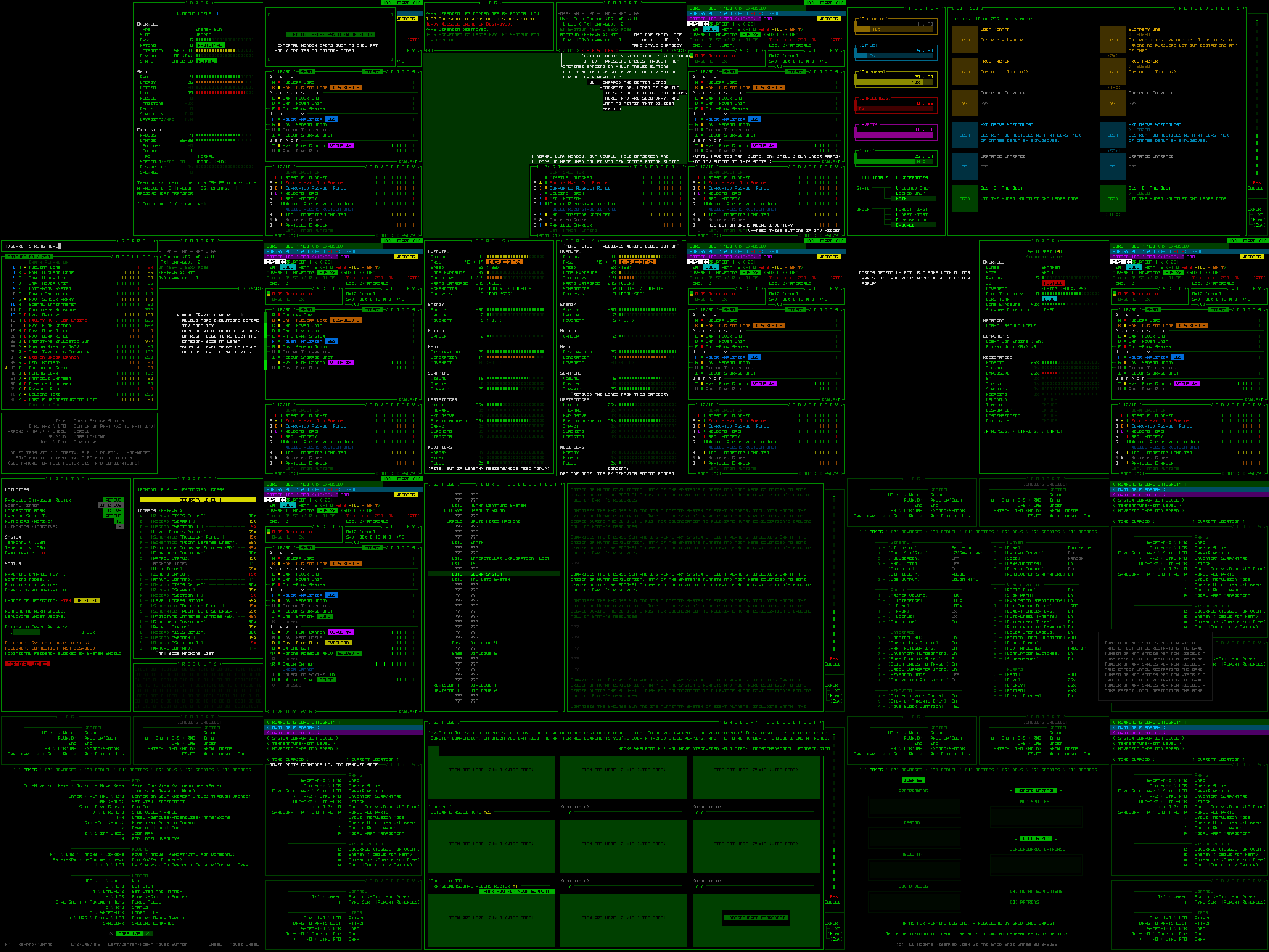
Full UI Upscaling, Part 5: Completion and Demos
They’re alive! Last month I shared a sizeable collection of interface mockups summarizing my vision for a playable Cogmind interface that could fit within a 45-row terminal. Those mockups are now a reality, fully implemented more or less as described, and in the time since I’ve even gone further down that path and implemented the so-called “Phase 4” UI with its greater number of modal windows.
Although I already demonstrated much of the first new modal UI layout in an earlier forum announcement, I figure I could review those features here in order to provide closure to this series, plus cover some related dev topics as well as the second modal layout.
A collage of 45-row interface mockups shared in January as part of Part 2 of this series.
“Semi-modal” 45-Row UI Layout
Although players are free to continue using the full 60-row layout originally designed for Cogmind, anyone who does not mind sacrificing some convenience in exchange for greater cell size can use 33% larger tiles and text by switching to a 45-row layout. In other words, anyone using size 18 fonts (the majority of players), would instead be using size 24 under the new layout.
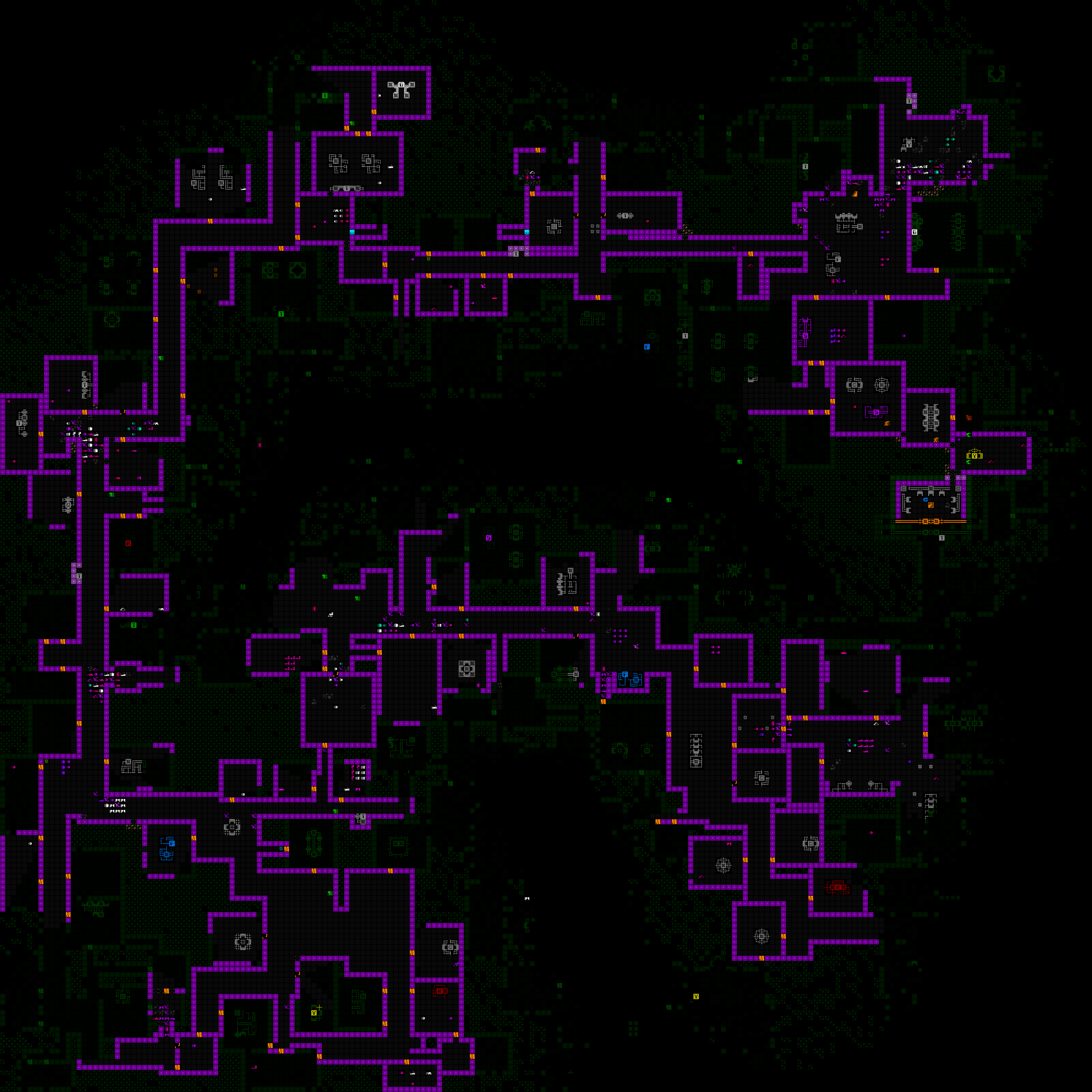
Comparison of Cogmind’s interface at 1080p when converted from its standard 60 rows to a 45-row layout using a smaller map view and modal inventory (open for full size 1920×1080).
One of the biggest compromises in this mode is the smaller map view, but it’s still reasonably large (at least 50×35), large enough to at least see out the extent of normal sight and attack ranges, and for information beyond that all the QoL recently developed for map zooming comes in handy, even when not zoomed.
Here is a sample screenshot of the 1080p 45-row terminal layout in the early game, before the inventory even switches to its modal form:
45-row UI layout with non-modal inventory, because there are not yet enough part slots to edge it out of the main interface.
Inventory/Parts
The other compromise is interacting with a modal inventory for much of a run, but I’ve also put a lot of work into designing QoL features to make it as seamless as possible.
The inventory! It’s gone!
Easy access to information and feedback is important, so of course the INVENTORY access button directly reports its current usage and capacity, pieces of info which would normally be found at the top of the inventory window itself.
Any time one or more items are added to the inventory through any means (picked up, detached, or otherwise) also shows a new indicator.
One of the most important forms of inventory interaction for mouse users, drag-dropping, is also preserved by automatically opening the inventory while dragging a part, then automatically closing it again after release, in case you want to put the item in your inventory.
Automated modal inventory toggling in action, followed by some other inventory interaction. Dropping the item on the INVENTORY button would actually work, too. (Dragging a part out of the inventory would still require opening the inventory first.)
In fact, quite a few operations will automatically toggle the inventory like that wherever it makes sense--the part management keyboard interface (‘p’), the ‘d’rop shortcut, part swapping, item tagging…
In this example, hitting ‘p’ to activate the part management menu, then ‘a’ for attach, automatically opens the inventory, from which ‘2’ is selected for the Transmission Jammer, attaching it then automatically closing the inventory again.
Of course the regular old swap menu also works just fine, even when the inventory is modal, meaning opening the inventory is often not even necessary.
Here the result of the swap operation also displays the indicator for a part having been added to the inventory.
The inventory-first keyboard swap system has also been modified to remain compatible with a modal inventory, with automated opening/closing if necessary.
One of the most controversial aspects of the 45-row interface is likely how it treats part type headers. As I wrote about during the mockup descriptions, we can save space, and delay inventory modality, by temporarily removing the headers themselves from the parts list. That was going to be an optional feature disabled by default, but for now I’ve instead decided to have it do that automatically, and be opt-out instead.
Condensed part headers in action. They double as CYCLE buttons for mouse users, functionality that would otherwise be lost since the header buttons are hidden.
The headers are only replaced by the sidebar method for as long as the inventory conversion to modal form is delayed (so about two evolutions in the mid-game), after which they’re restored to normal again since there’s plenty of room.
Secondary Windows
As per the mockups, many of Cogmind’s secondary windows that were originally designed for at least 50 rows had to be squished down to 45, including machine hacking, the status window, and item/robot info.
The most obviously different of the group is item info, which saved enough lines by moving its art off to the side.
Sample part info as fit into a 45-row UI layout.
The other biggest new feature which took a while to build and finalize but will likely be seen by almost no one (:P) is the [M]ore button as applied to robot resistances. Such a button was already added to Beta 13 to support the occasional longer item/effect descriptions, but was given new purpose for the very rare possibility that a robot might have too many total lines in its info window, in which case one way to cut it down to size is to put excess resistances in a popup window.
More!
The world map view was yet another one of the secondary windows originally designed for a height of 50, but fortunately removing some of its interior padding was enough to shrink that to 45. At the same time, I also took this opportunity to do something else that I’ve wanted to do for years: speed it up! Although I first designed the map in 2016 with this fun vision of a map animating the route you took to get to your current location, while not too problematic in Cogmind’s early years, the continued addition of new areas and potential for lengthier routes could make it a bit of a slot to view the full map in the late game, so I’ve rebuilt it to appear in its entirety almost instantly :D
Instant route!
This world map change will benefit everyone, regardless of UI layout. In fact a number of tweaks and fixes made throughout the layout development project have carried over to the regular interface as well.
Game Menu
A good half of the work involved in creating a 45-row version of the interface involved adjustments to the game menu and its various subwindows. It was a lot. The content was, after all, mostly designed to fit within the map area, which had presumed minimum dimensions of 50×50. At least we didn’t have to worry about the width (whew--very glad Cogmind was designed for 4:3), but again with the height…
Pages with a 50-row layout now needed 35-row layouts as well.
Overall the biggest impacts were to the Advanced commands page, which had always been pushing up against the limit to begin with, and all the records interfaces.
At least the solution was obvious in this case: After all these years, I was finally forced to add a second page to the advanced commands :P
The problem with the Achievements/Gallery/Lore records, and actually much of the “game menu” in all, was spaghetti code. Most of Cogmind is fairly well organized code, but not the game menu and its pages--it’s all in just two files to which I kept adding and adding and adding and sharing variables and it’s just messy all around. I used this opportunity to clean it up a bit, especially the records code which share a lot of the same functionality anyway but instead of using common functions there was just copy-pasted code everywhere.
Design-wise, at least the records weren’t trying to fit into the map view area, and they turned out fairly well, if slightly cramped compared to before.
Achievements UI in the 45-row layout, with reworked collection% and export buttons on the right side.
Amidst the refactoring, in another of those “I should do this while I’m here” moments that benefits all layouts, I finally darkened the background when a modal popup is active in the game menu. Doing so always made sense, of course, but it wasn’t vital and it never felt worth dedicating the time before.
Finally a darkened background!
After building this new UI layout, last week I streamed the first run to make use of it, explaining all the major features as we went…
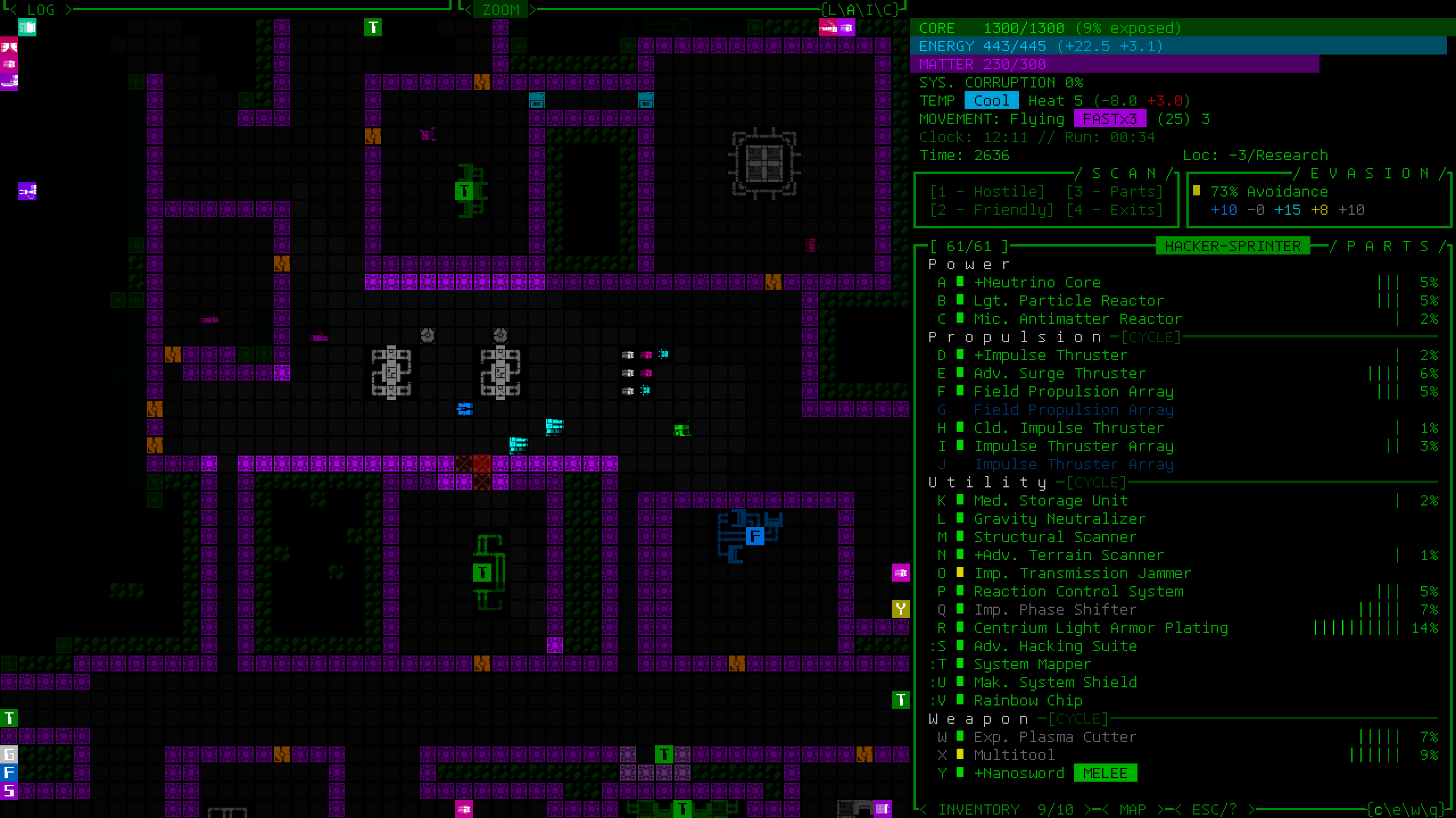
“Modal” 45-Row UI Layout
The first 45-row layout I developed is essentially “semi-modal,” because all windows are visible as usual until only later when just the inventory is hidden as necessary. The true modal interface hides multiple windows, and does it immediately from the start, but in doing so allows for a map view which is almost as large as what Cogmind was designed for (50×50).
All three options are available in a new setting at the top of the Options menu.
UI Layout selection menu coming to Cogmind Beta 13.
How do we reclaim our missing map height? By making the top-side consoles all but disappear, of course! The info displayed up there does not warrant constant attention anyway, consisting of transient logging info and some menus for accessing control of allies and intel. Anything that might be of potential importance can be displayed temporarily, and any menus can be called up as needed. The result is a much taller map view: 50×44.
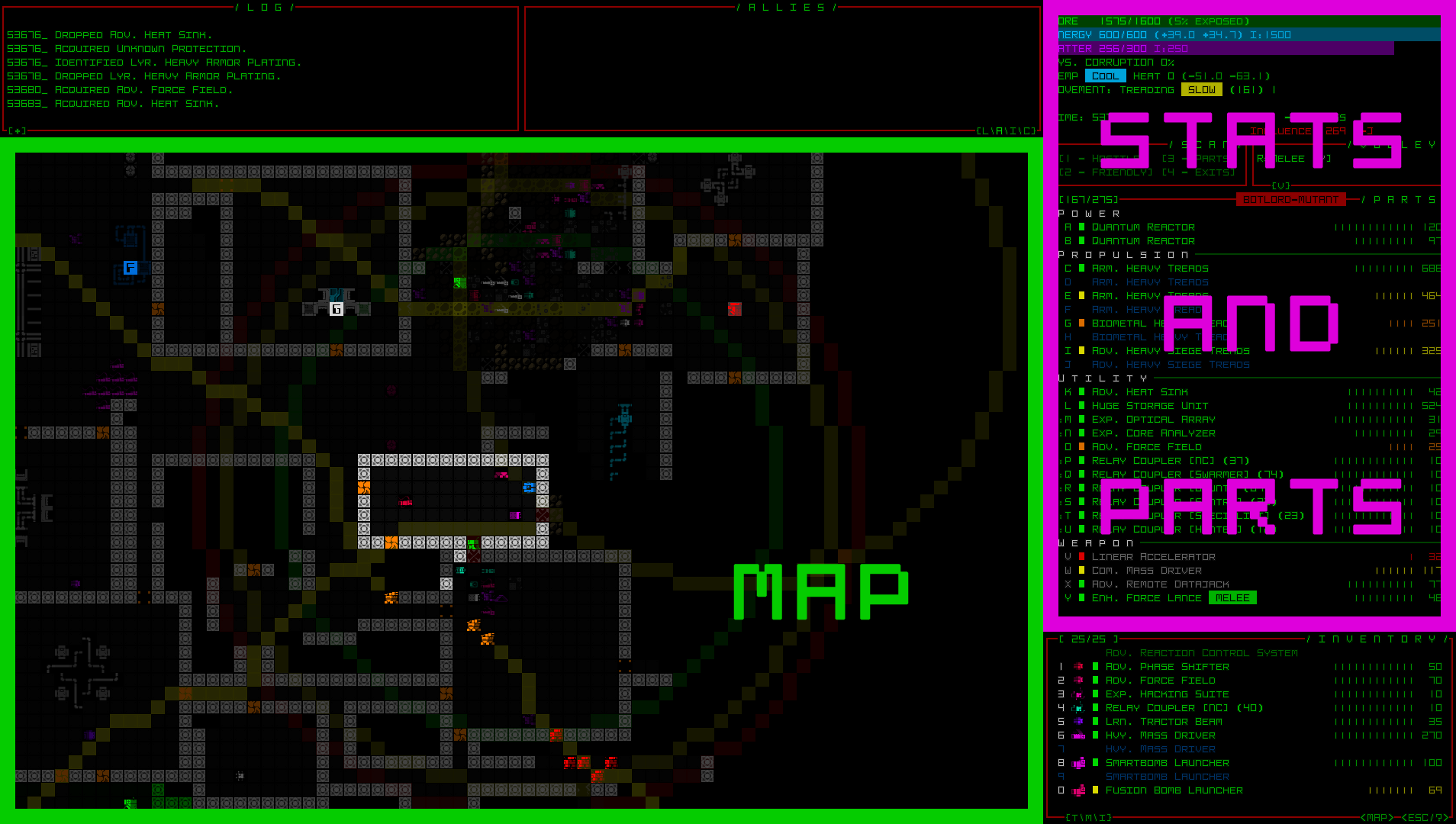
Modal 45-row UI layout screenshot sample (1080p). (See here for a 1440p sample using the new Tamsyn font.)
The top row buttons serve more or less the same functions, such as toggling the message log to its full height, or switching the center console mode, though in this case the toggle must also open the Allies/Intel windows to make them visible and interactive when necessary.
Interacting with various buttons atop the map in the Model 45-row layout.
The Extended Log and Combat Log modes simply determine what the space below is used for when messages are being displayed.
Two columns of message log data. The line count and duration can be controlled via advanced.cfg options.
You might recognize the temporary message log style from POLYBOT-7, which is where I ripped it from :)
An alternative example combining the regular message log, which always at least appears on the left, with a combat log on the right.
The automated full-detail combat log messages (the ones that even in the 60-row layout could appear over the map as combat plays out) are hidden by default in 45-row layouts, even if the detail level is set to Full, since given the narrower map view they can easily obscure nearby action.
There is a new config option to force it anyway, for those so inclined, but as usual, as long as it’s currently your turn, in combat log mode you can always scroll the combat log backward to review the details of recent combat. (However, in the Modal 45-row layout there is currently no way for the mouse to initiate this scroll--it’s keyboard-only…)
Scrolling the extended combat log history.
I’ll be streaming a run in this layout as well, once the build is ready…
Extra Credit
With playtesting having only just begun, I’m sure these layouts could use some more polish here and there, but they seem in a really good place already. Looking further ahead, there’s also the chance that other related features might be added as well, things I’ve held off on so far in the interest of actually releasing this to players and getting back to the content expansion I was working on before.
Tutorial
One such feature I was on the fence about throughout layout planning, and to a lesser extent throughout all of Cogmind development, is a more intrusive vector for tutorial info. I much prefer to maintain Cogmind’s theme of immersion as best possible, and that has always meant avoiding an in-your-face type tutorial with dedicated popups or some similar effect. A sound cue and flashy log messages, that’s it.
In particular this Modal 45-row interface has me more worried about teaching new players, especially if it’s to be a default layout, because log messages automatically disappear after a little while. Yes the log can be opened in full to view them as normal, but players would need to be proactive about it. A log-based tutorial was already easy enough to miss bits of before, and people did :P
To somewhat address that issue I doubled the duration of specifically tutorial messages in the Modal layout, so they remain visible longer even as other messages disappear.
Another problem which had me again thinking about alternatives is the handful of tutorial messages that appear when the log area is not visible at all in the modal layout, such as while hacking! (since in that case the machine hacking interface now extends all the way to the top of the screen) One might suggest putting these immersion-breaking messages right in the hacking interface itself, but if we’re going to go that far we may as well take the dedicated popup route :/
I’m letting this topic simmer for now, and ultimately the decision would be affected by whatever our default layout ends up being.
Screenshot Mode
Although not particular to modal layouts, and a feature I’ve been considering for years, the need for some form of “screenshot mode” clearly becomes more acute with the introduction of new UI layouts.
One of the original principles of Cogmind UI design was the desire to have all or almost all important information necessary for decision-making visible at all times on the main interface--stats, parts and their condition, inventory and item states, the map, the log, basically everything.
I like that by extension this means a single screenshot could be a comprehensive or at least very good indicator of a run’s overall state, either as a record or something to share with others. For that reason I’ve often considered facilitating a way to include one’s entire inventory contents in a single screenshot, since some builds might possess about 10~15 items that aren’t currently visible in the screenshot (some people have taken to sharing Cogmind’s stat dumps to provide that info, and more, in lieu of a screenshot, but screenshots tend to be easier to digest overall; other folks have literally stitched together their own screenshots to include a complete inventory…).
And now depending on one’s UI layout we might have not only zero inventory items visible in a screenshot, but also even a missing message log and list of allies etc. In that light, I guess the chance that I finally add such a feature will only grow going forward… I’ll be keeping an eye on the sharing scene among frequent players using these layouts.
I don’t have any mockups of “screenshot mode” for you now, but the idea is simply that some of the map area could be used to display the additional info.
A New Default
When the next Cogmind version releases, new and old players alike will be faced with a new UI layout. But which one?
The setting can be changed in the Options menu, but it needs a default, and even returning players who have a config file will be initialized to that layout. This will at least be a good way to get everyone to realize the new layout options exist (if they somehow miss the repeated news :P).
I really like the original layout (obviously), specifically designed to immerse with maximum information, at the cost of cell size perhaps requiring a large display. That might work for a relatively specific target audience, but Cogmind has many more players these days, players who come from a variety of backgrounds and with different setups, and they’d like to enjoy the gameplay, too, so some accommodation is necessary. One of the other layouts then, with larger fonts from the get to…
My original assumption was that the default would be the middle option--partially modal with most windows and info still visible, just the significantly larger text (yay for most people on laptops) and smaller map view (but still large enough). Leaning even more heavily in a modal direction for new players loses some of the overall atmosphere, plus hiding information can be bad. However, that may not be the case with what gets immediately hidden in Cogmind--the top-side windows aren’t essential for new players, and necessary messages are still shown and accessible… so maybe hiding windows is okay in order to let everyone see even more of the map at once? The message log being permanently visible doesn’t seem to imply that everyone will read it anyway--plenty of people miss important messages :P
The modal inventory has the largest impact on gameplay, and it doesn’t even take effect until part way through the game, at which point there is supporting QoL, and applies to both 45-row layouts anyway, so that doesn’t work in favor of either.
Results on a default: Inconclusive xD
This is the end of our multi-part series about building Cogmind’s fully upscaled semi-modal interface layout:
- History and Theory
- Holy Mockups
- Dynamic Terminal Swapping
- Simpler Lightweight Fonts
- Completion and Demos