Google rounds off Maps redesign with a new simplified bottom bar
![]()
- Google Maps’ simplified bottom bar redesign is finally rolling out to users.
- The updated design features three tabs: Explore, You, and Contribute.
- The Explore and Contribute tabs are the same as before, but the new You tab integrates features from the old Go, Saved, and Updates tabs.
Google is finally rolling out the Maps bottom bar redesign it first showcased at I/O this May. The simplified design briefly appeared for some users earlier this year, but it’s now widely available with Google Maps for Android version 11.138.x.
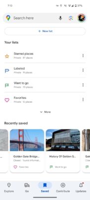
Google Maps’ bottom bar previously featured five tabs: Explore, Go, Saved, Contribute, and Updates. As you can see in the following screenshots, the redesigned bottom bar has just three tabs: Explore, You, and Contribute.
9to5Google reports that the Explore and Contribute tabs still offer the same functionality as before, but the new You tab now includes features previously offered in the Go, Saved and Updates tabs. The You tab is essentially a renamed version of the old Saved tab, and it’s largely the same in terms of the UI and features. However, it now also offers features from the Go and Updates tabs.
The Go tab’s features are now condensed into a new “Saved trips” option in the Your lists section on the You tab, and it gives you quick access to your favorite trips. Similarly, the notifications and messages options from the Updates tab have found a new place in the top right corner of the You tab.
The bottom bar refresh follows Google Maps’ new sheet-based redesign, which rolled out to users last month. It replaces full-screen UI elements with new sheets that float above the map and make more efficient use of the screen real estate. The updated Google Maps UI with the floating sheets and compact bottom bar is currently limited to Android. It’s not clear when these changes will make it to the iOS version of the app.

