Everyone loves an underdog story. Names like Rudy, Rocky, and Bilbo get us to root for the undersized, underpowered hero in the face of unthinkable odds every time. For a while, my favorite underdog story was the one where Motorola, the original king of the flip phone, tried to reclaim its crown from Samsung. It pitted the Razr against the Galaxy Z Flip, hoping that nostalgia, a slightly bigger cover screen, and a cleaner Android skin would take it back to the top.
At first, it didn’t work. Samsung grabbed all of the headlines for its Galaxy Z Flip series, drawing me into the world of flip phones. Then, Motorola skipped a year or two, practicing and creating the training montage that every good underdog flick needs. Now, Motorola is back with its second Razr Plus, and I don’t think it’s an underdog anymore. The Motorola Razr Plus (2024) vs Samsung Galaxy Z Flip 6 is finally a flip phone title match.
Little screens, big expectations

Credit: Ryan Haines / Android Authority
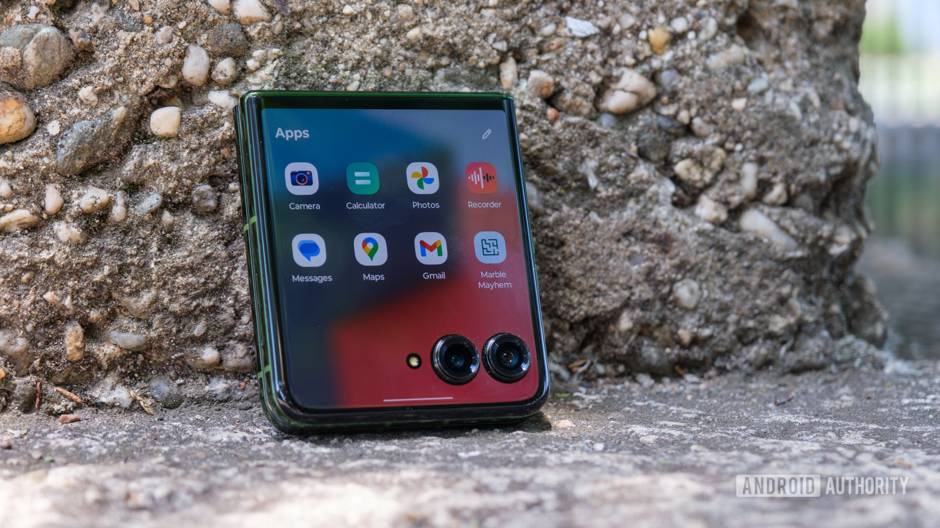
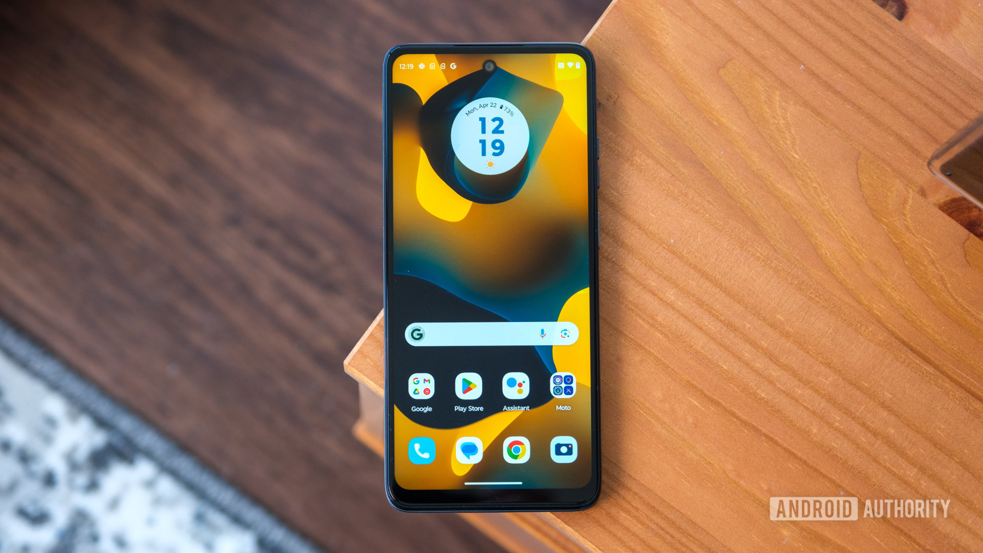
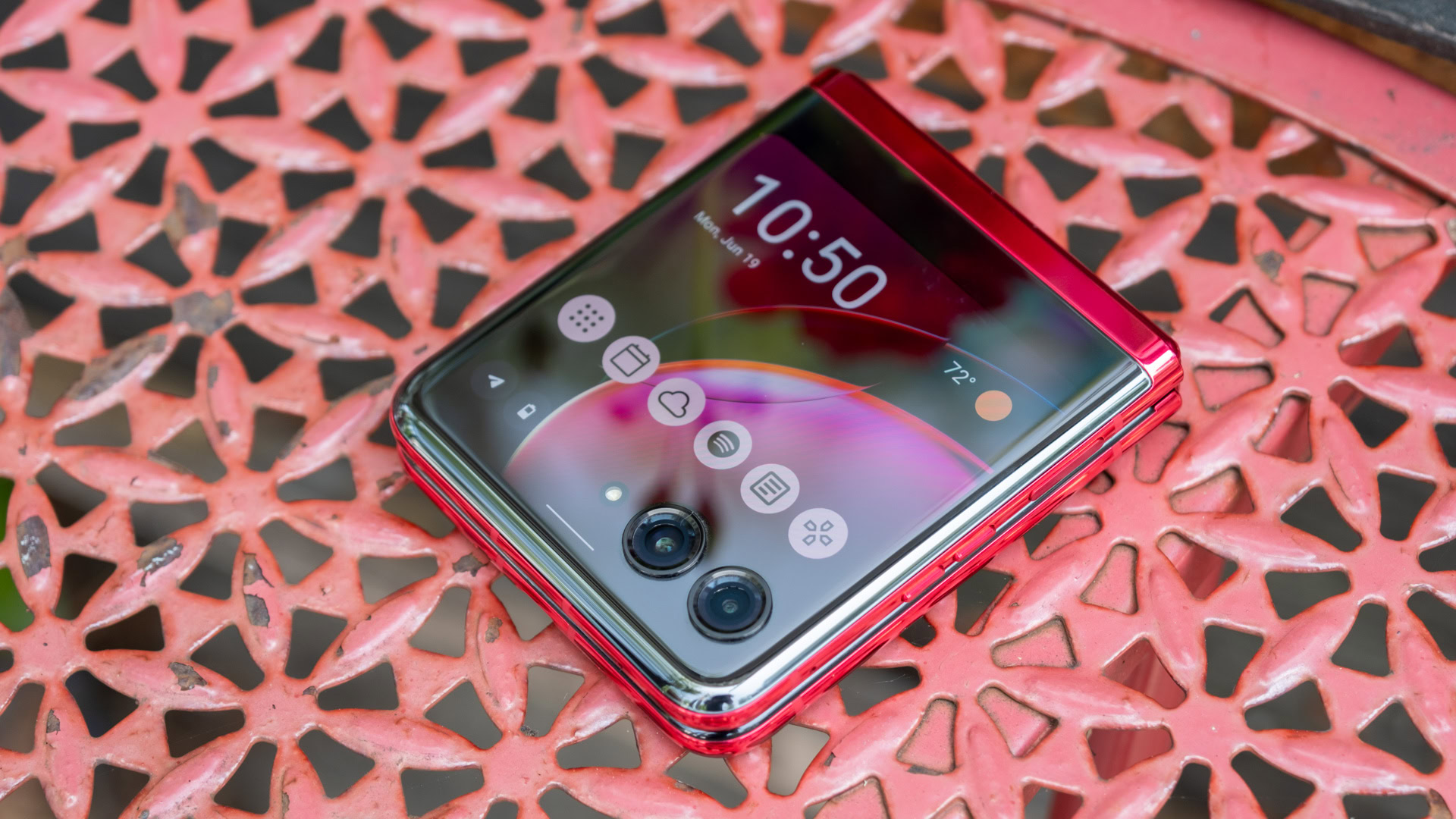
Falling in love with a flip phone is all about how you use the big screen — or rather, the not-so-big screen. And when it comes to the Motorola Razr Plus vs Samsung Galaxy Z Flip 6, the cover screens are about as different as can be. Where Samsung’s experience is locked down and measured, Motorola’s is open and flexible. The Galaxy Z Flip 6 forces apps into a smaller, square window within its folder-shaped panel, while the Razr Plus allows them to stretch across its entire display, even if the camera cutouts are in the way. Somehow, the acceptance of imperfection is what wins me over.
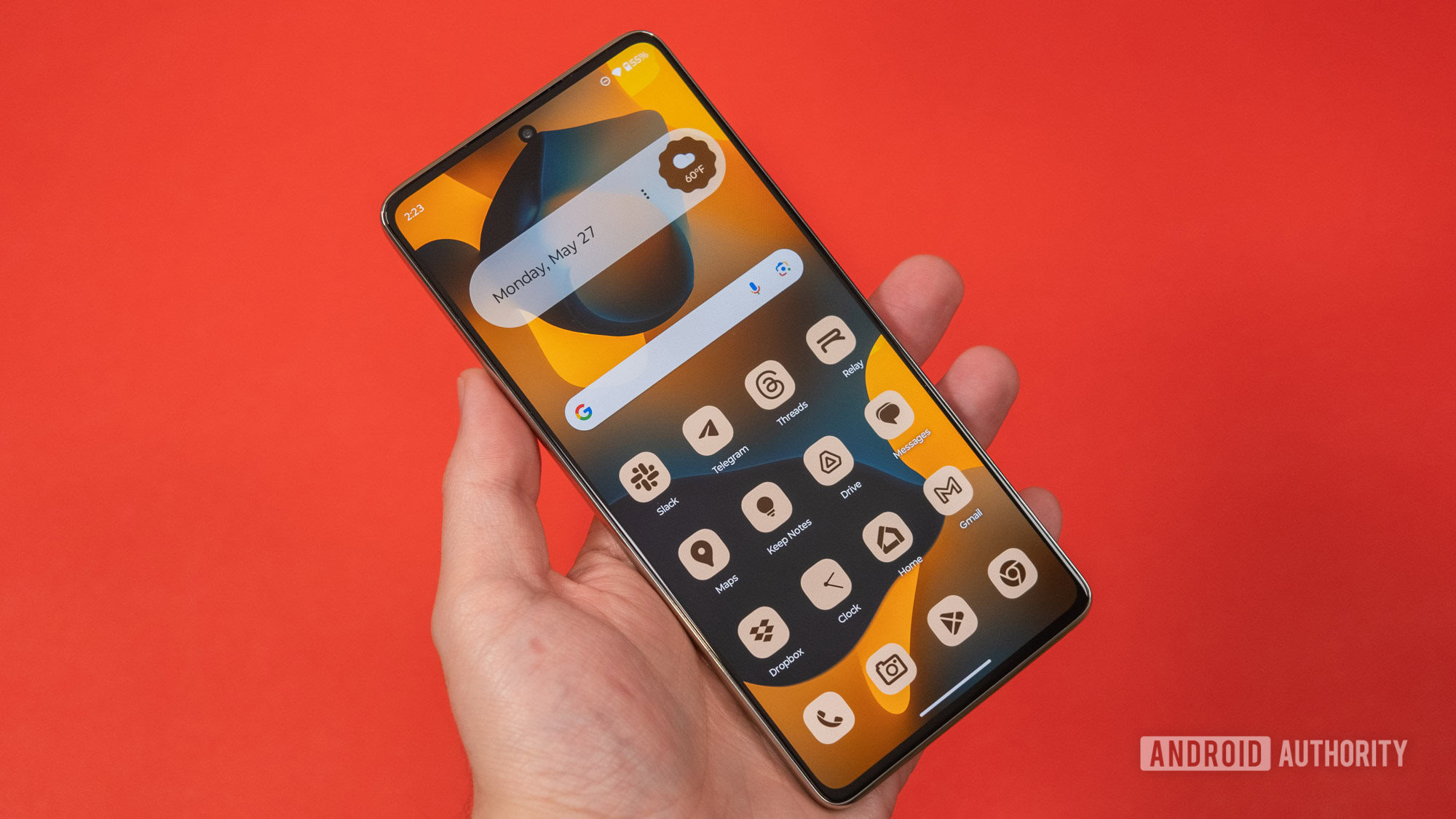
I understand why Samsung didn’t change its latest Flex Window from the 3.4-inch Super AMOLED panel it introduced on the Galaxy Z Flip 5 — most people still haven’t tried a flip phone, let alone purchased one. Unfortunately, that also means it hasn’t fixed what people (or at least I) didn’t like about the complicated software experience, either. Good Lock is still a requirement if you want to put more than Maps, YouTube, and Google Messages (not Samsung Messages) in your app drawer. I, of course, jumped through the hoops to get the rest of my apps on the Flex Window, but I had to reference the guide I wrote a year ago explaining how to do it. It feels like an over-engineered solution to a problem that Motorola just ignored — the fact that apps optimized for tall, thin phone displays won’t run perfectly on short, square cover screens.
Sorry, Samsung, but one app drawer is always better than two.
To its credit, Samsung has an excellent set of widgets on the Galaxy Z Flip 6. They’re set up so that you can combine multiple widgets on each panel of the Flex Window, making it almost feel like a giant Galaxy Watch or a small Nest display. One or two — like Spotify — need a layout all their own, but I can appreciate having my calendar, weather forecast, and easy access to a voice recorder all on one page, even if they don’t offer as much information right up front.
And yet, I still think I like Motorola’s experience better. The Razr Plus gained some extra real estate for 2024, stretching from 3.6 inches to an even 4-inch AMOLED panel that covers almost the entire top of the phone. It’s an overpowered display, combining a variable 165Hz refresh rate with up to 2,400 nits of peak brightness and packing in nearly 100 more pixels per inch than its Samsung rival. Motorola’s cameras are less intrusive, too, sitting in lower, rounded housings instead of Samsung’s relatively tall, color-matched rings.
Design and specs aside, I prefer Motorola’s cover screen because of the software experience and its willingness to embrace imperfection. Yes, it sounds backward, but it’s true. I just finished saying how tall, thin apps don’t work as well on short, square displays, but Motorola at least lets them try with as much of its display as possible. You can add any app to your cover screen drawer with a simple flip of a toggle, and Motorola programmed a button to push apps above the camera cutouts should they block parts of the interface. It lets me doom scroll through Instagram, catch up on House of the Dragon on a display it was never meant to be seen on, and try to outscore fellow tech journalists in Freekick Football without opening my phone.
Samsung doesn’t get all the credit for the best widgets, either. Although Motorola’s aren’t quite as flexible — you can’t put several on one page — they offer far more information upfront. When I set up my Razr Plus, it came with games, access to my contacts, my calendar, and the weather right out of the box — oh, and just one app drawer to worry about. The Galaxy Z Flip 6, on the other hand, gave me a weather widget in the corner of one panel, leaving me to do the rest on my own. Some people might love that flexibility, but it could create a steep learning curve for those who’ve never used a flip phone.
Opposing viewpoints

Credit: Ryan Haines / Android Authority
Even though I don’t think the Razr Plus is an underdog anymore, part of that mentality still exists within the phone. Specifically, the fact that underdogs usually have to be clever and try new things to outsmart their opponent, be it Chick Hicks, Davy Jones, or the Globo Gym Purple Cobras. To its credit, Motorola decided to think differently about the cameras on its latest Razr Plus. I’m just not sure if this is a winning strategy.
Instead of sticking with the wide and ultrawide combination that we’re used to on flip phones — well, and any other dual-camera device — Motorola decided to double down on portrait mode. It upgraded its 12MP primary camera to a sharper 50MP sensor, then ditched the reliable 13MP ultrawide camera for a 50MP telephoto with 2x optical zoom. Normally, I’d be thrilled since I’m not the biggest believer in the ultrawide field of view, but there’s something about a telephoto sensor in this form factor that doesn’t feel quite right.
Motorola went all-in on portrait mode... only to limit its cover screen to 1x zoom.
Don’t get me wrong, it’s great that a dual-camera flip phone can zoom in as far as the triple-camera Galaxy S24, but that’s not where phones like this are at their strongest. I prefer to use the Razr Plus and the Galaxy Z Flip 6 closed, treating their large primary sensors like super-powered selfie cameras. But when I do that, I rarely exceed 0.5x or 1x zoom — neither of which needs a telephoto sensor. Perhaps more confusingly, the Razr Plus won’t let you zoom beyond 1x on its cover screen, saving all of its portrait power for when the phone is open.
Samsung, on the other hand, follows the underdog vs rival story perfectly (at least in Hollywood terms). It knows what works, and it stuck with it. The Galaxy Z Flip 6 packs the wide and ultrawide camera pairing that it’s had since the beginning, this time with a higher-resolution 50MP primary sensor for the bulk of your shooting. Sure, it has smaller individual pixels and bins by default (Motorola does, too), but the swap means that Samsung can crop its sensor for 2x optical zoom. Oh, and the Galaxy Z Flip 6 lets you zoom in on the cover screen, no telephoto sensor required.
Samsung’s flip phone finally supports Expert RAW now, too, in case you want even more control over your camera settings. Though, once again, it’s more fun to pull up the front cameras and snap away. And, if you’re going to do that, Samsung’s Auto Zoom makes it much easier to frame your shot and automatically zoom before you use a gesture to take your photo. It’s not lightning fast — the camera takes a second or two to identify you — but it’s made life significantly easier when lining up pictures with friends.
Here are just a few shots and some of my thoughts from both cameras:
Motorola Razr Plus
It feels somewhat unfair to the Galaxy Z Flip 6 that I’ve spent more time with the Motorola Razr Plus, but that’s the way it goes sometimes. The Razr Plus has come with me for several adventures, including its own launch event in Brooklyn, a trip to the Guinness Open Gate Brewery here in Baltimore, and a stop at an Orioles game. I’ve put it through its paces at all of my stops, and I’ve picked up on a few things. For starters, I’m still not convinced that it needs a telephoto camera. Sure, it’s capable of 2x optical zoom, but everything beyond 4x is pretty much digital, and it all looks pretty rough. The 30x image of a player at home plate looks closer to a painting, which isn’t a great thing.
The Razr Plus struggles a bit with shadows, too. In the second row of photos, it’s tough to pick out the centers of the metal flowers around the archway, and the Razr Plus darkened my friend Derrek’s face even though we took a selfie in the middle of a bright warehouse. But hey, I used a Razr to take a picture of Paris Hilton, the original Razr influencer, so that’s something.
Samsung Galaxy Z Flip 6
As mentioned, I haven’t spent quite as long with the Galaxy Z Flip 6, but it’s long enough to notice a few things. For starters, I definitely missed having an ultrawide angle during my time with the Razr Plus. Living in a tall city, there are plenty of times when you want to fit just a little bit more in your shot. Also, Samsung definitely skews to a darker color profile. The mural of a jaguar is lighter in real life, and the statue of two lacrosse players is as well. Sometimes, the darker hues work out for Samsung — its greens are still extremely punchy, but I don’t think I’d call it true to life.
Things like recording video from either side and taking selfies on the internal cameras generally come out in the wash. The Razr Plus (2024) and Galaxy Z Flip 6 support up to 4K video at 60fps, 1080p at 240fps, and HDR10 Plus from their primary cameras, both with optical image stabilization. Motorola’s 32MP punch hole selfie camera and Samsung’s 10MP option are both fine, too, but I’ve hardly used either one because of how much better the primary cameras are.
Need for power, need for speed

Credit: Lanh Nguyen / Android Authority
Our ex-underdog still has one major limitation in its quest to dethrone the Galaxy Z Flip 6, though — its chipset can’t quite keep up. While both the Razr Plus and Galaxy Z Flip 6 ship with the same base RAM and storage (12GB and 256GB, respectively), the modified configuration of Qualcomm’s Snapdragon 8s Gen 3 is no match for Samsung’s overclocked Snapdragon 8 Gen 3 for Galaxy. In film terms, Anakin Skywalker’s podracer doesn’t get the same thrust from its engines as Sebulba’s.
As we all know, Anakin wins the Boonta Eve Classic in the end, but it’s not down to raw power. If it were, he’d lose every time, just like the Razr Plus does in most of our benchmarking tests against the Galaxy Z Flip 6. The difference isn’t always a big one — the single-core Geekbench 6 and PC Mark tests were relatively close — but Samsung’s flip phone opens a much wider gap regarding graphics. Its performance in the Wild Life test started at triple the score of the Razr Plus, and even after 20 runs, it remained more than 50% higher than its competitor. Much of the gap in graphics performance comes back to the Snapdragon 8s Gen 3 using an older GPU, so sometimes it pays to grab the latest chipset.
Of course, it’s not all bad news for the Razr Plus. It still puts in a solid shift and feels capable of making it through a mixed day of usage — so long as you trust the cover display for lighter tasks. Honestly, you’re probably not going to notice too many of the gains from Samsung’s more powerful chipset anyway — it might be a hair quicker here and there, but both chipsets are perfectly capable of cruising through day-to-day tasks like web browsing, answering emails, and a little bit of gaming anyway.

Credit: Ryan Haines / Android Authority
Where the Razr Plus does make up some significant ground is in its battery life and charging setup. Like Anakin, it might not be more powerful, but it can run longer and return to full strength quicker. Both the Razr Plus and the Galaxy Z Flip 6 pack 4,000mAh batteries, and in our battery drain test, Samsung’s flip phone only ran away in one category: 4K video playback. It more than doubled the Razr Plus’ performance, which is great news if you watch a lot of high-resolution videos, but Motorola came out at least slightly ahead in Zoom calling, web browsing, camera snapping, and even gaming battery life, a mix of which you’re more likely to do throughout the day.
Motorola also keeps its edge (pun intended) when it comes to charging. The Razr Plus (2024) offers Galaxy S24 Ultra-level 45W wired TurboPower charging, which easily beats the Galaxy Z Flip 6’s 25W wired speed with a compatible charger. Both tie in 15W wireless charging, though Motorola has a slight advantage in reverse wireless speeds, too, at 5W instead of 4.5W.
Galaxy AI still reigns supreme

Credit: Ryan Haines / Android Authority
Oh, and don’t think I’ve forgotten about 2024’s buzzword of the year — AI. One of the most important pieces of both Samsung’s and Motorola’s choice in the chipset is that both Snapdragon models support on-device AI features. From there, it’s up to the two companies to see how quickly they can roll out their respective features.
So far, like every underdog story worth its salt, Samsung is winning. The Galaxy Z Flip 6 is further ahead in all manner of Galaxy AI-powered features, with things like Auto Zoom, Sketch to Image, and Portrait Studio debuting in One UI 6.1.1. They’re new additions on top of Circle to Search, Live Translate, and Photo Assist, which Samsung introduced in previous generations. I’ve only really come to trust Circle to Search and Auto Zoom, as they feel the most straightforward, though I’ll also generate a wallpaper here and there — if you still want to classify that as exciting, on-device AI.
On the Razr Plus, Moto AI needs to catch up. Right now, Motorola is only ready to offer a few of its generative features, including two forms of wallpaper generation called Style Sync and Magic Canvas. It also has a couple of camera wrinkles — Adaptive Stabilization and Action Shot — but the best of its on-device power is coming… eventually. Remember that it took Motorola over a year to bring Android 14 to its previous Razr Plus, so who knows when “eventually” could be.
The Motorola Razr Plus (2024) finally deserves its crown

Credit: Ryan Haines / Android Authority
There are plenty of ways to end an underdog story. Rudy sacks the quarterback, Rocky wins the fight, and Luke Skywalker blows up the Death Star (or defeats the emperor, take your pick of Star Wars film). No matter which one you prefer, there still has to be a winner. And, despite its more useful pair of cameras, more powerful chipset, and longer update commitment, I can’t bring myself to pick the Galaxy Z Flip 6. Yes, it’s an excellent phone and easily Samsung’s most complete Galaxy Z Flip to date, but it also feels like a phone stuck spinning its wheels.
There are so many things that Samsung’s latest Galaxy Z Flip 6 has in its corner. It has a better ecosystem of accessories, an almost infinitely customizable software experience, and a build quality that’s worthy of a museum display, and yet it feels too surgical and precise for my liking. There are phones I think should feel like well-oiled machines, like the Samsung Galaxy S24 Ultra and Apple iPhone 15 Pro Max, but they’re the opposite of the Galaxy Z Flip 6. Instead, this phone should be leaning on its uniqueness and embracing the fact that it’s smaller and more portable than a Klondike Bar.
Samsung's flip phone feels like a tool, but I prefer the imperfect flexibility of the Razr Plus.
Which is exactly what the Razr Plus does. Motorola’s top-end flip phone is less powerful, won’t get seven years of updates, and has cameras that make almost no sense in this form factor, and yet it’s by far the more enjoyable to use. The Razr Plus’ rounded frame is comfortable to hold and use for hours on end, while its vegan leather (or suede) back panel adds a softness and a pop of color that reminds me of the Motorola of old. I didn’t have to jump through any hoops to add an app drawer to the cover screen, nor did I have to reorganize the preloaded widgets — I just fired up the Razr Plus and got to exploring until my battery died. Then, I charged it back up at a speed that Samsung reserves only for products named Ultra.
Of course, I can’t speak for everyone. I know some Samsung die-hards will only consider the Galaxy Z Flip when they pick up a flip phone. They’ll happily spend the extra cash (Samsung bumped its price by $100) to stay within the Galaxy ecosystem. However, I will keep returning to the Razr Plus as long as Motorola continues to embrace the fun side of Android.
![]()


